
In the intricate tapestry of brand identity, color stands as a foundational thread, shaping perception, evoking emotion, and distinguishing entities. While much attention is often paid to vibrant hues and striking palettes, the role of white—or the absence of color—is equally, if not more, critical. Understanding “what colors make white” isn’t merely a scientific curiosity; it’s a strategic imperative for brand designers, marketers, and strategists. This seemingly simple question unlocks a deeper appreciation for how white functions across different media, influences visual hierarchy, and ultimately defines a brand’s aesthetic and message.

The Duality of White: Additive vs. Subtractive Color Models
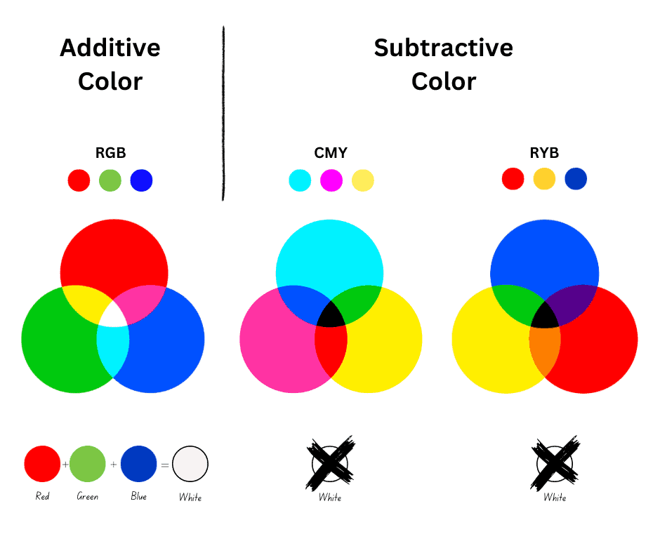
The concept of “what colors make white” is fundamentally split into two distinct models, each critical for understanding how your brand’s white appears across various touchpoints. These models dictate how light and pigment interact, influencing everything from digital screen displays to printed brochures.
Additive Color (RGB): The Light-Based Foundation of Digital Branding
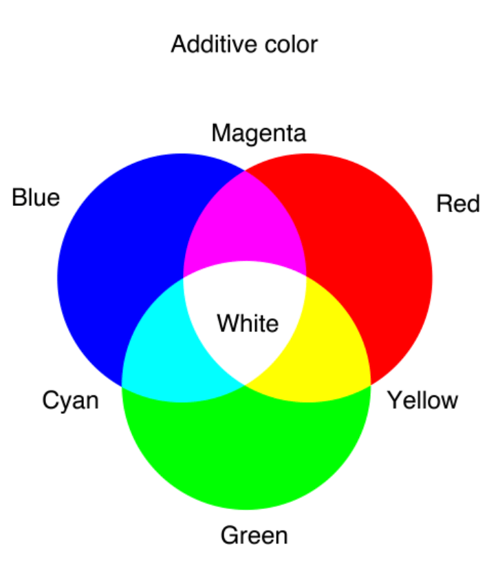
In the realm of digital media, white is not merely a background but a vibrant composite of light. The Additive Color Model, primarily represented by RGB (Red, Green, Blue), is the cornerstone of how colors are perceived on screens. This model operates on the principle that mixing different wavelengths of light produces new colors, and crucially, combining all three primary colors—Red, Green, and Blue—at their full intensity results in pure white light.
Think of your smartphone, computer monitor, or television screen. Each pixel on these devices contains tiny red, green, and blue light emitters. When all three are turned on simultaneously at maximum brightness, the light waves combine to create white. This is why when you define white in a digital design program, you’ll typically see values like R:255, G:255, B:255, or the hexadecimal code #FFFFFF.
For brand professionals, understanding RGB white is paramount for digital consistency. Your website, social media graphics, app interfaces, digital advertisements, and video content all rely on this model. The white you choose for these platforms can convey modernity, spaciousness, and clarity. However, without a grasp of RGB, maintaining brand integrity across diverse digital devices—each with its own screen calibration and display characteristics—becomes a significant challenge. A slight deviation in the RGB values of your brand’s white can alter the entire mood of your digital presence, making it appear dull, yellowish, or overly cool. Therefore, meticulously defining and adhering to specific RGB values for your brand’s white in digital guidelines is a non-negotiable step for a cohesive online identity.
Subtractive Color (CMYK): The Pigment-Based Reality of Print Branding
Contrasting sharply with the additive model is the Subtractive Color Model, most commonly represented by CMYK (Cyan, Magenta, Yellow, Key/Black), which governs how colors are produced in print. Unlike light, pigments absorb certain wavelengths of light and reflect others. When you mix different colored inks, you are subtracting (absorbing) more light, and the more colors you mix, the darker the resulting color becomes.
In theory, mixing full concentrations of Cyan, Magenta, and Yellow inks should produce black, as nearly all light would be absorbed. In practice, however, these inks rarely produce a true, rich black; instead, they often result in a muddy dark brown. This is why black (K for Key plate) ink is added to the CMYK model, providing depth and sharpness to dark areas and text.
The critical distinction for white in the CMYK model is that it is not made by mixing colors. Instead, white is typically the absence of ink, allowing the underlying paper stock to show through. When a designer specifies white in a print file (e.g., C:0, M:0, Y:0, K:0), they are instructing the printer not to lay down any ink in that area. This means the quality, texture, and inherent shade of the paper itself become your brand’s white.
This fundamental difference presents unique challenges for brand consistency. The bright, luminous white of a screen (RGB) cannot be perfectly replicated in print, where white is passive and dependent on the physical medium. Brands must consider their paper choices carefully – an off-white recycled stock will convey a different message than a stark, bright white coated stock. For brand strategists, this necessitates specific guidelines for print applications, often including recommendations for paper types, finishes, and, in some specialized cases, the use of white ink on colored substrates to achieve a desired ‘white’ effect where the base material isn’t naturally white. Harmonizing the perception of white between digital and print environments requires a nuanced understanding and careful planning.
The Strategic Power of White Space in Branding and Marketing
Beyond its technical definition as a color, “white” takes on a metaphorical and immensely powerful role in branding as white space (or negative space). This isn’t just empty room; it’s a deliberate design element that profoundly impacts how a brand’s message is received and perceived.
More Than Just ‘Nothing’: The Brand Value of Negative Space
White space is the unprinted or unpopulated area around and between elements in a design layout, whether on a website, a print ad, or product packaging. Far from being a waste of space, it’s a sophisticated tool that enhances readability, improves comprehension, and creates a distinct brand aesthetic. By providing breathing room, white space allows the viewer’s eye to process information without being overwhelmed. It acts as a visual pause, guiding attention to key brand elements like logos, taglines, or product images.
For many high-end, luxury, or minimalist brands, strategic use of white space is a hallmark of their identity. Brands like Apple, Tiffany & Co., and many premium automotive manufacturers leverage extensive white space to communicate exclusivity, sophistication, purity, and precision. It suggests confidence, implying that the brand doesn’t need to shout to be heard. It creates an aura of quiet authority and premium quality, allowing the product or message to speak for itself without clutter or distraction. This strategic deployment of negative space is a direct reflection of a brand’s commitment to clarity and elegance.
White as a Canvas: Highlighting Brand Elements
When used effectively, white space transforms into an intentional canvas, elevating and drawing focus to other brand elements. It provides contrast, making colored elements, typography, and imagery appear more vibrant and impactful. Imagine a bold, colorful logo placed against a stark white background – the white amplifies the logo’s presence, making it impossible to ignore.
This principle is vital for visual marketing and corporate identity. White backgrounds are often chosen for product photography to ensure the product stands out without competing distractions. In web design, ample white space around call-to-action buttons or critical information ensures high visibility and user engagement. Psychologically, white is associated with purity, cleanliness, and new beginnings. Brands can leverage these associations to convey transparency, efficiency, and a fresh perspective. A brand utilizing a clean, white aesthetic can subtly suggest trustworthiness and simplicity, attributes highly valued by consumers in an increasingly complex world.
Navigating White in Corporate Identity and Brand Guidelines
The strategic use of white in branding necessitates meticulous definition and consistent application. A casual approach to “white” can lead to a fragmented brand experience, undermining credibility and visual coherence.
Defining Brand White: Beyond Just #FFFFFF
While #FFFFFF (pure white in RGB) or C:0 M:0 Y:0 K:0 (no ink in CMYK) serve as technical starting points, a brand’s white is often more nuanced. “White” encompasses a spectrum of subtle variations: off-whites, warm whites with a hint of yellow or red, and cool whites with a touch of blue. These subtle distinctions can profoundly influence brand perception. A heritage brand might opt for a warmer, creamy white to evoke a sense of tradition and comfort, while a cutting-edge tech company might choose a bright, cool white to communicate innovation and modernity.
Therefore, comprehensive brand guidelines must go beyond generic definitions. They should specify the exact RGB values for digital applications and provide clear CMYK breakdowns for print, alongside any specific paper stock recommendations that define the print “white.” In some cases, a brand might even specify a Pantone color for white if a particular opaque white ink or a very specific shade on a unique substrate is crucial to its identity. Defining these nuances ensures that the chosen white consistently reinforces the brand’s desired mood and personality across all platforms.
Consistency Across Media: Bridging Digital and Print Whites
One of the most significant challenges in brand management is ensuring consistency when white is treated so differently in additive (digital) and subtractive (print) models. The luminous white of a screen will never perfectly match the paper-based white of a brochure. The goal, then, is not identical reproduction but rather consistent perception and impact.
Brand guidelines should provide strategies for bridging this gap. This might include:
- Color Calibration: Ensuring monitors are regularly calibrated to a consistent standard helps designers accurately visualize how colors, including white, will appear.
- Proofing: Reviewing physical proofs of print materials against digital mock-ups is crucial for identifying discrepancies and making adjustments before mass production.
- Understanding Substrates: Explicitly specifying paper types (e.g., brightness, finish, coating) in brand guidelines for print is essential, as the paper itself defines the print white.
- Strategic Design Choices: Designers can compensate for differences by adjusting surrounding colors or typefaces to maintain the overall visual harmony and brand feeling.
The objective is to ensure that whether a consumer encounters your brand on a backlit screen or a physical piece of paper, the “white” they perceive contributes to a unified and recognizable brand experience, reinforcing the core attributes the brand wishes to convey.
The Psychological and Cultural Dimensions of White in Branding
The choice and application of white in branding are not solely technical or aesthetic; they are deeply intertwined with psychology and cultural meaning, influencing emotional responses and perceived brand values.
Universal Meanings and Cultural Nuances
Globally, white carries several common associations. It is widely linked to purity, innocence, peace, cleanliness, clarity, and new beginnings. These universal traits make white a powerful tool for brands aiming to convey transparency, simplicity, efficiency, and health. For instance, medical and healthcare brands frequently employ white to evoke a sense of sterility, trust, and professionalism. Tech brands often use white to symbolize innovation, minimalism, and a clean user experience.
However, the meaning of white is not entirely universal. Cultural nuances must be meticulously considered, especially for global brands. While white is the traditional color for weddings in many Western cultures, symbolizing purity, it is the color of mourning and funerals in several Eastern and African cultures. In some contexts, white can also be associated with surrender or emptiness. Brands operating in diverse markets must be acutely aware of these differing interpretations to avoid unintended messaging or cultural missteps. A thorough cultural audit is essential to ensure that the brand’s white resonates positively with its target audience worldwide.
Case Studies: Brands That Master White
Numerous brands have effectively leveraged the power of white to solidify their identity and communicate their core values:
- Apple: Perhaps the quintessential example, Apple’s consistent use of white in product design, packaging, retail stores, and advertising has become synonymous with minimalism, sophistication, innovation, and user-friendliness. The vast white spaces around their products highlight elegant design and reinforce a clean, intuitive experience.
- Tiffany & Co.: While famous for its robin’s egg blue, Tiffany’s prominently uses white in its packaging, particularly for the iconic white ribbon that adorns its blue boxes. This combination evokes luxury, purity, and classic elegance, elevating the perceived value of their jewelry.
- Google: Although their logo is colorful, Google’s search engine interface is predominantly white. This design choice emphasizes clarity, simplicity, and efficiency, allowing users to focus entirely on the search bar and results without visual clutter. It underpins their core function: providing immediate, unobstructed access to information.
- Dyson: The high-tech appliance brand frequently uses white in its product design and marketing to convey cleanliness, advanced engineering, and futuristic appeal. The sleek white forms of their vacuums and air purifiers suggest purity and high performance.
These brands demonstrate that understanding “what colors make white”—both technically and symbolically—is not a mere detail but a strategic asset. By mastering the duality of white in additive and subtractive models, appreciating the strategic power of white space, meticulously defining brand white in guidelines, and respecting its psychological and cultural dimensions, brands can harness this seemingly simple color to build a powerful, coherent, and universally resonant identity.
aViewFromTheCave is a participant in the Amazon Services LLC Associates Program, an affiliate advertising program designed to provide a means for sites to earn advertising fees by advertising and linking to Amazon.com. Amazon, the Amazon logo, AmazonSupply, and the AmazonSupply logo are trademarks of Amazon.com, Inc. or its affiliates. As an Amazon Associate we earn affiliate commissions from qualifying purchases.