In the world of color theory and professional design, blue occupies a unique position. It is one of the three primary colors in the RYB (Red, Yellow, Blue) color model—the system most commonly taught in art schools and foundational design education. Because blue is a primary color, it is defined by its inability to be created through the mixture of other pigments. In a subtractive color system, you cannot mix other colors to create blue; rather, you must start with blue as your base to create the vast spectrum of secondary and tertiary colors. Understanding this limitation is the first step toward mastering color strategy in branding, marketing, and visual identity.

The Foundation of Color Theory in Brand Identity
When developing a corporate identity, the selection of a color palette is not merely an aesthetic choice; it is a strategic maneuver that dictates how a target audience perceives a brand. Blue is perhaps the most widely used color in professional branding, favored by financial institutions, technology giants, and healthcare organizations alike.
The Subtractive vs. Additive Reality
To understand why blue cannot be “made” from other colors, one must distinguish between the physical medium of pigments and the digital medium of light. In the traditional RYB model used in painting and printing, blue is a primary color. If you are working with physical paint, there is no combination of red, yellow, or any other pigment that will yield a true blue. If you attempt to mix colors to approximate blue, you will invariably end up with a muddy brown or a desaturated grey.
In the world of professional design, this creates a strict rule: blue must be present in your palette from the start. If your brand guidelines require a specific shade of blue, you are not looking for a “mix”; you are looking for a specific pigment or digital formula. This is where Pantone Matching Systems (PMS) become vital. By selecting a specific blue—such as Reflex Blue or Process Blue—designers ensure consistency across physical collateral, from business cards to signage, ensuring that the brand’s visual identity remains untainted by the unpredictability of manual mixing.
The Psychology of Blue in Marketing
Because blue is foundational, it carries a psychological weight that other colors cannot replicate. It is frequently associated with trust, stability, intelligence, and calm. Brands that want to project a sense of reliability—think of major banking firms or software companies—rarely opt for high-energy colors like red or orange as their primary identity. Instead, they choose blue.
However, the “lack” of a way to mix blue means that designers must focus on the manipulation of blue rather than its creation. By adding white, black, or complementary colors, you shift the hue, tint, or shade to convey different brand messages. A light, airy blue suggests openness and innovation, while a deep, navy blue communicates authority and legacy.
Strategic Color Manipulation: Beyond the Primary
While you cannot create blue from other colors, the professional designer’s craft lies in how they alter blue to fit the specific needs of a brand. Once you have established your base blue, the focus shifts to creating a comprehensive color scheme that supports the primary identity.
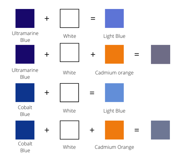
Creating Tints, Shades, and Tones
In brand strategy, we rarely use a primary color in isolation. To build a balanced interface or marketing campaign, we utilize the triad of tinting, shading, and toning.
- Tints: By adding white to your base blue, you create a tint. These lighter variations are essential for background elements, website interfaces, and supporting graphic assets. They maintain the brand’s blue identity while preventing visual fatigue.
- Shades: By adding black to the base blue, you create a shade. These deeper, more dramatic versions of the color are perfect for text, borders, or areas where you need to emphasize gravity and seriousness.
- Tones: By adding grey (or a complementary color), you desaturate the blue. This is a highly sophisticated move in modern branding. Muted, desaturated blues are currently trending in the SaaS and tech sectors because they feel premium, understated, and modern compared to the saturated, “web-safe” blues of the early 2000s.
The Role of Complements in Brand Contrast
The most effective way to make your blue brand identity “pop” is not by trying to make blue, but by mastering the colors that sit opposite to it on the color wheel. In the RYB model, orange is the direct complement to blue.
When you pair a high-quality blue with an orange accent, you create a dynamic tension that draws the viewer’s eye. Many tech startups use this strategy: a clean, professional navy blue for the primary UI and deep navigation bars, paired with a vibrant, punchy orange for call-to-action (CTA) buttons. This contrast is effective because it leverages the fundamental laws of color theory to guide user behavior. The blue establishes the trust; the orange demands the action.
Digital Implementation: The Shift to RGB
While the pigment-based RYB model explains why blue is a primary color, the digital world operates on the RGB (Red, Green, Blue) model. In digital branding, blue is still a primary color, but the way we “mix” it changes entirely.
Light vs. Pigment
In the RGB model, colors are created by the emission of light. If you are designing for a website, an application, or a digital billboard, you are working with additive colors. When you combine Red light and Green light in a digital environment, you get Yellow. However, you still cannot create Blue by mixing Red and Green. Blue remains a fundamental component of the light spectrum used in digital displays.
This distinction is crucial for brand managers who oversee omni-channel campaigns. A color that looks vibrant on a screen (RGB) may look significantly duller when printed (CMYK). Because blue is so difficult to reproduce accurately across different mediums, professional branding teams invest heavily in style guides that define the exact hexadecimal (HEX) codes for web, and CMYK process values for print.
Consistency as a Brand Asset
If a customer sees your brand on their phone, then encounters your printed brochure, and then visits your physical office, their brain expects to see the exact same “blue” in every instance. Because blue is a primary color, variations in the blue you use can subconsciously signal to the customer that your brand is disorganized or “off.”
Consistency is a form of brand equity. By understanding that blue cannot be created by mixing other colors—and therefore must be precisely selected and maintained—you treat your brand’s blue as a non-negotiable asset. Whether it is a specific shade of “Corporate Navy” or a “Tech Horizon Blue,” that color becomes a shorthand for your company’s values and quality.

Conclusion: The Professional Approach to Blue
The question of “what mixed colors make blue” is a foundational inquiry that serves as a reminder of the limitations of the physical world. In design, branding, and marketing, the answer is simple: you don’t mix colors to get blue. You choose it.
Blue is a starting point, not an end result. By treating blue as a primary pillar of your identity, you move away from the amateurish attempt to manufacture your look and toward the professional practice of managing it. You select a base, you expand it through tints and shades, you provide contrast through its complement, and you protect it through rigorous consistency across digital and physical media.
In the competitive landscape of corporate identity, blue remains the gold standard for a reason. It is reliable, it is authoritative, and most importantly, it is intentional. By mastering the usage of blue, you communicate to your audience that your brand is built on a foundation of clarity, purpose, and professional design excellence. Do not try to blend your way into a brand identity; choose your primary color with precision, and build your entire visual strategy around that singular, unmixed strength.
aViewFromTheCave is a participant in the Amazon Services LLC Associates Program, an affiliate advertising program designed to provide a means for sites to earn advertising fees by advertising and linking to Amazon.com. Amazon, the Amazon logo, AmazonSupply, and the AmazonSupply logo are trademarks of Amazon.com, Inc. or its affiliates. As an Amazon Associate we earn affiliate commissions from qualifying purchases.