
Peace, an abstract yet profoundly universal human aspiration, has always sought tangible representation. In a world characterized by diverse languages, cultures, and belief systems, these representations, or symbols, act as powerful agents of communication, transc transcending barriers and forging a shared understanding. From a brand strategy perspective, symbols of peace function as universal brand assets, each possessing its own unique history, visual identity, and emotional resonance that collectively form the global brand identity of peace itself. They are not merely pictures; they are meticulously crafted, historically authenticated, and widely recognized identifiers that communicate complex ideals with immediate clarity and impact.

These symbols are the ultimate example of global branding, establishing a clear message that resonates with a vast, multicultural audience without the need for traditional marketing budgets or corporate backing. Their “brand equity” is built on centuries of shared human experience, conflict, and the enduring hope for reconciliation. Understanding them through the lens of branding reveals not just their individual significance but also the strategic genius behind their enduring power to unite, inspire, and remind humanity of its collective longing for harmony.
The Dove: A Timeless Brand Icon of Peace
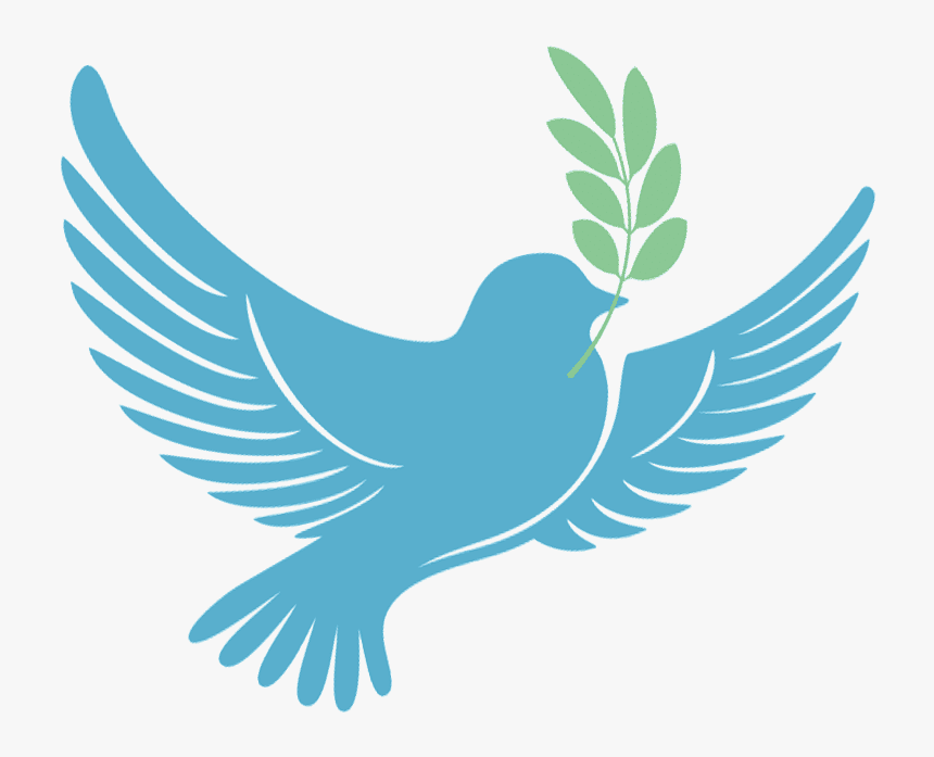
Few images evoke peace as immediately and universally as the white dove. Its serene posture, often depicted with an olive branch, has cemented its status as an unparalleled brand icon for tranquility and hope.
Genesis and Brand Story
The dove’s potent brand narrative originates from ancient mythologies and Abrahamic religions. Its most famous “origin story” comes from the biblical account of Noah’s Ark, where a dove returns with an olive branch, signaling the end of the flood and the beginning of a new, peaceful era for humanity. This powerful narrative provided the dove with its foundational ‘brand story’ – one of new beginnings, divine promise, and the cessation of strife. Over millennia, this story imbued the dove with deep emotional resonance, transforming it from a mere bird into a universally understood emblem of reconciliation and fresh starts. Its journey from a religious narrative to a secular symbol demonstrates exceptional brand agility and cultural transcendence.
Visual Identity and Recognition
The visual identity of the dove as a peace symbol is characterized by its simplicity and grace. Typically depicted in pristine white, its form is often captured in gentle flight or perched, head bowed in contemplation, with the distinct green olive branch clutched in its beak. This aesthetic clarity ensures instant recognition across all demographics and cultures. The choice of white symbolizes purity and innocence, reinforcing the unblemished ideal of peace, while the soft lines and delicate posture convey gentleness and hope. This visual consistency has allowed the dove to serve as an instantly identifiable ‘brand logo’ for peace initiatives, humanitarian organizations, and diplomatic efforts worldwide, making it one of the most successful visual brands in history.
Brand Evolution and Adaptability
The dove’s remarkable brand longevity and adaptability are testaments to its inherent power. From Picasso’s iconic “Dove of Peace” lithograph, designed for the World Peace Congress in 1949, to its widespread use in countless logos, protest art, and digital emoticons, the symbol has demonstrated extraordinary flexibility. It has been reinterpreted across various ‘marketing channels’ – fine art, political campaigns, commercial products, and social media – consistently delivering its core brand message without dilution. This adaptability speaks volumes about its robust brand equity; it can be stylized, simplified, or rendered realistically, yet its meaning as a symbol of peace remains universally understood, proving its enduring strength as a global brand.
The Olive Branch: A Historic Emblem’s Enduring Brand Power
Complementing the dove, the olive branch stands as another venerable symbol, its branding for peace rooted deeply in antiquity and fortified by centuries of diplomatic and cultural association.
Roots in Ancient Branding
The olive branch’s brand journey began in the cradle of Western civilization. In ancient Greek mythology, the olive tree was a sacred gift from the goddess Athena, symbolizing peace, prosperity, and wisdom. Roman tradition further solidified its brand positioning, with ambassadors using olive branches as tokens of truce during wartime negotiations. These powerful historical associations provided the olive branch with significant ‘brand equity’ long before the concept of branding existed. It became intrinsically linked to the cessation of hostilities, a visual shorthand for negotiation and the yearning for accord, establishing its authority as a mark of peace.
Diplomatic Currency and International Brand Usage
The olive branch’s brand power is most evident in its continued use as a ‘diplomatic currency.’ Its inclusion in the emblem of the United Nations, where two olive branches cradle a world map, unequivocally positions it as a universal brand for international peace and security. This deliberate branding by a global body reinforces its authority and ensures its recognition as a symbol of global cooperation and reconciliation. Furthermore, many national flags and governmental seals incorporate the olive branch, signifying their commitment to peace and their diplomatic intentions. This institutional endorsement highlights its role as a universally recognized ‘brand mark’ for peace negotiations and international agreements, signifying intent and fostering trust on a global stage.
Design Simplicity, Brand Clarity
The simple, organic design of the olive branch contributes significantly to its strong, unambiguous brand message. Its natural form – a slender branch adorned with delicate leaves and sometimes olives – conveys growth, life, and natural harmony. This visual clarity allows it to be easily reproduced and understood across diverse cultures and languages, eliminating ambiguity in its brand communication. Its unadorned elegance reinforces the idea of peace as a natural, fundamental state. This unpretentious design, coupled with its profound historical weight, ensures that the olive branch remains a powerful and effective brand for peace, instantly communicating hope and reconciliation without the need for complex interpretation.
The Peace Sign (CND Symbol): A Modern Brand Revolution
In contrast to the ancient origins of the dove and olive branch, the peace sign emerged as a deliberate, mid-20th-century ‘brand launch’ that rapidly became a global icon for protest and peace.
Mid-20th Century Brand Launch
The peace sign, formally known as the Campaign for Nuclear Disarmament (CND) symbol, was designed by Gerald Holtom in 1958 for a march against nuclear weapons in Britain. Its design was a clever abstraction of the semaphore signals for ‘N’ (nuclear) and ‘D’ (disarmament), with the circle symbolizing the globe or unity. This was a highly strategic and intentional act of branding: creating a distinct, reproducible logo for a specific social and political movement. Its direct connection to nuclear disarmament gave it an immediate, urgent ‘brand positioning’ as an emblem of anti-war sentiment, marking a departure from more traditional, ancient peace symbols.
Global Brand Adoption and Counter-Culture Marketing
The symbol’s brilliant ‘marketing’ took hold during the anti-war movements of the 1960s, particularly the protests against the Vietnam War. It rapidly became a viral, grassroots brand for peace, adopted by counter-culture movements and youth activists across the globe. Unlike symbols propagated by institutions, the peace sign spread organically, through hand-drawn posters, embroidered patches, and graffiti, becoming a powerful symbol of solidarity. Its adoption by figures like Martin Luther King Jr. further amplified its reach and cemented its status as a universal symbol of non-violent resistance. This unprecedented viral spread demonstrated the power of a compelling visual brand to mobilize and unify a diverse global audience around a shared cause.
Brand Versatility and Cultural Impact
The peace sign’s phenomenal brand versatility allowed it to transcend its original context. While born from the anti-nuclear movement, it quickly evolved into a generalized brand for peace, protest, and non-conformity. It appeared in fashion, music album art, political cartoons, and artistic expressions, becoming synonymous with ideals of freedom, love, and anti-establishment sentiment. Its simple, graphic design made it easy to reproduce, contributing to its ubiquity. This unique strength lies in its ability to signify both a specific campaign and a broader philosophical stance, illustrating how a well-designed brand can evolve beyond its initial scope to become an enduring cultural icon with widespread recognition and emotional connection.
Other Iconic Symbols and Their Brand Contributions to Peace
While the dove, olive branch, and peace sign dominate, numerous other symbols have contributed significantly to the ‘brand architecture’ of peace, each with its unique ‘brand positioning’ and emotional appeal.
The White Poppy: A Brand Alternative for Remembrance
The white poppy emerged as a distinct ‘brand alternative’ to the traditional red poppy, which commemorates military fallen. Launched by the Co-operative Women’s Guild in 1933, its specific ‘brand positioning’ is to remember all victims of war – civilians, combatants, and those affected by conflict – while simultaneously committing to peace and challenging militarism. It represents a different facet of peace: not just the absence of war, but an active pursuit of non-violence and a critique of its causes. This nuanced brand approach offers an important counter-narrative, highlighting how branding can articulate specific perspectives within a broader movement.
The Cranes for Peace: A Brand of Hope and Resilience
The story of Sadako Sasaki, a Japanese girl who contracted leukemia after the atomic bombing of Hiroshima and attempted to fold a thousand paper cranes, transformed the origami crane into a poignant ‘brand of hope’ and resilience. This symbol, particularly prevalent in Japan, represents healing, peace, and the fragility of life in the face of nuclear war. Its emotional ‘brand appeal’ lies in its narrative of childhood innocence, suffering, and the quiet act of creation as a form of resistance and prayer for a peaceful world. The cranes are not merely decorative; they are a powerful, emotionally charged brand that communicates the profound human cost of conflict and the enduring spirit of hope.
Hands and Gestures: Universal Body Language as Brand Signals
Beyond static images, certain human gestures function as universal ‘brand signals’ for peace. The ‘V’ sign, popularized by Winston Churchill and later adopted by the counter-culture movement as a peace symbol, is a prime example of a non-verbal brand cue. Similarly, clasped hands signify solidarity and reconciliation, while open palms can denote peaceful intentions or a lack of weapons. These gestures, deeply embedded in human interaction, serve as instinctive, globally understood brand markers for peace, transcending linguistic barriers and fostering immediate connection and understanding. Their power lies in their direct, unmediated communication of universal human sentiments.
Branding Peace: The Strategic Power of Universal Symbols
The collection of these diverse symbols forms a powerful, multi-faceted ‘brand architecture’ for peace, demonstrating the strategic genius of visual communication in addressing humanity’s most profound aspirations.
Building a Universal Brand Identity
Together, these symbols – from the ancient dove to the modern peace sign – contribute to a robust, universal brand identity for peace. They render an abstract, intangible concept tangible and shareable, providing a common visual vocabulary for an ideal that transcends political boundaries, religious dogma, and cultural differences. This collective brand identity allows for a consistent message of harmony and non-violence to be communicated globally, shaping collective understanding and guiding aspirations towards a more peaceful existence. It’s a testament to how visual assets can build a cohesive brand for an idea.
Communication Beyond Language Barriers
One of the most profound strategic advantages of these peace ‘brands’ is their efficacy as ‘brand messengers’ that overcome linguistic and cultural divides. A dove with an olive branch, a peace sign, or clasped hands requires no translation; their meaning is immediately understood across continents. This visual shorthand is invaluable in a diverse world, enabling rapid and clear communication of complex ideals. They foster a shared understanding of peace, acting as universal touchpoints that connect individuals regardless of their spoken tongue, proving the unparalleled power of visual branding in global communication.
Inspiring Action and Fostering Engagement
Powerful peace ‘brands’ are not merely decorative; they are tools for inspiration and mobilization. They serve as rallying points for collective aspiration, appearing on banners at protests, in the logos of humanitarian organizations, and on personal adornments, signifying affiliation and commitment. These symbols foster engagement by providing a tangible focal point for individuals and communities to express their desire for peace, organize movements, and advocate for change. They act as a constant visual reminder, inspiring individuals to contemplate, promote, and actively work towards a more peaceful world.

The Enduring Brand Legacy
The continuous presence and evolution of these peace symbols highlight their enduring ‘brand legacy.’ They are not static artifacts but living brands that continue to be reinterpreted, adopted, and cherished by new generations. The ongoing ‘marketing’ effort required to keep the brand of peace relevant and impactful is achieved through their persistent visibility in media, education, and public discourse. This ensures that the universal longing for peace remains at the forefront of human consciousness, continually reinforced by these powerful and emotionally resonant visual assets. Their longevity is a testament to the timeless appeal and strategic power of their branding.
In conclusion, the various symbols of peace are far more than simple images; they are expertly crafted, globally recognized ‘brand assets’ that collectively embody and communicate humanity’s deepest aspirations for harmony and understanding. Through their distinct histories, powerful visual identities, and profound emotional resonance, symbols like the dove, the olive branch, and the peace sign have built an unparalleled global brand identity for peace itself. They transcend language, inspire action, and perpetually remind us of our shared brand aspiration for a world free from conflict. Their enduring presence underscores the critical role of strong visual branding in unifying diverse populations around a common, vital cause.
aViewFromTheCave is a participant in the Amazon Services LLC Associates Program, an affiliate advertising program designed to provide a means for sites to earn advertising fees by advertising and linking to Amazon.com. Amazon, the Amazon logo, AmazonSupply, and the AmazonSupply logo are trademarks of Amazon.com, Inc. or its affiliates. As an Amazon Associate we earn affiliate commissions from qualifying purchases.