
In the world of corporate identity and marketing strategy, few assets are as recognizable, resilient, or strategically sound as Pepto-Bismol. To a consumer, it is a household staple for digestive relief. To a brand strategist, however, “the Pepto-Bismol” represents a masterclass in building a “brand moat”—a set of unique, inimitable characteristics that protect a product from competition and ensure decade-over-decade market dominance.
Owned by Procter & Gamble (P&G), Pepto-Bismol is often studied in business schools not just for its pharmaceutical efficacy, but for its genius-level application of visual linguistics, sensory branding, and rhythmic marketing. When we ask “what is the Pepto-Bismol” from a brand perspective, we are looking at the blueprint for how a brand can own a specific color, a specific sound, and a specific emotional space in the consumer’s mind.
The Power of Color: How Pepto-Bismol Owns the Visual Spectrum
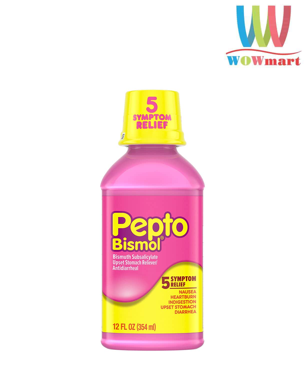
The most immediate answer to what defines this brand is its uncompromising use of the color pink. In the pharmaceutical and over-the-counter (OTC) categories, branding is often dominated by “trust” colors—sterile whites, clinical blues, or professional greens. Pepto-Bismol broke this convention by choosing a vibrant, bubblegum pink that serves as a powerful visual disruptor.
Owning a “Visual Hammer”
Visual marketing expert Laura Ries coined the term “Visual Hammer” to describe a non-verbal brand element that drives a “Verbal Nail” into the consumer’s mind. For Pepto-Bismol, the pink color is the ultimate hammer. By consistently using this specific shade for over a century, the brand has achieved a level of color-category association that few others enjoy. Just as UPS owns “Brown” and Tiffany & Co. owns “Robin’s Egg Blue,” Pepto-Bismol has effectively patented the concept of “Pink Medicine” in the collective consciousness.
This wasn’t an accidental choice. The color pink is psychologically associated with gentleness and soothing. In a category where the consumer is often experiencing acute discomfort, the visual identity of the product acts as the first step in the “healing” process. The branding signals relief before the bottle is even opened.
The Strategic Value of Differentiation
In a crowded retail environment, differentiation is the key to survival. Most private-label or generic alternatives attempt to mimic the leader. While store brands often adopt the pink color to signal they are “like” Pepto-Bismol, the original brand’s head start and relentless consistency mean that any competitor using pink is essentially providing free advertising for the category leader. This is a classic brand strategy: when you own the category’s most distinctive feature, your competitors are forced to either look like a “knock-off” or attempt to build a new visual language from scratch, which is prohibitively expensive.
Positioning the “Multi-Symptom” USP: A Lesson in Simplified Value Propositions
Beyond its visual identity, the brand’s strength lies in its positioning strategy. In the OTC market, brands often struggle with “feature creep” or overly complex messaging. Pepto-Bismol’s strategy revolves around a simplified, catch-all value proposition known as the “5-Symptom Relief” model.
The Power of the List
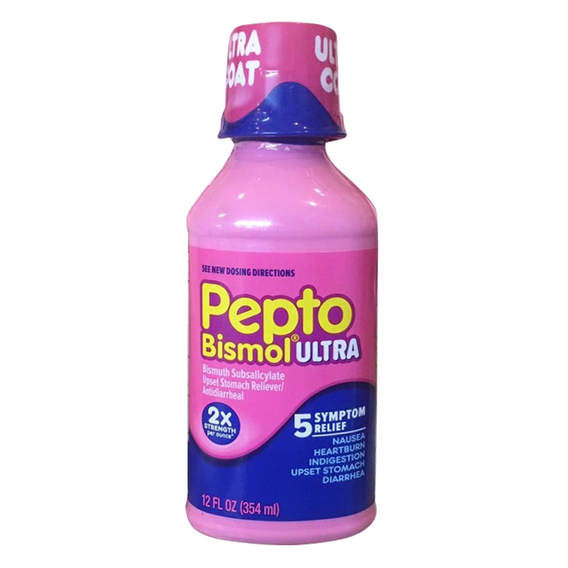
The brand’s messaging—Nausea, Heartburn, Indigestion, Upset Stomach, and Diarrhea—is more than just a list of ailments; it is a proprietary mnemonic. By grouping these specific symptoms together, the brand positions itself as the “Swiss Army Knife” of digestive health.
From a marketing standpoint, this is a “broad-spectrum” strategy. Instead of forcing the consumer to diagnose themselves and choose between five different specialized products, Pepto-Bismol offers a single, low-friction solution. This reduces “cognitive load” for the buyer, which is a critical advantage in retail environments where purchase decisions are often made in seconds.
Creating a Category of One
Through its “multi-symptom” positioning, the brand has successfully navigated a space between antacids and anti-diarrheals. It doesn’t just compete with Tums or Imodium; it creates a unique middle ground where it is the sole dominant player. This is “Blue Ocean Strategy” in action: creating a market space where the competition is made irrelevant because you are the only brand addressing the totality of the consumer’s problem.
Sound, Motion, and Memory: The Anatomy of a Successful Brand Jingle
One cannot discuss the brand’s identity without addressing its use of sonic branding. In an era where many brands are moving toward minimalist, silent digital ads, Pepto-Bismol doubled down on one of the most effective rhythmic marketing campaigns in history.
The Rhythmic Mnemonic
The “Nausea, Heartburn, Indigestion, Upset Stomach, Diarrhea” jingle, accompanied by its signature dance moves, is a textbook example of high-recall advertising. This campaign works on multiple levels of consumer psychology:
- Retention: The rhythmic delivery makes the symptoms easy to remember.
- Normalization: By using a catchy beat and lighthearted dance, the brand de-stigmatizes uncomfortable medical issues.
- Cross-Generational Appeal: The simplicity of the soundbite allows it to translate across TV, radio, and social media platforms like TikTok, where “sounds” are the primary currency of engagement.
Cultural Salience and Top-of-Mind Awareness
A brand’s goal is “Top-of-Mind Awareness” (TOMA). When a consumer experiences a specific pain point, the brand wants to be the first name that pops into their head. By embedding its five symptoms into a rhythmic jingle, Pepto-Bismol ensures that the moment a person feels one of those symptoms, the song—and thus the brand—is triggered in their memory. This is the “nudge” that leads to conversion at the point of sale.
Longevity and the Trust Moat: Maintaining Relevance in the Modern Era
A brand that has existed for over 100 years faces the constant threat of becoming “your grandparents’ medicine.” Pepto-Bismol’s longevity is a result of its ability to evolve its marketing tactics while keeping its core identity—the “Brand DNA”—entirely intact.
Modernizing the Icon
The brand has successfully transitioned from traditional print and television into the digital age. It uses its “Pink” identity to create high-impact social media content that leans into “meme culture” without losing its professional credibility. For example, during major food-centric holidays or sporting events (like the Super Bowl or Thanksgiving), the brand increases its presence through humorous, lifestyle-oriented content. It moves from being a “remedy” to being a “lifestyle companion” for the modern foodie.
The Brand Moat and Corporate Identity
From a corporate perspective, Pepto-Bismol is a high-margin asset because its brand equity allows for premium pricing. Even though generic bismuth subsalicylate is chemically identical, consumers are willing to pay a premium for the Pepto-Bismol name. Why? Because in healthcare, trust is the ultimate currency.
The “brand moat” here is built on three pillars:
- Heritage: A century of proven results.
- Consistency: The product looks, smells, and tastes exactly as it did decades ago.
- Visibility: Relentless marketing that ensures it is never out of sight or out of mind.
Key Strategic Takeaways for Modern Brands
When we analyze “what is the Pepto-Bismol,” we find a set of universal principles that any brand—tech, finance, or retail—can apply to their own strategy:
- Own a Singular Attribute: Whether it’s a color, a sound, or a specific word, find a unique identifier and defend it aggressively.
- Simplify the Solution: In a complex world, the brand that offers the simplest path from “problem” to “solution” usually wins.
- Lean Into the Sensory: Human memory is tied to senses. Use visual, auditory, and even tactile elements (like the specific texture of the Pepto liquid) to anchor your brand in the consumer’s brain.
- De-stigmatize the Problem: If your brand solves an “unpleasant” problem, use humor, rhythm, and approachable design to lower the barrier to entry for the consumer.
In conclusion, Pepto-Bismol is far more than a medicinal solution; it is a masterclass in corporate identity. It proves that with a bold visual strategy, a simplified value proposition, and a commitment to brand consistency, a product can move beyond its functional utility to become a cultural icon. It is the gold standard for how to build a brand that is not just purchased, but remembered.
aViewFromTheCave is a participant in the Amazon Services LLC Associates Program, an affiliate advertising program designed to provide a means for sites to earn advertising fees by advertising and linking to Amazon.com. Amazon, the Amazon logo, AmazonSupply, and the AmazonSupply logo are trademarks of Amazon.com, Inc. or its affiliates. As an Amazon Associate we earn affiliate commissions from qualifying purchases.