
In the vast and intricate world of branding, colour is far more than a mere aesthetic choice; it is a potent psychological tool, a silent communicator, and a cornerstone of identity. Among the myriad hues available, plum holds a particularly intriguing position. Often overlooked in favour of more common primary or secondary colours, plum possesses a unique blend of characteristics that, when harnessed strategically, can imbue a brand with depth, sophistication, and a distinct personality. Understanding “what is plum colour” goes beyond a simple visual definition; it delves into its emotional resonance, cultural connotations, and strategic applications within brand strategy, marketing, and design.
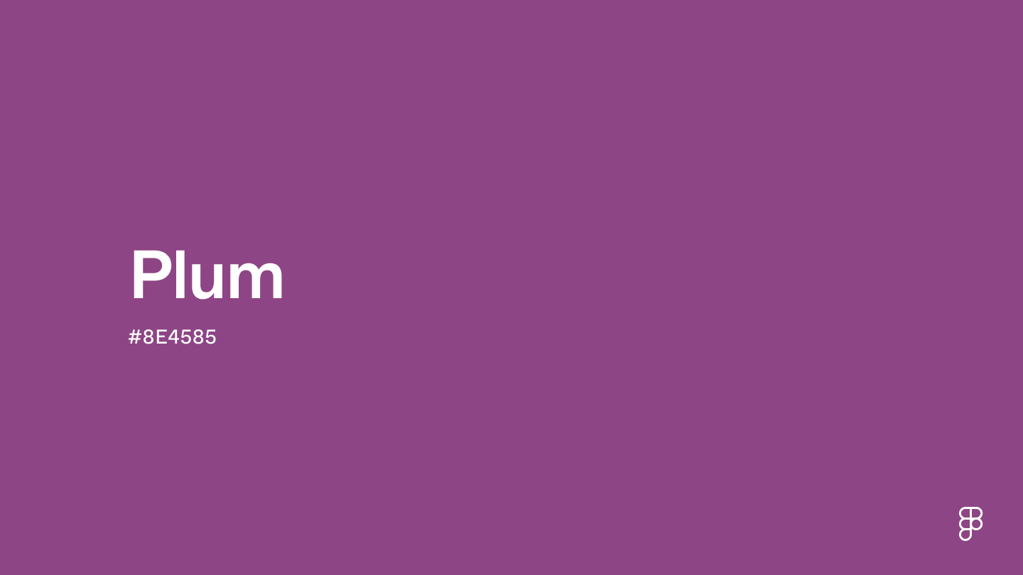
Plum is not a singular, monolithic colour but rather a rich spectrum. At its core, it’s a deep, reddish-purple, reminiscent of the fruit from which it takes its name. However, its variations are vast, ranging from darker, almost blackish-purples with hints of brown to brighter, more vibrant purples leaning towards magenta. This inherent versatility is one of its greatest strengths in branding, allowing it to adapt to various brand personas and messages while retaining its core identity. This article will unpack the essence of plum, explore its strategic utility in brand identity, discuss its leverage in marketing, delve into its psychological impact on consumers, and examine real-world applications and best practices.
Unpacking the Essence of Plum: Defining the Colour
To truly appreciate plum’s branding potential, we must first understand its nuanced definition and inherent qualities. It’s a colour that evokes a sense of both familiarity and intrigue, bridging the gap between nature and luxury.
The Spectrum of Plum: From Deep Purple to Reddish-Brown Undertones
Defining plum isn’t as straightforward as defining a primary colour. It lives in the complex intersection of red and blue, with varying degrees of saturation and lightness that pull it in different directions. A classic plum often has a noticeable red undertone, giving it warmth and richness, differentiating it from a cooler, more traditional purple. Some plum shades lean deeper, almost into aubergine or a dark mulberry, suggesting profound elegance and mystery. Others might incorporate a touch of brown, grounding the colour and giving it an organic, earthy quality that can be quite comforting and authentic. This breadth means that a brand choosing “plum” isn’t merely picking one colour, but rather a family of tones that can be precisely calibrated to convey specific messages. The specific shade chosen will dictate whether the brand leans towards opulence, creativity, warmth, or gravitas.
Historical and Cultural Connotations of Plum
The significance of colours is often deeply rooted in history and culture, and plum is no exception. Historically, purples and deep reds, including shades akin to plum, were difficult and expensive to produce. This scarcity often led to their association with royalty, nobility, wealth, and power. Tyrian purple, for instance, was reserved for emperors and religious figures, establishing a legacy of exclusivity and prestige that still resonates today. While modern dyes have democratized the colour, the subconscious link to luxury and status persists. In some cultures, plum colours can also be associated with spirituality, wisdom, and intuition, thanks to their connection to the broader purple spectrum. This rich historical tapestry provides a powerful backdrop for brands looking to tap into these established associations.
Psychological Impact: Emotions and Associations with Plum
From a psychological perspective, plum is a compelling colour. It combines the energy and passion of red with the stability and wisdom of blue, resulting in a balanced yet vibrant hue. It often evokes feelings of sophistication, ambition, creativity, and uniqueness. Brands using plum can project an image of being discerning, artistic, and forward-thinking. It can also suggest maturity, wisdom, and a certain gravitas, making it suitable for brands that want to convey authority and trustworthiness without being overly conservative. For consumers, plum can feel luxurious and indulgent, hinting at quality and exclusivity. Yet, its natural origins also lend it an organic, wholesome feel when used appropriately, particularly with earthier undertones.
Plum in Brand Identity: Strategic Applications
The choice of colour in brand identity is never arbitrary; it’s a calculated decision designed to resonate with a target audience and articulate a brand’s core values. Plum, with its multifaceted nature, offers a wealth of strategic applications.
Target Audience and Brand Persona: When Plum is the Right Fit
Plum is particularly effective for brands targeting a sophisticated and discerning audience. If your brand aims to project luxury, creativity, uniqueness, or a blend of tradition and modernity, plum could be an excellent choice. It works well for high-end fashion, beauty products, gourmet food and beverage brands, boutique hotels, artistic ventures, and even certain tech companies aiming for a premium, innovative aesthetic. Brands that want to differentiate themselves from competitors who might use more common blues or reds can find a distinctive niche with plum. It’s a colour that suggests confidence and a subtle rebellion against the mundane, appealing to consumers who value individuality and quality.
Logo Design and Visual Identity: Making a Memorable Statement
In logo design, plum can be both bold and understated. A deep, rich plum can serve as a primary brand colour, conveying gravitas and elegance. When paired with metallic accents like gold or silver, it instantly elevates the brand’s perceived value. Used as an accent colour, a brighter plum can add a pop of creativity and warmth to an otherwise neutral palette. Its ability to stand out without being garish makes it a strong contender for logos that need to be both memorable and timeless. For visual identity systems, plum can be consistently applied across various touchpoints, from business cards and stationery to office interiors, reinforcing a cohesive and sophisticated brand image.
Packaging and Product Design: Elevating Perceived Value
Packaging is a crucial moment of truth for many brands, and plum can significantly influence consumer perception. For luxury goods, cosmetics, or artisanal foods, plum packaging can signal premium quality, indulgence, and exclusivity. Imagine a chocolate box in a deep plum, or a skincare product housed in a bottle of a muted plum hue – these instantly communicate a sense of care, quality ingredients, and a luxurious experience. Its richness makes products feel more substantial and valuable, encouraging consumers to associate the brand with a higher-tier offering. The colour also works well for products that evoke warmth, comfort, or a sense of natural goodness, particularly when combined with complementary earthy tones.
Digital Presence: Websites, Apps, and Social Media Aesthetics
In the digital realm, plum offers versatility for creating engaging and sophisticated online experiences. On websites, it can be used for calls-to-action, navigation elements, or as a background colour to establish a premium feel. Its depth provides good contrast for readability, especially when paired with lighter text. For apps, plum can be integrated into icons, interfaces, or splash screens to maintain brand consistency and create a visually appealing user experience. On social media, plum-centric visuals can help a brand stand out in a cluttered feed, conveying a consistent and aesthetically pleasing brand personality that resonates with its target audience. It’s particularly effective for creating an elegant and artistic social media presence that draws the eye.
Leveraging Plum in Marketing and Communication
Beyond static identity elements, plum can be dynamically leveraged in marketing campaigns and communications to evoke specific responses and tell compelling brand stories.

Advertising Campaigns: Evoking Desired Responses
In advertising, plum can be a powerful tool for mood-setting and emotional connection. For high-end product advertisements, it can be used in imagery and text overlays to create an atmosphere of luxury, desire, and sophistication. A plum backdrop can make a product pop, drawing attention while subtly communicating its premium nature. For campaigns focused on creativity or innovation, a brighter, more vibrant plum can convey excitement and forward-thinking. It helps brands to position themselves as unique and innovative players, moving beyond conventional choices to capture attention and inspire engagement.
Storytelling Through Colour: Crafting a Narrative
Colour is an integral part of brand storytelling, and plum offers a rich palette for narrative development. A brand might use plum to tell a story of heritage and tradition, drawing on its historical associations with royalty and luxury. Alternatively, it could be used to convey a narrative of artistic expression and individuality, appealing to consumers who value self-expression. For brands with an environmental or organic focus, plum’s natural origins (from the fruit) can be subtly highlighted when combined with greens or browns, telling a story of natural goodness and sustainability. The key is to consciously link the specific shade of plum to the emotional and conceptual core of the brand’s story.
Differentiation in a Crowded Market: Standing Out with Plum
In today’s highly competitive market, differentiation is paramount. Choosing plum can instantly set a brand apart from competitors who might default to more common colour schemes. While blue often signifies trustworthiness and red signifies energy, plum offers a more nuanced and sophisticated alternative. It allows a brand to carve out a unique visual identity that is both memorable and distinctive, positioning itself as premium, creative, or uniquely insightful. This distinctiveness is invaluable for cutting through the noise and capturing consumer attention, ensuring that the brand leaves a lasting impression that isn’t easily confused with others.
The Psychology of Plum in Consumer Perception
The way consumers perceive and react to colours is deeply ingrained. Plum, with its complex psychological profile, can strategically influence buying decisions and brand loyalty.
Luxury and Exclusivity: The Allure of Deep Plum
As discussed, deep plum shades carry an undeniable aura of luxury and exclusivity. This perception is not merely aesthetic but rooted in historical associations and psychological triggers. When consumers see a brand adorned in deep plum, they often infer a higher quality, a greater attention to detail, and a premium price point. This makes it an ideal choice for brands that position themselves at the higher end of their market, from luxury cars and high fashion to bespoke services. The colour conveys that the brand understands and caters to discerning tastes, creating an aspirational connection with its target audience.
Creativity and Innovation: Inspiring Thought with Lighter Hues
While deep plum signals luxury, lighter and brighter variations of plum can evoke creativity, imagination, and innovation. These shades often have a more vibrant, artistic feel, appealing to consumers who identify as creative or are drawn to brands that push boundaries. Tech companies, design agencies, or artistic ventures can use these lighter plum tones to signal their forward-thinking approach and inspire a sense of wonder and new possibilities. It suggests a brand that is not afraid to explore new ideas and offers unique solutions, appealing to an audience that values originality.
Sophistication and Maturity: Building Trust and Authority
Plum, by its very nature, carries a sense of maturity and sophistication. It’s a colour that feels grounded yet refined, making it excellent for brands that want to convey authority, trustworthiness, and a timeless appeal. Financial institutions, professional services, educational bodies, or heritage brands can leverage plum to establish a dignified and credible image. It suggests wisdom and experience without being old-fashioned, striking a balance between gravitas and approachability. This helps in building long-term trust and loyalty with a clientele that values stability and reliability.
Case Studies and Best Practices: Brands Embracing Plum
While not as ubiquitous as blue or red, many successful brands have strategically embraced plum to powerful effect. Examining these instances offers valuable insights into its effective application.
Global Brands: How Industry Leaders Utilize Plum
While direct “plum” primary branding might be less common for mega-corporations, various global brands incorporate plum tones into their secondary palettes or specific product lines to achieve particular effects. For instance, luxury fashion houses often feature plum in their seasonal collections or haute couture lines, leveraging its association with opulence and high fashion. Beauty brands frequently use plum in their cosmetic lines (lipsticks, eyeshadows) or packaging to denote sophistication and glamour. Even some tech giants, while primarily using blues or greens, might introduce plum accents in their UI/UX for specific premium features or brand collaborations to convey innovation and exclusivity. These examples highlight plum’s versatility as both a primary identifier and a powerful supporting actor.
Emerging Trends: The Future of Plum in Branding
As consumers increasingly seek authenticity, uniqueness, and a departure from the mass-market aesthetic, plum is poised to gain even greater prominence. There’s a growing trend towards richer, more complex colour palettes in branding, moving away from overly simplistic or hyper-minimalist approaches. Plum, with its inherent depth and versatility, fits perfectly into this trend. We might see more brands in sustainable fashion, artisanal crafts, wellness, and experiential services adopting plum to signal their premium, thoughtful, and unique offerings. Its ability to bridge natural warmth with sophisticated luxury makes it a strong candidate for brands appealing to conscious consumers.

Avoiding Pitfalls: When Plum Might Not Be the Best Choice
While powerful, plum is not a universal solution. It might not be the best choice for brands targeting a very young demographic (unless specifically designed for sophisticated children’s luxury goods), or those aiming for an overtly playful, energetic, or overtly “natural/earthy” (without any luxury undertone) image. Overuse of very dark plum can also sometimes appear heavy or somber if not balanced with brighter accents. It’s essential to conduct thorough market research and competitor analysis to ensure plum aligns perfectly with the brand’s core message and resonates positively with its specific target audience. The key is strategic intent and mindful application, ensuring the chosen shade and its accompanying palette work harmoniously to convey the desired message without missteps.
In conclusion, plum is a colour of profound depth, sophistication, and versatility. Far from being a mere shade, it is a strategic asset in a brand’s arsenal, capable of conveying luxury, creativity, wisdom, and uniqueness. By understanding “what is plum colour” in its full spectrum – from its psychological impact to its historical connotations and strategic applications in design and marketing – brands can harness its power to build compelling identities, forge emotional connections with consumers, and ultimately, differentiate themselves in an increasingly vibrant marketplace. The judicious application of plum can elevate a brand from being merely seen to being truly felt, fostering loyalty and cementing a powerful, memorable presence.
aViewFromTheCave is a participant in the Amazon Services LLC Associates Program, an affiliate advertising program designed to provide a means for sites to earn advertising fees by advertising and linking to Amazon.com. Amazon, the Amazon logo, AmazonSupply, and the AmazonSupply logo are trademarks of Amazon.com, Inc. or its affiliates. As an Amazon Associate we earn affiliate commissions from qualifying purchases.