
In the realm of visual communication, few symbols carry as much weight, recognition, and emotional resonance as the poppy. While it began as a simple wildflower on the battlefields of Flanders, it has evolved into a global brand icon that signifies far more than botanical beauty. For brand strategists, marketers, and corporate identity experts, the poppy serves as a masterclass in semiotics—the study of signs and symbols and their interpretation.
To understand what the poppy signifies in a modern professional context, we must look beyond its petals. We must examine how a symbol becomes a “brand,” how it maintains its relevance across a century, and how it manages to command instant trust and emotional investment from a global audience.

The Semiotics of the Poppy: From Nature to Iconography
At its core, branding is the art of shorthand. It is the ability to convey a complex set of values, histories, and emotions through a single visual cue. The poppy is perhaps the most successful example of “organic branding” in human history. Its significance is rooted in its visual simplicity and its deep-seated psychological triggers.
Visual Simplification and Recognition
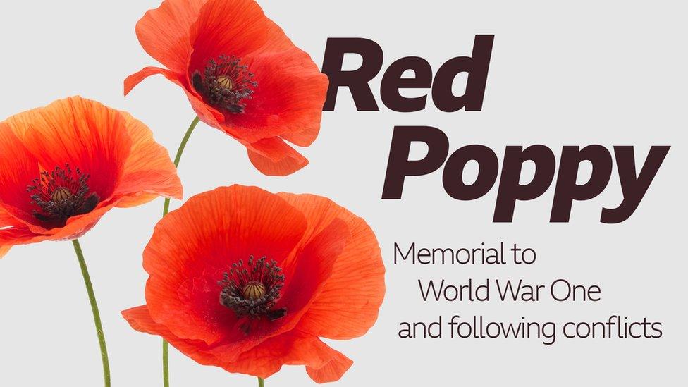
The most effective brands are those that can be drawn from memory. Much like the Nike “Swoosh” or the Apple logo, the stylized poppy used by organizations like the Royal British Legion or the Veterans of Foreign Wars relies on high contrast and basic geometry. The vibrant red signifies passion, sacrifice, and vitality, while the black center provides a focal point of gravity and solemnity. In branding terms, this high-contrast palette ensures visibility across all mediums—from digital avatars to physical lapel pins.
Emotional Anchoring in Brand Messaging
The poppy signifies a profound “emotional anchor.” In marketing, an emotional anchor is a stimulus that evokes a specific psychological state. For the poppy, that state is a blend of gratitude, somber reflection, and community belonging. Brands that can tap into such universal human experiences achieve a level of “Brand Equity” that money cannot buy. The poppy doesn’t just represent a flower; it represents a narrative—the story of resilience and the promise to “never forget.” This narrative is the “Brand Story” that provides the symbol with its enduring power.
The Royal British Legion: Managing a Century-Old Brand Identity
While the poppy belongs to the public consciousness, its most prominent custodian is the Royal British Legion (RBL). For the RBL, the poppy is not just a symbol; it is a corporate identity that must be protected, managed, and modernized to ensure the organization’s survival and its ability to fundraise.
Consistency Across Touchpoints
A key pillar of brand strategy is consistency. For over 100 years, the RBL has ensured that the poppy remains the central pillar of its visual identity. Whether it is appearing on a football shirt, a giant projection on Big Ben, or a small digital icon on social media, the poppy remains unmistakable. This consistency builds “Brand Salience”—the degree to which a brand is thought of or noticed when a customer is in a buying (or donating) situation. By keeping the symbol consistent, the RBL ensures that the poppy remains the “top-of-mind” symbol for remembrance.
Navigating Modernization and Digital Transformation
In recent years, the RBL has faced the challenge of making a century-old symbol relevant to a digital-first generation. This required a strategic pivot in how the poppy signifies value. We have seen the introduction of “digital poppies” (NFTs and social media filters) and plastic-free, recyclable paper poppies. This is a classic example of “Brand Evolution.” By aligning the symbol with modern values—such as environmental sustainability and digital accessibility—the “Poppy Brand” ensures it does not become a relic of the past but remains a living, breathing part of the current cultural discourse.
Luxury and Lifestyle: The Poppy as a Stylistic Signifier
Beyond the realm of non-profit branding and remembrance, the poppy has been co-opted by the fashion and luxury industries to signify a different set of brand values: vitality, avant-garde elegance, and urban nature.
Kenzo and the Aesthetics of Vitality
The late designer Kenzo Takada famously adopted the poppy as the icon for his “Flower by Kenzo” fragrance. In this context, what the poppy signifies shifts from “remembrance” to “urban energy.” The brand uses the poppy to represent a flower that can grow anywhere—even in the cracks of a sidewalk. This is a strategic use of “Brand Personality.” Kenzo leveraged the poppy’s natural resilience to position his brand as vibrant, poetic, and unconventionally beautiful. The poppy became a “Brand Asset” that distinguished Kenzo from the more traditional floral motifs used by competitors like Chanel or Dior.
Cultural Appropriation vs. Appreciation in Design
When a brand uses a symbol as potent as the poppy, it must navigate the fine line between appreciation and appropriation. Because the poppy signifies deep sacrifice in many cultures, its use in commercial design must be handled with sensitivity. Brands that use the poppy purely for its aesthetic value without acknowledging its historical weight risk “Brand Backlash.” This highlights a crucial lesson in modern marketing: symbols do not exist in a vacuum. A brand’s identity is always in conversation with the cultural and historical context of its audience.
The Economic Impact of Symbolism: Conversion Through Compassion
In the business of charity, the poppy is a high-performing “Conversion Tool.” The “Poppy Appeal” is one of the most successful recurring marketing campaigns in history, raising millions of pounds annually. This success is built on two financial-branding pillars: trust and the halo effect.
Trust as a Brand Currency
In an era of “fake news” and skepticism toward institutions, trust is the most valuable currency a brand can hold. The poppy signifies a “Seal of Approval.” When a consumer sees the poppy on a product or a storefront, they immediately associate that entity with a vetted, honorable cause. This “Trust Equity” allows the RBL and associated charities to maintain high conversion rates during their annual campaigns, as the “purchase” (the donation) is seen as a low-risk, high-reward moral investment.
The “Halo Effect” of Social Responsibility
Corporate entities often partner with the poppy brand to benefit from the “Halo Effect.” This is a cognitive bias where our overall impression of a brand influences how we feel about its specific traits. When a corporation like a major airline or a supermarket chain displays the poppy, they are engaging in “Cause Marketing.” By associating their corporate identity with what the poppy signifies—duty, honor, and community—they enhance their own brand image, making them more attractive to socially conscious consumers.
Strategic Takeaways: Leveraging Symbolism in Your Brand
What can business leaders and brand designers learn from what the poppy signifies? The journey of this symbol from a battlefield flower to a global icon offers several actionable insights for any organization looking to build a lasting identity.
- Simplify to Amplify: The poppy’s power lies in its simplicity. If your brand’s visual identity is too complex, it will fail to anchor itself in the consumer’s mind. Aim for a “Signature Icon” that can be recognized in a heartbeat.
- Own a Narrative: The poppy is successful because it is the protagonist of a powerful story. Your brand should not just sell a product; it should signify a set of values or a mission. What is the “In Flanders Fields” of your company?
- Adapt Without Losing the Core: The move toward plastic-free poppies shows that you can change the “delivery mechanism” of your brand without changing the “message.” Stay relevant to the times, but remain true to your heritage.
- Protect Your Intellectual Property: The poppy is a protected trademark in many jurisdictions. A strong brand signifies something unique, and that uniqueness must be legally defended to prevent “Brand Dilution.”
In conclusion, what the poppy signifies is a masterclass in the intersection of history, emotion, and strategic branding. It proves that a symbol, when managed with consistency and integrity, can transcend its physical form to become a global language of its own. For any brand looking to leave a lasting mark, the poppy serves as the ultimate blueprint for symbolic longevity.
aViewFromTheCave is a participant in the Amazon Services LLC Associates Program, an affiliate advertising program designed to provide a means for sites to earn advertising fees by advertising and linking to Amazon.com. Amazon, the Amazon logo, AmazonSupply, and the AmazonSupply logo are trademarks of Amazon.com, Inc. or its affiliates. As an Amazon Associate we earn affiliate commissions from qualifying purchases.