
In the architecture of brand strategy, color is rarely a matter of mere aesthetic preference. It is a psychological trigger, a historical anchor, and a silent communicator of values. To understand why certain colors command respect in the modern marketplace, one must often look back at their historical origins. Perhaps no color carries more weight in this regard than purple. When we ask what the color purple stands for in the Bible, we are not just exploring ancient textiles; we are uncovering the foundational blueprint for luxury branding, corporate identity, and the psychology of high-status positioning.
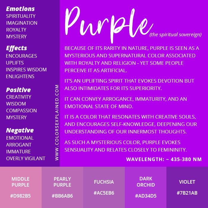
In biblical antiquity, purple was not just a hue; it was a socio-economic statement. Its association with royalty, divinity, and wealth was so absolute that it created a visual shorthand for authority that persists in brand design today. By examining the biblical significance of purple through the lens of brand strategy, businesses can learn how to leverage color to evoke feelings of exclusivity, wisdom, and premium value.
The Historical Context of Purple: From Tabernacle Tapestries to Brand Prestige
The biblical significance of purple begins with its scarcity. In the ancient world, specifically during the periods chronicled in the Old and New Testaments, purple dye was derived from the Murex sea snail. The process of extracting this dye was laborious, requiring thousands of mollusks to produce just a few grams of pigment. This inherent rarity meant that purple was the most expensive commodity of its time, often literally worth its weight in silver or gold.
The Rarity of Tyrian Purple
The “Tyrian Purple” mentioned in historical and biblical contexts was the ultimate luxury good. From a branding perspective, this is the earliest example of “scarcity marketing.” Because the dye was so difficult to produce, it was reserved for the highest echelons of society. In the Bible, we see this color used extensively in the construction of the Tabernacle and the garments of the High Priest. Exodus 26:1 describes the curtains of the Tabernacle as being made of “fine twisted linen, and blue, and purple, and scarlet.”
For a brand strategist, this teaches a vital lesson: value is often derived from the difficulty of acquisition. When a brand adopts purple today, it taps into a deep-seated cultural memory of rarity. It signals that the product or service is not for the masses, but for those who appreciate the “refined and the rare.”
The Association with Royalty and Priesthood
Throughout the biblical narrative, purple is synonymous with the elite. In the Book of Judges, the kings of Midian are described as wearing purple robes. In the New Testament, the rich man in Jesus’ parable is famously “clothed in purple and fine linen.” Even the mocking of Jesus by Roman soldiers involved placing a purple robe on him to satirize his claim to kingship—a testament to how deeply the color was linked to the concept of a “Sovereign.”
In corporate identity, this association allows brands to bypass logical arguments and speak directly to the consumer’s desire for status. When a brand like Hallmark or Rolex utilizes purple in its packaging or accents, it is borrowing the “Royal Decree” established thousands of years ago. It positions the brand as a leader, an authority, and a provider of “regal” quality.
Biblical Symbolism as a Blueprint for High-End Branding
In the Bible, purple is often interpreted as a blend of blue and red. Blue traditionally represents the heavenly or the divine, while red represents the earth or humanity. Purple, therefore, stands for the mediation between the two—the bridge between the earthly realm and the divine authority. This “mediation” role is a powerful concept for personal branding and corporate strategy.
Sovereignty and Leadership
The biblical use of purple signifies a “Mandate of Heaven.” It suggests that the wearer has the right to lead. In a modern business context, leadership is the cornerstone of brand equity. A brand that wants to position itself as a thought leader or a category king can utilize purple to subtly suggest that its authority is undisputed.
Consider the “Purple Cow” concept popularized by Seth Godin. While Godin’s focus was on being “remarkable,” the choice of purple was no accident. It signifies a brand that is so distinct and authoritative that it stands completely apart from the “brown” or “white” cows of the commodity market. It is the color of the “Chosen,” much like the biblical figures who were set apart by their purple attire.
Mystery, Wisdom, and Spirituality
Beyond raw power, purple in the Bible carries a weight of mystery and spiritual depth. It was used in the veil of the Temple, separating the Holy of Holies from the rest of the world. This creates a brand archetype of the “Magician” or the “Sage.”
Brands that deal in innovation, high-level consulting, or creative services often use purple to suggest that they possess “hidden knowledge” or a superior level of wisdom. It is a color that invites curiosity while demanding respect. If your brand strategy involves solving complex problems or providing visionary insights, the “biblical” purple provides a visual framework for that identity.

Color Psychology: Why Modern Brands Leverage the “Biblical” Purple
When we translate biblical symbolism into modern color psychology, we find that the resonance remains remarkably consistent. The brain processes purple as a sophisticated, cognitively demanding color. It does not shout for attention like red; instead, it glows with a quiet, confident intensity.
Luxury and Premium Positioning
The “Asprey Purple” or the deep violets used by luxury chocolate brands like Cadbury (which even fought legal battles to protect its specific shade) are direct descendants of the biblical “Seller of Purple” mentioned in the Book of Acts. Lydia of Thyatira was a high-end merchant who dealt in these expensive fabrics. Her business model was predicated on the fact that purple was a “premium-only” market.
In modern brand strategy, purple is the go-to for “Premiumization.” If a brand is launching a “Black Label” or an “Ultra-Premium” tier, shifting the color palette toward deep purples and golds creates an immediate psychological elevation. It moves the product from a “need” to a “want,” and finally to an “aspiration.”
Creativity and Innovation
While the biblical roots are in royalty, the modern application has expanded into the realm of the “unconventional.” Because purple was so rare in nature (outside of specific mollusks and rare flowers), it became associated with the supernatural and the imaginative.
Tech brands like Twitch and Yahoo have used purple to signal that they are different from the “Corporate Blue” of IBM or Dell. In this sense, they are using the biblical “Set Apart” nature of the color to foster a brand identity of innovation. They are telling their audience: “We are not part of the standard world; we operate in the realm of the extraordinary.”
Implementing Purple in Your Brand Identity Strategy
Selecting purple for a brand is a high-stakes decision. Because of its intense historical and biblical baggage, it can easily feel “over-the-top” if not handled with strategic precision.
Finding the Right Shade: From Lavender to Plum
The biblical “Argaman” (reddish-purple) and “Tekhelet” (bluish-purple) offer two different strategic paths.
- Deep Plums and Royal Purples: These are best for corporate identities that want to project stability, tradition, and high-end luxury. They mirror the “Tabernacle” purple, suggesting sanctity and unshakeable value.
- Lavenders and Bright Violets: These are more modern and accessible. They retain the “creativity” of purple but lose the “heavy” weight of royalty. These are excellent for wellness brands, creative agencies, or brands targeting a more youthful, innovative demographic.
Cultural Resonances and Global Perception
While the biblical foundation is strong in Western and Middle Eastern branding, a global brand strategy must account for how this “biblical” color is perceived elsewhere. In some cultures, purple is associated with mourning, while in others, it remains the color of the elite.
However, the “Royal” association is almost universal due to the historical influence of the Roman Empire and the subsequent spread of biblical literature. When a brand uses purple, it is participating in a global visual language of “The Best.”
The Future of Color Strategy: Merging Tradition with Digital Identity
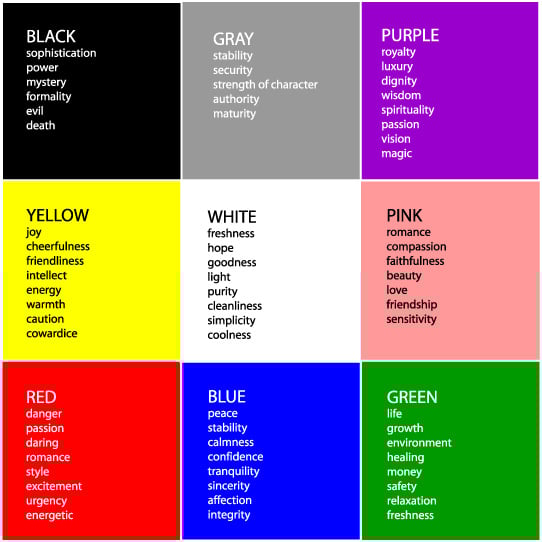
As we move further into a digital-first economy, the “biblical” purple is being reimagined for the screen. In UI/UX design, purple is often used for primary action buttons or “Pro” features because it stands out against the sea of blue and gray that dominates the internet.
The color purple, which once represented the physical presence of God in a Tabernacle or the status of a king on a throne, now represents the “Premium User Experience” or the “Exclusive Digital Membership.” The medium has changed, but the message—scarcity, authority, and high value—remains identical to its ancient origins.
By understanding that the color purple stands for royalty, mediation, and divine authority in the Bible, brand strategists can craft identities that are not just trendy, but are rooted in thousands of years of human psychology. To choose purple is to claim a seat at the table of the elite. It is a bold, strategic move that, when executed correctly, transforms a company from a mere business into a sovereign authority in its field.
aViewFromTheCave is a participant in the Amazon Services LLC Associates Program, an affiliate advertising program designed to provide a means for sites to earn advertising fees by advertising and linking to Amazon.com. Amazon, the Amazon logo, AmazonSupply, and the AmazonSupply logo are trademarks of Amazon.com, Inc. or its affiliates. As an Amazon Associate we earn affiliate commissions from qualifying purchases.