Amtrak, America’s national passenger rail corporation, embodies a powerful visual identity that extends far beyond mere transportation. The aesthetic appearance of an Amtrak train is a meticulously crafted extension of its brand strategy, a moving billboard that communicates reliability, comfort, and the enduring romance of rail travel. From the distinctive livery to the thoughtfully designed interiors, every visual element plays a crucial role in shaping passenger perception and reinforcing corporate identity. Understanding “what an Amtrak train looks like” is to delve into a masterclass of brand design, where form meets function to deliver a consistent and memorable customer experience.
The Visual Language of a National Brand: Amtrak’s Exterior Design
The exterior of an Amtrak train is instantly recognizable, a testament to decades of consistent brand application. Its design language is a blend of heritage and practicality, engineered to evoke confidence and national presence.
Iconic Color Schemes and Livery
The most striking aspect of an Amtrak train’s exterior is its livery – the signature color scheme and branding. Historically, Amtrak has utilized a phased approach to its livery, with Phase III (blue, white, and red stripes with the “arrow” logo) being particularly iconic and widely recognized. While subsequent phases have evolved, the core palette often revolves around deep blues, silvers, and reds. Blue typically dominates the body of the passenger cars and locomotives, symbolizing stability, trust, and the vast American sky. Silver accents or bands add a sense of modernity and speed, while splashes of red (often in stripes or logos) introduce dynamism and patriotism. This consistent use of a patriotic and soothing color scheme across its diverse fleet ensures immediate brand recognition, whether a train is speeding through an urban corridor or winding through a rural landscape. The strategic application of these colors serves not just aesthetic appeal but also a powerful branding message, positioning Amtrak as a reliable national service.
Aerodynamic Forms and Functional Aesthetics
Beyond color, the physical form of Amtrak’s trains communicates specific brand attributes. Locomotives, such as the powerful GE P42DC Genesis or the Siemens Charger series, exhibit robust, often aerodynamic designs. The sleek, streamlined noses and smooth body panels of modern locomotives convey efficiency, speed, and cutting-edge engineering, aligning with a brand promise of timely and safe travel. Passenger cars, too, contribute to this narrative. The double-deck Superliner cars, with their distinctive tall profile and large windows, project spaciousness and an expansive view of the American scenery, reinforcing the idea of a relaxed and comfortable journey. In contrast, the single-level Amfleet cars, used primarily on shorter-distance routes, maintain a streamlined, utilitarian look that emphasizes efficiency and speed for corridor service. The Acela Express, Amtrak’s high-speed service, presents an even more advanced aerodynamic profile, signaling premium service and rapid transit capability, a clear differentiator within its market. Each design choice, from the curve of a nose cone to the height of a car, is a calculated move to reinforce Amtrak’s diverse service offerings and brand promises.
Branding Elements and Logos
Integral to the exterior design are the distinctive branding elements. The Amtrak “arrow” logo, with its dynamic, forward-pointing design, is prominently displayed on locomotives and often on the sides of passenger cars. This logo is more than just an emblem; it’s a visual metaphor for movement, progress, and direction, perfectly encapsulating the essence of rail travel. The typeface used for the “Amtrak” name itself is typically bold and clear, ensuring legibility from a distance and reinforcing a no-nonsense, dependable brand image. The consistent placement and size of these branding elements across the entire fleet, despite variations in rolling stock, are critical for maintaining a unified corporate identity. This uniformity ensures that no matter which train a passenger encounters, the core Amtrak brand is unmistakable, contributing to a cohesive brand experience and powerful visual recall.
Interior Design as a Passenger Experience Driver
The interior of an Amtrak train is where the brand truly comes alive for the passenger. It’s an environment meticulously designed to deliver on promises of comfort, convenience, and a unique travel experience.
Comfort and Functionality Across Classes
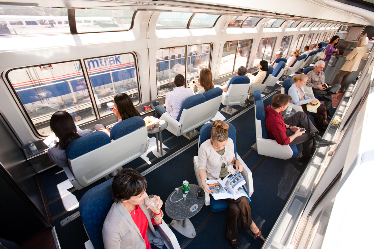
Amtrak’s interior design strategy caters to a diverse range of passenger needs, from the budget-conscious traveler to those seeking luxury. Coach class cars, for instance, feature comfortable, reclining seats, often with ample legroom, designed for long hours of travel. The materials chosen—durable fabrics and easy-to-clean surfaces—reflect a brand emphasis on practicality and accessibility. Business Class and First Class offer enhanced seating, often leather or premium fabric, with more space and amenities like power outlets and sometimes complimentary services. These upgrades subtly signal a premium offering, aligning with the brand’s tiered service strategy. Roomettes and Bedrooms on Superliner and Viewliner trains, distinct from open-coach seating, transform into private spaces. Their compact yet ingenious design, featuring convertible seating and beds, private restrooms, and showers in some configurations, speaks to a brand that values privacy, convenience, and an elevated overnight experience, akin to a mobile hotel room. The thoughtful layout and choice of finishes in these sleeping accommodations reinforce Amtrak’s commitment to comfort and a unique, nostalgic form of travel.
Consistency in Cabin Decor and Amenities
Despite the variations across service classes and car types, Amtrak strives for a cohesive cabin decor that reinforces its national identity. Common design elements include durable carpeting, LED lighting that mimics natural daylight, and large windows that frame the passing scenery. The consistent use of specific color palettes (often subdued blues, grays, and natural tones) and materials throughout the fleet helps to create a unified brand environment. Overhead luggage racks, easily accessible restrooms, and café or dining car facilities are standard features, designed with a focus on functionality and passenger convenience. This attention to detail ensures that passengers experience a predictable level of comfort and amenity, strengthening brand trust and loyalty. Even the visual cues, such as safety signage and informational displays, are standardized to maintain a consistent brand voice throughout the journey.
Thematic Elements in Observation and Dining Cars
Specialty cars, such as observation lounges and dining cars, are key components of Amtrak’s brand experience, particularly on long-distance routes. Observation cars, like the Superliner Sightseer Lounge, boast expansive windows, often curving into a dome, offering panoramic views. Their interior design prioritizes comfort and an open, communal feel, encouraging passengers to relax and connect with the landscape. Dining cars feature a more traditional, restaurant-like setting, complete with tables and chairs, and often a focus on scenic window views. The ambiance in these cars is deliberately designed to foster a sense of social gathering and to elevate the dining experience beyond mere sustenance. These thematic interiors are crucial for reinforcing Amtrak’s brand promise of a journey that is as enjoyable and memorable as the destination itself, appealing to the leisure traveler seeking more than just transportation.
Architectural Heritage and Modernization: A Blend of Eras
Amtrak’s fleet is a fascinating blend of older, refurbished cars and brand-new, cutting-edge rolling stock. This mix presents both a challenge and an opportunity for brand consistency and evolution.
Superliner’s Enduring Appeal
The Superliner cars, introduced in the late 1970s and early 1980s, represent a significant part of Amtrak’s heritage and brand identity, particularly for long-distance routes in the Western U.S. Their double-deck design and robust construction evoke a sense of classic American rail travel, albeit with modern comforts. The spacious interiors, large windows, and sturdy build contribute to a perception of reliability and a timeless journey. While these cars have undergone numerous refurbishments, their core architectural style remains consistent, a nod to an enduring legacy that resonates with passengers seeking a nostalgic yet comfortable travel experience. The Superliner’s familiar profile is a brand icon in itself, signifying epic cross-country adventures.
Acela Express: The Face of High-Speed Modernity
In stark contrast, the Acela Express, launched in 2000, embodies Amtrak’s commitment to high-speed, modern rail. Its sleek, aerodynamic locomotives and passenger cars are designed for speed and efficiency on the Northeast Corridor. The interior design of Acela reflects a premium, business-oriented service, with features like larger seats, power outlets at every seat, and Wi-Fi. The sophisticated, contemporary aesthetic—clean lines, modern finishes, and subdued lighting—positions Acela as a competitor to short-haul airline travel, aligning with a brand strategy focused on efficiency, productivity, and an upscale experience for a specific market segment. Acela’s distinct look is a powerful statement about Amtrak’s capacity for innovation.
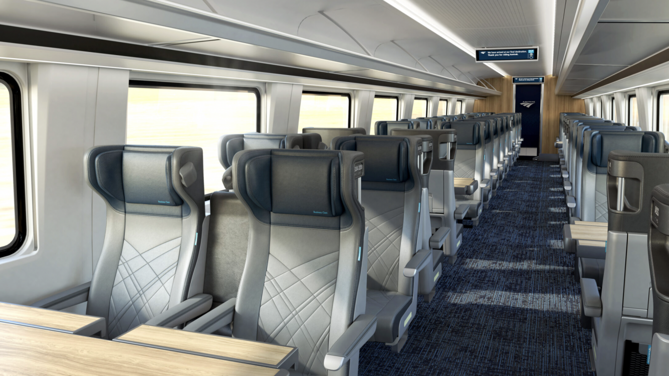
Upcoming Fleet Upgrades and Brand Evolution
Looking forward, Amtrak is investing heavily in new fleet modernizations, such as the Airo trains (replacing Amfleet cars) and new long-distance single-level trains. These new designs aim to integrate the best of both worlds: modern amenities, enhanced accessibility, and improved energy efficiency, all while maintaining a consistent and recognizable Amtrak brand identity. The visuals revealed for these new fleets show a strong emphasis on contemporary aesthetics, with larger windows, redesigned interiors, and advanced technological features. This forward-looking design strategy is crucial for keeping the Amtrak brand relevant and appealing to future generations of travelers, demonstrating an evolution that respects heritage while embracing progress. The new designs are crafted to elevate the passenger experience, reaffirming Amtrak’s commitment to comfortable and efficient rail travel in the 21st century.
The Train as a Mobile Marketing Tool
Every Amtrak train, in its design and presence, functions as a powerful, moving advertisement for the brand. Its visual characteristics contribute significantly to its marketing and public perception.
Visibility and Recognition on the Landscape
As Amtrak trains traverse thousands of miles across the country daily, their distinctive appearance—the characteristic blue, silver, and red livery; the arrow logo; the unique silhouettes of Superliners or Acelas—makes them instantly recognizable. They become part of the national landscape, a familiar and reassuring presence. This constant visibility acts as a pervasive marketing tool, reinforcing brand awareness and presence in communities, towns, and cities along their routes. People see an Amtrak train and automatically connect it with the brand, a continuous visual reminder that keeps Amtrak top-of-mind for potential travelers.
Evoking Nostalgia and Future Aspirations
Amtrak’s design language skillfully balances a nod to the romanticized past of American rail travel with an embrace of future possibilities. The classic lines of some refurbished cars or the spaciousness of a Superliner can evoke a sense of nostalgia for a golden age of travel, appealing to those who cherish the journey itself. Simultaneously, the sleekness of an Acela or the promise of upcoming modern fleets speaks to efficiency, innovation, and a forward-thinking approach, attracting passengers who prioritize speed and contemporary amenities. This dual appeal in its visual identity allows Amtrak to connect with a broad demographic, leveraging both sentimental attachment and modern expectations in its branding.
Photography and Social Media Appeal
The photogenic nature of Amtrak trains contributes significantly to organic marketing, especially in the age of social media. From dramatic shots of locomotives against vast landscapes to interior glimpses of cozy accommodations, the visual appeal of Amtrak trains generates user-generated content that serves as authentic endorsements. Photographers and travelers often share their experiences, capturing the unique aesthetic of the trains and their journeys. This visual storytelling, amplified across platforms like Instagram and Facebook, extends Amtrak’s brand reach and enhances its perceived value, turning passengers into brand advocates through shared visual experiences.
Design Challenges and Brand Consistency
Maintaining a coherent brand look across a diverse and aging fleet, while introducing new designs, presents significant challenges for Amtrak’s corporate identity team.
Maintaining Uniformity Across Diverse Fleets
Amtrak operates a variety of locomotive models and passenger car types, some dating back decades, while others are brand new. Ensuring a consistent brand aesthetic—from livery to interior finishes—across such a heterogeneous fleet is a continuous challenge. Older cars may show wear and tear, or their original designs may not perfectly align with contemporary brand guidelines. This requires strategic refurbishment programs and careful consideration of how new designs integrate with the existing fleet to avoid brand fragmentation. The goal is to ensure that a passenger’s experience, whether on a heritage Superliner or a new Airo train, still feels distinctly “Amtrak.”
Balancing Cost, Durability, and Aesthetics
Design decisions for a national rail service are heavily influenced by practical considerations such as cost, durability, and maintenance. Materials chosen for interiors must withstand heavy use and be easy to clean, impacting aesthetic choices. Exterior paints and finishes must be resilient to harsh weather conditions and constant movement, balancing visual appeal with longevity and cost-effectiveness. The brand design team must work within these operational realities, making choices that project quality and reliability without excessive expenditure, ensuring the trains look good and perform well over their long service lives. This constant negotiation between idealistic design and practical constraints is central to maintaining Amtrak’s brand integrity.

Adapting to Regional Nuances vs. National Identity
While Amtrak strives for a national identity, some routes or partnerships might present opportunities or necessities for minor aesthetic variations. For example, joint services with state-supported routes might see specific branding elements alongside Amtrak’s. The challenge lies in allowing for these localized expressions without diluting the overarching national Amtrak brand. The core visual language—the primary colors, logo, and overall design philosophy—must remain dominant and recognizable, ensuring that even with regional adaptations, the passenger consistently identifies the service as an Amtrak experience. This careful balancing act reinforces the brand’s adaptability while preserving its core identity.
aViewFromTheCave is a participant in the Amazon Services LLC Associates Program, an affiliate advertising program designed to provide a means for sites to earn advertising fees by advertising and linking to Amazon.com. Amazon, the Amazon logo, AmazonSupply, and the AmazonSupply logo are trademarks of Amazon.com, Inc. or its affiliates. As an Amazon Associate we earn affiliate commissions from qualifying purchases.