
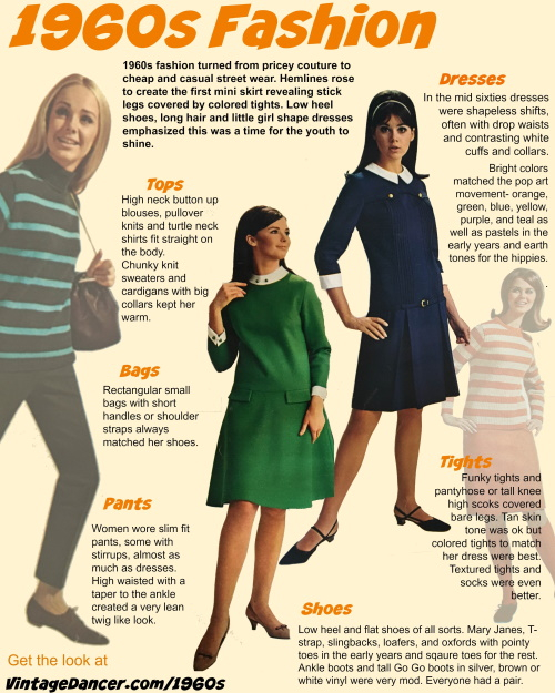
The 1960s were more than just a decade of changing hemlines and vibrant patterns; they represented a seismic shift in how humans communicate identity through visual symbols. When we ask, “What did they wear in the 1960s?” we are essentially asking how a generation rebranded itself in the wake of post-war conformity. For the modern brand strategist, marketer, or designer, the fashion of the 1960s offers a masterclass in demographic targeting, visual disruption, and the power of personal branding.
In this era, clothing transitioned from being a mere functional necessity or a marker of social class into a powerful tool for cultural positioning. By examining the sartorial choices of the 1960s through the lens of brand strategy, we can uncover the foundational principles that continue to drive successful corporate and personal brands in the digital age.
The Birth of the Youth Market: Segmenting the Consumer Identity
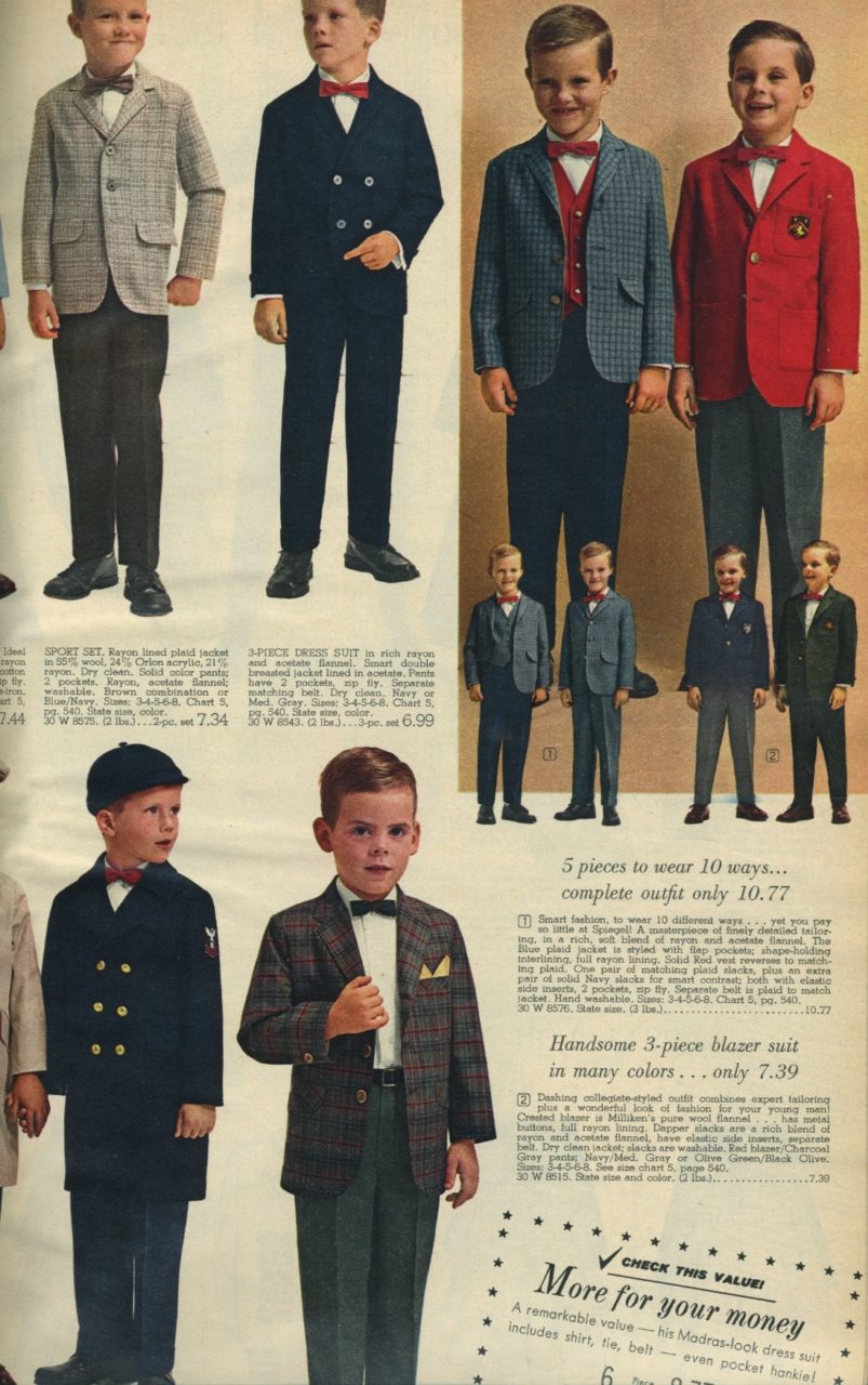
Before the 1960s, the concept of a “teenager” as a distinct economic force barely existed. Young people were largely expected to dress like smaller versions of their parents. However, the 1960s saw the emergence of the first true “lifestyle brands”—movements that were defined by what people wore, what they listened to, and how they identified themselves against the status quo.
From Mass Production to Niche Community
The shift toward “Mod” (Modernist) culture in London during the early 60s is perhaps the earliest example of niche community branding. Young people used slim-fit Italian suits, parkas, and Chelsea boots to signal membership in an exclusive, forward-thinking tribe. For today’s brand managers, this mirrors the transition from mass-market advertising to the hyper-segmented community building seen on platforms like Discord or Instagram. The 1960s taught us that consumers do not just buy products; they buy entry into a community.
Authenticity as a Brand Pillar
By the late 1960s, the “Hippie” movement introduced a different kind of branding: the brand of “anti-brand.” By wearing fringe, denim, and handmade tie-dye, the youth of the late 60s were signaling a rejection of corporate artifice. This was an early iteration of “Authenticity Marketing.” Today, when brands lean into “raw” or “behind-the-scenes” content, they are utilizing the same psychological triggers established by the counterculture movement: the desire for transparency and a rejection of the polished, “perfect” corporate facade.
Visual Language and Disruption: The Power of the Space Age and Mod Minimalism
The visual identity of the 1960s was characterized by extreme disruption. Just as a brand today might use a radical UI/UX redesign to capture attention, 1960s designers used geometric shapes and “Space Age” aesthetics to signal that they were the future.
The Minimalism of Mary Quant and the Mini Skirt
Mary Quant did not just design a shorter skirt; she rebranded the female silhouette. Her use of bold, primary colors and simple, geometric lines (the “Daisy” logo being a prime example of early corporate identity success) resonated because it offered a clean break from the cluttered, restrictive layers of the 1950s. In brand strategy, this is the equivalent of “decluttering” a brand’s visual language to make it more accessible and energetic. The lesson here is clear: when the market becomes saturated with complexity, the brand that offers the most striking simplicity wins.
Futurism and the “Space Age” Aesthetic
Designers like Pierre Cardin and André Courrèges looked toward the Apollo missions for inspiration, utilizing vinyl, silver fabrics, and helmet-like hats. This wasn’t just fashion; it was “Futurist Branding.” They were aligning their personal brands with the most significant technological leap of the century. Modern tech brands often do the same, using sleek, metallic finishes and “cosmic” gradients to suggest that their software or hardware is part of the next frontier. By aligning a visual brand with a broader cultural aspiration (like space travel), you elevate the product from a commodity to a symbol of progress.
Personal Branding Lessons: The Power of Iconography and Consistency
The 1960s provided some of the most enduring case studies in personal branding. Figures like Jacqueline Kennedy, Twiggy, and Jimi Hendrix understood that a consistent visual “uniform” could create an unshakeable brand identity.
The Jackie Kennedy Effect: The Power of Strategic Consistency
Jacqueline Kennedy’s pillbox hats, oversized sunglasses, and shift dresses created a brand of “Approachable Aristocracy.” Her style was so consistent that it became a visual shorthand for elegance and American resilience. In corporate branding, this is known as “Brand Cohesion.” Whether it’s the specific shade of blue used by a tech giant or the specific tone of voice in a luxury brand’s copy, consistency builds trust. Jackie Kennedy’s brand survived triumphs and tragedies because the core visual elements remained steady.
Twiggy and the Rise of the “Face”
The 1960s saw the transition from the “fashion model” to the “supermodel”—essentially, the birth of the Influencer. Twiggy, with her waif-like build, pixie cut, and painted-on eyelashes, became a brand unto herself. She wasn’t just a person; she was a logo. Her image was licensed for everything from clothes to dolls. This demonstrates the power of “Visual Hook” in branding. If you can create a single, recognizable visual element—whether it’s a specific hairstyle or a unique logo mark—you can achieve brand recall that transcends the product itself.
The Strategic Legacy: Applying 60s Disruption to Modern Brands
The 1960s were a decade of “Creative Destruction.” Old norms were discarded to make room for radical new identities. This cycle of destruction and rebirth is exactly what modern brands must navigate in the face of AI, digital transformation, and shifting social values.
Challenging the Status Quo through Visual Rebellion
In the 1960s, wearing a mini skirt or growing your hair long was a radical act of brand positioning. It said, “I am not part of the old guard.” Today, brands that take a stand on social issues or adopt unconventional business models (like B-Corps or decentralized organizations) are engaging in a similar form of rebellion. To build a brand that lasts, one must identify the “uniform” of the current industry and then strategically deviate from it to capture the “Eye-Share” of the market.
The Democratization of Style and Brand Access
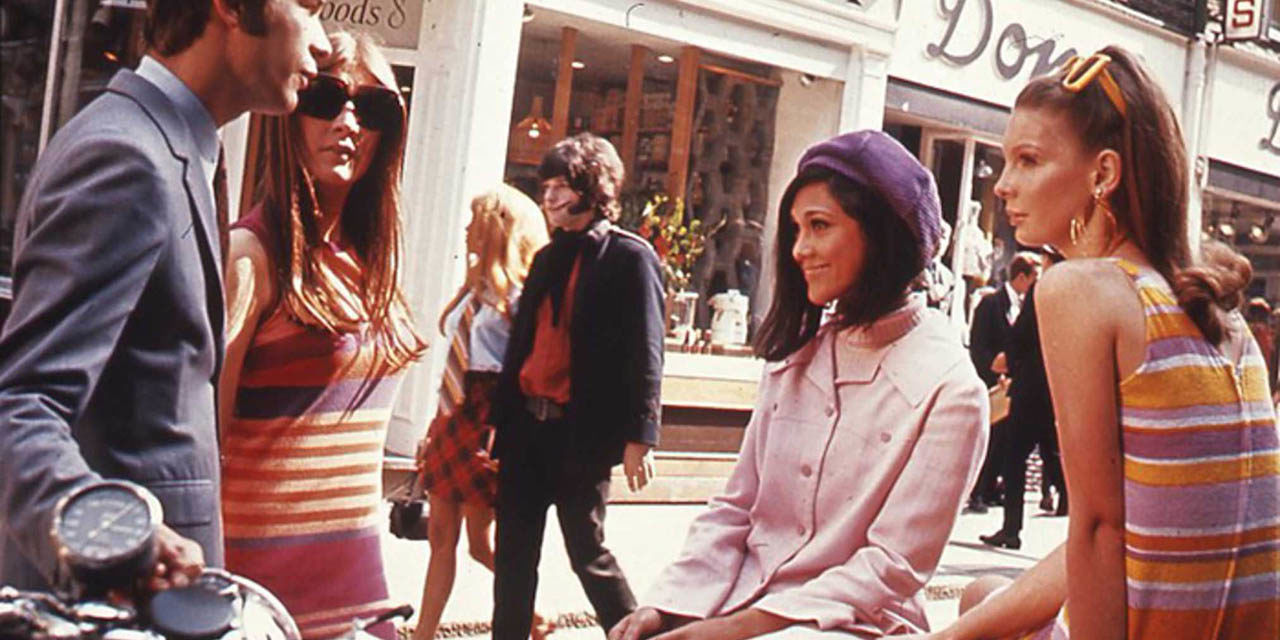
Finally, the 1960s moved fashion from the ateliers of Paris to the high streets of London and New York. This democratization of style mirrors the democratization of brand building today. In the 60s, a girl with a sewing machine and a bold idea could become the next Mary Quant. Today, an entrepreneur with a smartphone and a compelling story can build a global brand. The 1960s taught us that the power of a brand lies not in its price point, but in its ability to resonate with the zeitgeist.
In conclusion, what they wore in the 1960s was a manifesto of change. By studying the decade’s shift from structured conformity to expressive individualism, modern brand strategists can learn how to navigate the complexities of today’s market. Whether through the use of bold visual disruption, the cultivation of niche communities, or the power of consistent personal iconography, the lessons of 1960s style remain the blueprint for any brand looking to make a lasting cultural impact.
aViewFromTheCave is a participant in the Amazon Services LLC Associates Program, an affiliate advertising program designed to provide a means for sites to earn advertising fees by advertising and linking to Amazon.com. Amazon, the Amazon logo, AmazonSupply, and the AmazonSupply logo are trademarks of Amazon.com, Inc. or its affiliates. As an Amazon Associate we earn affiliate commissions from qualifying purchases.