
In the intricate world of brand identity and design, color is more than just an aesthetic choice; it’s a language, a feeling, and a strategic differentiator. While black is often the go-to for creating grey, relying solely on its dilution can result in a flat, lifeless, or even dull hue that does a disservice to a brand’s visual narrative. Crafting grey without black opens up a spectrum of rich, complex, and nuanced shades that can imbue a brand with sophistication, depth, and a unique character often missed by simpler approaches. This exploration delves into the art and science of creating chromatic greys, revealing how these subtle shifts can profoundly impact perception and strengthen a brand’s overall presence.
The Strategic Imperative of Nuanced Grey in Brand Identity
For many brands, grey serves as a foundational element – a backdrop, a secondary color, or a crucial accent. However, the decision of which grey to use, and how it’s achieved, is rarely given the strategic consideration it deserves. Moving beyond the default black-and-white scale unlocks a powerful tool for visual storytelling.
Beyond Utility: Grey as a Brand Statement
A truly effective brand color palette extends beyond vibrant primary and secondary hues. The supporting neutral tones, particularly greys, play an indispensable role in providing balance, sophistication, and readability. When a brand’s grey is derived from a careful mixture of chromatic colors rather than just diluted black, it carries an inherent warmth or coolness, a subtle undertone that resonates with the brand’s core values. This ‘chromatic grey’ possesses a vibrancy and depth that a simple dilution of black often lacks. It can speak to legacy, innovation, approachability, or exclusivity, depending on its underlying color composition.
Consider a luxury brand seeking to convey timeless elegance. A grey with a hint of blue or purple undertone might feel more refined and upscale than a sterile, purely achromatic grey. Conversely, an organic food brand might opt for a grey with warm, earthy undertones (perhaps a touch of yellow or red) to evoke naturalness and warmth. These subtle distinctions are not accidental; they are meticulously crafted elements of a cohesive brand strategy designed to elicit specific emotional responses and reinforce brand messaging without explicit words.
The Pitfalls of “Flat Black” Greys
The ease of simply mixing black with white or reducing the ‘K’ (black) channel in a CMYK mix often leads designers and brands down a path of visually uninspired greys. These “flat black” greys, while functional, lack personality and can feel stark or generic. They don’t interact well with other colors in the palette, sometimes appearing muddy or creating unwanted optical effects where they clash rather than harmonize.
In print, an overly light black ink can appear washed out, while in digital media, a purely achromatic grey (rgb(128,128,128)) can feel cold and lacking in character. A brand striving for distinction cannot afford to overlook these nuances. The goal is to create greys that are harmonious extensions of the primary palette, not merely afterthoughts. By understanding how to formulate grey from other colors, brands gain control over these subtle yet significant aspects of their visual identity, ensuring every element, no matter how neutral, contributes to a richer, more impactful brand experience.
Unpacking the Color Science: Crafting Chromatic Grey
To understand how to make grey without black, it’s crucial to grasp the two fundamental color models: subtractive and additive. Each offers distinct pathways to achieving rich, complex grey tones.
Subtractive Mixing: Primaries and Complements
The subtractive color model is what we encounter in physical media like paints, inks, and dyes. Here, colors are created by absorbing (subtracting) certain wavelengths of light and reflecting others.
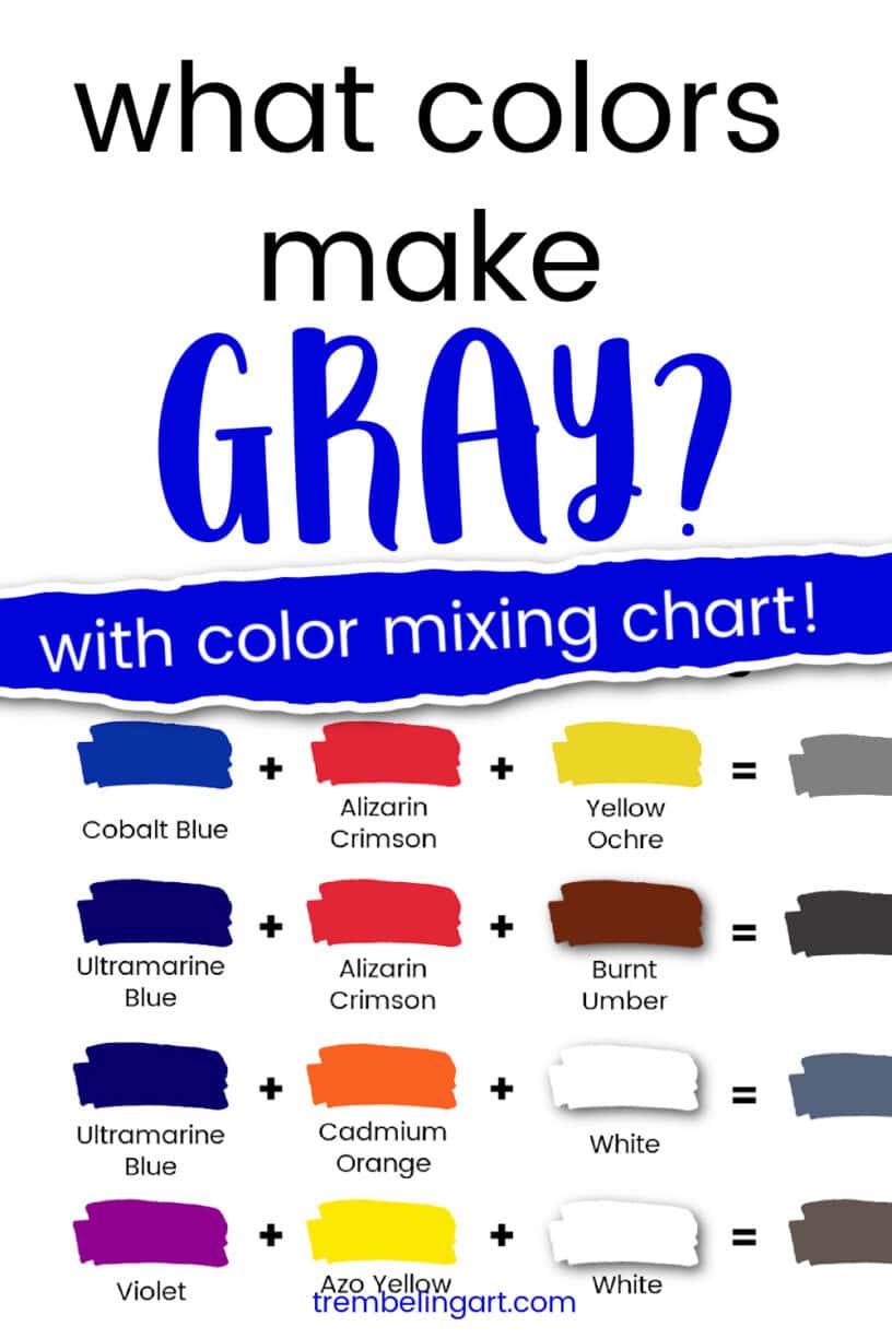
- Primary Colors (RYB): Historically, red, yellow, and blue (RYB) are considered the primary colors for subtractive mixing. When mixed in equal proportions, these three primaries absorb most light wavelengths, resulting in a dark, desaturated color that approximates black or a deep grey. Adjusting the proportions will shift the grey towards a warmer (more red/yellow) or cooler (more blue) undertone. For example, a grey with a slightly higher proportion of blue will feel cooler and more reserved.
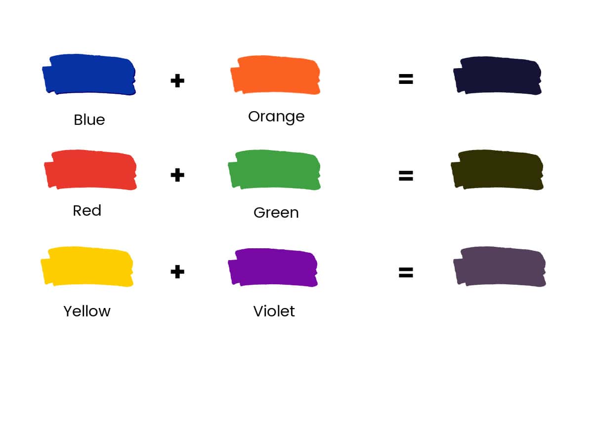
- Complementary Colors: A more sophisticated approach to creating grey involves mixing complementary colors – colors directly opposite each other on the color wheel. When complementary colors are mixed, they neutralize each other, producing a wide range of greys and browns. This method is particularly effective for achieving vibrant greys because the original colors, even when desaturated, retain a subtle presence, giving the grey a lively quality.
- Red + Green: Mixing red and green creates a grey with a warm, earthy quality. Varying the proportions can lead to anything from a reddish-brown-grey to a more olive-toned grey. This combination can evoke a sense of heritage or organic authenticity.
- Blue + Orange: Combining blue and orange yields a sophisticated, often cooler grey. A slight dominance of blue will create a steely, professional grey, while more orange can introduce a soft, smoky warmth. This is excellent for brands aiming for professionalism with a touch of approachability.
- Yellow + Purple: Mixing yellow and purple results in a modern, often edgy grey. A balanced mix can produce a surprisingly rich, almost metallic grey, while emphasizing one color over the other can create greys with unique golden or lavender undertones. This combination speaks to innovation and creativity.
The beauty of using complementary colors is that they naturally balance each other out, creating a neutral base while infusing the grey with a subtle chromatic bias. This prevents the grey from appearing lifeless and allows it to harmonize more effectively with other colors in the brand palette.
Additive Mixing: The Digital Canvas (RGB for Grey)
The additive color model, primarily used in digital displays (screens, monitors), operates differently. Here, colors are created by adding different wavelengths of light. The primary colors are red, green, and blue (RGB).
To create a perfectly neutral, black-less grey in the RGB model, you simply need to set the red, green, and blue values to be equal. For example:
rgb(128, 128, 128)is a middle grey.rgb(200, 200, 200)is a light grey.rgb(50, 50, 50)is a dark grey.
However, just as with subtractive mixing, you can introduce subtle chromaticity to these digital greys without using black. By slightly altering the balance of R, G, and B, you can create nuanced greys:
rgb(130, 128, 128): A very subtle reddish-warm grey.rgb(128, 130, 128): A very subtle greenish-cool grey.rgb(128, 128, 130): A very subtle bluish-cool grey.
These slight variations are crucial for digital brand assets, ensuring that even neutral elements align with the overall brand tone and resonate with the psychological impact intended by the brand’s primary colors.
Your Brand’s Palette: Recipes for Distinctive Non-Black Greys

The true power of understanding non-black grey creation lies in its application to your brand’s specific visual language. By intentionally selecting the underlying hues, you can craft greys that are uniquely yours.
Red + Green: Warm and Anchoring Greys
Greys derived from red and green combinations often exude a sense of warmth, earthiness, or tradition. Brands in sectors like heritage fashion, artisanal goods, or environmental initiatives might find this type of grey particularly compelling. A deeper, more saturated red-green grey can anchor a design, providing a stable foundation, while a lighter version can offer a soft, inviting backdrop. Think of the rich, muted greys found in natural landscapes or aged materials.
Blue + Orange: Cool and Sophisticated Greys
The blue and orange combination produces greys that typically lean towards a cooler, more sophisticated aesthetic. These greys are ideal for technology companies, financial institutions, or luxury services that aim to project professionalism, trustworthiness, and innovation. A grey with a pronounced blue undertone can feel crisp and modern, while a touch more orange can soften it, making it more approachable without losing its professional edge. It’s the kind of grey you see in contemporary architectural designs or high-end electronics.
Yellow + Purple: Energetic and Modern Greys
For brands looking to convey creativity, vibrancy, or a modern outlook, greys mixed from yellow and purple offer exciting possibilities. These greys can be surprisingly dynamic, with a subtle energy that distinguishes them from more traditional neutrals. A grey with a hint of purple can feel luxurious and artistic, while a whisper of yellow can make it feel more energetic and optimistic. This mix is often found in artistic brands, creative agencies, or cutting-edge consumer products.
The Triadic Approach: Red + Blue + Yellow (or CMY Equivalents)
For brands seeking a balanced, truly neutral grey with underlying chromatic complexity, mixing all three primary colors (Red, Blue, Yellow in paint; Cyan, Magenta, Yellow in print) is an excellent strategy. By adjusting the ratios, you can subtly nudge the grey in any direction without it becoming overtly colored. This allows for a harmonious grey that integrates seamlessly with a broad primary palette, providing ultimate versatility while retaining a richness that a simple black-and-white mix cannot match. In print (CMYK), a grey might be composed of C:40% M:30% Y:30% K:0% to get a warm grey without black, for instance, or C:30% M:30% Y:30% K:0% for a more neutral version. The key is ensuring the K (black) channel is either absent or minimal if the goal is to create grey “without black” in its most literal sense.
Implementing Your Unique Grey: Consistency Across Brand Touchpoints
Once your brand’s specific non-black grey has been formulated, the next crucial step is ensuring its consistent application across all brand touchpoints. This meticulous attention to detail reinforces brand professionalism and memorability.
Designing Logos, Typography, and Backgrounds
The chromatic grey you choose can serve as a vital component in your logo’s secondary color palette, as the color for body text in print and digital applications, or as a sophisticated background for web pages and marketing materials. For logos, a non-black grey can provide a softer, more approachable contrast than pure black, allowing other brand colors to pop without being overshadowed. In typography, especially for extensive body copy, a subtly warm or cool grey can significantly improve readability and reduce eye strain compared to stark black, while also aligning with the brand’s overall mood. As a background, these nuanced greys offer depth and texture, serving as an elegant stage for your product or service.
Web & Digital: Ensuring Color Fidelity
Digital platforms present unique challenges due to variations in screen calibration and color rendering. It’s essential to define your non-black greys using precise RGB or Hex codes for web and digital applications. Remember, the same grey might appear slightly different on various devices. Therefore, testing your chosen greys across multiple screens (desktop, mobile, tablet) is critical to ensure your brand’s intended visual impact remains consistent. Tools like color management systems and brand style guides are indispensable for maintaining fidelity across all digital assets, from social media graphics to website elements.
Print & Packaging: Managing Material Interaction
Physical applications, such as print collateral, packaging, and signage, require careful consideration of CMYK values and the interaction of inks with different materials. The same CMYK formula for a non-black grey can look significantly different on uncoated paper versus glossy stock. Uncoated paper tends to absorb more ink, making colors appear slightly duller, while glossy paper can make them more vibrant. Performing press checks and using color proofs are vital steps to ensure the printed result aligns with your brand’s vision. Understanding how your chosen grey interacts with different textures and finishes (e.g., matte vs. gloss) on packaging can also elevate the tactile and visual experience of your brand.
The Competitive Advantage: Elevating Brand Perception with Intentional Grey
In a crowded marketplace, every design choice contributes to a brand’s competitive edge. The intentional use of non-black greys is a subtle yet powerful way to stand out.
Signaling Sophistication and Authenticity
Brands that invest in crafting nuanced, chromatic greys communicate a deeper level of sophistication and attention to detail. This signals to consumers that the brand is thoughtful, precise, and dedicated to excellence in every aspect, not just in its products or services. Such subtle elegance can elevate a brand above competitors who rely on more generic color palettes, conveying an air of authenticity and refined taste. It’s about creating a holistic visual experience where every element, even the most neutral, feels deliberate and meaningful.
Fostering Memorability and Recognition
While a primary brand color might be immediately recognizable, a distinctive grey can contribute significantly to overall brand memorability. When a unique grey consistently appears across all brand touchpoints, it becomes an inherent part of the brand’s visual signature. Consumers may not consciously articulate why they prefer a certain brand’s aesthetic, but these carefully chosen, nuanced greys contribute to a subconscious feeling of quality, consistency, and identity. This fosters a stronger, more enduring connection with the brand, making it more recognizable and fostering loyalty in the long run. By mastering the art of creating grey without black, brands unlock a powerful, understated tool for lasting impact.
aViewFromTheCave is a participant in the Amazon Services LLC Associates Program, an affiliate advertising program designed to provide a means for sites to earn advertising fees by advertising and linking to Amazon.com. Amazon, the Amazon logo, AmazonSupply, and the AmazonSupply logo are trademarks of Amazon.com, Inc. or its affiliates. As an Amazon Associate we earn affiliate commissions from qualifying purchases.