
In the competitive landscape of brand strategy and corporate identity, color is far more than an aesthetic choice. It is a silent communicator that conveys values, evokes specific emotional responses, and establishes a brand’s position within the market hierarchy. Burgundy—a deep, reddish-purple hue inspired by the wines of the Burgundy region in France—is one of the most potent colors available to a designer. It occupies a unique space between the high-energy passion of red and the grounded stability of brown.
For brand strategists, understanding what colors go good with burgundy is essential for building a visual identity that resonates with a target audience. Whether you are designing a high-end luxury label, a traditional financial institution, or a modern lifestyle brand, the secondary and accent colors you pair with burgundy will determine whether the brand feels inclusive, exclusive, energetic, or timeless.
The Psychology of Burgundy in Brand Strategy
Before selecting a palette, a brand strategist must first deconstruct the psychological profile of burgundy. Because it is a saturated, dark shade, it naturally commands attention without the aggressive “stop” signal associated with bright scarlet or crimson. In the world of branding, burgundy communicates several key attributes:
Evoking Luxury and Authority
Burgundy has long been associated with the aristocracy and the ecclesiastical hierarchy. In modern branding, this translates to a sense of “quiet luxury.” It suggests that a brand is established, confident, and does not need to shout to be heard. It is a staple for heritage brands that want to emphasize their longevity and expertise.
The Balance of Power and Sophistication
While standard red is often used to trigger impulse buys (common in fast food and clearance sales), burgundy is used to invite contemplation. It suggests sophistication and a higher price point. It moves the consumer from an emotional state of “excitement” to one of “aspiration.” When paired correctly, it creates a brand experience that feels curated and intentional.
Strategic Color Pairings: Building a Cohesive Visual Identity
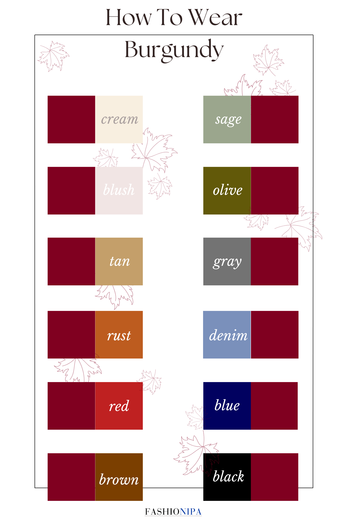
Choosing the right complementary or analogous colors for burgundy is a matter of strategic alignment. Each combination shifts the brand’s narrative. Here are the most effective pairings categorized by the brand personality they project.
Burgundy and Gold: The Peak of Premium Branding
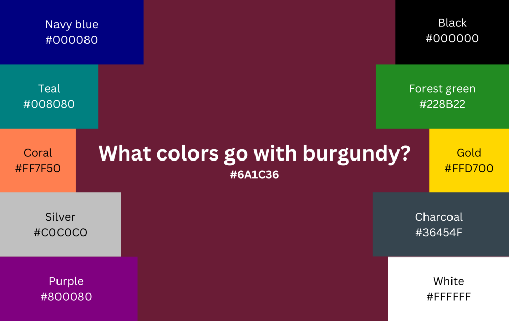
If the objective is to signal ultra-luxury, exclusivity, and prestige, gold is the definitive partner for burgundy. This is a classic “royal” palette.
- Strategic Application: This pairing is highly effective for high-end hospitality, premium spirits, and luxury automotive brands.
- Visual Impact: The warmth of the gold acts as a high-contrast highlight against the depth of the burgundy. It suggests wealth and quality. In digital design, using gold gradients or metallic textures against a matte burgundy background creates a sense of physical depth and tactility.
Burgundy and Cream or Off-White: Accessible Elegance
Pure white can often create a “clinical” look when paired with such a dark color. However, cream, beige, or “eggshell” softens the intensity of burgundy.
- Strategic Application: This combination is ideal for lifestyle brands, organic skincare, and boutique consultancy firms.
- Visual Impact: It creates a sense of “breathable” luxury. The cream provides a neutral canvas that allows the burgundy to act as a sophisticated anchor without overwhelming the viewer. This is particularly effective for editorial layouts and minimalist brand websites.
Burgundy and Navy Blue: Corporate Stability and Trust
For brands that need to project maximum reliability and professionalism—such as law firms or wealth management groups—navy blue is the ideal companion.
- Strategic Application: Professional services and corporate B2B branding.
- Visual Impact: This is a low-contrast, harmonious pairing. Both colors carry a heavy “visual weight.” Together, they suggest a brand that is serious, traditional, and anchored in history. To prevent the design from looking too dark, designers often introduce a light grey or silver as a tertiary accent.
Burgundy and Forest Green: Organic Sophistication
This is an analogous-adjacent pairing that leans into the colors of the natural world, specifically those seen in autumn or high-end traditional estates.
- Strategic Application: Outdoor luxury brands, traditional social clubs, and heritage apparel.
- Visual Impact: It creates a “country estate” aesthetic. It feels grounded and authentic. However, care must be taken with the saturation levels to ensure the brand doesn’t look like a holiday-themed identity; keeping both tones muted and deep is key.

Burgundy and Teal or Slate Blue: Modern Contrast
For a more contemporary and “disruptor” feel, pairing burgundy with a cool-toned teal or a dusty slate blue creates a dynamic tension.
- Strategic Application: Tech startups seeking a “mature” look, creative agencies, and modern architecture firms.
- Visual Impact: The coolness of the teal vibrates against the warmth of the burgundy. It moves the brand away from “traditional” and toward “innovative.” It suggests a brand that respects the past but is looking toward the future.
Applying Burgundy Across Digital and Physical Brand Touchpoints
A strategic color palette must be functional across various mediums. Burgundy presents unique challenges and opportunities in both digital and physical design.
Digital Design and User Experience (UX)
In the digital space, burgundy is an excellent choice for a primary brand color, but it must be handled with care regarding accessibility.
- Readability and Contrast: Because burgundy is a dark value, placing black text over it is a violation of WCAG (Web Content Accessibility Guidelines) standards. Brand designers must use high-contrast white or light cream text.
- UI Elements: Burgundy is a powerful color for “Call to Action” (CTA) buttons in a high-end context. While many brands use bright greens or oranges for buttons, a deep burgundy button on a cream background can drive conversions by signaling a “premium” action or commitment.
- Atmosphere: A dark-mode website using burgundy as an accent color creates an immersive, “lounge-like” digital experience, perfect for luxury portfolios or high-end service providers.
Packaging and Print Materials
In the physical world, burgundy thrives through texture.
- Material Selection: Burgundy looks significantly different on matte paper than it does on high-gloss packaging. For a “Brand Strategy” perspective, matte finishes with spot-UV or foil stamping (in gold or silver) are the industry standard for communicating high value.
- Consistency (CMYK vs. RGB): Burgundy is notoriously difficult to keep consistent between a backlit screen and a printed brochure. Strategists must define specific Pantone (PMS) codes to ensure that the “sophisticated wine” color doesn’t turn into a “muddy brown” or a “bright purple” during the printing process.
Case Studies: Brand Archetypes Using Burgundy
To understand how to deploy burgundy effectively, we can look at its use within different brand archetypes.
The “Ruler” Archetype
Brands that occupy the “Ruler” archetype—those that provide a sense of control, leadership, and high status—frequently use burgundy. Think of luxury hotel chains or Ivy League universities. They pair burgundy with stone greys and golds to reinforce a sense of permanent authority.
The “Sage” Archetype
The “Sage” seeks truth and provides wisdom. Academic publishers and high-level consulting groups often use burgundy paired with deep blues or charcoal. The color suggests a “library” atmosphere, indicating that the brand is a repository of deep knowledge and historical context.
The “Explorer” Archetype (Luxury Tier)
While many explorer brands use bright oranges or greens, the luxury explorer (think high-end luggage or expedition gear) uses burgundy paired with tan leather tones and forest greens. This suggests that while the brand is adventurous, it does so with a level of refinement and class.
Best Practices for Implementing a Burgundy-Centric Brand System
When finalizing a brand identity centered around burgundy, follow these strategic guidelines to ensure longevity and impact:
- Define the Ratio: Use the 60-30-10 rule. 60% should be a neutral (like cream or light grey), 30% should be burgundy, and 10% should be your “pop” accent color (like gold, teal, or even a bright coral for a modern twist).
- Monitor Saturation: Burgundy can easily become “heavy.” Balance it with lighter tints or ample whitespace in your brand guidelines to prevent the identity from feeling oppressive or dated.
- Consider Global Context: In some Eastern cultures, red and its derivatives signify luck and prosperity. In Western contexts, burgundy signifies status. Ensure the pairing aligns with the cultural nuances of your primary market.
- Test for Digital Accessibility: Always run your burgundy-based color pairings through a contrast checker. A beautiful palette that no one can read is a failure in brand communication.
By strategically selecting what colors go with burgundy, a brand can move beyond simple aesthetics into the realm of psychological influence. Whether you choose the timelessness of burgundy and gold or the modern edge of burgundy and slate, the goal is the same: to create a visual identity that is as deep, complex, and enduring as the color itself.
aViewFromTheCave is a participant in the Amazon Services LLC Associates Program, an affiliate advertising program designed to provide a means for sites to earn advertising fees by advertising and linking to Amazon.com. Amazon, the Amazon logo, AmazonSupply, and the AmazonSupply logo are trademarks of Amazon.com, Inc. or its affiliates. As an Amazon Associate we earn affiliate commissions from qualifying purchases.