
In the competitive landscape of global commerce, a brand’s visual identity often speaks louder than its mission statement. Among the primary and secondary colors available to designers, purple occupies a unique, almost paradoxical space. It is a color that does not exist on the linear electromagnetic spectrum—our brains create it by perceiving a mix of red and blue light. In the world of brand strategy, this “synthetic” nature makes purple a tool of immense psychological power. To ask “what color is purple” in a branding context is to ask how a business can balance the fierce energy of red with the stable reliability of blue to create an aura of luxury, mystery, and forward-thinking innovation.
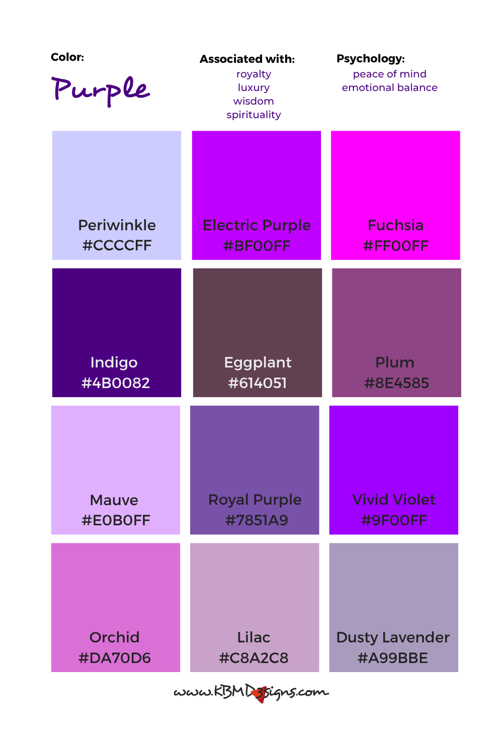
The Psychology of Purple: Why It Resonates in the Consumer Mind
Color psychology is the bedrock of effective brand strategy. Before a customer reads a single word of copy, they have already made an emotional judgment based on the brand’s palette. Purple is a rare visitor in the natural world, which has historically lent it an air of exclusivity and supernatural significance.
Luxury, Nobility, and the History of Tyrian Purple
The association between purple and wealth is not accidental; it is rooted in thousands of years of socioeconomic history. In ancient times, “Tyrian purple” was derived from the secretions of sea snails, a process so labor-intensive that the dye was worth its weight in silver. Consequently, purple became the de facto color of emperors and monarchs.
In modern branding, this heritage translates into “premium positioning.” When a brand chooses a deep, saturated violet, it is signaling to the consumer that its products are of higher quality, more exclusive, and worth a higher price point. It moves the conversation away from utility and toward status.
The Intersection of Stability and Energy
Technically, purple is a secondary color, born from the marriage of red and blue. In brand strategy, these two parent colors represent polar opposites: red is the color of passion, urgency, and physical action, while blue is the color of trust, security, and intellectual calm.
Purple occupies the “sweet spot” between these two extremes. It provides the excitement of red without the aggression, and the serenity of blue without the coldness. For a brand, this means purple can evoke a sense of “dynamic wisdom.” It is the color of a company that is confident enough to be quiet, yet powerful enough to lead.
Defining the Visual Identity: Purple in Modern Brand Strategy
Choosing purple for a corporate identity is often a deliberate move toward “differentiation.” In industries saturated with “safe” blues (banking and healthcare) or “high-energy” reds (fast food and retail), purple acts as a disruptor. It signals that a brand is not following the herd.
Creativity and Problem Solving
Beyond luxury, purple is the color of the imagination. Because it is rarely found in abundance in nature, it is often associated with the artificial, the artistic, and the innovative. Brands that want to position themselves as creative problem-solvers—especially in the software and design sectors—utilize purple to suggest that they think differently.
It evokes the “ah-ha!” moment of discovery. By using purple, a brand tells its audience that it inhabits a space where logic (blue) meets intuition (red), making it the ideal hue for companies focused on brainstorming, visionary tech, and artistic expression.
Mysticism and Wellness Niche Positioning
In the wellness and beauty sectors, the meaning of purple shifts toward the spiritual. Light shades like lavender and lilac suggest grace, elegance, and tranquility. Brands in these niches use purple to tap into the “mindfulness” economy.
For these companies, purple represents a bridge between the physical and the metaphysical. It is used to brand products that promise an experience rather than just a result—scents that evoke memories, skincare that feels like a ritual, or apps that facilitate meditation. Here, the “color of purple” is the color of internal peace and holistic health.
Case Studies: Brands That Own the Purple Spectrum

To truly understand how purple functions in the market, one must look at the giants who have successfully claimed a stake in this color territory. These brands do not just use purple; they have integrated it so deeply into their corporate DNA that the color itself serves as a trademark.
Cadbury and the Legal Battle for a Hue
Perhaps no brand is more synonymous with purple than Cadbury. The confectionery giant uses a specific shade—Pantone 2685C—to wrap its Dairy Milk bars. This choice was originally a tribute to Queen Victoria, reinforcing the “royalty and luxury” aspect of the color.
Cadbury’s commitment to purple is so strong that they spent years in legal battles attempting to trademark the specific shade for chocolate packaging. This demonstrates a core tenet of brand strategy: when you “own” a color, you own a shortcut to the consumer’s brain. A shopper doesn’t need to read the label; they see the purple flash and their brain registers “Cadbury” and “premium chocolate” instantly.
Twitch and the Digital Community Experience
In the tech world, Twitch is the undisputed king of purple. In a sea of gaming platforms that often lean into “edgy” blacks and reds, Twitch’s vibrant, neon purple stands out as welcoming yet high-tech.
For Twitch, purple represents the “third space”—a digital community that is neither work nor home. It signals a playful, creative environment that is distinct from the professional blue of LinkedIn or the social red of YouTube. The color helps cultivate a sense of belonging among its users, defining the “Twitch culture” as something unique and slightly rebellious.
Hallmark: Emotional Connection and Heritage
Hallmark uses a regal purple in its crown logo to signify its status as the “gold standard” of the greeting card and ornament industry. For Hallmark, purple is about the weight of sentiment. It suggests that the emotions conveyed in their products are “noble” and significant. The color elevates a simple piece of cardstock into a meaningful artifact of human connection, leveraging the historical weight of purple to add value to the brand’s heritage.
Selecting the Right Shade: Practical Design Considerations
When building a brand identity, simply saying “the color is purple” is insufficient. The specific tint, tone, and shade determine the brand’s voice. A misstep in saturation can change the message from “luxury” to “juvenile” or from “innovative” to “gloomy.”
Complementary Colors and Visual Harmony
In professional design, purple is rarely used in a vacuum. Its impact is defined by its relationship with other colors.
-
Purple and Gold: The ultimate symbol of luxury and prestige. Used by high-end brands to signal wealth.
-
Purple and Yellow: As complementary colors (opposites on the color wheel), this pairing creates maximum contrast and high energy. It is often used in professional sports and retail to grab attention.
-
Purple and White: Suggests cleanliness, clarity, and modern minimalism. This is common in the “fem-tech” and premium skincare industries.
Cultural Variations in Meaning
A global brand strategy must account for how purple is perceived across different borders. While Western cultures largely associate it with royalty and wealth, other regions have different interpretations:
-
In Thailand and parts of South America, purple is traditionally associated with mourning and sorrow.
-
In China, purple represents spiritual awareness and physical healing, often linked to the harmony of the universe.
-
In Japan, the color historically represented the highest rank in the government, available only to the highest-level officials.
Understanding these nuances is vital for a brand’s international expansion. A “regal” purple in London might be perceived as a “somber” purple in Bangkok.

The Future of Purple: Trends in Digital-First Branding
As we move deeper into an era dominated by OLED screens and digital-first experiences, the way we perceive purple is evolving. In the digital realm, purple is often used to represent “The Metaverse,” AI, and futuristic concepts. This is because purple, especially in its “electric” or “cyber” variations, feels less like a pigment and more like light itself.
Modern tech startups are increasingly moving away from “Corporate Blue” in favor of “Deep Violet” and “Electric Magenta.” This shift represents a broader trend in brand strategy: the move toward individuality and the “creator economy.” In this context, purple is the color of the “unconventional.” It is the color for brands that are not just part of the future, but are actively inventing it.
In conclusion, purple is far more than a simple mixture of red and blue. It is a strategic tool that, when used correctly, can elevate a brand from a mere commodity to a symbol of luxury, creativity, and authority. Whether it is the deep, historic purple of a luxury chocolate bar or the vibrant, digital purple of a streaming platform, this color remains one of the most potent assets in a brand strategist’s toolkit. To know what color purple is, one must understand the delicate balance between tradition and innovation.
aViewFromTheCave is a participant in the Amazon Services LLC Associates Program, an affiliate advertising program designed to provide a means for sites to earn advertising fees by advertising and linking to Amazon.com. Amazon, the Amazon logo, AmazonSupply, and the AmazonSupply logo are trademarks of Amazon.com, Inc. or its affiliates. As an Amazon Associate we earn affiliate commissions from qualifying purchases.