
In an era where personal identity is meticulously curated and projected across various platforms, every visual element contributes to one’s personal brand. Even seemingly minor choices, such as the color of one’s orthodontic braces, become opportunities for strategic self-expression. Far from being a mere medical necessity, braces, particularly their visible components, serve as a potent accessory, a temporary yet impactful extension of one’s personal aesthetic and brand narrative. The question “what color braces are the best” transcends simple preference; it delves into the realm of design, perception, and the deliberate construction of one’s visual identity during a significant period of transformation. Understanding the psychological implications of color, the principles of visual design, and the nuances of personal branding can elevate this choice from a fleeting decision to a strategic maneuver in managing how one is perceived by the world.
The Power of Visual Identity: Braces as a Personal Brand Statement
In the intricate tapestry of personal branding, every detail, however small, weaves into the overall impression one presents. Braces, often seen as a temporary fixture, are, in fact, a highly visible component of one’s face for an extended period. During this time, they become an integral part of one’s public persona, offering a unique canvas for expression.
Beyond Function: Braces as an Accessory
Historically, braces were solely utilitarian, their aesthetic secondary to their corrective function. Today, advancements in materials and design, coupled with a heightened awareness of personal image, have transformed them. Colored elastics and bands are no longer just functional components; they are design elements. They provide an opportunity for individuals to infuse their treatment period with personality, acting much like an item of clothing, a piece of jewelry, or a distinct hairstyle. This shift repositions braces from a purely medical appliance to a deliberate fashion and personal branding accessory, allowing individuals to project specific attributes and reinforce their desired image.
First Impressions and Perceptual Cues
First impressions are notoriously powerful and often indelible. The visual cues we offer within the first few seconds of an encounter significantly shape how others perceive us. The color of one’s braces, situated prominently within the smile, contributes directly to these critical initial judgments. A vibrant, bold color might signal creativity, confidence, or a playful disposition. Conversely, a subtle, classic hue could communicate professionalism, maturity, or an understated elegance. These choices are not arbitrary; they are non-verbal communication signals that contribute to the narrative of one’s personal brand, influencing social interactions, professional perceptions, and overall receptiveness from one’s audience. Strategically selecting a color that aligns with one’s overarching personal brand goals can pre-frame interactions and reinforce desired perceptions from the outset.
The Psychology of Color in Personal Branding
Color psychology is a robust field, demonstrating how different hues evoke distinct emotions and associations. In personal branding, leveraging this understanding is paramount.
- Blue often conveys trustworthiness, stability, and intelligence – ideal for individuals aiming for a professional or dependable brand image.
- Green can suggest growth, freshness, and harmony, appealing to those with an eco-conscious or holistic brand.
- Red is associated with passion, energy, and confidence, suitable for a dynamic and assertive persona.
- Purple frequently denotes luxury, creativity, and wisdom, aligning with sophisticated or artistic brands.
- Black and Dark Grey project sophistication, authority, and elegance, often chosen for a more serious or minimalist brand aesthetic.
- Pink can convey friendliness, approachability, and youthful optimism.
- Clear/Silver hues offer neutrality, blending seamlessly and projecting a discreet, unflashy, and clean image.
The “best” color, therefore, is not universally fixed but is instead the color that most effectively amplifies the specific attributes one wishes to highlight within their personal brand framework. This deliberate selection empowers individuals to actively sculpt their visual narrative and evoke a desired psychological response from their audience.
Navigating the Spectrum: Strategic Color Choices for Your Persona
Choosing the “best” color for braces is akin to selecting a brand palette for a personal identity—it requires strategic thought and an understanding of how colors interact with one’s overall image. The goal is to select hues that reinforce, rather than detract from, the desired personal brand.
Aligning with Professionalism: Subtle and Classic Hues
For individuals operating in professional environments or those aiming to project an image of gravitas, competence, and reliability, a more understated approach to brace colors is often advisable. Colors such as clear, silver, light grey, or even subtle shades of light blue or green can blend more seamlessly with natural tooth tones, minimizing their visual impact. These choices communicate a focus on substance over spectacle, aligning with brand values like professionalism, maturity, and a refined aesthetic. They ensure that the primary focus remains on one’s contributions and communication, rather than on a vivid accessory. This strategy is particularly pertinent for professionals in fields such as law, finance, medicine, or corporate leadership, where a conservative yet polished appearance is often a cornerstone of trust and credibility.
Expressing Creativity and Individuality: Bold and Vibrant Tones
On the other end of the spectrum lies the opportunity for vibrant self-expression. For artists, designers, creatives, or those who thrive on standing out and showcasing a unique personality, bold and bright colors can be a powerful tool. Hues like electric blue, emerald green, fuchsia, or even multi-color combinations can signal dynamism, innovation, and an unapologetic embrace of individuality. This approach transforms braces from a background element into a foreground statement, actively contributing to a personal brand that values uniqueness and creative flair. These choices resonate with individuals who understand that their personal brand thrives on distinctiveness and who are comfortable using every facet of their appearance to tell their story. For a personal brand built on originality and artistic sensibility, the “best” color might be the one that sparks conversation and demonstrates a daring aesthetic.
Seasonal and Event-Driven Branding: Dynamic Color Play
Personal branding, much like corporate branding, can benefit from dynamism and adaptability. While a core aesthetic remains constant, specific elements can be modulated to suit seasons, holidays, or particular events. This concept can be applied to brace colors. For instance, an individual might opt for deep reds and greens during the holiday season, pastels for spring, or school/team colors during a significant event. This strategic use of color shows engagement, personality, and an attention to detail that further strengthens a comprehensive personal brand. It demonstrates an individual who is not only aware of their image but also actively manages and adapts it to remain relevant and engaging, treating their braces as a dynamic visual component that can be updated to reflect current contexts and celebratory moments.

Complementing Skin Tone and Features: A Design Principle
Beyond personal preference and psychological association, good design dictates that colors should complement the wearer. Just as clothing designers consider skin tone and hair color, so too should individuals choosing brace colors.
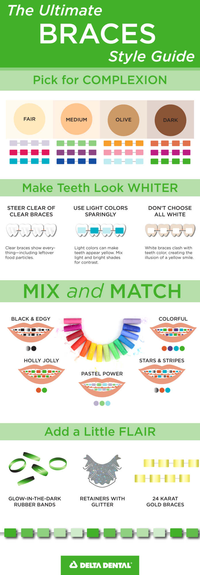
- Cooler skin tones (pink or blue undertones) often benefit from cool colors like blues, purples, and emerald greens, which enhance natural radiance.
- Warmer skin tones (yellow or golden undertones) are often complemented by warm colors such as reds, oranges, and yellow-greens, which can brighten the complexion.
- Consider also the natural color of your teeth. Very light shades can sometimes make teeth appear yellower by contrast, while darker, richer tones (e.g., dark blue or purple) can make teeth appear whiter.
The goal here is harmony—selecting colors that enhance overall appearance and contribute positively to one’s perceived attractiveness, thereby strengthening the visual aspect of the personal brand. This design-centric approach ensures that the chosen color works synergistically with one’s natural features, creating a cohesive and aesthetically pleasing overall impression.
Consistency vs. Evolution: Long-Term Branding with Braces
The journey with braces is often a multi-month or multi-year commitment, presenting an extended opportunity for personal brand management. The decision regarding color isn’t a one-time event; it can evolve, reflecting changes in personal style, professional aspirations, or even mood.
Maintaining a Core Aesthetic
For individuals committed to a consistent personal brand, particularly those in roles requiring unwavering trust or a stable public image, maintaining a consistent color choice throughout the treatment period can be beneficial. Opting for a signature color or a neutral palette reinforces predictability and steadfastness—valuable attributes in many professional contexts. This approach communicates a deliberate and unwavering sense of self, creating a stable visual anchor for their personal brand. It aligns with the principle of brand consistency, where repetitive exposure to a specific visual identity solidifies recognition and reinforces core brand messages.
Adapting Your Look: Scheduled Color Changes
Conversely, the periodic nature of brace adjustments offers a unique opportunity for brand evolution. Every appointment is a chance to refresh one’s visual identity, similar to updating a website or changing a professional headshot. This flexibility allows individuals to experiment with different aspects of their personality or to align their visual brand with evolving professional or social roles. For instance, an individual might start with professional, subtle colors for a job search phase, then transition to more expressive hues once established in a creative role. This dynamic approach to personal branding, leveraging the modular nature of brace colors, shows adaptability and a nuanced understanding of self-presentation. It demonstrates that a personal brand can be both strong in its core and flexible in its expression.
Seeking Professional Input: Orthodontists as Style Consultants
While the ultimate decision rests with the individual, orthodontists, through their daily interaction with aesthetic choices and facial structures, can inadvertently serve as valuable (if informal) style consultants. They possess insights into how colors interact with oral hygiene, tooth staining, and even the optical illusion of tooth whiteness. For example, some vibrant colors might make teeth appear whiter, while others could highlight discoloration. Discussing color options with the orthodontic team, considering their practical advice on maintenance and appearance, can refine the decision-making process. This collaborative approach ensures that the chosen color not only aligns with personal branding goals but also maintains a polished and appealing look throughout the treatment.
The Impact Beyond the Smile: Building Confidence and Presence
Ultimately, the choice of brace color, while a visual and branding decision, ripples out to impact one’s internal state and overall presence. A thoughtful selection can significantly contribute to self-confidence, an indispensable asset for any strong personal brand.
Self-Perception and Empowerment
When individuals feel good about their appearance, their self-perception improves. Choosing a brace color that genuinely reflects one’s personality, aligns with their personal brand, or even makes them smile every time they look in the mirror, fosters a sense of empowerment. This internal confidence translates into outward presence—a more engaging demeanor, more assertive communication, and a stronger aura of self-assurance. This is a critical feedback loop: strategic personal branding choices lead to enhanced self-esteem, which in turn amplifies the impact of the personal brand.
Engaging with Your Audience (Social and Professional)
A well-chosen brace color can be a conversation starter, a subtle differentiator, or simply a visual cue that reinforces one’s established brand. It can facilitate easier social interactions, making one more approachable or memorable. In professional settings, a consistent and intentional aesthetic, even extending to brace colors, demonstrates attention to detail and a holistic understanding of self-presentation—qualities that resonate positively with colleagues, clients, and superiors. It shows an individual who is deliberate about their image, a characteristic often associated with competence and thoroughness.

Leaving a Memorable Mark
In a crowded world where standing out is key, every element that contributes to memorability is valuable. The “best” color for braces is not just about aesthetics; it’s about making a positive, lasting impression that aligns with the desired personal brand narrative. Whether it’s a bold statement that screams creativity or a subtle choice that whispers sophistication, the carefully selected color contributes to a cohesive, impactful personal brand that lingers in the minds of those encountered. It transforms a temporary medical necessity into a powerful tool for visual storytelling and enduring personal presence.
aViewFromTheCave is a participant in the Amazon Services LLC Associates Program, an affiliate advertising program designed to provide a means for sites to earn advertising fees by advertising and linking to Amazon.com. Amazon, the Amazon logo, AmazonSupply, and the AmazonSupply logo are trademarks of Amazon.com, Inc. or its affiliates. As an Amazon Associate we earn affiliate commissions from qualifying purchases.