
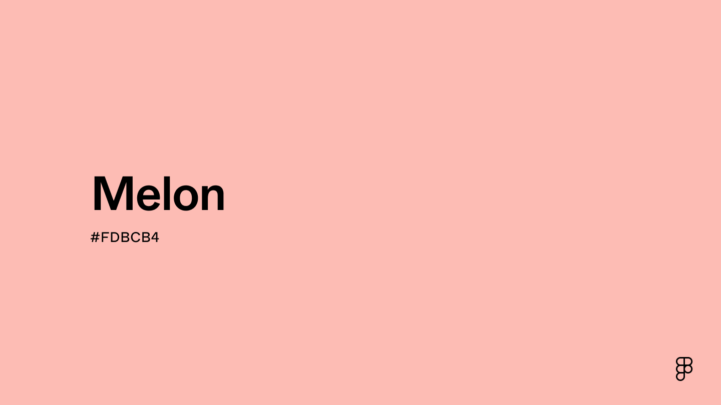
The question “what color is melon?” seems innocuous, perhaps even trivial. Yet, for brand strategists, designers, and marketers, this seemingly simple query unveils a complex interplay of perception, cultural context, and strategic choice that is fundamental to crafting a compelling corporate identity. In a world saturated with visual information, the precise definition and deployment of color can be the differentiating factor that elevates a brand from forgettable to iconic. The ambiguity inherent in “melon” — is it the vibrant orange of cantaloupe, the pale green of honeydew, or the deep pink-red of watermelon? — serves as a perfect case study for the intricate art and science of brand color strategy.
The Spectrum of Subjectivity: Why “Melon” Challenges Brand Consistency
At its core, “melon” isn’t a single, universally recognized color. It’s a family of hues, each evoking different sensations, memories, and associations. This inherent subjectivity presents a fascinating challenge for brands striving for a unified visual language.
Decoding the Melon Palette: From Farm to Brand Guide
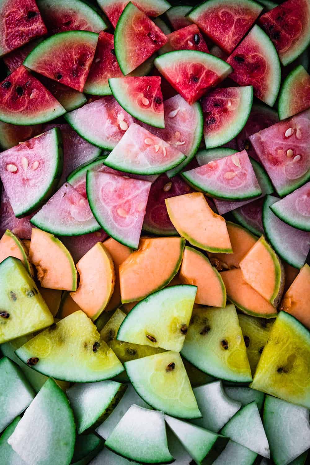
Consider the diverse members of the melon family. Cantaloupe presents a warm, earthy orange, often associated with sun, warmth, and natural sweetness. Honeydew, in contrast, offers a cool, refreshing pale green, suggesting crispness, hydration, and a lighter touch. Watermelon, especially its interior, is a vibrant, often intense red or deep pink, signaling juiciness, summer, and bold flavor. Each of these carries a distinct emotional and psychological footprint.
For a brand, simply stating “our color is melon” is woefully inadequate. It creates a vast interpretive gap, leading to potential inconsistency across different touchpoints, from digital advertisements and packaging to physical retail spaces and employee uniforms. A brand aiming for a fresh, invigorating image might gravitate towards honeydew green, while one emphasizing warmth and zest might lean into cantaloupe orange. The lack of precision can dilute brand recognition and confuse consumers.
The Peril of Ambiguity: How Vague Color Naming Undermines Identity
In an age where global markets and diverse consumer bases are the norm, brand consistency is paramount. A brand’s colors are often the first, and most lasting, impression it makes. If a brand’s primary color is vaguely defined, it risks:
- Diluted Brand Recognition: Consumers may struggle to associate a fluctuating color with the brand.
- Inconsistent Messaging: Different shades can convey different emotions, inadvertently sending mixed signals about the brand’s values or product benefits.
- Production Challenges: Manufacturers, printers, and digital designers will interpret “melon” differently, leading to variations in actual output.
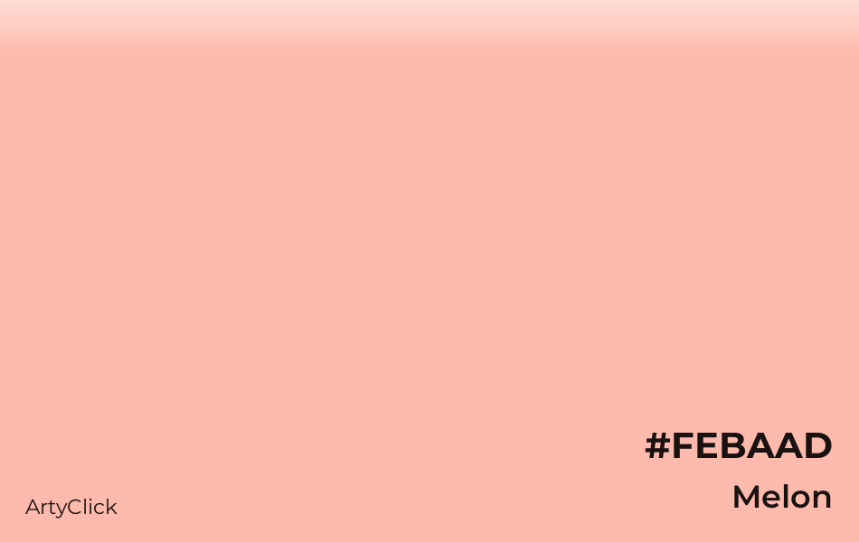
The solution lies not in avoiding such evocative descriptors but in pairing them with rigorous standardization. Pantone Matching System (PMS), CMYK, RGB, and Hex codes become the essential translators, converting poetic color descriptions into measurable, replicable data points, ensuring that “melon” is precisely defined, whether it’s “Melon Cantaloupe PMS 16-1360 TCX” or “Honeydew Green #C7F1B1.”
Color Psychology in the “Melon” Spectrum: Crafting Emotional Connections
Beyond mere identification, color is a potent psychological tool, capable of influencing mood, behavior, and perception. The varied hues within the “melon” spectrum offer a rich palette for brands seeking to evoke specific emotional responses and functional associations.
Warmth, Freshness, and Vitality: The Core Emotional Resonance
The “melon” family generally falls into a spectrum that evokes feelings of warmth, freshness, and vitality.
- Cantaloupe-like oranges/peaches often convey friendliness, optimism, energy, and creativity. They can stimulate appetite (crucial for food brands) and suggest a natural, wholesome quality. Brands in health, wellness, and natural products frequently leverage these tones.
- Honeydew-like greens are associated with nature, growth, tranquility, and health. They often communicate freshness, purity, and environmental consciousness. Brands focusing on organic products, sustainability, or refreshing beverages might find these shades particularly effective.
- Watermelon-like reds/pinks are more energetic and playful, conveying passion, excitement, and a sense of fun. These bold hues can signify sweetness, indulgence, and vibrancy, making them suitable for brands targeting younger demographics or those in the confectionary and beverage sectors.
Understanding these underlying psychological drivers allows brands to strategically select a “melon” shade that aligns perfectly with their desired brand personality and target audience’s emotional landscape.
Cultural Context and Global Perception of Melon Hues
The interpretation of colors isn’t universal. While some associations are widespread, cultural nuances can significantly alter a color’s meaning. For instance, while red might signify luck and prosperity in some Asian cultures, it can be a warning sign in others. Green, often linked to nature in the West, can also represent jealousy or inexperience.
Brands operating on a global scale must conduct thorough research to ensure their chosen “melon” hue resonates positively across all target markets. A “melon” shade that evokes refreshing naturalness in one region might be perceived as bland or unappetizing in another. This layer of complexity underscores the need for deep cultural insight in brand strategy, ensuring that the selected color palette communicates universally, or is adapted strategically for specific locales.
Strategic Deployment: Leveraging “Melon” in Brand Assets
Once a precise “melon” hue is defined and its psychological impact understood, the next challenge is its consistent and impactful deployment across all brand assets. This is where strategic design principles come into play, transforming a chosen color into a cornerstone of brand recognition.
Packaging and Product Design: Telling a Story with Color
For food and beverage brands, the “melon” color family is an obvious and potent choice for packaging. A “Melon Burst” flavored drink must visibly communicate that flavor through its packaging color. However, it’s not just about matching the fruit; it’s about conveying the experience of the fruit. A vibrant watermelon pink on a juice box speaks of summer fun, while a subtle honeydew green on a gourmet sorbet implies sophistication and natural purity.
Beyond direct food products, these colors can extend to other industries. A cosmetic brand might use a cantaloupe-inspired orange to suggest a healthy, sun-kissed glow, while a home goods company might incorporate a muted honeydew green into its textiles to evoke tranquility and natural comfort. The chosen “melon” hue becomes a shortcut for communicating product benefits and sensory experiences.
Digital Presence and Marketing Campaigns: Maintaining Visual Fidelity
In the digital realm, maintaining color fidelity is a constant battle. Different screens, devices, and lighting conditions can alter how a color appears. Brands must establish robust digital style guides that specify hex codes for web, RGB values for digital ads, and ensure responsive design principles account for potential color shifts.
A “melon” campaign needs to feel consistent whether it’s viewed on a smartphone, a high-definition television, or a print magazine. This requires meticulous attention to detail from designers and marketers, often involving sophisticated color management systems to calibrate outputs across various media. The goal is to ensure that the chosen “melon” shade remains unmistakably theirs regardless of where or how a consumer encounters it.
The Dynamic Future of Color: Personalization and Predictive Analytics
The evolution of technology is bringing new dimensions to color strategy. AI-driven tools can analyze vast datasets of consumer preferences, predict color trends, and even personalize color schemes for individual users based on their past interactions or demographic profiles. Imagine a website where the “melon” shade subtly shifts based on whether the user has shown a preference for warm or cool tones in previous browsing sessions.
Furthermore, dynamic branding allows for flexible color palettes, where a primary “melon” shade might be complemented by a rotating set of secondary colors tailored for specific campaigns or seasonal promotions. This agility, however, demands an even more rigorous definition of the core brand colors to prevent fragmentation of identity.
In conclusion, the seemingly simple question “what color is melon?” opens a profound discussion on the art and science of brand color strategy. It underscores the importance of precision, psychological insight, cultural awareness, and consistent execution in leveraging color to build a powerful and resonant brand identity. For brands, “melon” is never just a color; it’s a strategic decision.
aViewFromTheCave is a participant in the Amazon Services LLC Associates Program, an affiliate advertising program designed to provide a means for sites to earn advertising fees by advertising and linking to Amazon.com. Amazon, the Amazon logo, AmazonSupply, and the AmazonSupply logo are trademarks of Amazon.com, Inc. or its affiliates. As an Amazon Associate we earn affiliate commissions from qualifying purchases.