
The name “Lululemon” has become synonymous with premium athletic wear, mindfulness, and a specific brand of aspirational West Coast lifestyle. To the uninitiated, it sounds like a playful, alliterative string of syllables—perhaps a reference to a fruit or a whimsical character. However, the origin of the name and the strategic logic behind its creation provide a masterclass in brand positioning, phonetic branding, and the complexities of global corporate identity.
In the world of brand strategy, names are rarely chosen by accident. They are engineered to evoke specific feelings, imply quality, and carve out a niche in a crowded marketplace. The story of why Lululemon is called Lululemon is a blend of founder-led intuition, marketing psychology, and a controversial approach to international marketability.

The Phonetic Architecture: Creating a Distinct Brand Sound
When Chip Wilson founded Lululemon in Vancouver in 1998, he wasn’t just looking for a catchy name; he was looking for a sound that would resonate within a specific global hierarchy of perceived value. The naming process was rooted in Wilson’s observations of the Japanese market during his previous business venture, Homeless Skateboards.
The Power of the “L” Sound
Wilson noticed that many Japanese brands attempted to use English-sounding names to gain “Western” prestige. Specifically, he observed that because the Japanese language does not have a native “L” sound (distinct from “R”), names containing the letter “L” often sounded authentically North American or European to Japanese consumers. This phonetic difficulty, paradoxically, added a layer of exoticism and perceived value to the brand.
Wilson’s strategy was to create a name with three “L”s to maximize this effect. The logic was that if a brand name was difficult for certain foreign markets to pronounce, it would reinforce the idea that the brand was an authentic, high-end Western import. This approach to “phonetic branding” suggests that the sound of a name can be just as important as its meaning. In the case of Lululemon, the meaning was essentially non-existent; the name was a neologism designed purely for its auditory and visual impact.
Alliteration and Memorability
From a cognitive marketing perspective, Lululemon benefits from alliteration and repetition. Alliterative names—like Coca-Cola, Bed Bath & Beyond, or Dunkin’ Donuts—are easier for the human brain to process and remember. The rhythmic quality of “Lu-lu-le-mon” gives it a sing-song cadence that is both distinctive and playful. It stands in stark contrast to the aggressive, sharp sounds often found in traditional athletic brands (think of the hard “K” in Nike or the staccato “das” in Adidas). For a brand rooted in the gentle, fluid movements of yoga, a softer, more melodic name was a strategic masterstroke.
Visual Semiotics: Beyond the Name
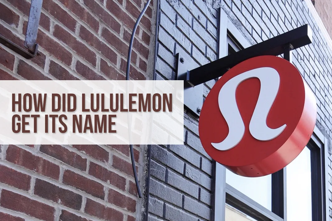
While the name Lululemon is a phonetic construct, the visual identity that accompanies it tells a different story. One of the most common questions in brand strategy circles is why the Lululemon logo—which looks like a stylized “A”—doesn’t match the “L” of its name.
The “Athletically Hip” Legacy
The logo was actually designed before the name Lululemon was finalized. In the early stages of the brand’s development, Wilson had considered the name “Athletically Hip.” The logo we see today—a stylized, curvaceous emblem—is actually a minimalist representation of the letter “A” from that original name.
When the name Lululemon was ultimately chosen through a survey of 100 people, the “A” logo was already gaining traction. Rather than discarding the visual equity they had begun to build, the company decided to keep the emblem. This decision highlights a crucial rule in brand management: visual consistency often trumps literal alignment. Over time, the logo has evolved from a letter “A” into a “stigma-less” symbol of a global community. It is no longer read as a letter; it is read as a badge of membership.
The “Stigma-less” Emblem
In design strategy, an emblem that does not rely on a specific letter or word is highly versatile. The Lululemon logo functions similarly to the Apple logo or the Nike Swoosh. It is an abstract shape that the consumer can fill with meaning. By detaching the logo from the name’s literal initial, Lululemon created a symbol that feels more like a crest or a totem than a corporate monogram. This has allowed the brand to transition seamlessly from yoga mats to office wear and high-fashion collaborations, as the symbol represents a lifestyle rather than a specific product category.
Brand Positioning: Crafting a Lifestyle Movement
The name Lululemon serves as the foundation for what is arguably the brand’s greatest strength: its ability to create an “in-group” culture. In brand strategy, this is known as tribal marketing. The name is unique enough that saying it feels like using a specialized vocabulary.
From Product Name to Cultural Shorthand
Because “Lululemon” is a unique word with no prior meaning, the company had a blank slate upon which to write its brand values. They filled this vacuum with the “Lululemon Manifesto”—a collection of aphorisms and life advice that adorned their iconic reusable shopping bags.
The name quickly moved from being a brand label to a cultural shorthand. Consumers didn’t just buy leggings; they became “Lulu” devotees. The shortening of the name to “Lulu” is a classic example of “brand intimacy,” where the consumer feels a level of comfort and familiarity that allows them to use a nickname. This transition from a four-syllable corporate name to a two-syllable term of endearment is a key indicator of a brand’s successful integration into the consumer’s personal identity.
Creating the “Super-Girl” Persona
The naming and branding of Lululemon were specifically targeted at a persona Wilson called “Ocean”—a 32-year-old professional woman who is fit, health-conscious, and successful. The name Lululemon was designed to sound fresh, modern, and feminine without being overly delicate. It suggested a playful side to a consumer who was otherwise very serious about her career and her fitness. By naming the brand something that felt “un-corporate,” they successfully appealed to a demographic that was beginning to prioritize wellness and self-care over traditional status symbols.
The Evolution of Corporate Identity and PR
The history of the Lululemon name is not without its controversies, and these moments provide valuable lessons in brand crisis management and the importance of founder alignment.
Managing a Founder’s Legacy
The original reason for the name—the “L” sound and its relationship to the Japanese market—became a source of public relations friction when Chip Wilson’s comments about the naming process were viewed as culturally insensitive. For a brand that markets itself on the principles of “Namaste” and inclusivity, these origins presented a challenge to the corporate identity.
The way the brand handled this is a study in “brand pivot.” As the company grew and Wilson moved away from day-to-day operations, the corporate narrative shifted. Lululemon began to lean more heavily into its technical innovation, its “Science of Feel,” and its community-based marketing. The name remained, but its origin story was largely overwritten by the brand’s current actions and community impact. This demonstrates that while a name’s origin is fixed, a brand’s meaning is fluid and can be redefined through consistent messaging and corporate social responsibility.
Scalability and Global Identity
Despite the controversial origins regarding international pronunciation, Lululemon has seen immense success in Asian markets, particularly in China and Japan. This suggests that while Wilson’s original theory on the “L” sound may have been based on a specific era of marketing, the name’s ultimate success in those regions was driven by product quality and the universal appeal of the “athleisure” lifestyle.
The name Lululemon has proven to be remarkably scalable. It is distinctive enough to stand out in any language. It does not translate into anything offensive or confusing in major global markets, which is a common pitfall for brands expanding internationally (the “Chevy Nova” effect). The abstract nature of the name became its greatest asset during global expansion; because it meant nothing, it could mean anything the brand wanted it to mean in a new territory.

Lessons for Modern Brand Strategy
The story of Lululemon’s name offers several key takeaways for entrepreneurs and brand strategists.
First, phonetics matter. The way a name feels in the mouth and sounds in the ear is a vital component of brand recall. The use of alliteration and specific consonant sounds can influence a consumer’s perception of a brand’s origin and quality level.
Second, identity is more than a name. Lululemon’s success shows that a brand can thrive even if its logo and its name aren’t perfectly aligned, provided the visual identity is strong and the brand’s values are consistently communicated. Consistency in the “vibe” of the brand is often more important than literal logic.
Finally, names are empty vessels. A brand name is ultimately a container for the experiences, quality, and community that a company builds. Lululemon may have started as a phonetic experiment with a controversial backstory, but it has been transformed by its consumers into a symbol of a global wellness movement. In the end, what a brand is called matters less than what that name represents to the person wearing the logo.
aViewFromTheCave is a participant in the Amazon Services LLC Associates Program, an affiliate advertising program designed to provide a means for sites to earn advertising fees by advertising and linking to Amazon.com. Amazon, the Amazon logo, AmazonSupply, and the AmazonSupply logo are trademarks of Amazon.com, Inc. or its affiliates. As an Amazon Associate we earn affiliate commissions from qualifying purchases.