
The 1994 general election in South Africa was more than a political milestone; it was one of the most complex and successful rebranding exercises in modern history. To understand what was happening during the Mandela voting period from a brand strategy perspective is to witness the intentional dismantling of a toxic corporate identity—Apartheid South Africa—and the rapid prototype of a new, inclusive global brand: the “Rainbow Nation.”
This transition required a masterclass in personal branding, visual identity, and strategic communication. As millions stood in long, winding queues, the world wasn’t just watching a change in government; it was watching the launch of a brand that would redefine the country’s position in the global marketplace.

The Mandela Brand: From Political Prisoner to Global Icon
At the heart of the 1994 transition was the personal brand of Nelson Mandela. Brand strategy often relies on a central figure to personify the values of an organization. Mandela did not just lead the African National Congress (ANC); he became the living embodiment of the new South African brand.
The Visual Language of Reconciliation
Mandela’s brand was meticulously managed to project two core values: strength and forgiveness. During the 1994 voting period, his visual identity shifted away from the militant imagery of the 1960s toward the “Madiba” persona. The introduction of the “Madiba Shirt”—brightly colored, silk batik prints—was a strategic departure from the stiff, Western suits of the previous regime. This sartorial choice signaled accessibility, African pride, and a break from colonial formalities. It was a visual shorthand for a new era of leadership.
Strategic Communication and the “Madiba” Persona
The “Mandela brand” leveraged the power of narrative. By focusing on his 27 years of imprisonment not as a period of bitterness, but as a period of preparation, his team successfully positioned him as a “Unifying Catalyst.” During the 1994 elections, every speech and public appearance was curated to reassure minority groups while galvanizing the majority. This is a classic brand pivot: taking a history of conflict and repositioning it as a foundation for future stability.
Rebranding a Nation: Dismantling the Apartheid Identity
When a brand carries a “toxic legacy,” a simple name change is rarely enough. The South African state in 1994 faced the ultimate rebranding challenge. The “South Africa” brand was associated with international sanctions, segregation, and systemic oppression. To attract foreign investment and tourism, the brand needed a total overhaul.
The Birth of the “Rainbow Nation” Concept
Coined by Archbishop Desmond Tutu and adopted by Mandela, the “Rainbow Nation” became the brand’s core value proposition. In branding terms, this served as the “Big Idea.” It provided a framework for diversity that moved beyond the binary of black and white. During the April 1994 voting period, this concept was marketed heavily to ensure that the diverse “stakeholders” (the citizens) felt they had equity in the new enterprise. The rainbow metaphor allowed for a “multi-product” identity where individual cultures could coexist under a single corporate umbrella.
Flags, Anthems, and Symbolic Capital
A brand is often only as strong as its visual assets. The 1994 election saw the debut of the new South African flag. Designed by Fred Brownell, the flag was a masterpiece of graphic design and brand synthesis. By incorporating the colors of the ANC (black, green, and yellow) with the colors of the colonial-era flags (red, white, and blue) in a unique “Y” shape, the design communicated convergence.
Similarly, the decision to merge two distinct anthems—”Nkosi Sikelel’ iAfrika” and “Die Stem van Suid-Afrika”—into a single hybrid piece was a strategic move in auditory branding. It forced a literal harmony between two opposing groups, creating a brand experience that was emotional and unavoidable.

Marketing the Vote: The Logistics of a Nationwide Campaign
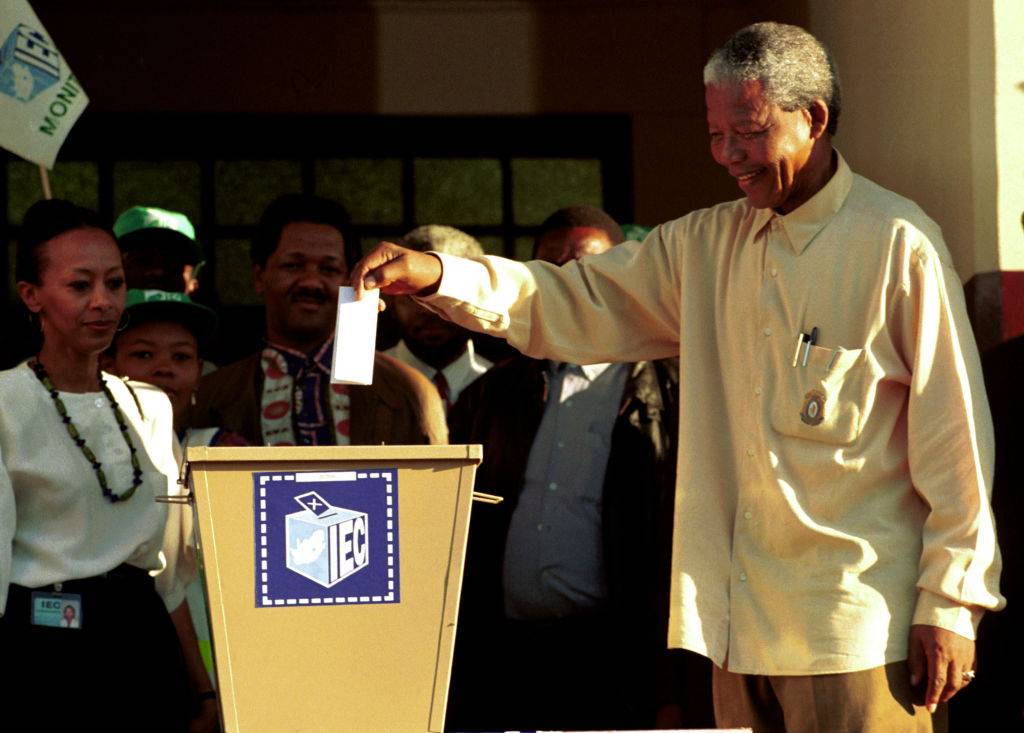
The actual process of the 1994 voting was a massive exercise in “customer education.” The Independent Electoral Commission (IEC) had to market the concept of democracy to a population where a vast majority had never been allowed to participate in the process.
Education as a Brand Touchpoint
The 1994 election required a massive “UX” (User Experience) design project. Millions of first-time voters needed to understand the mechanics of the ballot. The branding of the election itself focused on the slogan “Free and Fair.” This was the promise the brand had to deliver on. Educational campaigns used posters, radio spots, and community workshops to lower the barrier to entry, ensuring that the “customer journey” from the queue to the ballot box was as seamless as possible despite the immense logistical hurdles.
Inclusive Design in Ballot Systems
One of the most significant brand innovations during the 1994 vote was the design of the ballot paper. To ensure inclusivity for the illiterate or semi-literate, the ballot featured photographs of party leaders and colorful party logos. This use of visual semiotics ensured that the brand of each political party was instantly recognizable without the need for text. This design choice was essential for maintaining the integrity of the brand’s promise of “universal” suffrage.
Corporate South Africa and the Transition
As the 1994 elections took place, the private sector was undergoing its own rebranding crisis. Corporate brands that had flourished under the old regime needed to signal their alignment with the new democratic values to avoid being left behind.
Balancing Global Perception and Local Reality
During the Mandela voting period, major South African corporations like Anglo American, Old Mutual, and Sasol began shifting their corporate social responsibility (CSR) focus. Their branding started to emphasize “nation-building.” They recognized that the value of their own brands was now inextricably linked to the success of the South African national brand. If the country failed, their market caps would vanish.
Re-entry into the Global Market
The 1994 election served as a “Product Launch” for South Africa in the global marketplace. International brands that had pulled out of the country during the divestment movement of the 1980s—such as Coca-Cola and Pepsi—began to eye a return. The branding of the 1994 election as a “miracle” transition was essential in convincing these global entities that South Africa was a safe and aspirational market once again.
Legacy Branding: Long-term Impacts on South Africa’s Global Position
The events of 1994 created a “Brand Equity” that South Africa would trade on for decades. The image of the long voting lines became a global symbol of democratic resilience.
The “Mandela Effect” on National Export
Post-1994, the “Made in South Africa” tag gained a new layer of meaning. It became associated with the “triumph of the human spirit.” This brand halo helped South Africa win the bids for major global events, most notably the 2010 FIFA World Cup. The foundational branding work done during the 1994 election period provided the narrative framework for these future successes.
Challenges to Brand Consistency
In the years following the 1994 vote, the challenge for South Africa has been “brand consistency.” While the 1994 transition was a masterstroke of strategy, maintaining the “Rainbow Nation” brand in the face of economic inequality and political scandal has proven difficult. However, the core identity established during those four days in April 1994 remains the benchmark. The branding was so powerful that even decades later, the “1994 moment” is the primary reference point for the country’s potential.
In conclusion, what was happening during the Mandela voting of 1994 was a profound realignment of identity. Through the strategic use of personal branding, visual symbols, and inclusive communication, South Africa successfully executed a high-stakes brand pivot. It transitioned from a global pariah to a symbol of hope, proving that even the most damaged brands can be redeemed through vision, consistency, and a clear, unifying message.
aViewFromTheCave is a participant in the Amazon Services LLC Associates Program, an affiliate advertising program designed to provide a means for sites to earn advertising fees by advertising and linking to Amazon.com. Amazon, the Amazon logo, AmazonSupply, and the AmazonSupply logo are trademarks of Amazon.com, Inc. or its affiliates. As an Amazon Associate we earn affiliate commissions from qualifying purchases.