
The seemingly simple question of a warning sign’s shape unveils a sophisticated interplay of design, psychology, and global standardization crucial to brand identity, public safety, and effective communication. Far from arbitrary, the geometric forms employed in warning signage are meticulously chosen to convey immediate, unambiguous messages, transcending language barriers and cultural nuances. These shapes are a fundamental aspect of a silent, universally understood visual language, acting as critical touchpoints for informing, guiding, and protecting individuals across various environments. Understanding the rationale behind these shapes provides insight into effective visual communication and the power of design in shaping perception and behavior, whether for public infrastructure or corporate responsibility.
The Psychology of Geometric Form in Safety Communication
The human brain processes shapes and symbols at a primal level, often before explicit text is even registered. This pre-cognitive understanding makes geometric forms incredibly effective in situations where rapid comprehension is paramount, such as in warning signs. Each basic shape carries inherent psychological associations that designers leverage to communicate specific types of information and urgency.
Triangles: The Universal Call to Caution
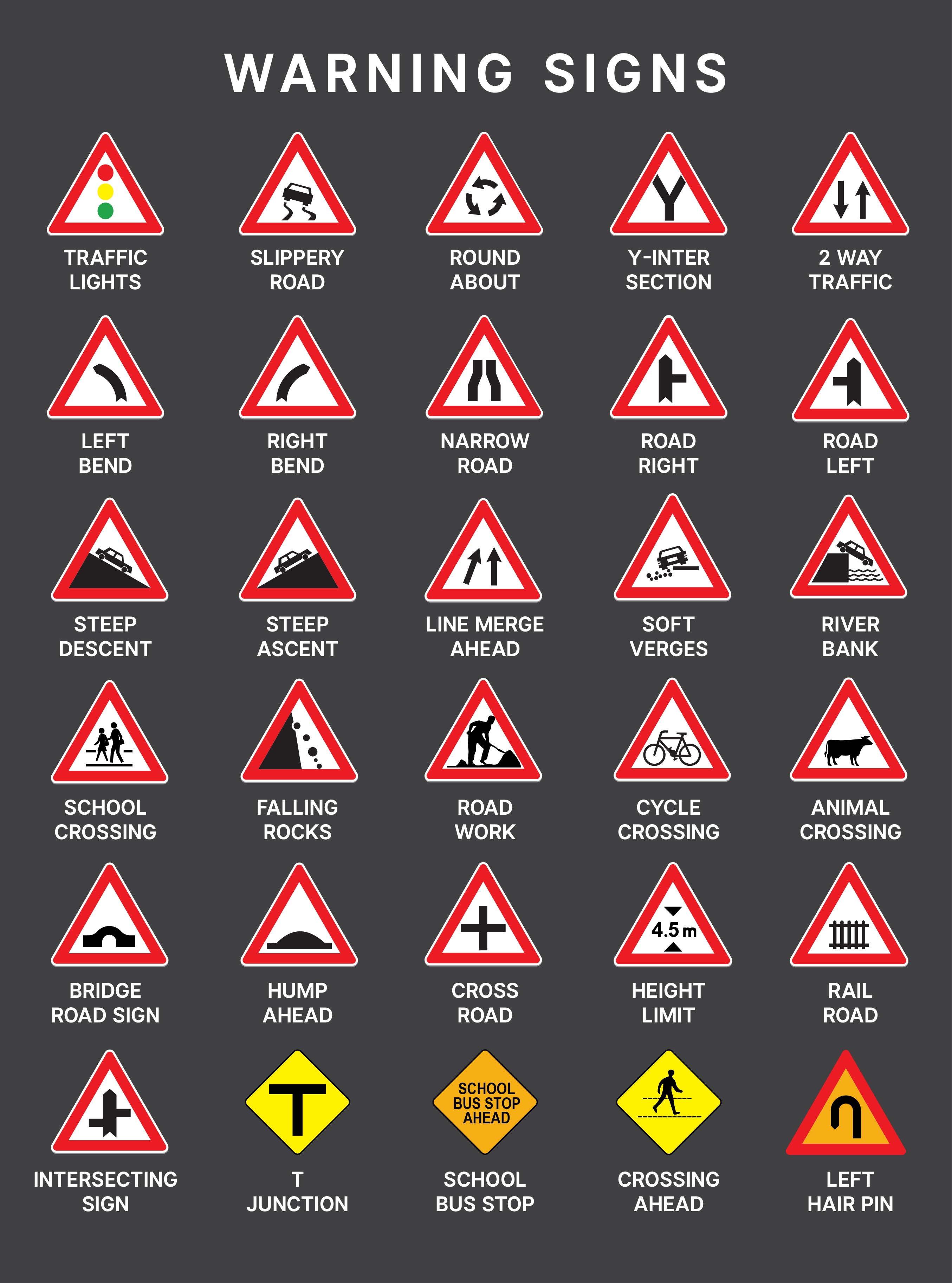
Triangles, particularly equilateral triangles with a point facing upwards, are perhaps the most universally recognized shape for warning. In many cultures, the triangle naturally conveys instability, dynamism, and a sense of impending action or change. This inherent tension makes it ideal for signaling caution or potential danger. Often depicted with a black border, a yellow background, and a black pictogram, these signs demand attention and indicate a need for vigilance. From road signs warning of curves or school crossings to industrial signs alerting to hazardous materials, the triangle’s pointed nature intuitively guides the eye towards the potential threat, compelling an immediate assessment of the surroundings. Its angularity creates a sense of urgency, firmly establishing the presence of a hazard that requires an active response from the viewer.
Diamonds: Navigating Immediate Hazards
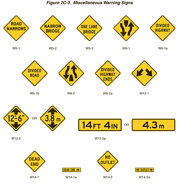
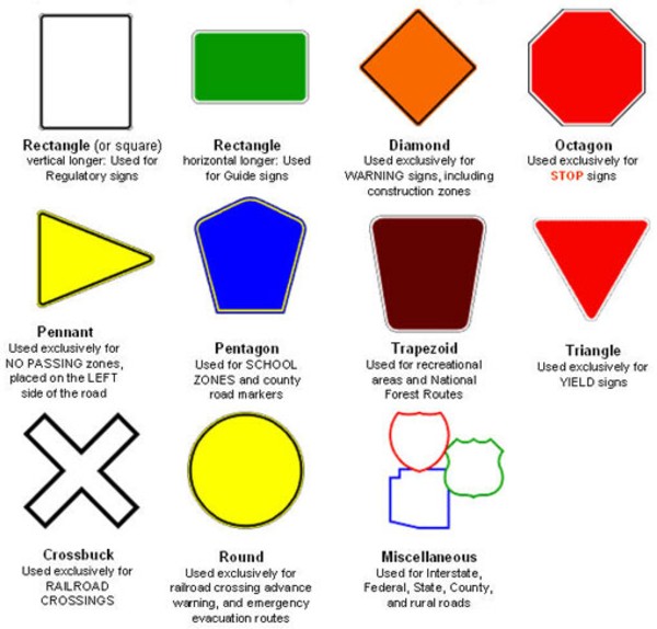
While triangles often signal a potential future hazard, the diamond shape frequently indicates a more immediate, present danger or specific road condition that demands driver awareness. In North America, for instance, diamond-shaped signs are predominantly used for road warnings, such as “slippery when wet,” “deer crossing,” or “lane reduction.” The unique orientation of the square on its point distinguishes it from other common shapes, making it stand out in a visual landscape. Its four distinct points still convey an element of caution, but the broader area within the shape allows for more detailed pictograms or brief text, offering specific information about the current condition. This shape’s effectiveness lies in its distinctiveness and its direct association with active, ongoing hazards that require immediate attention and often, a change in behavior.
Circles: Prohibition and Command
Circles, with their continuous, unbroken form, inherently convey notions of completeness, enclosure, and absolute authority. In warning sign design, circles are predominantly used for two distinct purposes: prohibition and command. When a circle features a diagonal line through its center, typically in red on a white background, it unequivocally signifies “no” or “do not.” Examples include “no smoking,” “no entry,” or “no U-turn.” The unbroken boundary of the circle reinforces the absolute nature of the prohibition, leaving no room for ambiguity. Conversely, solid blue circles often indicate a mandatory action or command, such as “wear eye protection” or “keep left.” These command signs utilize the circle’s authority to enforce compliance, guiding safe behavior through explicit instruction. In both applications, the circle’s clean, definitive shape removes uncertainty, making it a powerful tool for controlling actions and maintaining safety protocols.
Squares and Rectangles: Information and Guidance
In contrast to the urgent alerts of triangles and diamonds, or the strictures of circles, squares and rectangles are the workhorses of informational and guidance signage. Their stable, grounded nature conveys reliability and permanence, making them ideal for relaying non-critical but important details. These shapes are commonly used for general information, emergency exits, first aid locations, fire equipment, and directional guidance. For instance, square or rectangular signs with green backgrounds often denote safety equipment or escape routes, while those with blue backgrounds might indicate mandatory information or services. Their geometric simplicity and ample surface area allow for clear text, detailed pictograms, or multi-lingual messaging without visual clutter. This stability aligns perfectly with their role in providing calm, clear instruction and vital information, reinforcing a sense of order and preparedness.
Beyond Aesthetics: Brand Consistency and Global Standards
The choice of shape for warning signs extends far beyond mere aesthetics; it is deeply embedded in the principles of brand consistency, not just for individual entities but for entire industries and public safety systems globally. The effectiveness of a warning sign, much like a corporate logo, relies on its instant recognition and consistent interpretation across diverse contexts.
ISO and ANSI: Harmonizing Visual Language
To achieve this global consistency, international and national standardization bodies like the International Organization for Standardization (ISO) and the American National Standards Institute (ANSI) have developed comprehensive guidelines for safety signs. These standards dictate not only the shapes but also the colors, symbols, and even the luminosity of warning signs. The primary goal is to create a harmonized visual language that transcends linguistic and cultural barriers. For example, ISO 7010 specifies safety signs that combine a geometric shape, a specific color, and a graphical symbol to convey a particular message. This standardization means that a “flammable material” sign in Tokyo will use the same basic triangular shape, yellow background, and flame pictogram as one in Berlin or New York, ensuring immediate understanding by anyone, anywhere. This global ‘brand’ of safety helps mitigate risks by minimizing confusion and maximizing the speed of recognition, reinforcing a universal commitment to human safety. For companies operating internationally, adherence to these standards is not just a regulatory requirement but a critical component of their corporate social responsibility and a demonstration of their commitment to employee and public welfare.
The Role of Color in Reinforcing Shape
While shape provides the fundamental structure, color serves as a powerful enhancer, adding another layer of meaning and urgency to warning signs. The combination of specific shapes and colors creates a robust, multi-layered communication system.
- Yellow/Amber (often with black triangles): Universally associated with caution, warning of potential hazards.
- Red (often with circles or squares): Signifies danger, prohibition, or emergency stop, demanding immediate action. The bold contrast with white further amplifies its urgency.
- Blue (often with circles or squares/rectangles): Indicates mandatory actions or specific information, promoting compliance.
- Green (often with squares/rectangles): Signals safety, first aid, or escape routes, providing reassurance and guidance to a safe area.
This consistent color coding, when paired with the standardized shapes, creates a highly effective visual shorthand. It reinforces the sign’s message, ensuring that even in conditions of low visibility or for individuals with color blindness, the primary message can often be inferred from the shape and secondary visual cues. This synergy of shape and color is a masterclass in design for critical communication, where every element is optimized for clarity and impact.
Warning Signs as Elements of Corporate and Public Identity
Beyond their direct safety function, warning signs contribute significantly to the perceived identity of an organization or a public space. They are subtle yet powerful brand touchpoints that communicate responsibility, care, and a commitment to safety. For a company, properly designed and strategically placed warning signs are an implicit statement about their operational standards and corporate values.
Communicating Responsibility and Care
When a manufacturing plant, a construction site, or a public facility meticulously adheres to safety signage standards, it sends a clear message about its operational integrity and its prioritization of human well-being. This reflects positively on the “brand” of the organization, fostering trust among employees, visitors, and the wider community. Conversely, poorly maintained, incorrect, or absent warning signs can imply negligence, erode confidence, and even damage a brand’s reputation, especially in the event of an incident. In this sense, warning signs are an integral part of a company’s visual identity, demonstrating their dedication to responsible operation and their proactive approach to risk management. They transform abstract corporate policies into tangible, visible commitments.
Designing for Diverse Audiences and Environments
The design of warning signs also involves considering the diverse audiences that will encounter them and the varied environments in which they are placed. This requires a human-centered design approach. Signs must be legible from appropriate distances, understandable by individuals with varying levels of literacy or linguistic backgrounds, and durable enough to withstand environmental factors. This often means integrating pictograms that are globally recognized, using high-contrast colors, and ensuring appropriate sizing and placement. For example, signs in a chemical plant will differ in material and size from those in a public park, yet both must convey their warning effectively. Adapting these visual communications to specific contexts while maintaining adherence to universal design principles is a complex design challenge. It speaks to a brand’s ability to communicate effectively and inclusively, ensuring that its safety messages are accessible to all, thereby reinforcing its responsible corporate identity.
The Evolving Landscape of Warning Sign Design
While the fundamental principles of shape and color remain steadfast, the landscape of warning sign design is not static. Technological advancements and a deeper understanding of human factors are continually shaping how these critical communication tools are conceived and deployed.
Digital Integration and Dynamic Signage
The rise of digital technology introduces new possibilities for dynamic warning signs. Digital displays can change messages based on real-time conditions – for example, adjusting speed limit warnings during adverse weather or displaying specific hazard alerts only when relevant sensors are triggered. This dynamic capability allows for more context-sensitive and timely warnings, moving beyond static communication. Such signs can integrate animation, flashing lights, or even audible alerts to draw attention more effectively in rapidly changing environments. This digital evolution represents a significant leap in how brands and public entities can communicate immediate risks, offering a proactive layer of safety that traditional static signs cannot match. However, maintaining the clarity and immediate recognition of traditional shapes and colors within these dynamic displays remains crucial, ensuring that innovation enhances, rather than detracts from, universal understanding.
Human Factors and Usability in Design
The field of human factors continues to inform warning sign design, emphasizing usability and effectiveness from the perspective of the end-user. Research into cognitive load, visual processing, and reaction times helps refine the symbols, colors, and shapes to maximize impact and minimize ambiguity. This means testing signs with diverse populations, understanding how environmental factors like glare or fog affect visibility, and ensuring that the placement of signs aligns with natural lines of sight. The ultimate goal is to design warning signs that are not just aesthetically pleasing or compliant with standards, but genuinely effective in preventing accidents and promoting safe behavior. This iterative, user-centric approach to design ensures that warning signs remain potent tools in the broader strategy of public safety and brand responsibility, continuously adapting to new challenges while retaining their foundational psychological and communicative power.
aViewFromTheCave is a participant in the Amazon Services LLC Associates Program, an affiliate advertising program designed to provide a means for sites to earn advertising fees by advertising and linking to Amazon.com. Amazon, the Amazon logo, AmazonSupply, and the AmazonSupply logo are trademarks of Amazon.com, Inc. or its affiliates. As an Amazon Associate we earn affiliate commissions from qualifying purchases.