
Understanding the dimensions of poster board is a fundamental aspect of effective visual communication and graphic design. Whether you are creating a professional presentation for a corporate boardroom, a retail point-of-sale display, or a high-impact branding campaign, the canvas you choose dictates the viewer’s engagement and the clarity of your message. In the realm of design and marketing, size is not merely a measurement; it is a tactical choice that influences layout, legibility, and brand presence.
The Standard Dimensions of Poster Board
While various specialty sizes exist, the stationery and printing industry has gravitated toward specific standard sizes for poster board to maintain consistency across framing, mounting, and display equipment. Choosing the right size starts with knowing exactly what is available off-the-shelf and how those dimensions impact your layout.
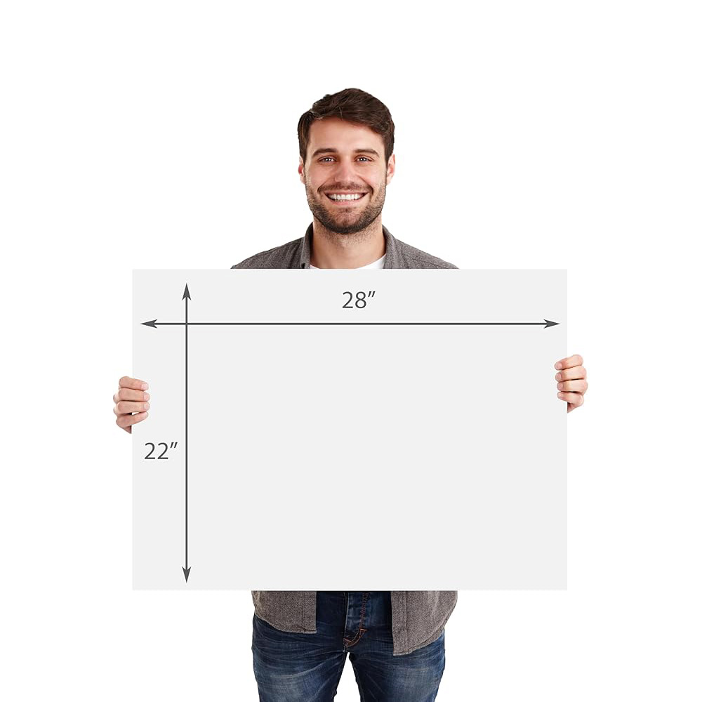
The Industry Standard: 22 x 28 Inches
The most ubiquitous size for poster board—found in almost every craft store, office supply shop, and classroom—is 22 by 28 inches. This size serves as the baseline for the majority of school projects, retail signage, and temporary event posters. From a design perspective, this aspect ratio is highly versatile, providing enough surface area to communicate a clear hierarchy of information without overwhelming the viewer. When designing for this size, you are working with approximately 616 square inches of real estate, which is sufficient for high-impact typography and one or two compelling visual anchors.
Large Format Options: 28 x 44 and Beyond
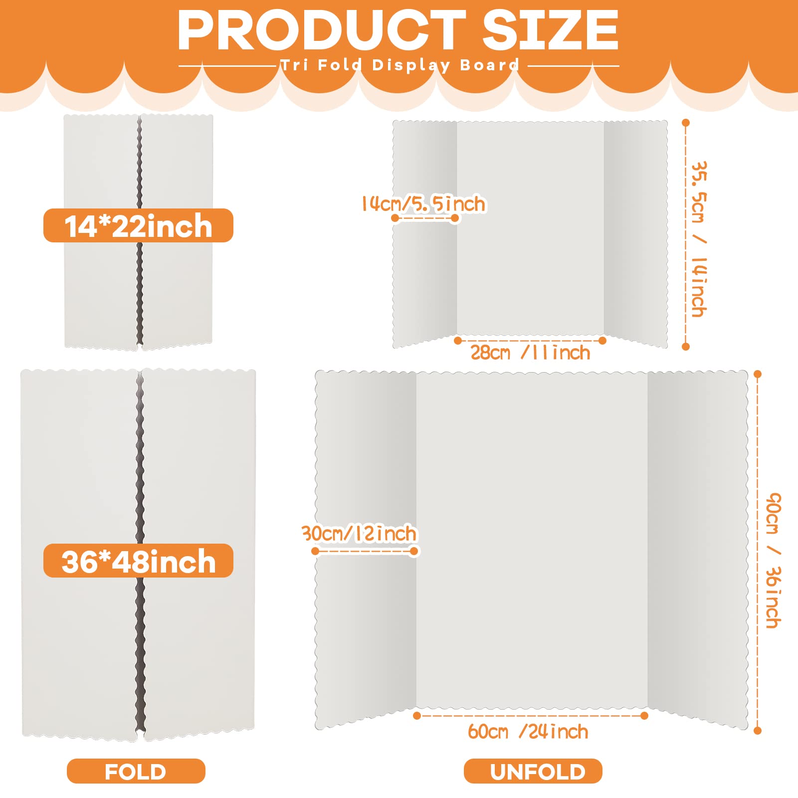
For projects that require greater visibility or more complex information density, larger formats are necessary. The 28 by 44-inch board is a common step up, often utilized for retail promotions where the poster needs to be seen from across a store aisle. Beyond these standard retail sizes, professional printing services offer custom-cut boards that can reach dimensions like 36 by 48 inches or even larger. In branding, these larger canvases are used to create immersive experiences, ensuring that the brand’s visual identity dominates the physical space it occupies.
Thickness and Weight Considerations
While “size” usually refers to the length and width, the thickness—or “ply”—of the poster board is equally critical. A poster board that is too thin will warp or buckle under the weight of adhesive materials or ink, undermining the professional aesthetic of your brand. Standard boards typically range from 12-ply to 20-ply. Selecting the right thickness is a design decision; a thicker, more rigid board signals higher quality and permanence, which is essential if the poster is intended to be a reusable part of your corporate branding kit.
Designing for Impact: Strategic Sizing and Layout
Choosing the size of a poster board is not just about the surface area available; it is about how that space interacts with the human eye. Effective design requires a deep understanding of scale and visual hierarchy. When you select a board size, you are setting the boundaries for how your audience will process your brand’s narrative.

Defining the Visual Hierarchy
Once you have selected your board size, the next step is establishing a clear visual hierarchy. On a standard 22 x 28-inch board, the primary headline should command the top third of the space, allowing the reader to immediately grasp the core message. If you opt for a smaller poster size, your hierarchy must be tighter, focusing on a single, high-impact focal point. In larger formats, you have the luxury of white space, which is a powerful tool in luxury branding; it signals confidence and allows the viewer to focus on specific brand elements without visual clutter.
The Role of Margins and Bleed
A common mistake in poster design is ignoring the “safe zone.” When working with poster board, it is vital to account for mounting hardware or potential trimming. Always leave at least a one-inch margin around the perimeter of your design. This frame of white space acts as a border that draws the eye inward, focusing attention on your content. In corporate design, consistency in these margins across different poster sizes is what creates a cohesive brand identity. If your brand uses a specific margin-to-content ratio, apply that same logic regardless of whether you are printing a small announcement poster or a large-scale event sign.
Typography and Readability by Size
The physical size of your board determines the minimum font size you can use. For a 22 x 28-inch poster viewed from five feet away, the header text should ideally be no smaller than 72 points to ensure readability. As you scale up to 28 x 44 inches, you have more room for secondary information, but you must resist the urge to fill every square inch. A well-designed poster uses size to guide the viewer’s eye through a flow of information. If the board is too large and the text is too small, the design loses its effectiveness, and the brand message is diluted.
Aligning Poster Board Choice with Brand Strategy
In the context of brand strategy, the physical medium is a direct extension of the company’s identity. The choice of poster board size communicates as much as the colors and logo printed upon it. A brand that uses large, high-quality, mounted poster boards throughout its offices or at trade shows conveys a sense of stability and prestige. Conversely, using undersized or flimsy materials can inadvertently signal a lack of attention to detail.
Contextual Relevance: Where Will the Poster Live?
The physical environment dictates the ideal size. A poster designed for a trade show booth needs to stand out against a backdrop of competitors; in this scenario, larger is almost always better. However, a poster designed for an internal company announcement in a breakroom should be appropriately sized to the wall space it occupies. If a poster is too large for its environment, it becomes an obstacle; if it is too small, it becomes invisible. Always conduct a site visit or request a floor plan before finalizing your board dimensions.
Materiality as Brand Identity
Beyond dimensions, the finish of the poster board—matte, gloss, or foam-core—is a critical brand choice. Matte finishes are often perceived as more sophisticated, high-end, and readable under bright lights, which is ideal for minimalist, luxury, or professional service branding. Gloss finishes can add vibrancy to colors but can suffer from glare, making them tricky in certain lighting conditions. Foam-core boards, which are essentially thick poster boards with a rigid foam center, offer a 3D presence that feels substantial and premium. Your choice of board material should align with your brand’s voice: is it bold and energetic (gloss/foam-core) or understated and elegant (matte)?
Scalability and Digital Integration
Modern brand strategy often involves cross-channel integration. A poster board is rarely a standalone asset; it is often part of a campaign that includes social media graphics, email headers, and web banners. When planning your poster design, ensure your logo, fonts, and color palette are scalable. A design that works well on a 22 x 28-inch board should be easily adaptable to a smaller format. Consistency across these various sizes is the hallmark of a mature brand. When the audience sees the same visual language on a small flyer as they do on a large poster board at an event, it reinforces brand recognition and builds trust.
Final Best Practices for Execution
To ensure your poster board projects achieve the desired impact, follow these final professional guidelines:
- Mockups First: Always print a scaled-down version of your design on an 8.5 x 11-inch sheet to check the balance of elements before printing at full scale.
- High-Resolution Assets: Remember that as you increase the size of the board, the resolution requirements for images and logos increase exponentially. Ensure all assets are vector-based or high-DPI (at least 300) to prevent pixelation on larger prints.
- Lighting Assessment: Consider where the board will be displayed. If it will be under harsh overhead lighting, avoid high-gloss finishes that create distracting reflections.
- Consistency: If you are deploying multiple boards across a space, maintain consistent color profiles and font weights to ensure the environment feels curated rather than cluttered.
By treating the size of your poster board as a deliberate branding decision rather than an afterthought, you elevate the quality of your visual communication. Whether you stick to the standard 22 x 28-inch size or venture into custom, larger formats, your goal remains the same: to command space, capture attention, and communicate your brand’s core values with clarity and impact.
aViewFromTheCave is a participant in the Amazon Services LLC Associates Program, an affiliate advertising program designed to provide a means for sites to earn advertising fees by advertising and linking to Amazon.com. Amazon, the Amazon logo, AmazonSupply, and the AmazonSupply logo are trademarks of Amazon.com, Inc. or its affiliates. As an Amazon Associate we earn affiliate commissions from qualifying purchases.