
In the high-stakes world of cinematic marketing, the movie poster remains the most iconic and enduring touchpoint of a film’s brand identity. While digital trailers and social media campaigns generate immediate buzz, the physical presence of a movie poster in a theater lobby or on a city street provides a tangible sense of scale and permanence. For marketers, designers, and brand strategists, understanding the “standard” size of a movie poster is not merely a matter of measurements; it is about mastering the canvas upon which a brand’s visual narrative is built.
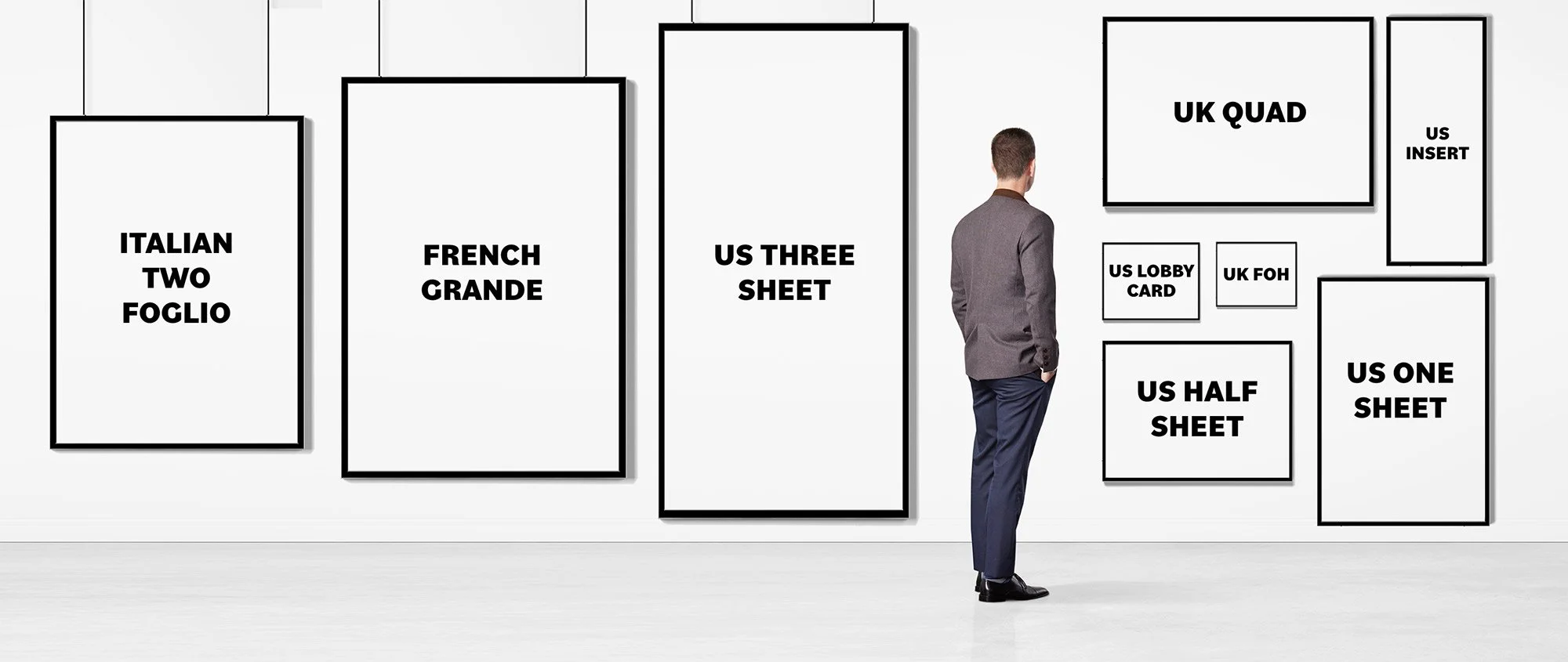
To the uninitiated, a poster is simply a piece of printed paper. However, in professional branding, dimensions dictate the hierarchy of information, the placement of the “billing block,” and the psychological impact on the viewer. Choosing the right format ensures that the film’s visual identity is preserved across various environments, from high-traffic urban centers to the intimate corridors of a local cinema.
The One-Sheet: The Gold Standard of Cinematic Branding
When industry professionals speak of a “standard” movie poster, they are almost exclusively referring to the “One-Sheet.” This is the universal format utilized by major studios and independent distributors alike to represent a film’s primary brand identity during its theatrical run.
Dimensions and Technical Specifications
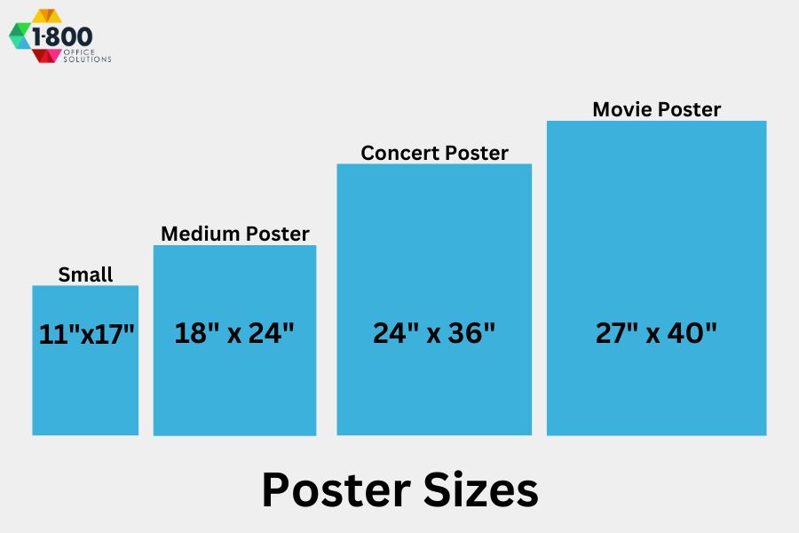
The modern standard One-Sheet measures 27 x 40 inches (approximately 68.6 x 101.6 cm). It is important to note that prior to the 1980s, the standard was slightly different, often measuring 27 x 41 inches. The shift to 40 inches allowed for more streamlined mass production and standardized framing in modern multiplexes.
From a design and branding perspective, the 27 x 40-inch canvas offers a specific aspect ratio (roughly 2:3) that has become synonymous with “theatricality.” This vertical orientation is optimized for human eye-tracking, allowing a designer to lead the viewer from the “hook” (the main visual or star) down to the “payoff” (the title) and finally to the “call to action” (the release date and credits).
Why 27 x 40 Inches Matters for Brand Consistency
Brand consistency is the cornerstone of any successful marketing campaign. The One-Sheet acts as the “source of truth” for a film’s visual assets. Because theater lightboxes are built specifically to accommodate these dimensions, any deviation can result in a distorted brand image—either through awkward cropping or visible gaps in the display.
Furthermore, modern One-Sheets are typically printed as “double-sided” on a semi-gloss or high-gloss stock. This means the image is printed in reverse on the back of the paper. When placed in a theater’s backlit frame, the light passes through the ink on both sides, significantly increasing the saturation and contrast of the colors. For a brand, this ensures that the “visual punch” of the poster is maintained regardless of the ambient lighting in the theater, making the colors pop and the shadows deep and cinematic.
Beyond the One-Sheet: Diversifying the Visual Presence
While the One-Sheet is the primary asset, a comprehensive brand strategy requires a multi-format approach. Different environments demand different scales to effectively communicate the film’s message and capture the audience’s attention.
Bus Shelters and Large Format Displays
In urban environments, the “Bus Shelter” poster—often referred to as a “6-Sheet”—is a critical tool for outdoor branding. Measuring 40 x 60 inches, these posters are significantly larger than the theatrical One-Sheet. The purpose of this size is visibility from a distance.
When designing for a 40 x 60 canvas, brand strategists must account for “glance time.” Because people are often driving or walking past these displays, the visual identity must be simplified. This is where the core brand elements—usually a single iconic image and a massive title—take precedence over the fine details of a billing block. The large format commands the physical space, asserting the film’s status as a “must-see” event.
Teaser Posters vs. Main Theatrical Releases
The size of the poster often remains the same (27 x 40 inches) for both teaser and main theatrical versions, but the branding strategy shifts.
- Teaser Posters: These are released months before the film. They often feature minimal text, a single striking image, or just a logo. The goal is to build brand intrigue and “mystery.”
- Theatrical Posters: These are the final branding pieces. They include the full cast list, the “credits block,” and usually a more complex composition.
By maintaining the same standard size for both, studios create a sense of continuity. The viewer recognizes the shape and placement of the poster in the lobby, reinforcing the brand over several months of exposure.
Inserts and Half-Sheets: The Legacy Formats
While less common today, formats like the “Insert” (14 x 36 inches) and the “Half-Sheet” (22 x 28 inches) were once staples of movie branding. These smaller, landscape-oriented or narrow-vertical posters were designed for tight spaces like elevator banks or small theater foyers. Today, these sizes are primarily the domain of collectors and boutique distributors, but they serve as a reminder that brand visibility must be adaptable to the physical constraints of the environment.
The Psychology of Scale in Brand Identity
The dimensions of a movie poster do more than just fit into a frame; they dictate how a consumer interacts with the brand. There is a psychological component to scale that professional marketers leverage to create an emotional response.
Command of Physical Space
A 27 x 40-inch poster is large enough to be immersive but small enough to be viewed at eye level. When a viewer stands in front of a professionally lit One-Sheet, the poster occupies a significant portion of their field of vision. This creates a psychological “handshake” between the brand and the consumer. The scale signals that the product (the film) is a premium experience, worthy of high-quality printing and dedicated display space.
In branding, “white space” or “negative space” is often used to convey luxury or sophistication. The standard movie poster size provides enough real estate to utilize negative space effectively. A minimalist poster for a prestigious drama uses the large canvas to isolate a single character, creating a sense of loneliness or intensity that would be lost on a smaller, postcard-sized flyer.
Hierarchy and Information Architecture
The standard size allows for a proven information architecture. In branding, we talk about the “Three-Second Rule”: a viewer should understand the essence of the brand within three seconds.
- The Visual (The Who/What): Occupies the top 60-70% of the poster.
- The Title (The Brand Name): Dominates the lower-middle section.
- The Release Date (The Call to Action): Placed clearly at the bottom.
- The Billing Block (The Verification): Small text at the very bottom that lends “industry authority” to the brand.
This hierarchy is only possible because of the 40-inch height. If the poster were smaller, the billing block would become illegible, or the title would have to be shrunk, diminishing the brand’s impact.
Production and Implementation Strategy
A brand is only as good as its execution. In the movie industry, the production phase of the poster is where the strategy meets the physical world.
Material Selection and Brand Perception
The “feel” of a poster contributes to the brand’s perceived value. Standard One-Sheets are typically printed on 100lb or 80lb gloss paper. For high-end “prestige” films or limited-run “art house” brands, studios may opt for heavier matte paper or even screen-printed versions.
These choices are strategic. A glossy finish suggests a high-octane, big-budget blockbuster—vibrant, shiny, and commercial. A matte finish suggests an intellectual, artisanal, or “indie” brand identity. The size remains the same, but the tactile quality changes the brand story.
Managing Global Distribution Standards
Film is a global business, and branding must be consistent across borders. While 27 x 40 inches is the North American standard, the “Quad” poster (30 x 40 inches) is the standard in the United Kingdom.
The Quad is a landscape (horizontal) format. This presents a unique branding challenge: how do you take a brand identity designed for a vertical 2:3 ratio and adapt it to a horizontal 4:3 ratio? Strategic branding requires that the key art be designed with “bleed” and flexible composition so that whether the poster is a US One-Sheet or a UK Quad, the brand remains instantly recognizable. This modular approach to design is essential for maintaining brand equity in international markets.
The Evolution of Poster Size in the Digital Age
As we move toward an increasingly digital landscape, the concept of “poster size” is expanding. While the physical 27 x 40-inch sheet remains the crown jewel, brand designers must now think in terms of “Digital One-Sheets.”
Integrating QR Codes and Interactive Elements
Modern poster branding often includes a bridge between the physical and digital worlds. Designers are now incorporating QR codes into the standard layout. This requires a careful balance; the code must be large enough to be functional but small enough not to disrupt the brand’s visual flow. By placing a QR code on a 27 x 40-inch poster, the brand transforms a static image into a gateway for a trailer, a ticket-buying platform, or an augmented reality (AR) experience.

The Future of Static Assets in a High-Tech World
Despite the rise of motion posters—digital screens that show moving versions of the artwork—the dimensions of these screens almost always mimic the 27 x 40-inch One-Sheet. This suggests that the “Standard Movie Poster Size” has moved beyond paper; it has become a standardized aspect ratio for cinematic storytelling.
Whether it is a printed sheet of paper or a 4K LED display, the 2:3 vertical ratio remains the most effective way to frame the “hero” of a story. It honors the legacy of cinematic branding while providing a consistent framework for future innovation. For any brand operating in the entertainment space, the standard movie poster size is not just a constraint—it is the ultimate platform for visual impact.
aViewFromTheCave is a participant in the Amazon Services LLC Associates Program, an affiliate advertising program designed to provide a means for sites to earn advertising fees by advertising and linking to Amazon.com. Amazon, the Amazon logo, AmazonSupply, and the AmazonSupply logo are trademarks of Amazon.com, Inc. or its affiliates. As an Amazon Associate we earn affiliate commissions from qualifying purchases.