
In the competitive landscape of modern commerce, a brand’s visual identity is often the first—and sometimes only—chance to make a lasting impression on a consumer. While many business owners focus on typography or catchy slogans, the most visceral element of branding is color. Among the most complex and evocative colors in the spectrum is purple. But to truly harness the power of purple in a professional context, one must understand its visual and psychological antithesis.
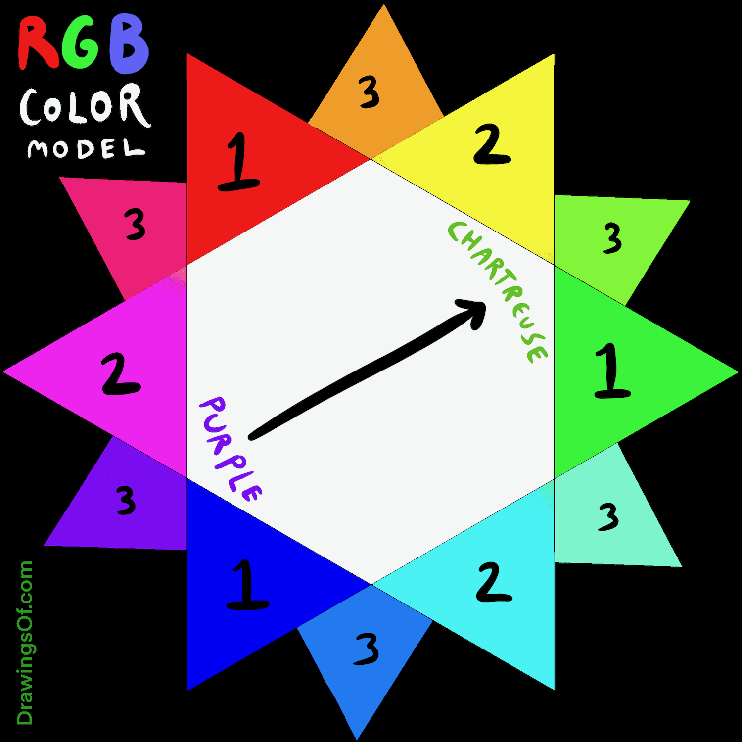
So, what is the opposite color of purple? In the world of traditional color theory and brand design, the direct complementary opposite of purple is yellow. This relationship is not merely a quirk of the color wheel; it is a foundational principle that drives some of the world’s most successful corporate identities. By exploring why these two colors sit across from each other, brand strategists can unlock new levels of visual impact, accessibility, and emotional resonance.

The Science of Color Contrast: Defining the Complementary Relationship
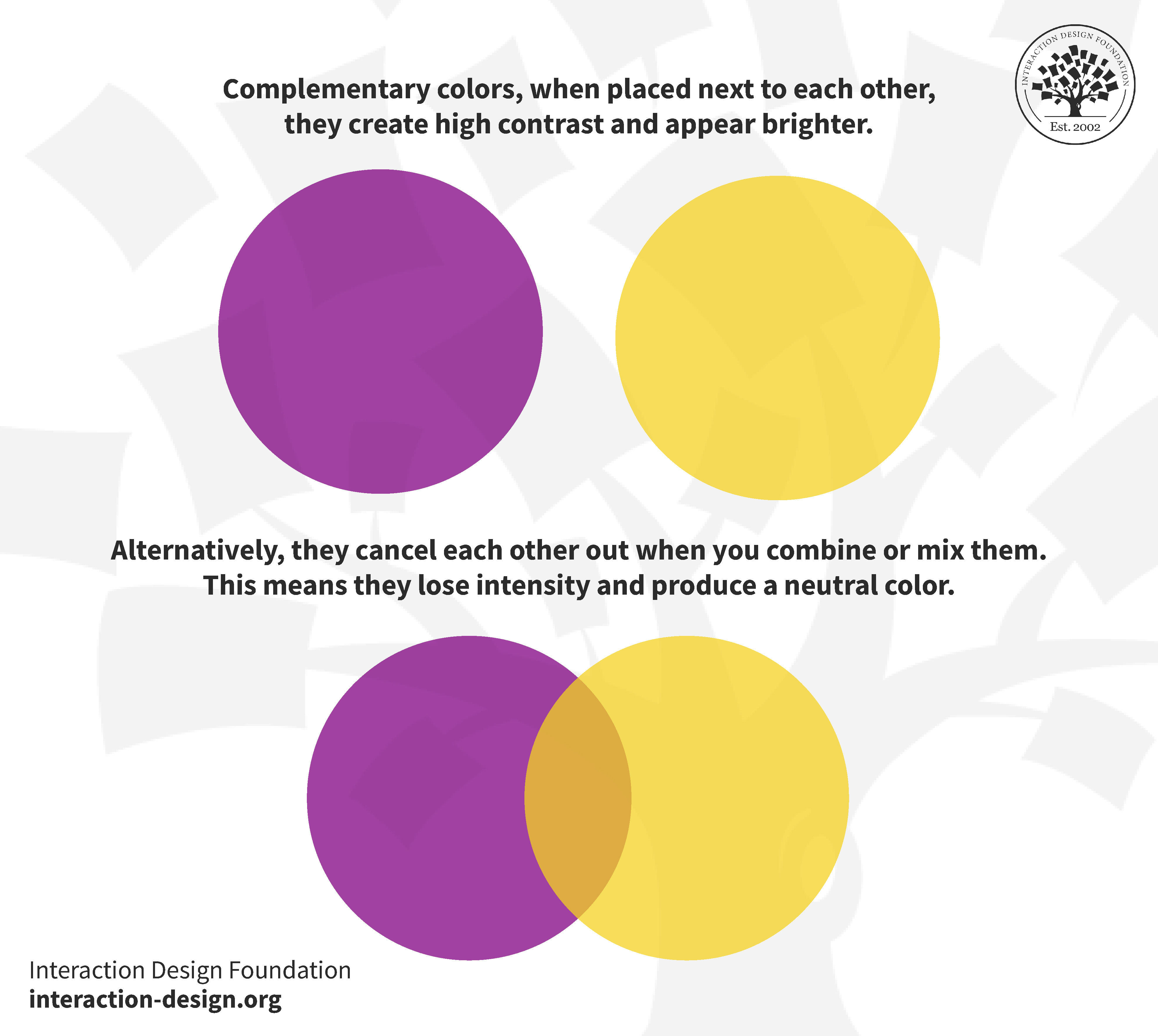
To understand why yellow is the opposite of purple, we must look at the mechanics of human perception and the history of color theory. This relationship is defined by “complementary colors”—hues that, when placed next to each other, create the strongest possible contrast and reinforce each other’s intensity.
The Color Wheel and the Golden Rule of Opposites
The concept of the color wheel, first pioneered by Sir Isaac Newton in the 17th century, remains the cornerstone of modern design. On a standard RYB (Red, Yellow, Blue) color wheel, colors are arranged in a circle based on their spectral frequency. Purple is a secondary color, created by mixing the primaries red and blue. When you draw a straight line from purple through the center of the wheel, it lands directly on yellow.
This positioning is significant for brand strategists because complementary colors occupy different “temperature” zones. Purple is fundamentally a cool color, leaning toward the stability of blue and the depth of the night. Yellow is the ultimate warm color, representing light, heat, and energy. This temperature gap is what creates the “vibration” often seen when the two colors touch, a phenomenon that forces the human eye to take notice.
The Optical Physics of Purple and Yellow
From a physiological standpoint, our eyes perceive color through cone cells that are sensitive to different wavelengths. When we stare at a vibrant purple shape for an extended period and then look at a white wall, we often see a “ghost image” or afterimage in yellow. This occurs because the photoreceptors sensitive to purple become fatigued, and the brain compensates by firing the signals for its opposite.
In brand strategy, this means that a purple-and-yellow palette isn’t just a choice; it’s a biological imperative. The brain seeks balance, and by providing both a color and its complement, a brand provides a “complete” visual experience that feels harmonious yet high-energy.
Why Complementary Colors Command Human Attention
In a crowded marketplace—whether on a supermarket shelf or a digital app store—the goal of design is to break through the “visual noise.” Because purple and yellow are opposites, they provide the highest level of luminance contrast. This makes the pair ideal for “Call to Action” (CTA) buttons, logos that need to stand out against urban backdrops, and packaging that must be legible from a distance. Understanding this “opposite” relationship allows a brand to dictate where a consumer looks first.
Psychological Resonance: Leveraging Purple and Yellow in Brand Identity
Color is the most immediate tool for storytelling. When a brand chooses purple, it is invoking a specific set of cultural and emotional associations. When it introduces the opposite—yellow—it balances those associations to create a more nuanced brand personality.
Purple: The Aura of Luxury, Wisdom, and Mystery
Historically, purple was the most expensive dye to produce, making it the exclusive domain of royalty and the ecclesiastical elite. Even in the digital age, purple retains an air of premium quality, sophistication, and luxury. It is also associated with creativity, mystery, and the “premium” tier of service. Brands like Hallmark, FedEx (the “Ex” portion), and various high-end skincare lines use purple to signal that they offer something beyond the mundane.
Yellow: The Spark of Optimism, Energy, and Clarity
On the other side of the spectrum, yellow is the color of the sun. It triggers the release of serotonin in the brain, leading to feelings of happiness, optimism, and spontaneity. It is also the most visible color in the spectrum, which is why it is used for high-visibility vests and road signs. In branding, yellow communicates affordability, speed, and friendliness. Icons like McDonald’s, Nikon, and IKEA utilize yellow to appear accessible and energetic.
The Strategic Synergy of High-Contrast Pairing
When a brand uses the opposite of purple to complement its primary palette, it creates a “balanced archetype.” For example, a luxury brand that uses only purple might seem unapproachable or overly somber. By adding yellow accents, the brand retains its “premium” status but adds a layer of warmth and accessibility. This duality is essential for brands that want to be perceived as both high-quality and customer-centric. The “opposite” relationship prevents the brand from feeling one-dimensional.
Practical Application: Case Studies in High-Contrast Branding
Theory is valuable, but the efficacy of the purple-yellow opposition is best seen in real-world brand executions. These examples demonstrate how the “opposite” effect translates into market dominance and instant recognition.
Sports Branding: The Power of the Los Angeles Lakers
Perhaps the most famous use of this color opposition is the Los Angeles Lakers. Their “Purple and Gold” (a saturated yellow) identity is one of the most recognizable in global sports. The purple represents the “royalty” of the franchise and its storied history, while the gold/yellow provides the high-energy “showtime” vibe of Los Angeles. Because these colors are opposites, the jerseys pop brilliantly against the hardwood floor and on television screens, making the brand unmistakable even to non-fans.
Retail and Digital Presence: Creating Visual Pop
Consider brands that operate in the digital space. A purple interface with yellow notification icons or “Buy Now” buttons utilizes the “opposite” rule to drive conversions. Because the eye is naturally drawn to the contrast between a cool purple background and a warm yellow element, the user’s journey is subconsciously guided toward the desired action. This is not accidental; it is a calculated use of color theory to improve User Experience (UX) and Brand Experience (BX).
Avoiding “Visual Fatigue” in Brand Collateral
Strategic use of opposites also prevents visual fatigue. A brand deck or a corporate website that is entirely purple can become oppressive and heavy. By utilizing the opposite color—yellow—as a highlight for bullet points, headers, or key data visualizations, the designer introduces “visual breathing room.” This keeps the audience engaged for longer periods, an essential factor in B2B branding and long-form corporate storytelling.
Digital Branding and Accessibility: Contrast in the User Experience
In the modern era, brand strategy is inseparable from digital accessibility. Understanding the relationship between purple and yellow is no longer just about aesthetics; it is about inclusivity and meeting global standards for legibility.
The Role of Complementary Colors in UI Design
In User Interface (UI) design, the “opposite” rule is often applied to ensure that text is readable. For a brand with a deep purple corporate identity, using white text is a standard choice, but using a pale yellow (its complement) can actually improve readability for certain users by reducing the harshness of the contrast while maintaining high visibility. This subtle shift can make a brand’s digital presence feel more sophisticated and thoughtfully engineered.
Designing for Inclusive Brand Experiences
Web Content Accessibility Guidelines (WCAG) require specific contrast ratios to ensure that individuals with visual impairments can navigate digital assets. Because purple (a dark value) and yellow (a light value) are naturally far apart in terms of luminance, they are a “safe” pairing for accessibility. Brands that prioritize this “opposite” relationship find it much easier to pass accessibility audits, which protects the brand’s reputation and ensures its message reaches the widest possible audience.
Testing Contrast Ratios for Global Brand Expansion
When a brand expands into global markets, color meanings can shift. However, the optical reality of contrast remains constant. By sticking to the “opposite” rule, a brand ensures that its visual hierarchy remains intact regardless of the cultural context. Whether in Tokyo, London, or New York, the human eye will always find the contrast between purple and yellow striking and legible.
Implementing Your Color Strategy: A Roadmap for Emerging Brands
For a new business or a brand undergoing a refresh, choosing a palette is a high-stakes decision. If purple is on the shortlist, the strategy must account for its opposite to ensure a well-rounded identity.
Identifying Your Primary Brand Archetype
Before committing to the purple-yellow contrast, a brand must identify its core archetype. Is the brand the “Magician” (Purple)? If so, the yellow accents should be used sparingly to maintain an air of mystery. Is the brand the “Jester” or the “Everyman” (Yellow)? If so, purple should be used as a grounding element to add a touch of professional weight to an otherwise playful identity.
Selecting Accents and Support Palettes
Branding rarely stops at just two colors. A sophisticated brand strategy uses the “opposite” relationship as a starting point. From there, designers can develop “split-complementary” palettes—using purple with yellow-orange and yellow-green. This softens the intensity of the direct opposite while maintaining the dynamic energy that high-contrast pairings provide.
Long-Term Brand Equity and Color Consistency
Finally, the most successful brands are those that “own” their color space. By understanding that yellow is the opposite of purple, a brand can create a comprehensive style guide that dictates exactly how these colors interact. This consistency builds brand equity; over time, consumers don’t just see colors—they see the brand. Whether it’s the flash of a yellow logo on a purple shopping bag or a purple app icon with a yellow notification dot, the strategic use of opposites ensures the brand remains etched in the consumer’s mind.
In conclusion, the opposite of purple is more than just a color on a wheel; it is a strategic tool for contrast, clarity, and emotional balance. By mastering the relationship between purple and yellow, brand architects can build identities that are not only beautiful but are also scientifically optimized for the human eye and the global market.
aViewFromTheCave is a participant in the Amazon Services LLC Associates Program, an affiliate advertising program designed to provide a means for sites to earn advertising fees by advertising and linking to Amazon.com. Amazon, the Amazon logo, AmazonSupply, and the AmazonSupply logo are trademarks of Amazon.com, Inc. or its affiliates. As an Amazon Associate we earn affiliate commissions from qualifying purchases.