
The seemingly insignificant dot adorning the lowercase ‘i’ and ‘j’ is a fundamental element of our written language, yet its name and function are often overlooked. This small typographical mark, known as a tittle, carries a surprising amount of weight in legibility, aesthetic appeal, and even the historical development of writing systems. In the realm of Brand identity and Design, understanding such granular details can elevate a visual message from merely functional to exceptionally impactful. This article will delve into the nomenclature, historical evolution, and crucial design considerations of the tittle, exploring its significance in contemporary branding and digital experiences.

The Nomenclature and Historical Roots of the Tittle
The term “tittle” itself is less common in everyday parlance than the letter it modifies, leading to a degree of mystery surrounding its identity. However, its origins are intertwined with the very evolution of alphabetic scripts and the practicalities of writing.
Defining the Tittle: Beyond a Simple Dot
At its core, a tittle is the small, distinct mark placed above lowercase letters like ‘i’ and ‘j’. It serves a critical disambiguating function, distinguishing these letters from similar-looking marks in certain fonts, particularly in cursive or rapidly written script. Historically, this distinction was vital for readability. Imagine the potential confusion in medieval manuscripts without clear differentiation between an ‘i’, an ‘l’, and a series of ascenders. The tittle, in this context, acts as a visual anchor, preventing misinterpretations and ensuring clarity.
The origin of the word “tittle” is thought to be derived from the Latin “titulus,” meaning “title” or “inscription,” which itself relates to the concept of a small mark or sign. Over time, this evolved into “tittle” in Old English, referring to a very small point or mark. It’s a testament to the enduring nature of typographical elements that a term from such ancient linguistic roots still accurately describes a mark we encounter countless times a day.
The Evolution from Scribe’s Mark to Digital Glyph
The tittle’s journey from a handwritten flourish to a digital element is a fascinating narrative of adaptation and preservation of form. In early handwritten scripts, the tittle was often more fluid and varied. Scribes, particularly in the context of Gothic script, developed distinct styles for these marks, sometimes elongating them or adding a slight flourish. This was partly for aesthetic reasons and partly to ensure legibility against the dense, angular forms of these scripts.
The advent of the printing press brought a need for standardization. As typefaces were designed and cast, the tittle became a more consistent and geometric element. Early printers and type designers had to decide on the precise size, shape, and placement of the tittle to ensure optimal legibility on the printed page. This process of standardization laid the groundwork for the typographic conventions we adhere to today.
In the digital age, the tittle has transcended its purely functional role and become a crucial component of digital typography. Screen resolutions and rendering technologies present new challenges and opportunities. Designers must ensure that the tittle remains clear and distinct even at small sizes on various displays. The digital tittle, therefore, is not merely a historical artifact but an active participant in the ongoing evolution of how we communicate visually through text.
The Tittle’s Role in Typographic Legibility and Brand Clarity
While its name might be obscure, the tittle’s impact on how we read and perceive written information is profound. Its presence, or indeed absence, can subtly but significantly influence the legibility of text and, by extension, the clarity of a brand’s message.
Ensuring Readability: The Functional Imperative of the Tittle
The primary function of the tittle is to enhance legibility. In many fonts, especially sans-serif and serif typefaces, the lowercase ‘i’ and ‘j’ can appear very similar to other strokes or simply as vertical lines without the distinguishing dot. Consider the visual similarities between an ‘i’, an ‘l’, and the ascender of a ‘t’ in certain condensed typefaces. The tittle provides an essential visual cue that helps the reader’s eye quickly differentiate these characters.
This is particularly important in blocks of text where rapid scanning and recognition of individual letters are crucial for comprehension. Without the tittle, reading speed would decrease, and the effort required to parse the text would increase, leading to reader fatigue. In a branding context, this translates directly to how easily a message can be consumed and understood. If a brand’s name or tagline is difficult to read due to poor typographic choices, its message can be lost before it’s even fully absorbed.
Furthermore, the tittle plays a role in distinguishing between uppercase and lowercase letters. While less of an issue with ‘i’ and ‘j’ specifically, the general principle of distinguishing marks is fundamental to typography. The consistent presence of the tittle reinforces the structure and rhythm of written language, contributing to a smooth reading experience.
The Aesthetic Dimension: Style and Personality of the Tittle

Beyond its functional imperative, the tittle also carries significant aesthetic weight. The design of the tittle – its shape, size, weight, and spacing relative to the letter itself – can subtly alter the overall feel and personality of a typeface, and consequently, a brand.
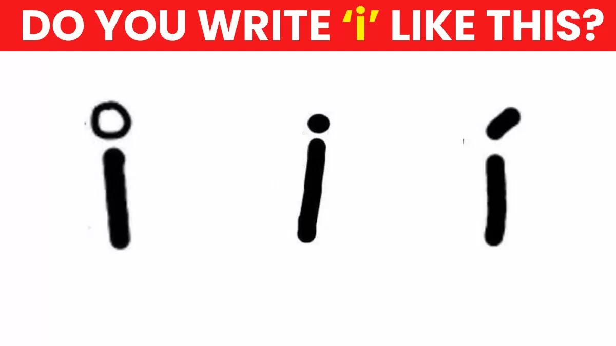
Different typefaces employ different styles of tittles. Some are perfectly round, others are slightly oval or even squared. Their weight can vary from a delicate hair stroke to a bolder, more substantial dot. The distance between the tittle and the main body of the letter also contributes to the visual rhythm and balance of the text.
In branding, these subtle differences can communicate a great deal. A rounded, soft tittle might evoke a sense of warmth, approachability, or playfulness. A sharper, more geometric tittle could convey precision, modernity, or sophistication. A slightly larger or heavier tittle might lend a feeling of boldness or emphasis. For designers crafting a brand’s visual identity, the choice of typeface and, by extension, the characteristics of its tittles, becomes a nuanced decision that contributes to the brand’s persona and its ability to connect with its target audience.
The Tittle in Digital Design and Branding Strategies
In the contemporary digital landscape, the tittle’s importance is amplified. As brands increasingly exist as digital entities, the nuances of typography in screens, apps, and web interfaces become paramount. Here, the tittle is not just a typographical element but a micro-detail that can impact user experience and brand perception.
Optimizing for Digital Screens: Resolution, Rendering, and Responsiveness
The digital environment presents unique challenges for typography. Pixels, the building blocks of digital displays, have inherent limitations in rendering fine details. At very small font sizes, a tittle can easily become blurred, merge with other parts of the letter, or even disappear altogether if not designed with digital legibility in mind.
Modern font design for digital use incorporates considerations for screen rendering. Typefaces intended for web and app use often have optimized tittles that are designed to remain clear and distinct across a range of screen resolutions and sizes. This might involve slightly larger tittles, specific spacing adjustments, or subtle modifications to their shape to ensure they render crisply on even the smallest mobile displays.
The concept of responsiveness also applies to typography. A well-designed brand typeface will ensure that the tittle maintains its intended visual impact and legibility as the text scales up or down across different devices. This meticulous attention to detail, down to the humble tittle, contributes to a seamless and professional user experience, reinforcing the brand’s commitment to quality and user-centric design.
Brand Identity and the Subtle Power of the Tittle
For brands, typography is a critical component of their visual identity, as vital as their logo or color palette. The choice of typeface communicates personality, values, and overall aesthetic. The tittle, as a constituent element of that typeface, plays a role in this communication, however subtle.
Consider brands that utilize very distinctive typefaces. The characteristic way their tittles are rendered can become an unconscious signal to consumers about the brand’s nature. A brand aiming for a classic, sophisticated image might choose a serif typeface with elegant, delicate tittles. Conversely, a tech startup emphasizing innovation and dynamism might opt for a sans-serif font with sharp, geometric tittles.
In branding case studies, designers often highlight how specific typographic choices contribute to a brand’s success. While the tittle might not be the primary talking point, its harmonious integration within the overall typographic system is essential. A misplaced, poorly rendered, or aesthetically dissonant tittle can detract from the intended brand message, creating a subliminal sense of discord or unprofessionalism.
Therefore, understanding the tittle’s role empowers designers and brand strategists to make more informed decisions. It’s about recognizing that every element of visual communication, no matter how small, contributes to the holistic perception of a brand. By paying attention to the tittle, brands can ensure that their visual language is not only legible and functional but also nuanced and evocative, effectively conveying their unique identity to their audience.
The Tittle as a Design Signature: Beyond the Obvious
In some instances, the tittle can even become a subtle design signature, a characteristic that, when consistently applied, subtly reinforces brand recognition. While not as overt as a logo, the unique styling of a tittle within a brand’s primary typeface can contribute to a distinct visual language that, over time, becomes associated with the brand.
This is particularly relevant in digital interfaces and applications where consistent typographic elements build familiarity and trust. When a user encounters a familiar “i” or “j” with a recognizable tittle, it can contribute to a sense of continuity and reinforce the brand’s presence. This is a testament to the power of consistent, detailed design that permeates every aspect of the user experience.
Ultimately, the tittle, often taken for granted, is a vital element of written communication and a surprisingly significant consideration in the sophisticated world of brand design and digital experiences. Its journey from a scribal necessity to a carefully crafted digital glyph underscores the enduring importance of detail in conveying clear, impactful messages.
aViewFromTheCave is a participant in the Amazon Services LLC Associates Program, an affiliate advertising program designed to provide a means for sites to earn advertising fees by advertising and linking to Amazon.com. Amazon, the Amazon logo, AmazonSupply, and the AmazonSupply logo are trademarks of Amazon.com, Inc. or its affiliates. As an Amazon Associate we earn affiliate commissions from qualifying purchases.