
In the modern digital landscape, a brand’s identity is much more than a logo or a catchy slogan. It is a cohesive visual language that communicates values, functionality, and personality at a glance. For Discord, a platform that has evolved from a niche tool for gamers to a global communication hub for millions, typography plays a central role in this identity. When users ask, “What is the Discord font?” they are usually looking for a technical answer, but the reality involves a sophisticated brand strategy that balances legacy, community, and future-proof design.

Discord’s current primary typeface is a custom-designed font known as gg sans. This shift to a bespoke typeface marks a significant milestone in Discord’s brand evolution, moving away from off-the-shelf solutions toward a proprietary visual language that embodies the platform’s unique culture.
The Evolution of Discord’s Typography
To understand where Discord’s visual identity stands today, one must look back at its origins. Typography is often the most subtle yet powerful tool in a designer’s arsenal, and Discord has utilized it to pivot its market positioning several times.
From Uni Sans to a Custom Identity
In its early years, Discord relied heavily on Uni Sans Heavy, a geometric sans-serif typeface known for its boldness and legibility. Uni Sans served a specific purpose: it felt modern, robust, and aligned with the “gamer” aesthetic of the mid-2010s. The heavy weights of Uni Sans were prominent in the original Discord logo and across its marketing materials.
However, as Discord expanded its reach beyond the gaming community to include study groups, AI enthusiasts, and corporate teams, the brand needed a typeface that was more versatile and inclusive. Uni Sans, while effective for a “hardcore” audience, could feel overly aggressive or rigid in a broader social context.
The Birth of gg sans
In late 2022, Discord introduced gg sans as its new signature font. The name itself is a nod to gaming culture, where “gg” stands for “good game”—a phrase used to signify sportsmanship and community at the end of a match. By naming their custom font gg sans, Discord subtly reinforced its roots even as it modernized its look.
The transition to gg sans was driven by a need for consistency and ownership. In the world of high-scale brand strategy, relying on licensed third-party fonts can create technical and legal complexities across various platforms (mobile, web, and desktop). By developing a custom font, Discord gained full control over its typographic expression, ensuring that the brand looks identical whether it’s viewed on a high-resolution monitor or a small smartphone screen.
Why Font Choice Matters in Brand Strategy
Typography is the “voice” of written text. The choice of gg sans over a more traditional font like Arial or Helvetica was not an aesthetic accident; it was a calculated strategic move to solidify Discord’s corporate identity.
Building Community Through Design
Discord’s brand strategy is centered on the concept of “belonging.” Unlike traditional social media platforms that focus on public broadcasting, Discord is built on private or semi-private communities. The typography must reflect this sense of intimacy and approachability.
gg sans features slightly rounded terminals and a balanced x-height, which makes it feel friendly and conversational. It avoids the clinical coldness of some tech-oriented fonts while maintaining enough structure to appear professional. This balance is crucial for a platform that hosts everything from casual friend groups to high-stakes developer communities. When a user sees the font, the subconscious message is one of accessibility and ease.
Accessibility and Legibility in Digital Spaces
In digital design, legibility is the baseline of a good user experience. For a platform where users spend hours reading text-heavy chat logs, the font must minimize eye strain. gg sans was optimized for readability at small sizes, which is a common requirement for Discord’s dense interface.
The design team focused on “character differentiation”—ensuring that often-confused characters, such as the lowercase ‘l’, the uppercase ‘I’, and the number ‘1’, are distinct. In a brand context, this attention to detail demonstrates a commitment to the user experience. A brand that prioritizes the comfort of its users through superior legibility builds trust and encourages long-term retention.
The Anatomy of Discord’s Visual Language
Typography does not exist in a vacuum. To understand the impact of the Discord font, one must look at how it interacts with the other elements of the platform’s visual language, such as the logo and color palette.
Clyde and the Intersection of Logo and Type
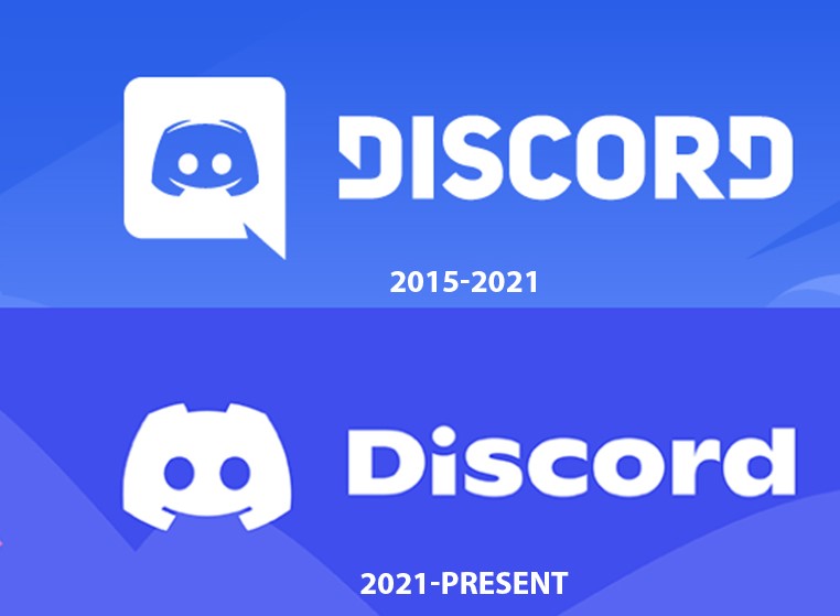
The Discord logo, affectionately known as “Clyde,” underwent a refinement in 2021. The previous iteration featured Clyde inside a “speech bubble” or “controller” shape. The redesign freed Clyde from the box and adjusted his proportions to be more symmetrical and recognizable.
The accompanying wordmark was also updated. While it isn’t gg sans (it is a custom typeface based on the spirit of Ginto), the wordmark and the UI font (gg sans) share a visual DNA. They both lean into a playful, geometric style that feels modern and “tech-adjacent.” This harmony between the logo and the UI font creates a unified brand experience. When the typography matches the energy of the logo, the brand identity feels more “stable” to the consumer.
Color Palette and Emotional Connection
The font’s impact is amplified by Discord’s iconic color palette, specifically “Blurple” (a vibrant hybrid of blue and purple). In brand design, color and type work together to evoke specific emotions. Blurple provides a sense of energy and creativity, while gg sans provides the structure.
This combination allows Discord to stand out in a crowded market. Many communication tools lean toward either extreme professional (Slack’s clean, corporate look) or extreme casual (gaming-specific forums). Discord occupies the middle ground. The typography is clean enough for a business meeting but quirky enough for a late-night gaming session.
Rebranding Lessons for Modern Digital Platforms
Discord’s journey from using off-the-shelf fonts to a custom-branded typeface offers several insights for brand strategists and designers. It highlights the shift in the tech industry toward “ownable” assets.
Balancing Familiarity with Innovation
One of the biggest challenges in rebranding a platform with a massive user base is avoiding “rebrand shock.” When Discord first updated its logo and typography, some parts of the community were vocal in their resistance. This is a common phenomenon; users form emotional attachments to the visual elements of the tools they use daily.
Discord’s strategy for managing this was to keep the core “soul” of the brand intact while polishing the execution. They didn’t switch to a serif font or a radically different color. They evolved their existing assets. gg sans feels like a natural successor to Uni Sans—it is an upgrade, not a replacement. For brands looking to modernize, the lesson is to identify the “equities” (the parts users love) and enhance them rather than discarding them.
Future-Proofing the Brand
By creating gg sans, Discord has future-proofed its visual identity. As the platform moves toward new frontiers—such as VR, AR, or deeper integration with different operating systems—having a proprietary font allows for seamless adaptation. They are no longer beholden to the licensing terms or design limitations of external font foundries.
Furthermore, a custom font acts as a form of intellectual property. It is a unique brand identifier that cannot be legally replicated by competitors. In a world where digital interfaces often look increasingly similar, having a distinct “voice” through typography is a powerful competitive advantage.

The Role of Type in Global Scaling
As Discord scales globally, the typography must also support a wide array of languages and character sets. Developing a custom font family allows the brand to ensure that its visual identity remains consistent across different alphabets, from Cyrillic to Kanji. This global consistency is a hallmark of a mature brand strategy. It ensures that the Discord “feeling” is the same for a user in Tokyo as it is for a user in San Francisco.
In conclusion, while the answer to “What is the Discord font?” is technically gg sans, the deeper answer lies in the brand’s commitment to community, legibility, and a unique visual identity. By moving toward a bespoke typeface, Discord has signaled its transition from a niche gaming tool to a foundational piece of the global digital infrastructure. The typography is not just a way to display text; it is the silent ambassador of the Discord brand, working in the background to foster a sense of belonging and clarity for every user who logs on.
aViewFromTheCave is a participant in the Amazon Services LLC Associates Program, an affiliate advertising program designed to provide a means for sites to earn advertising fees by advertising and linking to Amazon.com. Amazon, the Amazon logo, AmazonSupply, and the AmazonSupply logo are trademarks of Amazon.com, Inc. or its affiliates. As an Amazon Associate we earn affiliate commissions from qualifying purchases.