
Pink, at its core, is a desaturated red, a mixture of red and white. Yet, to define it merely by its chromatic composition is to overlook its profound significance in the realm of branding, design, and cultural identity. For marketers and brand strategists, pink is not just a hue; it is a powerful communication tool, imbued with a rich tapestry of associations, emotions, and historical context. Understanding “what is the colour pink” in a brand context means delving into its psychological impact, its strategic applications, and its evolving role in shaping consumer perceptions and market landscapes.
More Than a Hue: The Psychology of Pink in Branding
The human brain processes colours with remarkable speed, often triggering subconscious associations long before explicit recognition. Pink is no exception, carrying a weighty psychological presence that brands leverage to communicate specific messages and evoke desired emotional responses. Its broad spectrum, from delicate blush to vibrant fuchsia, allows for nuanced applications, each speaking a slightly different language to the audience.
The Nuance of Femininity and Youth
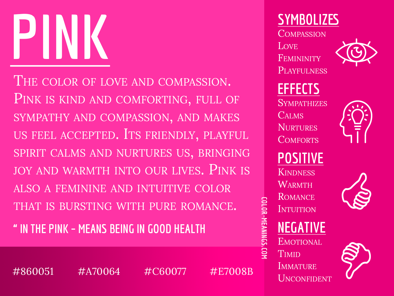
Historically, and perhaps most enduringly, pink has been linked to femininity and youth. This association, though culturally constructed and shifting over time, remains a dominant force in many markets. Brands targeting young girls, women’s products, or even segments seeking to evoke a youthful, gentle aesthetic often lean into pink. It can convey softness, innocence, and nurturing qualities. Think of cosmetic lines, baby products, or certain fashion labels that deliberately use pastel pinks to reinforce these traditional connections, creating an immediate, intuitive understanding of their target demographic and product benefits.
Evoking Playfulness, Sweetness, and Romance
Beyond overt femininity, pink possesses a unique ability to suggest playfulness, sweetness, and romance. Brighter, more saturated pinks like bubblegum or hot pink instantly inject a sense of fun and whimsy. Toy companies, confectionery brands, and entertainment platforms often harness these energetic shades to signal joy and lightheartedness. On the other end of the spectrum, softer, warmer pinks are quintessential for evoking romance and tenderness. Brands in the bridal industry, luxury lingerie, or even high-end patisseries often use these hues to create an atmosphere of elegance, warmth, and desirability, establishing an emotional bond with consumers centered on affection and indulgence.
Breaking Stereotypes: Pink’s Modern Rebirth
While its traditional associations are potent, pink is undergoing a significant contemporary reinterpretation, especially in branding. Modern brands are strategically deploying pink to challenge stereotypes, assert inclusivity, and project a more complex identity. The rise of “millennial pink,” for instance, signified a departure from overtly saccharine interpretations, embracing a more sophisticated, gender-neutral, and minimalist aesthetic. This strategic shift allows brands to align with progressive values, reaching broader audiences who appreciate a less prescriptive approach to colour. Brands in technology, finance, and even traditionally masculine sectors are now experimenting with pink to appear innovative, approachable, and forward-thinking, demonstrating a deliberate move to disrupt conventional colour coding and stand out in a crowded market. This rebirth underscores pink’s versatility and its power as a tool for brand differentiation and cultural commentary.
Strategic Pink: How Brands Leverage Its Power
The thoughtful application of pink in branding extends beyond mere aesthetics; it is a strategic decision rooted in market understanding, psychological impact, and competitive positioning. Brands that succeed with pink understand its multifaceted nature and deploy it with precision to achieve specific marketing objectives.
Targeting Demographics: From Toys to Luxury
One of pink’s most potent attributes is its ability to segment and target specific demographics. For decades, pink has been a cornerstone in marketing to young girls, symbolizing princesses, dolls, and all things “girly.” This deep-seated association makes it an automatic choice for toy manufacturers, children’s apparel, and entertainment aimed at this group. However, pink’s targeting capabilities are far more extensive. Elevated, muted pinks have found a strong footing in the luxury market, signaling sophistication, exclusivity, and a refined taste to affluent female consumers. Beauty brands, high-end fashion houses, and even some premium lifestyle services use these nuanced pinks to convey a sense of elegance and aspiration. Conversely, vibrant, bold pinks can target younger, trend-conscious demographics across genders, appealing to those who embrace an energetic, avant-garde, or playful aesthetic, as seen in streetwear or pop culture-inspired brands.
Differentiation and Memorability
In a visually saturated marketplace, differentiation is paramount. Pink, particularly in its less conventional applications, can be a powerful tool for standing out. While many sectors gravitate towards blues, greens, or grays, a strategic use of pink can immediately capture attention and etch a brand into the consumer’s memory. Consider a tech startup adopting a millennial pink in its branding amidst a sea of corporate blues; this immediately signals innovation, a fresh perspective, and a departure from the norm. This uniqueness not only aids in recall but also communicates a brand’s personality—whether it’s bold, empathetic, rebellious, or sophisticated. The choice of pink thus becomes a statement, a deliberate act of carving out a distinctive visual identity that resonates with a brand’s core values and sets it apart from competitors.
Emotional Connection and Consumer Loyalty

Colours play a critical role in fostering emotional connections, which are the bedrock of consumer loyalty. Pink, depending on its shade and context, can evoke feelings of comfort, happiness, intimacy, and trust. Brands using soft, warm pinks in their customer service touchpoints or wellness products aim to create an atmosphere of care and empathy, making consumers feel valued and understood. Similarly, fashion brands using romantic pinks cultivate an emotional bond around aspirations of beauty and self-expression. When a brand consistently uses pink to evoke specific, positive emotions that align with its product or service, it builds a powerful psychological link. This emotional resonance goes beyond transactional interactions, fostering a deeper sense of connection that encourages repeat purchases, brand advocacy, and long-term loyalty.
The Evolution of Pink’s Corporate Identity
The journey of pink through the annals of corporate identity is a fascinating study in cultural shifts, societal norms, and strategic rebranding. Its meaning and impact are far from static, continuously adapting to the zeitgeist and global sensibilities.
Historical Perceptions and Shifting Meanings
Historically, pink’s associations have fluctuated dramatically. In the early 20th century, particularly in Western cultures, pink was often seen as a stronger, more assertive colour, sometimes even associated with boys, while blue was considered more delicate for girls. It was only post-World War II, driven by marketing and cultural shifts, that the strict gender coding of pink for girls and blue for boys became deeply ingrained. This historical understanding is crucial for brands operating in legacy markets or those wishing to subvert traditional expectations. Brands today often navigate these historical layers, sometimes embracing the traditional to evoke nostalgia or familiarity, and at other times deliberately challenging them to project a contemporary, progressive image. The shifting meanings underscore that no colour, especially pink, exists in a vacuum; its corporate identity is always in dialogue with its past.
Cultural Context and Global Branding
The perception and impact of pink vary significantly across different cultures, posing a complex challenge and opportunity for global branding. While pink might universally suggest sweetness or femininity in some Western contexts, its associations can differ dramatically elsewhere. In some Asian cultures, for example, pink can symbolize marriage, love, or even purity, making it a powerful choice for wedding-related industries. In other regions, it might have religious or political connotations. Global brands must conduct thorough cultural research to understand these nuances. A blanket application of a pink-centric brand identity without cultural sensitivity can lead to misinterpretation, alienation, or even offense. Successful global brands either adapt their colour palette to local preferences or strategically use a universally appealing shade of pink that transcends specific cultural baggage, relying more on design and overall messaging to convey meaning.
Pink in Digital and Physical Spaces
The application of pink in branding also differs significantly between digital and physical realms. In physical spaces, such as retail environments, packaging, or interior design, pink can dramatically alter the mood and perception of a brand. A pink-themed boutique can feel inviting, chic, or playful, influencing the entire customer experience. Packaging in pink can make a product stand out on a shelf and convey its contents’ quality or intended use. In the digital space, pink’s luminosity and vibrancy can make a website or app icon pop, drawing immediate attention. However, digital rendering variations, screen calibrations, and accessibility considerations (such as contrast ratios) must be carefully managed to ensure the intended pink is consistently displayed and accessible to all users. Brands must ensure their chosen pink maintains its integrity and impact across all touchpoints, from a physical storefront to a mobile app, reinforcing a cohesive corporate identity.
Crafting a Pink Brand Identity: Best Practices
For brands considering pink, strategic implementation is key. It’s not about simply choosing a nice shade, but about integrating it thoughtfully into a broader brand strategy to maximize its impact and resonance.
Understanding Your Audience and Message
Before incorporating pink, a brand must deeply understand its target audience and the core message it wishes to convey. Is the aim to appeal to a traditional female demographic, or is it to challenge norms and project modernity? Is the brand selling luxury, affordability, playfulness, or seriousness? The specific shade of pink, its saturation, and its warmth will all contribute to this message. A soft, dusty pink for a wellness brand speaks differently than a neon pink for an e-sports team. Market research, audience demographics, psychographics, and brand positioning statements are invaluable in guiding this initial choice. The chosen pink must authentically represent the brand’s essence and resonate with the aspirations and values of its intended consumers.
Harmony with Other Brand Elements
Pink rarely operates in isolation. Its impact is amplified or altered by the colours it’s paired with, the typography, the imagery, and the overall design language of the brand. For example, a pastel pink paired with elegant serif fonts and minimalist graphics will evoke sophistication, whereas the same pink with playful sans-serifs and whimsical illustrations will feel youthful. Brands must consider how pink interacts with their secondary colour palette, ensuring visual harmony and clear communication. Does it complement the existing colours, or does it clash? Does it enhance readability or hinder it? A well-integrated pink identity supports and strengthens the entire visual ecosystem of the brand, creating a cohesive and memorable experience rather than just an isolated pop of colour.

Consistency Across All Touchpoints
Once a pink brand identity is established, consistency in its application is paramount. Every touchpoint—from the logo and website to packaging, social media graphics, advertising campaigns, and physical spaces—must faithfully represent the chosen pink. Inconsistent colour usage can dilute brand recognition, confuse consumers, and erode trust. Brand guidelines, detailing exact colour codes (Pantone, CMYK, RGB, Hex), usage rules, and approved applications, are crucial for maintaining this consistency across different designers, agencies, and platforms. This meticulous attention to detail ensures that whenever a consumer encounters the brand, the intended psychological and emotional impact of pink is consistently delivered, reinforcing brand identity and fostering a strong, recognizable presence in the market.
aViewFromTheCave is a participant in the Amazon Services LLC Associates Program, an affiliate advertising program designed to provide a means for sites to earn advertising fees by advertising and linking to Amazon.com. Amazon, the Amazon logo, AmazonSupply, and the AmazonSupply logo are trademarks of Amazon.com, Inc. or its affiliates. As an Amazon Associate we earn affiliate commissions from qualifying purchases.