
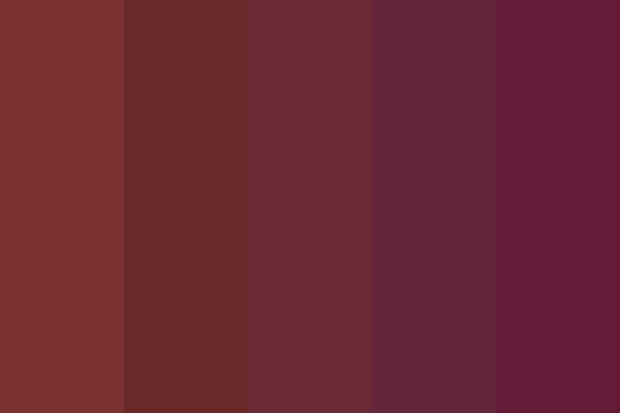
The color “Sangria” is more than just a descriptor; it is a meticulously crafted hue that occupies a significant place within the spectrum of visual design and brand strategy. It is typically defined as a deep, rich, and sophisticated reddish-purple or burgundy, often with subtle hints of brown that ground its vibrancy. This complex blend differentiates it from a pure red or purple, giving it a unique character that is both warm and opulent. Understanding the precise nature and psychological impact of Sangria is crucial for marketers, designers, and brand strategists aiming to leverage its inherent power in corporate identity, product presentation, and consumer engagement.
Decoding Sangria: A Rich Hue in the Visual Spectrum
At its core, Sangria is a hybrid color, deriving its depth and character from multiple base pigments. It is not a primary or secondary color, but rather a nuanced tertiary shade that expertly balances the intensity of red with the regal quality of purple, often mellowed by earthy brown undertones. This intricate composition contributes to its versatility and distinct emotional resonance.
The Ancestry of Sangria: Red, Purple, and Brown Tones
The dominant influence in Sangria is undoubtedly red, which imparts a sense of energy, passion, and warmth. However, it is not the aggressive, attention-grabbing red of a fire engine. Instead, the red in Sangria is muted and deepened, suggesting maturity and refinement rather than raw urgency. This is achieved through the integration of purple, a color historically associated with royalty, luxury, and spirituality. The purple notes infuse Sangria with an air of elegance and mystery, elevating it beyond a simple crimson.
Crucially, many interpretations of Sangria also feature subtle brown undertones. These earthy hints prevent the color from becoming overly bright or artificial, anchoring it with a sense of naturalness, stability, and authenticity. This addition makes Sangria feel organic and grounded, contrasting with the more synthetic appearance of some brighter purples or reds. The precise balance of these elements—the passionate red, the sophisticated purple, and the earthy brown—determines the exact shade of Sangria and its ultimate visual impact. Some variations might lean more towards a deeper wine-red, while others might appear as a richer plum. Regardless of the exact mix, the common thread is a deep, complex, and inviting hue that eschews simplistic categorization.
Psychological and Emotional Resonance
Colors are powerful tools in influencing perception and emotion, and Sangria is no exception. Its deep, multifaceted nature evokes a range of sophisticated feelings that can be strategically employed in branding.
Firstly, Sangria often conveys a sense of luxury and indulgence. Its richness is reminiscent of fine wines, precious gemstones, and opulent textiles. This association can immediately elevate a brand, suggesting premium quality, exclusivity, and a discerning taste. For businesses operating in high-end markets—whether fashion, gourmet food, hospitality, or luxury services—Sangria can be an invaluable asset in communicating a premium brand persona.
Secondly, the warmth inherent in its red components, combined with the depth of purple and brown, lends Sangria an air of sophistication and maturity. It’s a color that feels established, wise, and refined, rather than youthful or fleeting. Brands seeking to project authority, heritage, or a timeless appeal can find Sangria to be an excellent choice. It communicates a sense of gravitas and trustworthiness, suggesting a brand that is enduring and reliable.
Finally, Sangria can also evoke feelings of comfort and warmth. The subtle brown undertones and the subdued intensity of red create an inviting and cozy atmosphere. This makes it suitable for brands aiming to connect with consumers on an emotional level, fostering a sense of belonging, well-being, or hearth. Spa services, artisanal products, or even interior design brands might leverage Sangria to create a soothing yet luxurious environment.
Sangria in Branding and Corporate Identity
The strategic application of color is paramount in establishing a coherent and impactful brand identity. Sangria, with its unique blend of attributes, offers distinct advantages for businesses seeking to carve out a specific niche and communicate a precise message.
Strategic Application: Targeting Specific Audiences
Choosing Sangria for a brand’s corporate identity is a deliberate decision that signals specific values and aims to resonate with particular demographics. Brands targeting an affluent, educated, and mature audience often find Sangria to be highly effective. This demographic tends to appreciate subtlety over overt flashiness, and the nuanced depth of Sangria aligns perfectly with such preferences. It speaks to a refined sensibility, suggesting a brand that understands and caters to sophisticated tastes.
Furthermore, Sangria’s associations with indulgence and quality make it a compelling choice for brands positioned in the luxury sector, artisanal goods, or industries emphasizing craftsmanship and exclusivity. Think of high-end cosmetic lines, premium chocolate brands, exclusive fashion boutiques, or even certain professional services that wish to convey a sense of gravitas and bespoke excellence. The color can instantly communicate that a product or service is not mass-market but rather carefully curated and superior.
Differentiation and Memorability

In a crowded marketplace, standing out is critical. While red and purple are common in branding, Sangria’s specific blend offers a path to differentiation. It avoids the commonality of a primary red while sidestepping the sometimes whimsical or overtly feminine connotations of a lighter purple. This distinctiveness allows a brand to create a memorable visual signature that is recognizable yet unique.
A brand using Sangria effectively carves out a visual territory that sets it apart from competitors. It projects an image of individuality and confidence, suggesting that the brand is secure in its identity and not afraid to embrace a rich, complex aesthetic. This memorability extends beyond mere recognition; it helps embed the brand’s perceived values—luxury, sophistication, warmth—deeply within the consumer’s mind, creating a strong mental association that aids recall and preference.
Leveraging Sangria in Marketing and Design
Beyond corporate identity, Sangria’s versatility makes it a powerful tool in various marketing and design applications, from packaging and advertising to digital interfaces and physical environments.
Visual Harmony: Pairing and Contrast
The true power of Sangria in design often lies in its ability to interact with other colors. Its depth allows it to serve as a strong primary color, a rich accent, or a grounding neutral, depending on the palette it inhabits.
When paired with neutrals like creams, beiges, charcoals, or even deep olives, Sangria truly shines. These pairings allow its richness to come to the forefront without being overwhelmed. For instance, a Sangria logo on a creamy white background or a Sangria accent wall in a beige-toned retail space immediately conveys elegance and warmth.
For a more dynamic and vibrant feel, Sangria can be effectively contrasted with certain complementary or analogous hues. Golds and bronzes beautifully enhance its luxurious qualities, evoking a sense of preciousness and grandeur, ideal for high-end product packaging. Deep teals or forest greens can create a sophisticated, earthy palette, suggesting natural luxury or wellness. Lighter, dusty rose or blush tones can soften Sangria, lending a more romantic or feminine touch, suitable for certain beauty or lifestyle brands. The key is to find complementary colors that do not compete with Sangria’s inherent richness but rather amplify its desired emotional impact.
Digital and Print Considerations
When applying Sangria across different media, designers must consider the specific challenges and opportunities of digital and print formats.
In digital contexts (websites, apps, social media), the precise RGB or Hex codes for Sangria are crucial to ensure consistency across various screens and devices. Given the variability of display calibration, it’s important to select a shade that renders well without appearing overly dark or muddy on lower-quality screens, while still maintaining its intended richness on high-resolution displays. Sangria can be particularly effective for calls to action or key visual elements, as its depth can draw the eye without being jarring, providing a sense of understated importance.
For print applications (brochures, packaging, signage), working with CMYK values is essential. The translation from screen to print can sometimes alter color perception, so rigorous proofing is necessary to achieve the desired Sangria hue. Factors like paper stock (coated vs. uncoated), ink type, and printing process will all influence the final appearance. A matte finish might enhance Sangria’s sophistication, while a glossy finish could make it appear more vibrant and luxurious. Consistency across all brand touchpoints, from digital banners to physical product labels, reinforces brand identity and strengthens consumer recognition.
Case Studies in Visual Storytelling
Imagine a gourmet chocolate brand named “Velvet Cacao.” Their primary color scheme might feature Sangria as the dominant hue for their packaging and website. This choice immediately communicates premium quality, indulgence, and a rich, deep flavor profile. Accent colors like subtle gold foiling or creamy off-white text would enhance the luxurious feel, suggesting an artisanal product that is both sophisticated and inviting.
Consider a boutique hotel chain called “The Crimson Hearth.” Utilizing Sangria in their lobby decor, branding materials, and uniform accents would evoke a sense of warmth, refined comfort, and historical charm. Paired with dark wood, polished brass, and ambient lighting, Sangria helps to create an opulent yet welcoming atmosphere that speaks to discerning travelers seeking a unique and sophisticated experience. In both these hypothetical scenarios, Sangria is not just a color; it is a fundamental pillar of the brand’s visual storytelling, directly communicating its values and attracting its target audience.

The Evolving Perception of Color in Brand Narratives
The definition and application of colors like Sangria are not static; they evolve with cultural shifts, design trends, and technological advancements. What remains constant, however, is the fundamental role of color in shaping brand narratives and influencing consumer perception.
As global markets become more interconnected, understanding the nuances of color perception across different cultures is increasingly important. While Sangria generally conveys luxury and warmth in Western contexts, its associations might subtly shift elsewhere. Brands operating internationally must conduct due diligence to ensure their color choices resonate positively with diverse audiences.
Ultimately, “What is the color Sangria?” delves deeper than a simple hue definition. It asks how a specific, complex color can be strategically employed to build a powerful brand narrative, differentiate from competitors, and evoke precise emotional responses, thereby driving consumer engagement and loyalty in an increasingly visually driven world. It is a testament to the enduring power of color as a cornerstone of effective brand strategy.
aViewFromTheCave is a participant in the Amazon Services LLC Associates Program, an affiliate advertising program designed to provide a means for sites to earn advertising fees by advertising and linking to Amazon.com. Amazon, the Amazon logo, AmazonSupply, and the AmazonSupply logo are trademarks of Amazon.com, Inc. or its affiliates. As an Amazon Associate we earn affiliate commissions from qualifying purchases.