In the world of competitive sports, few visual markers are as iconic and instantly recognizable as the “Optic Yellow” of a softball. While a casual observer might see it as a simple equipment choice, a brand strategist sees a calculated move in product differentiation, visibility, and market identity. The transition from the traditional white ball to the high-visibility yellow we see today was not an accidental evolution; it was a defining moment that allowed softball to step out of the shadow of baseball and establish a unique corporate and visual identity.

Understanding the “why” behind the color of a softball offers profound insights into brand strategy, the psychology of color, and how organizations use visual cues to dominate a niche.
The Evolution from White to Optic Yellow: A Strategic Shift
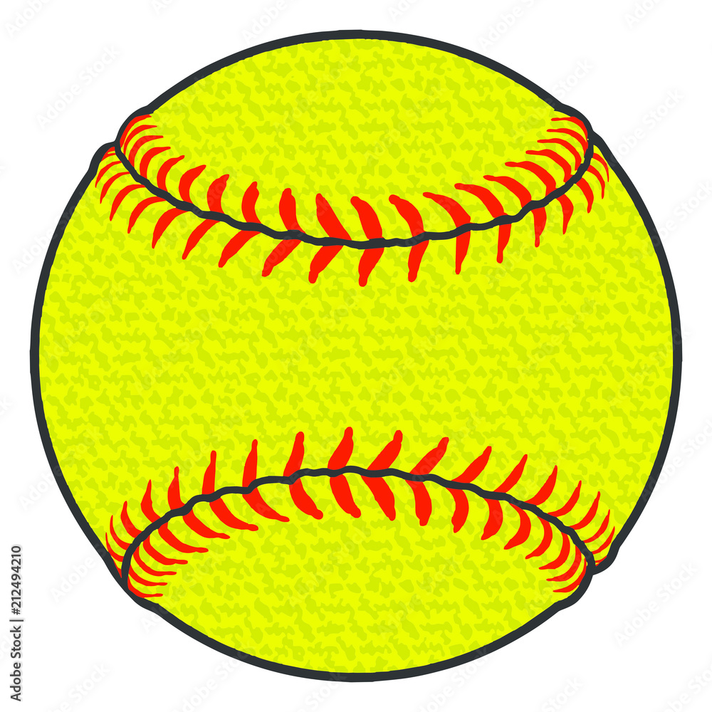
For decades, softballs were indistinguishable from baseballs in terms of color. They were white with red stitching—a classic look, but one that presented a significant branding challenge. By mimicking the aesthetics of baseball, softball struggled to define itself as a distinct professional entity. The shift to Optic Yellow in the early 1990s was the catalyst for a total rebranding of the sport.
Breaking Away from the Baseball Shadow
In marketing and brand strategy, “differentiation” is the cornerstone of success. If a product looks exactly like its competitor, it risks being perceived as a derivative or a “secondary” option. For years, softball was viewed through the lens of being “underhand baseball.” By adopting a vibrant, high-contrast color that baseball refused to touch, softball organizations effectively signaled a change in the product’s identity.
This move was a bold statement of independence. It allowed the sport to claim a visual territory that was entirely its own. Today, when a consumer sees a flash of neon yellow on a television screen or a store shelf, they don’t think “baseball”; they immediately recognize the brand of softball. This is the power of a unique visual asset.
The Scientific Basis for the Color Choice
Branding is most effective when it is backed by data and functionality. The selection of Optic Yellow wasn’t just about aesthetics; it was about the science of the human eye. Research into “human factors engineering” shows that the human eye is most sensitive to light at a wavelength of 555 nanometers—which falls directly into the lime-green/yellow spectrum.
From a brand perspective, this is “functional branding.” By choosing a color that was mathematically proven to be easier to track against a variety of backgrounds (green grass, brown dirt, blue sky), the sport improved its “user experience” for both players and spectators. When a brand solves a functional problem through its visual identity, it creates a deeper level of trust and loyalty with its audience.
Visual Identity and Market Positioning
The color of a softball serves as a primary touchpoint for its market positioning. In the competitive landscape of sporting goods, “Optic Yellow” acts as a trademark-style identifier that communicates speed, energy, and modernity.
Creating a Distinct Product Category
In brand strategy, the goal is often to “own” a category. If you cannot be the leader in an existing category, you create a new one. Softball achieved this by pivoting its visual language. The bright yellow ball became the centerpiece of a new aesthetic that extended to neon-colored bats, vibrant uniforms, and high-contrast gloves.
This “Electric” or “Neon” branding appeals to a younger demographic, positioning the sport as fast-paced and high-energy. By contrast, baseball maintained its “Classic” branding with white, gray, and navy tones, appealing to tradition and nostalgia. The color of the ball dictates the entire brand narrative of the sport: softball is the vibrant, modern alternative.
The Role of “Optic Yellow” in Brand Recognition
A brand’s “signature color” can increase brand recognition by up to 80%. Think of Tiffany Blue or Ferrari Red. For the sport of softball, Optic Yellow is that signature. This consistency across manufacturers like Rawlings, Wilson, and Dudley ensures that no matter who makes the ball, the “brand of the sport” remains cohesive.
This universal adoption of a single color creates a massive “moat” around the sport’s identity. It makes it nearly impossible for any other field sport to adopt that specific yellow without being compared to softball. This is a masterclass in land-grabbing a visual asset within the marketplace.
Consistency Across the Industry: Standardizing the Brand Experience
One of the greatest challenges in branding is maintaining consistency across different touchpoints. In softball, this is managed through strict governing bodies like USA Softball and the NCAA, which dictate the exact specifications of the ball’s appearance.
How Governing Bodies Protect the Visual Asset
The transition to yellow was not a suggestion; it became a mandate. By standardizing the “Optic Yellow” requirement, governing bodies ensured that every professional and collegiate game offered a consistent visual experience. This is similar to a franchise model where every location must use the same Pantone colors.
When a brand is consistent, it builds equity. Fans watching a game in California see the same vibrant ball as fans in Florida. This uniformity helps in “brand recall,” ensuring that the sport’s visual identity is reinforced every time a game is played or broadcast.
Brand Equity in Equipment Manufacturing
While the color is standardized, individual manufacturers like Dudley and DeMarini use the yellow canvas to build their own corporate identities. They do this through the “branding of the seams” and the “placement of the mark.”
For instance, the red stitching on a yellow ball has become a secondary brand identifier. Manufacturers experiment with the height and texture of these seams, but they never touch the yellow base. They recognize that the color is the “shared equity” of the sport, while their logos are the “private equity.” This balance allows individual brands to thrive within the larger ecosystem of the softball industry.
Lessons in Personal and Corporate Branding from the Diamond
The story of the softball’s color offers actionable lessons for business leaders and entrepreneurs looking to sharpen their own brand strategy. It proves that even a small change in visual direction can lead to a massive shift in market perception.
Choosing Your “Optic Yellow”: Finding Your Unique Value Proposition
Every business needs its own version of Optic Yellow—a feature, a service style, or a visual element that makes it impossible to ignore. In a crowded market, blending in is the equivalent of brand suicide.
To find your “yellow,” ask:
- What is the “industry standard” visual or service style in my niche?
- Is that standard actually the most effective for the end-user?
- What high-contrast alternative can I adopt that my competitors are too “traditional” to try?
By identifying a gap in the visual or functional landscape, a brand can position itself as the “clear choice” in a muddy field of competitors.
Emotional Connection and the “Bright” Aesthetic
Color evokes emotion. Yellow is psychologically associated with optimism, clarity, and energy. By centering its brand around this color, softball subconsciously communicates these values to its participants.
When developing a brand strategy, the emotional resonance of your color palette should align with your corporate mission. If your brand is about disruption and energy, high-visibility colors are your ally. If your brand is about security and legacy, you might stick to the “white and red” of tradition. The key is intentionality. The softball didn’t just turn yellow; it turned yellow to win.
The Future of Sport Branding: Beyond the Yellow Sphere
As we move further into a digital-first world, the “Optic Yellow” of the softball is proving to be even more valuable. In the age of 4K broadcasting and mobile streaming, high-contrast branding is essential for digital clarity.
Digital Branding and High-Contrast Optics
The color of a softball is perfectly optimized for the digital eye. On small smartphone screens, a white ball can easily get lost in the pixels of a compressed video stream. The Optic Yellow ball, however, pops against the digital background, making the sport more “watchable” in a mobile environment.
This foresight—whether intentional or lucky—has positioned softball as a sport that is inherently “social media friendly.” The vibrant colors look better in Instagram clips and TikTok highlights, which is where the next generation of “consumers” (players and fans) are being won over.

Conclusion: The Lasting Power of a Color Choice
The question “what is the color of a softball” seems simple, but the answer is a complex narrative of brand survival and strategic growth. By choosing Optic Yellow, the sport of softball didn’t just improve visibility for its players; it created a billion-dollar visual identity that separates it from every other sport on the planet.
For brands looking to make an impact, the softball serves as a reminder: don’t be afraid to break with tradition if science and strategy are on your side. Sometimes, the best way to be seen is to simply be the brightest thing on the field.
aViewFromTheCave is a participant in the Amazon Services LLC Associates Program, an affiliate advertising program designed to provide a means for sites to earn advertising fees by advertising and linking to Amazon.com. Amazon, the Amazon logo, AmazonSupply, and the AmazonSupply logo are trademarks of Amazon.com, Inc. or its affiliates. As an Amazon Associate we earn affiliate commissions from qualifying purchases.