
The term “drab” often conjures images of dullness, lack of vibrancy, or a general sense of muted unremarkableness. However, in the realm of brand strategy, corporate identity, and design, understanding “drab” goes far beyond a simple negative connotation. It’s not a single color on the spectrum but rather a qualitative description applied to hues that lack saturation, brilliance, or strong chromatic identity. Often leaning towards muted browns, greys, olive greens, or desaturated blues, drabness signifies an absence of visual excitement, yet this very characteristic can be a powerful, deliberate tool in a brand’s visual vocabulary.
Defining Drab: Beyond a Single Hue
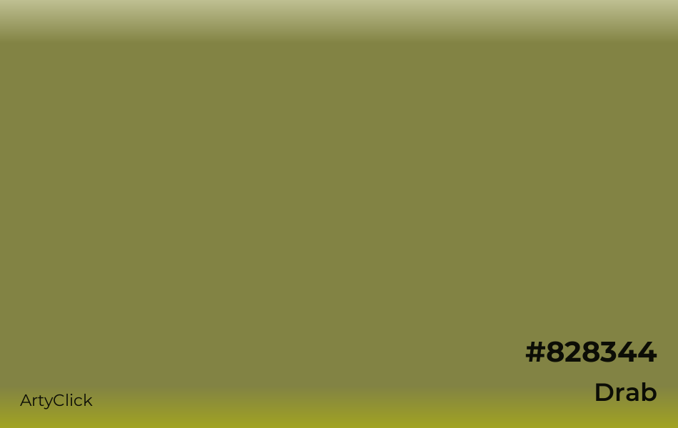
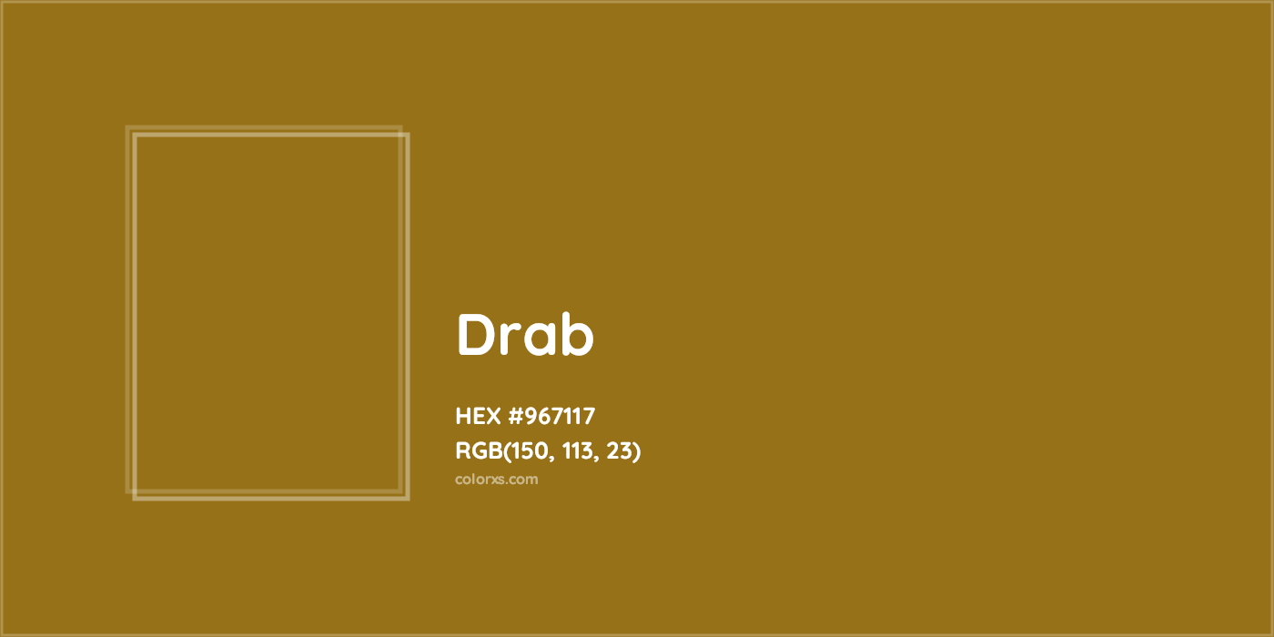
To truly grasp “drab” in a branding context, we must first dissect its properties. It’s less about a specific hex code and more about a color’s perceived qualities when placed within an overall palette. Drab colors are typically low in chroma (saturation) and often have a moderate to low value (lightness/darkness), preventing them from standing out with intensity. They are the background players, the earth tones, the muted naturals.
The Psychology of Understated Tones
The psychological impact of drab colors is complex and context-dependent. Unlike the energy of red or the tranquility of blue, drab colors do not typically evoke immediate, strong emotional responses. Instead, they often communicate a sense of groundedness, stability, and authenticity. They can be perceived as humble, serious, or pragmatic. In an increasingly overstimulated visual landscape, a drab palette can offer a visual respite, signaling a brand that prioritizes substance over flash. This can be particularly effective for brands aiming to build trust and gravitas, positioning themselves as reliable and enduring rather than trendy and fleeting.
Common Associations and Perceptions
The associations with drabness are varied. Historically, drab colors were common in military uniforms (think “drab green” or khaki) for camouflage and practicality, instilling a sense of utility and resilience. In fashion, drab tones can convey understated elegance, minimalism, or a commitment to sustainability through natural dyes. For brands, these associations can translate into:
- Authenticity: Suggesting natural, unprocessed, or honest qualities.
- Seriousness & Professionalism: Conveying a no-nonsense, focused approach, often seen in B2B sectors or financial services where gravitas is key.
- Sustainability & Eco-friendliness: Mimicking natural earth and plant tones, aligning with environmental values.
- Timelessness: Resisting fleeting trends by opting for enduring, classic palettes.
- Humility: Avoiding ostentation, signaling an approachable and down-to-earth persona.
However, the line between deliberate drabness and accidental dullness is fine. Without careful application, a drab palette risks being perceived as boring, old-fashioned, or uninspired, failing to capture attention or differentiate a brand in a competitive market.
The Strategic Use of Drab in Brand Design
When wielded intentionally, drab colors become powerful strategic assets in a brand’s visual identity. They are not merely placeholders but active contributors to the brand narrative and customer experience.
Evoking Authenticity and Trust
Many brands strive for an image of authenticity, transparency, and trustworthiness. Drab colors, with their natural and unassuming quality, can be instrumental in cultivating this perception. Brands in organic food, artisan crafts, sustainable fashion, or natural wellness often leverage earthy greens, muted browns, and stone greys to visually communicate their commitment to natural processes, traditional methods, and genuine ingredients. This palette subconsciously assures consumers of the brand’s integrity and closeness to nature, fostering a deeper sense of trust than a highly saturated, artificial-looking scheme might.
Creating Contrast and Focus
Paradoxically, drab colors can be used to make other elements stand out. When a brand’s primary message or product needs to be the focal point, a muted background or supporting palette allows the hero element to shine without visual competition. For example, a luxury brand might use a sophisticated drab grey for its packaging or website background, allowing the vibrant colors of its product or a subtle gold foil logo to command immediate attention. This strategic contrast elevates the perceived value and exclusivity of the highlighted element, demonstrating a sophisticated understanding of visual hierarchy. Designers often employ drabness as a canvas upon which brighter, more impactful messages are painted, ensuring that the brand’s key differentiators are never lost in visual clutter.
Sustainability and Earthiness
The rise of environmental consciousness has amplified the appeal of palettes that echo nature. Brands committed to sustainability, ethical sourcing, or eco-friendly practices frequently incorporate drab, natural tones into their corporate identity. Think of the recycled paper look, the muted greens of untainted foliage, or the soft browns of unbleached fibers. These colors don’t just look natural; they embody the brand’s values, signaling to consumers a shared commitment to the planet. This visual alignment helps build a strong emotional connection with a demographic that values environmental responsibility, making the brand’s stance clear without explicit statements.
When “Drab” Becomes a Differentiator
In a marketplace saturated with bold, bright, and often aggressive visual branding, a meticulously crafted “drab” identity can serve as a potent differentiator, carving out a unique space for a brand.
Minimalism and Anti-Glamour Aesthetics
The minimalist movement in design and branding often embraces muted palettes. Brands adopting an anti-glamour aesthetic deliberately eschew flashy colors and ornate designs in favor of simplicity, functionality, and understated elegance. This approach can appeal to a sophisticated consumer who values refinement over ostentation. Consider high-end architectural firms, minimalist fashion labels, or technology companies focused on seamless user experience; their branding often utilizes a palette dominated by whites, blacks, and various shades of grey or desaturated earth tones. Here, drabness communicates a sense of calm, clarity, and uncompromising quality, suggesting that the brand doesn’t need to shout to be heard.
Niche Market Appeal
Certain niche markets are particularly receptive to a drab aesthetic. Brands catering to connoisseurs of artisanal products, vintage enthusiasts, or those seeking a sense of heritage and tradition might find drabness perfectly aligns with their target audience’s preferences. A coffee roaster emphasizing its single-origin beans, a bespoke leather goods maker, or a heritage textile brand can use a muted palette to evoke a sense of craftsmanship, history, and the natural materials they employ. This specificity in color choice helps attract and resonate deeply with a particular segment, fostering strong brand loyalty among those who appreciate such nuanced visual communication.
Brand Storytelling Through Subtlety
Colors are powerful storytellers. While vibrant colors tell tales of excitement and energy, drab colors can tell stories of quiet strength, enduring quality, and profound depth. A brand using a drab palette might be telling a story of its origins, its commitment to slow production, or its focus on timeless design over fleeting trends. It can subtly communicate a narrative of resilience, wisdom, or understated luxury. This form of storytelling is less about overt declarations and more about nuanced suggestion, allowing consumers to uncover and connect with the brand’s values on a deeper, more introspective level. It’s an invitation to appreciate the subtle textures and profound meanings embedded within the brand’s identity.
Avoiding Unintended Drabness: Pitfalls and Solutions
While strategic drabness can be a virtue, accidental dullness is a branding pitfall. The key lies in understanding how to activate and elevate muted tones so they convey intention rather than oversight.
The Importance of Context and Complementary Colors
The perceived drabness of a color is heavily influenced by its surroundings. A shade that appears utterly lifeless in isolation can come alive when paired with the right complementary hues or accents. Strategic use of a vibrant pop of color—perhaps in a call-to-action button, a secondary graphic element, or a product highlight—can prevent an overall drab palette from becoming monotonous. Similarly, understanding the context of the brand’s industry, target audience, and message is crucial. A “drab” palette for a funeral home might be appropriate, but for a children’s toy brand, it would likely be a misstep.
Lighting, Texture, and Materiality
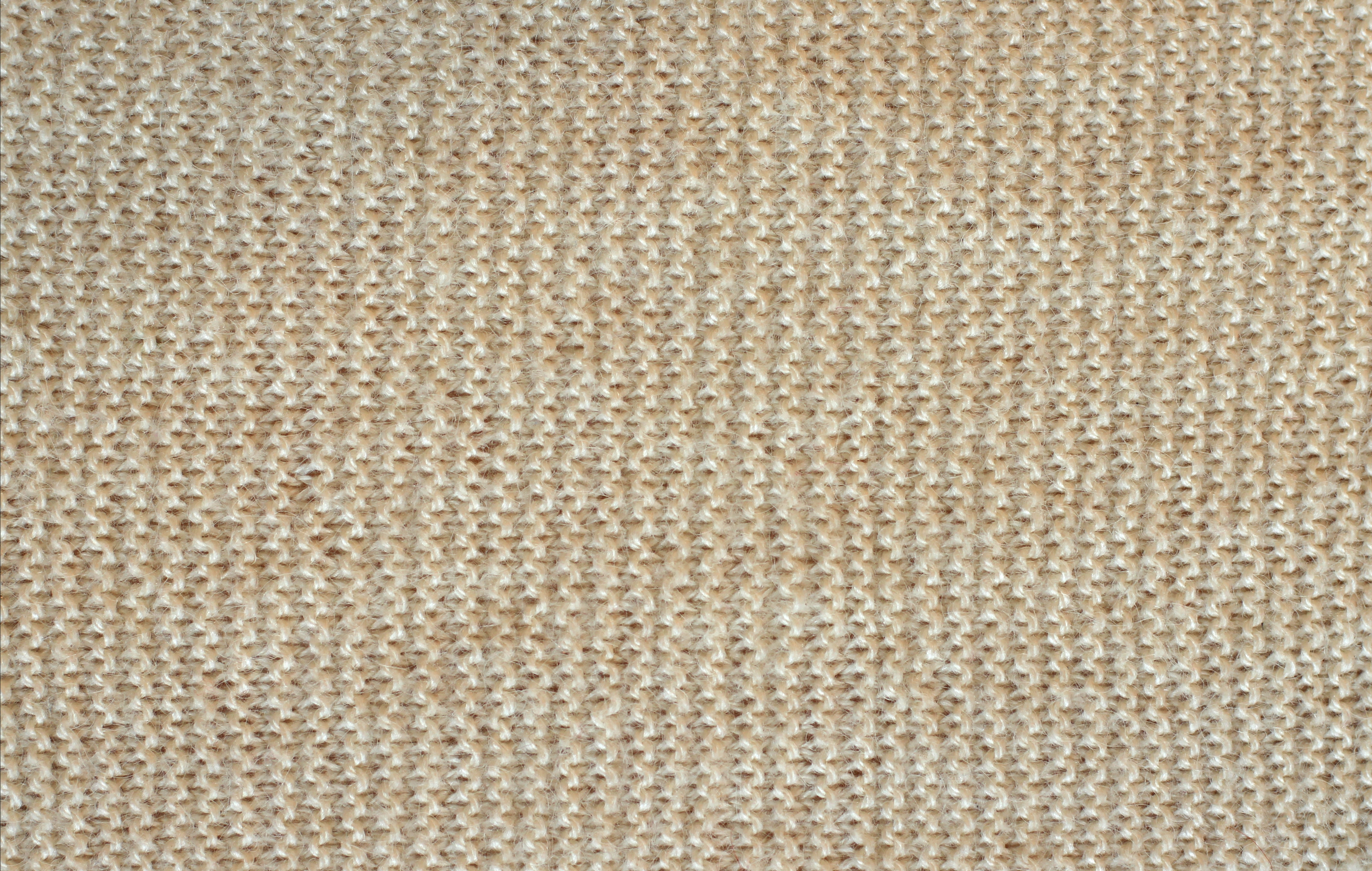
Color rarely exists in a vacuum. The way a color interacts with light, the texture of the material it’s applied to, and its overall materiality significantly impact its perceived vibrancy and depth. A drab grey on a matte, rough-textured paper stock will feel very different from the same grey on a glossy, smooth surface. Brands can use various textures—whether in packaging, website backgrounds, or physical spaces—to add richness and visual interest to a muted palette. Subtle patterns, metallic finishes (even in drab tones), or natural material textures (wood, stone, linen) can transform an otherwise plain color into something sophisticated and engaging. These tactile and visual nuances add layers of meaning and prevent the brand experience from feeling flat.
Refreshing a “Drab” Brand Identity
For brands whose identity unintentionally leans towards drabness, or those whose once-strategic drabness has become outdated, a refresh is necessary. This doesn’t necessarily mean abandoning the core palette entirely. Instead, it can involve:
- Introducing Strategic Accent Colors: Injecting small, carefully chosen doses of more vibrant colors to uplift the existing scheme without losing its essence.
- Updating Typography and Imagery: Modernizing fonts and using fresh, high-quality photography or illustrations can dramatically alter the perception of an existing color palette.
- Enhancing Materiality and Finish: Exploring new printing techniques, tactile materials, or digital finishes that add depth and sophistication.
- Revisiting Brand Story: Rearticulating the brand’s narrative to align the color choices with a compelling, intentional story, thus reframing perceived drabness as deliberate depth or elegance.
In conclusion, “drab” is not merely a negative descriptor but a potent, nuanced category of color application in branding. When skillfully deployed, it can embody authenticity, professionalism, sustainability, and sophisticated minimalism, allowing a brand to differentiate itself and forge deep connections with its audience through understated power. The mastery lies in intentionality, ensuring that “drab” communicates a deliberate choice rather than an accidental oversight.
aViewFromTheCave is a participant in the Amazon Services LLC Associates Program, an affiliate advertising program designed to provide a means for sites to earn advertising fees by advertising and linking to Amazon.com. Amazon, the Amazon logo, AmazonSupply, and the AmazonSupply logo are trademarks of Amazon.com, Inc. or its affiliates. As an Amazon Associate we earn affiliate commissions from qualifying purchases.