
In the vast landscape of digital typography, where fonts shape our interactions with technology, monospace stands as a distinctive and profoundly functional category. At its core, monospace refers to a typeface where every character occupies the exact same horizontal space, regardless of its intrinsic width. Unlike proportional fonts, where a narrow letter like ‘i’ takes up less space than a wide letter like ‘W’, a monospace font treats all glyphs—letters, numbers, symbols, and even spaces—as uniform blocks. This rigid, fixed-width characteristic is not merely an aesthetic choice; it underpins critical aspects of programming, data display, and digital security, making it an indispensable tool across numerous technological domains. Understanding monospace is key to appreciating the subtle yet powerful design decisions that optimize our interaction with digital systems.
Defining Monospace: The Fixed-Width Principle
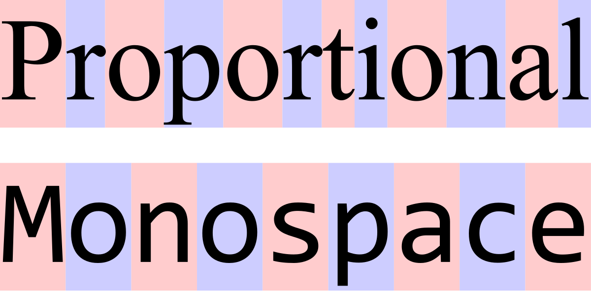
The defining characteristic of a monospace font is its uniform character width. Every letter, number, or symbol occupies precisely the same horizontal space. This is a fundamental departure from the majority of typefaces, known as proportional fonts, which adjust character spacing based on the natural width of each glyph. For instance, in a proportional font, the letter ‘i’ is much narrower than ‘m’, allowing for more natural kerning and a visually appealing, tightly packed text flow that mimics traditional print.
Fixed-Width Explained
To illustrate, consider the characters ‘i’, ‘m’, and ‘ ‘. In a monospace font, each of these, along with ‘1’, ‘*’, or ‘!’, would be allotted an identical pixel or unit width. This means that if you type ten ‘i’s, they will occupy the exact same horizontal dimension as ten ‘m’s or ten spaces. This consistent spacing creates a vertical alignment of characters, a grid-like structure that is crucial for specific technical applications. The consistency simplifies calculations of character positions and line lengths, making it predictable and programmable.
Contrast with Proportional Fonts
The distinction between monospace and proportional fonts becomes clearer when observing their application. Proportional fonts, such as Arial or Times New Roman, prioritize readability and aesthetic appeal for continuous prose. They are designed to be easy on the eyes, allowing for varied letterforms and natural spacing that guides the reader fluidly through text. This is ideal for books, articles, and general web content where the primary goal is rapid and comfortable comprehension. In contrast, monospace fonts, while sometimes perceived as less fluid for extended reading, excel in environments where character alignment, precise columnation, and code structure are paramount. Their very “stiffness” is their strength, enabling the visual parsing of structured data that would be chaotic with proportional spacing.
The Origins and Evolution of Monospace
The concept of fixed-width characters predates modern computing, rooted in the mechanical constraints of early information technology. Its origins are deeply intertwined with the development of typewriters and early computing systems, shaping how humans first interacted with digital and semi-digital information.
Typewriters and Early Mechanical Devices
The most direct ancestor of the monospace font is the mechanical typewriter. Due to the physical mechanism of striking characters onto paper, typewriters were inherently fixed-width. Each keypress advanced the carriage by the same increment, ensuring that characters were aligned in neat, vertical columns. This design simplified the mechanics of the machine and produced consistently formatted documents, making typewriters efficient tools for business and administration. This legacy established a visual precedent for technical text layout long before the advent of computers.
Early Terminals and Programming Interfaces
As computing evolved, particularly with the advent of mainframe computers and interactive terminals, monospace fonts became the de facto standard for displaying code and data. Early cathode-ray tube (CRT) terminals, designed for command-line interfaces, character-based operating systems, and punch card systems, operated under strict character grid limitations. These systems needed to display text predictably and efficiently, often with limited graphical capabilities. A fixed-width font allowed for straightforward character mapping to screen pixels, ensuring consistent display across different hardware and facilitating the creation of textual user interfaces (TUIs) where elements like borders and menus were drawn using standard characters. More importantly, it made debugging and understanding code—which is inherently structured—much easier, as every character could be precisely located and aligned. This historical necessity cemented monospace as the language of the programmer and system administrator.
Why Monospace Matters in Technology
The consistent spacing of monospace fonts offers significant practical advantages in technical contexts, addressing challenges that proportional fonts simply cannot. These advantages span code readability, data visualization, and even security protocols.
Code Readability and Alignment
For software developers, coders, and system administrators, monospace fonts are not merely a preference but a professional necessity. The consistent width of each character ensures that code maintains perfect vertical alignment, regardless of the characters used. This alignment is critical for:
- Syntax Highlighting: When keywords, variables, and comments are colored, their precise vertical stacking in a monospace font makes patterns and hierarchies immediately obvious. Indentation, which defines code blocks and logical structure in languages like Python, is clear and unambiguous.
- Symbol Alignment: Operators, parentheses, brackets, and other symbols align perfectly, making it easier to scan complex expressions or nested structures. Misplaced symbols, a common source of errors, become immediately apparent due to a break in the expected vertical pattern.
- Variable Names and Arguments: It helps in visually comparing variable names or arguments across multiple lines, facilitating the detection of typos or logical inconsistencies.
Without monospace fonts, code would appear jumbled, making it significantly harder to parse, debug, and maintain.
Data Display and Terminal Interfaces
Beyond coding, monospace fonts are crucial for displaying structured data. Whether it’s log files, configuration settings, or tabular data in a command-line interface, the fixed width ensures columns align perfectly. This clarity is vital for:

- Log Analysis: System logs often contain timestamps, process IDs, and message content. Monospace fonts ensure these fields appear in neat columns, simplifying the rapid scanning and identification of specific events or errors.
- Configuration Files: Many configuration files (e.g.,
.ini,.conffiles) rely on key-value pairs or structured sections. Monospace helps maintain the integrity of these text-based formats, making them easy to read and edit. - Command-Line Output: When running commands in a terminal, the output often presents data in a structured, columnar fashion. Monospace fonts preserve this structure, ensuring headers align with data and making it easy to interpret status reports, file listings, or network diagnostics.
Debugging and Error Identification
Debugging is an iterative process of identifying and fixing errors in code. Monospace fonts contribute significantly to this process:
- Precise Character Location: When an error message points to a specific line and character number, a monospace font makes it straightforward to navigate to that exact position. Each character at position
Xis preciselyXcharacters from the start of the line, simplifying cursor movement and selection. - Visual Comparison: When comparing two versions of code or looking for subtle differences in output, the fixed width allows for easy side-by-side comparison, highlighting discrepancies immediately through a break in visual alignment. Diff tools, which show changes between files, rely heavily on this property to present differences clearly.
- Whitespace Visualization: Monospace fonts can make non-breaking spaces, tabs, and other whitespace characters visually distinct (often by rendering special symbols), which is critical for debugging issues related to inconsistent spacing in code or data files.
Monospace in Modern Development and Design
While its roots are historic, monospace continues to be a cornerstone of modern technological workflows, adapting to contemporary tools and aesthetics.
IDEs and Text Editors
Every integrated development environment (IDE) and text editor—from VS Code and Sublime Text to IntelliJ IDEA and Atom—either defaults to a monospace font or strongly recommends one. These applications are meticulously designed around the expectation that developers will use a fixed-width typeface. Features like line numbering, syntax highlighting, code folding, and vertical selection tools all function optimally due to the predictable character spacing provided by monospace fonts. Many IDEs even offer highly specialized monospace fonts, often referred to as “coding fonts,” which include extended character sets, ligatures for common programming constructs (like -> combining into a single arrow glyph), and optimized character forms for improved legibility of frequently used symbols.
Command-Line Interfaces and Terminal Emulators
The command-line interface (CLI) remains a powerful and efficient way for developers and system administrators to interact with operating systems and applications. Terminal emulators (e.g., iTerm2, GNOME Terminal, Windows Terminal) are specifically designed to render text using monospace fonts. This ensures that commands, outputs, and any text-based user interfaces (like htop or vim) display correctly, maintaining their columnar integrity and visual structure. The clarity provided by monospace in these environments is paramount for tasks ranging from navigating file systems to managing cloud infrastructure.
Specific Coding Fonts and Their Features
The design of monospace fonts specifically for coding has become a specialized field. Modern coding fonts often go beyond basic fixed-width properties to enhance the developer experience:
- Distinct Character Forms: Differentiating easily confused characters like
0(zero) andO(capital O),l(lowercase L) and1(one) andI(capital i),.(period) and,(comma). - Optimized Ligatures: Combining character sequences like
!=,->,===into a single, more readable glyph without altering the underlying text data, improving code aesthetics and readability. Examples include Fira Code, JetBrains Mono, and Cascadia Code. - Extended Character Sets: Support for a wide range of Unicode characters, important for internationalization and displaying special symbols often used in documentation or specific programming paradigms.
- Balance of Aesthetics and Functionality: While prioritizing clarity, modern monospace fonts also aim for an appealing design, offering various weights and styles to suit individual preferences.
Choosing and Using Monospace Fonts
Selecting the right monospace font can significantly impact productivity and reduce eye strain for those who spend hours coding or analyzing data. It’s a personal yet crucial decision for many tech professionals.
Factors to Consider for Legibility
When choosing a monospace font, several factors contribute to its effectiveness and comfort:
- Clarity of Ambiguous Characters: As mentioned, the distinctness of
0/O,1/l/I, and similar pairs is paramount to avoid errors and reduce mental fatigue. - Weight and Contrast: The font’s thickness and how well it stands out against the background. Some prefer bolder fonts, while others opt for lighter weights. High contrast is generally desirable.
- Character Height and X-height: The height of lowercase letters relative to uppercase letters. A good x-height can improve readability at smaller font sizes.
- Dot/Punctuation Size: Ensures that periods, commas, semicolons, and other punctuation marks are clearly visible without being overly large.
- Spacing Between Characters: While fixed-width, the internal spacing within and around characters can vary, impacting how “airy” or “dense” the text feels.
Experimenting with different fonts and sizes in your preferred development environment is the best way to find what works for you. Many developers have a strong allegiance to specific fonts that they find optimal for their workflow.
Customization and Settings
Modern IDEs and text editors provide extensive customization options for fonts. Users can typically adjust:
- Font Family: Select from a wide range of installed monospace fonts.
- Font Size: Choose the optimal size for comfort and screen resolution.
- Line Height: Adjust the vertical spacing between lines to improve readability.
- Font Weight: Select regular, bold, or light variations.
- Ligatures: Enable or disable programming ligatures, which can be a personal preference.
The ability to fine-tune these settings empowers users to create a coding environment that minimizes eye strain and maximizes focus, making the monospace font an adaptable tool rather than a rigid constraint. In conclusion, monospace fonts, with their unassuming uniform character spacing, are a foundational element in the technological world. From the mechanical typewriters of the past to the sophisticated IDEs and command-line interfaces of today, their role in ensuring clarity, alignment, and precision in technical text is irreplaceable. For anyone interacting deeply with code, data, or system configurations, understanding and appreciating the humble monospace font is key to efficient and error-free digital engagement.
aViewFromTheCave is a participant in the Amazon Services LLC Associates Program, an affiliate advertising program designed to provide a means for sites to earn advertising fees by advertising and linking to Amazon.com. Amazon, the Amazon logo, AmazonSupply, and the AmazonSupply logo are trademarks of Amazon.com, Inc. or its affiliates. As an Amazon Associate we earn affiliate commissions from qualifying purchases.