
The humble ‘i’ prefix, a seemingly minor typographic choice, stands as one of the most powerful and enduring elements in modern brand nomenclature. Far from being a mere placeholder, the ‘i’ in iPhone, iPad, iMac, and iPod is a masterstroke of branding strategy, deeply embedded in Apple’s corporate identity and marketing ethos. Its meaning, while never strictly confined to a single definition, has evolved to encapsulate a multi-faceted brand promise, reflecting innovation, individuality, and an undeniable connection to the digital world.
The Genesis of the ‘i’ – A Legacy of Innovation and Internet
To fully understand the significance of the ‘i’ in iPhone, one must look back to its origins with the iMac. Introduced in 1998, the iMac marked a pivotal moment for Apple, signaling its resurgence under Steve Jobs and a clear direction towards the nascent internet era. The naming convention, established with this brightly colored, translucent computer, laid the groundwork for a branding legacy that would define the company for decades.
The iMac Precedent: Internet, Individual, Inspire
When Steve Jobs unveiled the iMac, he explicitly articulated what the ‘i’ stood for. The primary meaning was “Internet.” The iMac was designed from the ground up to make accessing the internet incredibly simple and intuitive, a revolutionary concept for the time. It was an “internet machine” at its core, aimed at democratizing web access for everyone.
However, Jobs also expanded on other implicit meanings, recognizing the power of a versatile brand signifier. He mentioned “individual,” “instruction,” “information,” and “inspiration.” These words collectively painted a picture of a product designed for the personal user, empowering them with knowledge, creativity, and a gateway to a new digital frontier. This multi-layered interpretation allowed the ‘i’ to be flexible, resonating with a broader audience without being constrained by a single, literal definition. It wasn’t just about connectivity; it was about what that connectivity enabled for the individual user. This nuanced approach to naming was foundational, suggesting that the ‘i’ was more than an initialism; it was an invitation to a new kind of computing experience.
Steve Jobs’ Vision for the Digital Hub
The ‘i’ brand also aligned perfectly with Jobs’ overarching vision of the “digital hub.” In the early 2000s, as personal computers became central to managing digital media, Apple positioned the Mac as the nexus for various ‘i’ devices: the iPod for music, iMovie for video, and iPhoto for pictures. Each ‘i’ product was designed to integrate seamlessly, creating an ecosystem where the user’s digital life revolved around Apple’s offerings. The ‘i’ became the connective tissue, symbolizing this integrated digital experience.
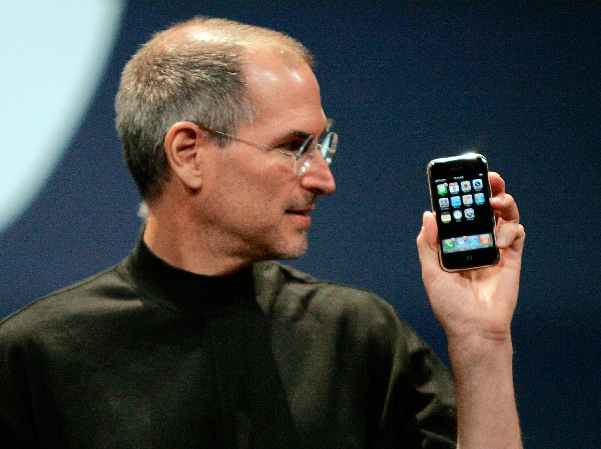
When the iPhone launched in 2007, it wasn’t just a phone; it was a revolutionary internet communications device and a paradigm shift in personal computing. The ‘i’ in iPhone thus carried forward the legacy of “Internet,” but also extended it to “interaction” and “intelligence” on a mobile platform. It was a personal internet device that redefined what a phone could be, bringing together all the facets of the ‘i’ philosophy into a single, pocketable device. The consistency of the ‘i’ across this expanding product line reinforced Apple’s brand narrative, creating a coherent and powerful message about innovation and user empowerment.
Beyond a Single Letter: The ‘i’ as a Branding Powerhouse
The longevity and widespread recognition of the ‘i’ prefix speak volumes about its effectiveness as a branding tool. It transcends its initial literal meanings to embody a sophisticated brand strategy that has resonated with billions globally. The ‘i’ has become synonymous not just with Apple, but with a particular set of values and user expectations.
Crafting Brand Identity and Aspiration
The ‘i’ has been instrumental in crafting Apple’s distinct brand identity. It projects an image of modernity, forward-thinking design, and a certain aspirational quality. Products bearing the ‘i’ prefix are often perceived as cutting-edge, user-friendly, and elegantly designed, aligning with Apple’s core brand promise of delivering premium experiences. This single letter acts as a powerful shorthand for the entire Apple ecosystem, instantly communicating quality, innovation, and a certain exclusivity. It creates an emotional connection, suggesting that owning an ‘i’ device is not just about technology, but about being part of a curated, sophisticated lifestyle. The ‘i’ thus helps to build and reinforce a strong, differentiated brand in a highly competitive market.
User-Centricity and Personal Connection
One of the most compelling aspects of the ‘i’ in Apple’s branding is its subtle yet profound emphasis on the individual user. The original expansion to “individual” was no accident. Each ‘i’ device, from the iMac to the iPhone, is designed to be deeply personal. They are extensions of the user, tailored for individual productivity, creativity, and communication. The ‘i’ implicitly suggests “my” device, fostering a strong sense of ownership and personal connection. This user-centric approach is a cornerstone of Apple’s design philosophy, where technology fades into the background, allowing the user’s experience to take center stage. This personalization strategy creates loyalty and makes users feel understood and valued by the brand. The ‘i’ acts as a personal pronoun, making the technology feel less like a tool and more like a companion.
The ‘i’ as a Symbol of Simplicity and Elegance
In the world of design and branding, simplicity is often the ultimate sophistication. The minimalist ‘i’ perfectly encapsulates Apple’s commitment to clean, intuitive design and user experiences. It’s a single, lowercase letter that is easy to remember, pronounce, and recognize across diverse cultures and languages. This simplicity extends beyond the name to the products themselves, which are renowned for their uncluttered interfaces and elegant aesthetics. The ‘i’ thus becomes a visual and conceptual shorthand for Apple’s design ethos: powerful technology made accessible and beautiful. This minimalist approach stands in stark contrast to the often complex and jargon-filled naming conventions of competitors, further distinguishing Apple in the marketplace and reinforcing its image as a purveyor of refined, user-friendly technology.
The ‘i’ in a Post-PC World: Evolution and Endurance
While the ‘i’ brand was born in the era of the personal computer and the nascent internet, its enduring presence in a world dominated by mobile and cloud computing speaks to its adaptability and the foresight of Apple’s branding strategy. The meaning has naturally evolved, yet its core tenets remain relevant.
From Internet Appliance to Ecosystem Cornerstone
The original “Internet” focus of the ‘i’ has broadened considerably. The iPhone, for example, is far more than just an internet access device; it’s a comprehensive mobile computing platform, a camera, a personal assistant, and a gateway to an entire ecosystem of apps and services. The ‘i’ now symbolizes the integration of these myriad functions, providing a seamless user experience across a range of devices and services. It signifies a connected lifestyle, where the user is always informed, entertained, and productive, regardless of location. The ‘i’ has transitioned from denoting a feature (internet access) to representing an entire digital lifestyle and an interconnected suite of tools that work harmoniously. This evolution underscores the ‘i’ as a dynamic symbol, capable of absorbing new meanings while retaining its core identity.
Consistency Across the Apple Portfolio
One of the greatest strengths of the ‘i’ branding is its consistent application across Apple’s most iconic products. The iPod revolutionized music, the iPhone redefined mobile communication, the iPad created the tablet category, and the iMac continues to be a benchmark for desktop computing. Each ‘i’ product has, at its core, disrupted its respective market, offering a superior, more intuitive user experience, and a strong connection to the internet and Apple’s services. This consistency has built tremendous brand equity, making each new ‘i’ product instantly recognizable and lending it an aura of innovation and quality by association. This cumulative brand value ensures that the ‘i’ prefix carries significant weight, signaling to consumers that a new product bearing the ‘i’ will likely deliver a premium and transformative experience.
Maintaining Relevance in a Saturated Market
In today’s crowded technology landscape, where new gadgets emerge daily, the ‘i’ prefix helps Apple maintain clarity and distinctiveness. It cuts through the noise, instantly signaling an Apple product. While Apple has introduced new naming conventions for some services (e.g., Apple TV+, Apple Music, Apple Watch), the core ‘i’ products remain foundational to its brand identity. The ‘i’ ensures that these flagship devices retain their unique heritage and communicate a direct lineage to the company’s most revolutionary innovations. This strategic mix of maintaining legacy naming for core products and adopting new nomenclature for services allows Apple to innovate while preserving its historical brand strength, ensuring that the ‘i’ remains a beacon of its enduring relevance.
The Strategic Implications of the ‘i’ Naming Convention
The decision to adopt and consistently apply the ‘i’ prefix across key products was not arbitrary; it was a deliberate and highly effective brand strategy with significant implications for market recognition, product development, and competitive differentiation.
Instant Recognition and Global Appeal
The simplicity and ubiquity of the ‘i’ have made it one of the most recognized prefixes in the world. Regardless of language or culture, the ‘i’ in iPhone is instantly associated with Apple and its premium offerings. This global recognition is invaluable for a multinational corporation, streamlining marketing efforts and fostering universal brand recall. It transcended linguistic barriers, becoming a universal signifier for a particular type of technology product. This instant brand recall is a testament to the strategic genius behind choosing such a minimalist yet impactful naming convention. It made Apple’s products universally approachable, contributing significantly to their mass adoption and cultural impact.
Facilitating Brand Extensions and New Product Lines
The modularity of the ‘i’ prefix has been a brilliant strategic enabler for Apple. It allowed the company to easily extend its brand into new product categories without diluting its core identity. From iPod to iPhone to iPad, the ‘i’ provided a consistent framework for naming new revolutionary devices. This flexibility allowed Apple to innovate rapidly and introduce new product lines that immediately felt like part of the larger Apple family, leveraging existing brand equity. This ease of brand extension meant that each new ‘i’ product could hit the market with the immediate credibility and recognition associated with its predecessors, significantly reducing the marketing hurdle for new product introductions.
Distinguishing Apple in a Competitive Landscape
In an industry often characterized by complex alphanumeric model numbers and generic product names, the ‘i’ prefix offered Apple a clear and memorable differentiator. It helped carve out a unique space for Apple products, making them stand out from competitors. This distinct naming convention, coupled with Apple’s iconic design language, created an unparalleled brand identity that was difficult for rivals to emulate successfully. The ‘i’ became a proprietary mark, signaling not just a product, but a complete ecosystem and a philosophy of design and user experience that was uniquely Apple’s. This differentiation strategy proved crucial in establishing Apple as a leader rather than just another player in the tech market.
The Enduring Legacy of the ‘i’
More than two decades after its introduction, the ‘i’ prefix remains a powerful testament to Apple’s branding prowess. It represents a masterclass in how a seemingly small element can carry immense brand weight and cultural significance.
A Masterclass in Minimalist Branding
The ‘i’ is a prime example of minimalist branding done right. It’s simple, elegant, memorable, and incredibly versatile. It communicates a complex array of meanings—internet, individual, innovation, inspiration—through a single, lowercase letter. This economy of design mirrors Apple’s product philosophy and contributes significantly to its iconic status. It proves that less can indeed be more when it comes to creating a lasting and impactful brand identity. The ‘i’ allows for interpretation, inviting consumers to project their own desires and aspirations onto the product, making it deeply personal.
The ‘i’ as a Testament to Apple’s Core Values
Ultimately, the ‘i’ in iPhone and other Apple products stands for far more than a literal translation. It embodies Apple’s core values: a relentless pursuit of innovation, a deep commitment to user experience, a focus on elegant design, and a vision for an interconnected digital future. It is a symbol of Apple’s unwavering dedication to creating products that empower individuals and simplify their lives. The ‘i’ is not just a naming convention; it is a brand statement, a promise, and an enduring legacy that continues to define one of the world’s most influential companies. It represents the very essence of what makes Apple, Apple.
aViewFromTheCave is a participant in the Amazon Services LLC Associates Program, an affiliate advertising program designed to provide a means for sites to earn advertising fees by advertising and linking to Amazon.com. Amazon, the Amazon logo, AmazonSupply, and the AmazonSupply logo are trademarks of Amazon.com, Inc. or its affiliates. As an Amazon Associate we earn affiliate commissions from qualifying purchases.