The color beige, often dismissed as simply “off-white” or “vanilla,” holds a profound and versatile position within the realm of brand strategy, design, and marketing. Far from being a mundane choice, beige, in its myriad variations, serves as a sophisticated tool for brands aiming to communicate specific values, evoke particular emotions, and establish a distinct identity in the market. Understanding what beige truly represents from a branding perspective unlocks its potential to convey everything from understated luxury to grounded authenticity.
The Psychological Underpinnings of Beige in Branding
At its core, beige is a neutral color, a blend of white with a touch of brown or yellow. This inherent neutrality is precisely what gives it immense power and flexibility in brand communication. Unlike bold, primary colors that demand immediate attention and carry strong, often singular, associations, beige operates on a more subtle, sophisticated wavelength. Its psychological impact is less about overt excitement and more about fostering feelings of calm, stability, and quiet confidence.

Calm and Serenity
Beige evokes a sense of peace and tranquility. For brands looking to create an atmosphere of relaxation, comfort, or refuge, beige is an excellent choice. This is particularly relevant for businesses in the wellness industry, spas, hospitality, and home decor, where the goal is often to provide an escape from the chaos of everyday life. A beige-dominant palette signals a gentle, soothing experience, encouraging customers to feel at ease and trust in the brand’s ability to deliver a harmonious environment or product.
Sophistication and Understated Luxury
One of beige’s most powerful associations is with sophistication and luxury. While gold or deep jewel tones often scream “luxury,” beige whispers it. This quiet confidence translates into an elegant, timeless appeal. High-end fashion brands, premium interior designers, and luxury automotive manufacturers frequently incorporate beige into their visual identities to convey an exclusive, refined aesthetic that transcends fleeting trends. It suggests a brand that values quality, craftsmanship, and enduring style over ostentation.
Reliability and Trustworthiness
As a natural, earthy tone, beige often carries connotations of groundedness and stability. This makes it an effective color for brands that wish to project reliability, trustworthiness, and a solid foundation. Financial institutions, professional services, and established corporations might use beige as an accent or a foundational neutral to subtly communicate their dependability and long-standing presence. It avoids the starkness of pure white while maintaining a clean, professional appearance.
Warmth and Approachability
Depending on its undertones, beige can lean warmer (more yellow or brown) or cooler (more grey, leading to “greige”). Warmer beiges convey a sense of comfort, warmth, and approachability. This makes them suitable for brands that want to feel welcoming and inviting, such as cafes, bakeries, or family-oriented businesses. They offer a gentle alternative to vibrant colors, creating a friendly yet sophisticated presence.
Strategic Application: Beige in Brand Identity
The strategic deployment of beige in a brand’s visual identity goes far beyond merely selecting a color. It involves understanding its context, its pairings, and its capacity to elevate a brand’s message. Its versatility allows it to serve multiple roles, from a primary brand color to a crucial supporting hue.
Crafting a Minimalist Aesthetic
Beige is a cornerstone of minimalist branding. Brands that prioritize simplicity, clarity, and focus on the core essence of their product or service often turn to beige. It provides a clean, uncluttered backdrop that allows products or messages to stand out without visual competition. This approach is prevalent in modern tech, sustainable fashion, and lifestyle brands that aim for a clean, conscientious image. The absence of overpowering color directs attention to texture, form, and content, embodying the “less is more” philosophy.
Evoking Natural and Sustainable Values
For brands deeply rooted in nature, sustainability, or organic principles, beige is a natural fit. Its earthy quality connects directly to concepts of raw materials, unbleached fabrics, and natural landscapes. Brands in organic food, eco-friendly products, or artisanal crafts use beige to visually communicate their commitment to natural ingredients, sustainable practices, and authenticity. It reinforces a narrative of transparency and environmental consciousness, resonating with consumers who prioritize ethical consumption.
Enhancing Luxury and Exclusivity
Luxury brands leverage beige to create an aura of exclusivity and refined taste. When paired with rich textures, metallic accents, or deep, sophisticated secondary colors, beige elevates the overall brand experience. It is not just about the product; it’s about the lifestyle and aspirations the brand represents. Think of the interior of a high-end boutique, the packaging of premium cosmetics, or the branding of bespoke services – beige often plays a starring role in conveying an air of discreet opulence. It signals quality and discernment without being ostentatious, appealing to a clientele that values understated elegance.
Supporting and Harmonizing Brand Palettes
While beige can certainly be a dominant brand color, its greatest strength often lies in its ability to act as a superb neutralizer and harmonizer within a broader brand palette. It can temper bolder colors, allowing them to pop without overwhelming the viewer. It provides breathing room, ensuring visual balance and sophistication. In web design, for instance, a beige background can make content more readable and visually pleasant than stark white, reducing eye strain while maintaining a clean aesthetic. For brands with complex visual identities, beige acts as a unifying thread, pulling disparate elements together into a cohesive whole.
The Evolution and Modern Reinterpretation of Beige
Historically, beige sometimes suffered from a reputation for being dull or uninspired, associated with “safe” choices rather than bold statements. However, in contemporary branding and design, beige has undergone a significant reinterpretation. It has shed its perceived blandness and emerged as a highly sought-after hue, appreciated for its nuance, versatility, and sophisticated simplicity.
From “Boring” to “Chic”
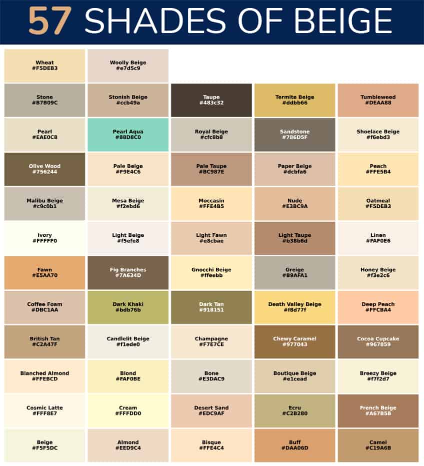
The shift in perception largely stems from a deeper understanding of color psychology and the rise of minimalist aesthetics and sustainable branding. Designers and brand strategists now recognize that the “boring” aspect of beige was often a result of poor execution or unimaginative pairings. When applied thoughtfully, with attention to texture, lighting, and complementary colors, beige transforms into a powerful design element. Modern interpretations often incorporate various undertones – rose beige, greige, taupe, mushroom – creating a rich spectrum that offers subtle differences in mood and message.
The Rise of “Greige” and Warm Neutrals
The popularity of “greige” (a blend of grey and beige) exemplifies this modern embrace of nuanced neutrals. Greige offers the cool sophistication of grey combined with the warmth and earthiness of beige, creating a balanced and highly adaptable color that resonates across diverse industries. Similarly, warm neutrals, which encompass various shades of beige, cream, and off-white, have become staples in branding for their ability to convey comfort, authenticity, and enduring style without being overly sterile. These colors provide a sophisticated alternative to pure white, offering more depth and a softer visual impact.

Beige as a Foundation for Brand Longevity
In an era of rapid trends and constant visual noise, brands are increasingly seeking elements that contribute to longevity and timelessness. Beige, with its inherent stability and classic appeal, offers precisely that. It is a color that does not go out of style; rather, it adapts. A brand built on a beige foundation can evolve its aesthetic over time by simply changing accent colors or typography, without needing a complete overhaul of its core identity. This makes it a strategic choice for businesses aiming for enduring relevance and a consistent, trustworthy presence in the market.
In essence, beige is far more than just a color; it is a strategic asset in a brand’s arsenal. When deployed with intention and insight, it communicates powerful messages of calm, sophistication, authenticity, and reliability, allowing brands to forge deep connections with their target audience and establish a distinct, memorable identity that stands the test of time.
aViewFromTheCave is a participant in the Amazon Services LLC Associates Program, an affiliate advertising program designed to provide a means for sites to earn advertising fees by advertising and linking to Amazon.com. Amazon, the Amazon logo, AmazonSupply, and the AmazonSupply logo are trademarks of Amazon.com, Inc. or its affiliates. As an Amazon Associate we earn affiliate commissions from qualifying purchases.