In the visual landscape of global commerce, color is rarely a matter of mere aesthetics. It is a strategic tool, a psychological trigger, and a foundational pillar of brand equity. Among the vast spectrum of available pigments, few carry the weight of authority and the pulse of vitality quite like Cardinal Red. Often mistaken for simple crimson or generic bright red, Cardinal Red is a specific, high-saturation hue that occupies a unique space in the world of corporate identity and brand strategy.
For brand designers and marketing strategists, understanding “what is Cardinal Red” requires looking beyond its Hex code. It involves analyzing how this particular shade communicates prestige, demands attention, and establishes a legacy. In this exploration, we will dissect the technical nature of Cardinal Red, its psychological impact on consumers, and how leading organizations leverage it to build enduring brand narratives.
The Anatomy of Cardinal Red: Defining the Visual Standard
To understand Cardinal Red from a branding perspective, one must first define its technical boundaries. In design, ambiguity is the enemy of consistency. Cardinal Red is characterized as a vivid, deep red that sits between the aggression of “Fire Engine Red” and the somber tones of “Maroon.” It is named after the plumage of the Northern Cardinal and the ecclesiastical robes of Catholic Cardinals—both of which signify a certain level of status and visibility.
The Technical Specifications: Hex, RGB, and CMYK
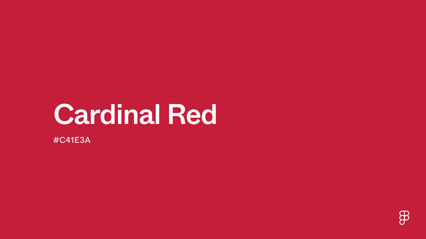
In the digital and physical realms of brand management, Cardinal Red is defined by precision. While various brands may have slight proprietary variations, the standard Cardinal Red is often represented by the Hex code #C41E3A. In the RGB (Red, Green, Blue) model used for digital screens, it consists of approximately 76.9% red, 11.8% green, and 22.7% blue. For print media (CMYK), the balance shifts to prioritize deep saturation without becoming “muddy,” typically requiring a high percentage of magenta and yellow with a touch of black for depth.
Historical Origins and Symbolic Prestige
The historical weight of Cardinal Red is what lends it a sense of “prestige” in modern branding. Historically, red dyes were expensive and difficult to produce, making them the domain of the elite. By adopting a color historically associated with high-ranking officials and rare natural beauty, a brand can subconsciously tap into a narrative of excellence and tradition. For a brand strategist, using Cardinal Red isn’t just about being noticed; it’s about being respected.
The Psychology of Cardinal Red in Branding
Color psychology is the cornerstone of effective marketing. Every hue sends a silent message to the consumer’s subconscious, influencing their perception of a company’s reliability, price point, and energy level. Cardinal Red is a powerhouse in this regard, offering a sophisticated blend of excitement and stability.
Evoking Authority and Passion
While a standard bright red might signal “danger” or “sale,” Cardinal Red leans into “authority.” It is a color that commands the room without shouting. In brand strategy, this shade is frequently used to represent passion tempered by discipline. It suggests that a company is energetic and forward-thinking but also possesses the gravitas and experience of an industry leader. This makes it an ideal choice for legacy brands looking to modernize without losing their historical footing.
Visibility and Consumer Action
Red is scientifically proven to increase the heart rate and create a sense of urgency. However, too much bright red can cause “visual fatigue,” leading consumers to turn away. Cardinal Red solves this dilemma. Because it is slightly deeper and more saturated, it retains the high visibility necessary for call-to-action buttons or logo recognition but is more pleasing to the eye over long periods. It draws the consumer in and holds their attention, facilitating a deeper connection with the brand’s visual content.
Case Studies: Brands and Institutions That Own Cardinal Red
The most effective way to understand the strategic value of Cardinal Red is to look at the organizations that have successfully claimed it as their primary identifier. In the world of branding, “owning” a color is the ultimate competitive advantage.
Higher Education: The Battle for “The Red”
In the academic sector, Cardinal Red is synonymous with elite status. Stanford University is perhaps the most famous proprietor of this color, utilizing “Stanford Cardinal” as its official identity. The choice is deliberate; it distinguishes the institution from the more common blues of the Ivy League, signaling a “Western Excellence” that is bold and innovative. Similarly, the University of Southern California (USC) uses a version of Cardinal paired with Gold, creating a brand identity that evokes Roman-inspired strength and athletic prowess. In these cases, the color serves as a unifying flag for students, faculty, and alumni.

Corporate Identity: Distinguishing the Premium from the Common
In the corporate world, Cardinal Red is often used to signify a “Premium” positioning. While a company like Target uses a brighter, more populist red to signal accessibility and energy, brands that lean toward Cardinal Red are often aiming for a more curated, professional image. Consider the distinction in the automotive or financial sectors, where deeper reds are used to suggest luxury and “performance” rather than mere “affordability.”
Sports Branding: The St. Louis Cardinals
The St. Louis Cardinals (MLB) provide a masterclass in using color to build a regional and national brand. Their use of Cardinal Red is literal, tied to their namesake, but it has evolved into a symbol of “Baseball’s Best Fans” and a culture of consistent winning. The color is so deeply embedded in the brand that the fans themselves are referred to as “Cardinal Nation.” This demonstrates how a specific hue can transition from a design choice to a cultural identity.
Implementing Cardinal Red into Your Brand Strategy
Choosing Cardinal Red for a brand is only the first step. The true challenge lies in its implementation across various touchpoints—from digital interfaces to physical packaging.
Choosing the Right Supporting Palette
Cardinal Red is a dominant color. To make it work effectively, a brand strategist must select a supporting palette that doesn’t compete for attention.
- The Classic Approach: Pairing Cardinal Red with white and light grey creates a clean, professional, and high-contrast look.
- The Luxury Approach: Combining it with metallic gold or deep charcoal signals high-end positioning and sophistication.
- The Modern Approach: Using it as an accent against a “Dark Mode” aesthetic (deep navies or blacks) allows the red to pop in digital environments.
Maintaining Consistency Across Platforms
One of the greatest risks in branding is “color drift.” Cardinal Red can easily look like burnt orange on a poorly calibrated monitor or like a dull brick color on low-quality cardstock. To prevent this, a Brand Identity Guide must strictly define the color across all formats:
- Digital: Specify the Hex and RGB.
- Print: Specify the Pantone (PMS) matching system (e.g., PMS 200 or 201 are often close approximations).
- Physical Spaces: Specify paint codes for office interiors or retail displays.
Accessibility and UI/UX Considerations
In modern digital branding, accessibility is non-negotiable. Cardinal Red generally offers excellent contrast against white backgrounds, making it a strong choice for headers and primary buttons. However, designers must ensure that text placed over Cardinal Red (or vice versa) meets WCAG (Web Content Accessibility Guidelines) standards to ensure readability for users with visual impairments.
The Future of Color in Brand Design
As we move further into a digital-first economy, the way we perceive and use colors like Cardinal Red continues to evolve. The rise of OLED screens and high-dynamic-range (HDR) displays allows for a wider “gamut,” meaning that the richness of Cardinal Red can be displayed more vibrantly than ever before.
Digital-First Color Rendering
Brands are now designing for screens first and physical paper second. Cardinal Red thrives in this environment because its depth translates well to the backlit nature of smartphones and tablets. It retains its “mood” even at lower brightness levels, ensuring that the brand identity remains intact across various user settings.
Sustainability and the “Green” Red
Interestingly, the branding world is seeing a shift toward sustainable production. For physical branding—packaging, apparel, and signage—the chemical composition of dyes is under scrutiny. Brands that utilize Cardinal Red are increasingly seeking eco-friendly pigment options that maintain the hue’s intensity without the environmental impact of traditional heavy-metal dyes. This commitment to “sustainable color” is becoming a secondary layer of the brand story itself.
Conclusion: The Lasting Impact of Cardinal Red
What is Cardinal Red? In the context of brand strategy, it is much more than a point on the color wheel. It is a calculated choice that balances the intensity of red with the gravity of deep saturation. It is a color of heritage, excellence, and strategic visibility.
By understanding the technical specifications, psychological underpinnings, and successful applications of this hue, brand owners and designers can move beyond “picking a color” and start “building an identity.” Whether it’s anchoring a university’s legacy or driving conversions on a high-tech app, Cardinal Red remains one of the most powerful tools in the brand strategist’s arsenal—a timeless shade that continues to command respect in an increasingly crowded visual world.
aViewFromTheCave is a participant in the Amazon Services LLC Associates Program, an affiliate advertising program designed to provide a means for sites to earn advertising fees by advertising and linking to Amazon.com. Amazon, the Amazon logo, AmazonSupply, and the AmazonSupply logo are trademarks of Amazon.com, Inc. or its affiliates. As an Amazon Associate we earn affiliate commissions from qualifying purchases.