In the world of global commerce, few names evoke a physical sensation quite like Tonka. To mention the brand is to immediately recall the weight of cold-pressed steel, the vibrant hue of industrial yellow paint, and the promise of indestructibility. However, Tonka is more than just a manufacturer of sandbox toys; it is a profound example of brand strategy, emotional marketing, and corporate identity. Understanding “what is a Tonka” requires peeling back the layers of its 75-year history to see how a small garden tool company transformed a Native American word for “great” into a global synonym for resilience.

The Genesis of the Tonka Brand Identity
The story of Tonka is a quintessential case study in accidental brilliance and strategic pivoting. Founded in 1946 as Mound Metalcraft in a school basement in Minnesota, the company’s original intent was to manufacture garden tools. However, when the founders inherited a set of toy designs from a previous tenant, they realized the potential of high-quality, steel-based playthings.
From Mound Metalcraft to Global Icon
The transition from Mound Metalcraft to Tonka Toys Inc. in 1955 was the first major strategic move in the brand’s history. The name “Tonka” was derived from the Dakota Sioux word “Tanka,” meaning “great” or “big,” specifically referencing Lake Minnetonka. This naming choice was a masterstroke in brand positioning. It anchored the product in a sense of place and strength, moving away from the industrial and somewhat generic “Mound Metalcraft” to something evocative, phonetic, and memorable.
By rebranding, the company moved from being a manufacturer of objects to a creator of an identity. They weren’t just selling trucks; they were selling “Greatness” in a localized, rugged package. This early focus on identity allowed Tonka to stand out in a post-war market flooded with cheap plastic alternatives.
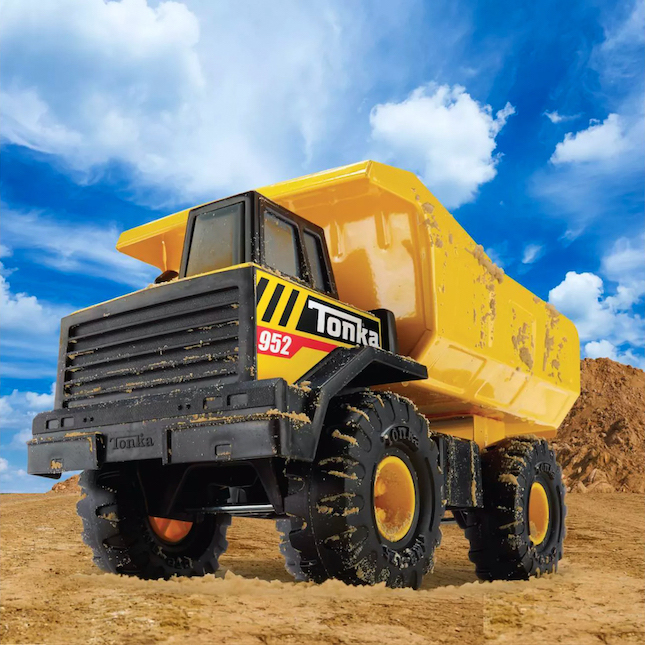
Designing for Durability: The Steel Foundation
From a brand strategy perspective, Tonka’s “Unique Selling Proposition” (USP) was its material: cold-pressed steel. At a time when the toy industry was shifting toward the cost-savings of plastics, Tonka doubled down on heavy-gauge metal. This was not merely a manufacturing choice; it was a brand-building one.
The weight of the product became a physical manifestation of the brand’s promise. When a child—or a parent—picked up a Tonka truck, the tactile feedback confirmed its value. This “tactile branding” created a psychological barrier for competitors; a lighter truck was perceived as a “lesser” truck. Tonka successfully commoditized durability, making it the primary metric by which all other automotive toys were judged.
“Tonka Tough” – The Psychology of a Slogan
If you ask a marketing professional to list the most effective slogans of the 20th century, “Tonka Tough” inevitably makes the list. This two-word phrase is a masterclass in brand alignment, distilling the entire corporate philosophy into a punchy, alliterative hook.
Strategic Marketing: Positioning Against Fragility
The “Tonka Tough” campaign was birthed from a need to prove the product’s worth in an era of “planned obsolescence.” The marketing strategy involved extreme demonstrations of the product’s strength. Famous advertisements featured elephants stepping on trucks and vehicles being dropped from heights, only to remain functional.
This wasn’t just advertising; it was proof-of-concept marketing. By positioning the brand against the fragility of childhood play, Tonka established an emotional contract with the consumer. For the parent, the brand represented a “one-time purchase” quality that saved money in the long run. For the child, it represented a tool that wouldn’t fail during the “work” of imaginative play. This dual-audience appeal is a rare achievement in marketing.
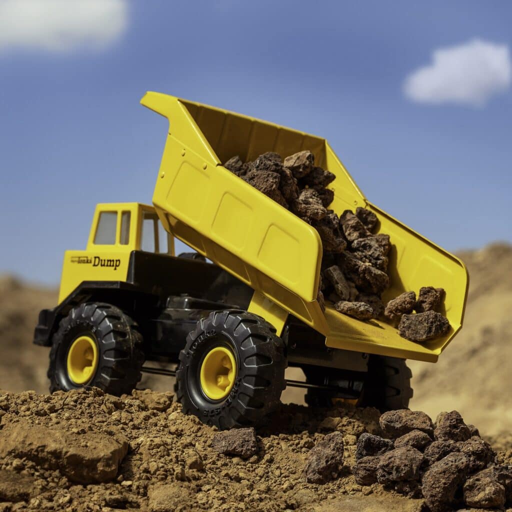
Emotional Branding and the Childhood Connection
Beyond the steel and the slogan lies the deep emotional resonance of the brand. Tonka represents a rite of passage. In brand theory, we often discuss “Archetypal Branding.” Tonka fits the “Explorer” and the “Creator” archetypes. It provides the tools for children to reshape their environment—to dig holes, move earth, and build structures.
By providing toys that mirrored the heavy machinery used in the real-world construction of 1950s and 60s America, Tonka tapped into the cultural zeitgeist of growth and industry. The brand became a bridge between childhood imagination and adult productivity. This emotional anchoring is why the brand remains potent today; it isn’t just a toy, it is a memory of competence and power.
Brand Licensing and the Modern Corporate Identity
As the decades progressed, Tonka faced the challenge that all legacy brands eventually encounter: how to remain relevant in a changing technological and corporate landscape. The transition from a family-owned Minnesota business to a key asset in the Hasbro portfolio (acquired in 1991) required a sophisticated evolution of the brand’s identity.
Navigating Acquisitions and Brand Equity
When Hasbro acquired Tonka, the primary goal was to preserve the “Brand Equity” built over the previous four decades. Hasbro understood that the “Tonka” name was more valuable than the factories that produced the trucks. They moved to diversify the product line while maintaining the core visual language—the specific “Tonka Yellow” and the bold, blocky typography.
However, the brand had to navigate the “Plastic vs. Steel” dilemma once more. Modern safety regulations and shipping costs made all-steel construction difficult for every product line. The brand strategy shifted to a “hybrid” model, where the “Classic” line maintained the steel heritage for collectors and traditionalists, while newer lines utilized high-impact polymers. This allowed the brand to hit different price points without diluting the “Tough” reputation, as long as the design language remained rugged.
Extending the Brand Beyond the Sandbox
One of the most significant developments in the Tonka brand strategy has been its expansion into licensing. Today, the Tonka logo can be found on work boots, apparel, and even real-world construction equipment. This is a classic example of “Brand Extension.”
By licensing the name to products that actually require durability—like footwear or tools—Hasbro reinforces the core brand promise. If a pair of boots is “Tonka Tough,” the consumer subconsciously applies fifty years of toy durability to that footwear. This synergy keeps the brand alive in the minds of adults who have outgrown the toys but still value the attributes the name represents.
Lessons for Modern Marketers from the Tonka Legacy
The longevity of the Tonka brand offers several vital lessons for modern business leaders, marketing directors, and entrepreneurs. In an age of digital intangibles, the “Tonka” model of physical reliability and clear positioning remains a gold standard.
Consistency as a Competitive Advantage
One of the reasons Tonka remains a household name is its refusal to drift from its core identity. While other toy brands chased trends—moving into electronics, tie-ins with fleeting movie franchises, or radical redesigns—Tonka stayed focused on trucks and construction.
In branding, consistency breeds trust. If a brand changes its identity too often, it loses its “mental shelf space” in the consumer’s mind. Tonka’s visual identity (yellow, black, and bold) has remained remarkably stable for over half a century. This consistency ensures that a grandfather can recognize the same brand for his grandson that he played with as a child, creating a multi-generational brand loyalty that is nearly impossible to manufacture overnight.
The Visual Language of Longevity
Tonka’s success also highlights the importance of “Visual Brand Language.” Every curve of a Tonka Mighty Dump Truck is designed to look heavy. The oversized wheels, the thick edges, and the simplified forms convey a sense of “industrial minimalism.”
For brands today, the lesson is clear: your design must communicate your values before the customer even reads your copy. If your brand stands for “Security,” your UI/UX and physical products should look and feel secure. Tonka doesn’t need to tell you it’s tough; its silhouette does the talking.
Conclusion: The Enduring Legacy of “Greatness”
What is a Tonka? On the surface, it is a yellow truck. But through the lens of brand strategy, it is a masterfully executed identity that has survived economic downturns, the rise of the digital age, and the shift in global manufacturing. It is a brand that succeeded by turning a physical attribute—durability—into a psychological certainty.
By sticking to its “Tonka Tough” ethos, the brand has transcended its category. It has become a genericized trademark for anything that can withstand punishment, yet it has managed to protect its legal trademark through clever licensing and constant reinvention. Whether it is through the nostalgia of a collector or the rugged boots of a construction worker, Tonka remains “Tanka”—great, big, and undeniably enduring. For any brand looking to build a legacy that lasts for decades, the Tonka story serves as the ultimate blueprint: define your value, prove it through your product, and never, ever compromise on your “Toughness.”
aViewFromTheCave is a participant in the Amazon Services LLC Associates Program, an affiliate advertising program designed to provide a means for sites to earn advertising fees by advertising and linking to Amazon.com. Amazon, the Amazon logo, AmazonSupply, and the AmazonSupply logo are trademarks of Amazon.com, Inc. or its affiliates. As an Amazon Associate we earn affiliate commissions from qualifying purchases.