In an era defined by an unprecedented deluge of data, the ability to make sense of complex information has become an indispensable skill. From guiding critical business decisions to informing scientific breakthroughs, data is the new oil, and its visualization is the refinery. Among the pantheon of data visualization techniques, one stands out for its simplicity, versatility, and profound ability to reveal hidden relationships: the scatter plot. Often referred to as “what is a scatter,” a scatter plot is a foundational graphical representation that plays a pivotal role across various technological domains, from software development and data science to AI and user experience design. It’s more than just a collection of dots; it’s a window into the underlying structure of our data, offering immediate insights that might remain obscured in tables of numbers.

This article delves into the essence of scatter plots, exploring their fundamental components, widespread applications in the tech world, the crucial insights they provide, the tools used to create them, and best practices for their effective deployment.
The Core Concept: Visualizing Relationships in Data
At its heart, a scatter plot is a mathematical diagram that uses Cartesian coordinates to display values for typically two variables for a set of data. Each point on the graph represents an individual data observation, with its position determined by the values of the two variables it corresponds to.
Defining the Scatter Plot
A scatter plot, also known as a scatter graph or scatter chart, is a type of plot or mathematical diagram using Cartesian coordinates to display values for two variables for a set of data. The data is displayed as a collection of points, each having the value of one variable determining the position on the horizontal axis and the value of the other variable determining the position on the vertical axis. When visualized this way, the pattern of the points can reveal correlations, clusters, or anomalies that might be difficult to discern from raw data alone. For instance, if one variable tends to increase as the other increases, the points will generally form an upward-sloping pattern, indicating a positive correlation. Conversely, a downward-sloping pattern suggests a negative correlation.
The Anatomy of a Scatter Plot (Axes, Data Points)
Understanding the basic structure of a scatter plot is key to interpreting it effectively.
- X-axis (Independent Variable): Typically represents the independent variable, or the predictor variable. This is the variable whose effect or influence on the other variable is being studied. For example, in a tech context, it could be “CPU Clock Speed.”
- Y-axis (Dependent Variable): Represents the dependent variable, or the response variable. This is the variable that is being observed or measured, and its values are thought to be influenced by the independent variable. Following the example, this could be “Application Performance Score.”
- Data Points: Each individual dot on the plot signifies a single data observation or record. Its location is precisely determined by its corresponding X and Y values. Each point is a unique instance of the phenomenon being studied, allowing for a granular view of the dataset.
Why Visualize? The Power of Insight
The human brain is remarkably adept at pattern recognition, a trait that makes visual data representation incredibly powerful. Numbers in a spreadsheet, even if meticulously organized, often fail to convey the story within the data as effectively as a visual summary. Scatter plots leverage this innate ability, transforming abstract numerical relationships into tangible, easily digestible patterns. They allow tech professionals to quickly grasp trends, identify outliers, and understand the distribution of data points, facilitating quicker hypothesis generation and validation. This visual immediacy is crucial in fast-paced technological environments where rapid decision-making can be a significant competitive advantage.
Applications Across the Technological Landscape
The utility of scatter plots extends far beyond theoretical statistics, finding practical applications in nearly every corner of the tech industry. Their ability to quickly reveal relationships between two numerical variables makes them indispensable.
Data Science and Analytics: Uncovering Patterns
For data scientists and analysts, scatter plots are a daily bread-and-butter tool. They are fundamental for initial data exploration (Exploratory Data Analysis or EDA), helping professionals understand the underlying structure of their datasets before applying complex algorithms. Data scientists use them to:
- Identify features for modeling: Determining which variables exhibit strong relationships can inform feature selection for machine learning models.
- Spot trends and anomalies: Easily detect unusual data points that might indicate errors or significant events.
- Validate assumptions: Visually check if linear relationships or other patterns, often assumed by statistical models, are present in the data.
Software Development: Performance and Debugging
In software engineering, scatter plots are employed to monitor and optimize system performance. Developers might use them to:
- Analyze latency vs. throughput: Plot request latency against the number of concurrent users to identify performance bottlenecks.
- Track resource utilization: Visualize CPU usage against memory consumption to understand resource dependencies.
- Debug by correlation: Plot error rates against specific software versions or environmental parameters to pinpoint problematic changes.
AI and Machine Learning: Feature Engineering and Model Evaluation
Scatter plots play a critical role in the lifecycle of AI and machine learning models.
- Feature Engineering: By visualizing how potential features correlate with the target variable, data scientists can engineer more robust features, improving model accuracy. For instance, plotting house price against square footage clearly shows a positive correlation, making square footage a strong predictive feature.
- Model Evaluation: Scatter plots can compare predicted values against actual values in regression tasks, helping to visualize model performance and identify areas where the model performs poorly. Residual plots, which scatter the residuals (errors) against predicted values, are a specialized form of scatter plot used to check for homoscedasticity and linearity assumptions.
- Clustering Analysis: While not strictly a scatter plot, the underlying principle of visualizing data points in a multi-dimensional space to identify clusters is directly related. Scatter plots help visualize the separation or density of clusters.
UI/UX Design: User Behavior Analysis
Even in user interface and user experience (UI/UX) design, scatter plots offer valuable insights.
- A/B Testing Analysis: Designers can plot user engagement metrics (e.g., time spent on page, conversion rates) against different design variations to visually compare performance and identify superior designs.
- User Journey Mapping: Though often represented by flow charts, scatter plots can help visualize the distribution of users across different stages or features, highlighting common paths or drop-off points.
- Heatmap Data Interpretation: When combined with other data, scatter plots can represent user interaction points, helping to understand where users focus their attention or encounter issues.
Key Insights and Interpretations from Scatter Plots
The true power of a scatter plot lies in its ability to quickly communicate complex relationships. Interpreting the visual patterns formed by the data points is crucial for extracting actionable insights.
Identifying Correlations: Positive, Negative, and No Correlation
The most immediate insight gained from a scatter plot is the presence and nature of correlation between the two variables:
- Positive Correlation: If the points tend to rise from the bottom left to the top right, it indicates that as the value of the independent variable (X) increases, the value of the dependent variable (Y) also tends to increase.
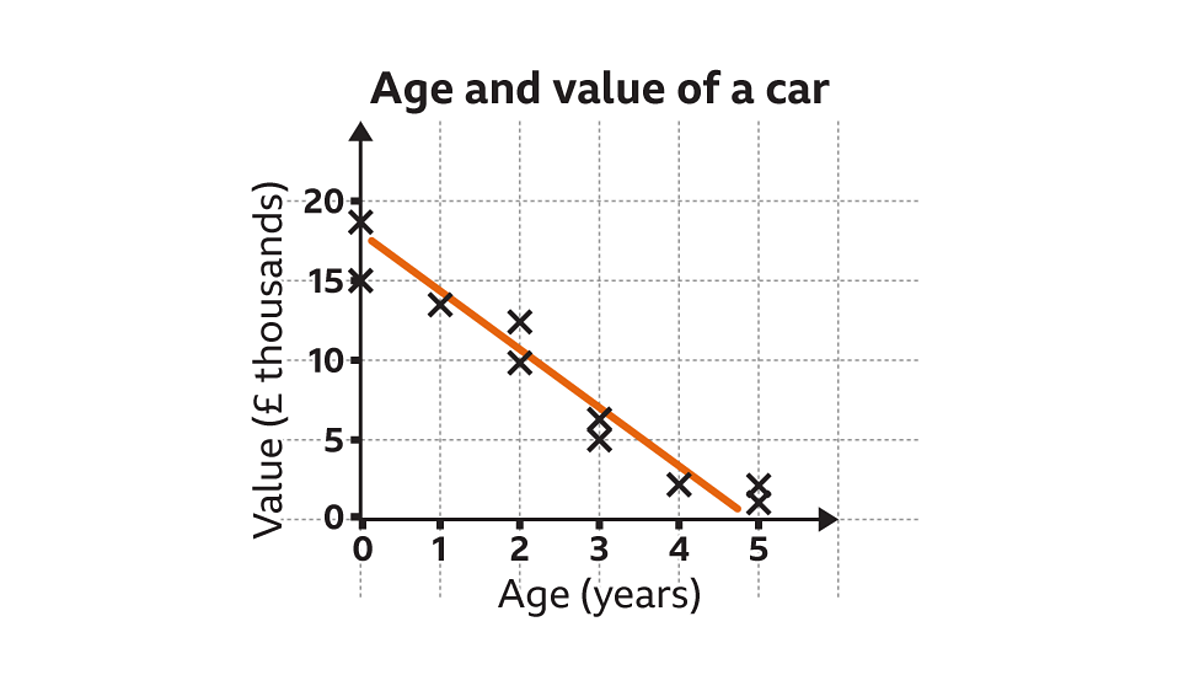
- Negative Correlation: If the points tend to fall from the top left to the bottom right, it suggests that as X increases, Y tends to decrease.
- No Correlation: If the points are scattered randomly across the plot with no discernible pattern, it indicates little to no linear relationship between the two variables. It’s important to remember that “no linear correlation” doesn’t necessarily mean no relationship at all; there could be a non-linear relationship.
Detecting Outliers and Anomalies

Outliers are data points that lie significantly far away from the general cluster of points. Scatter plots are excellent for visually identifying these anomalies. In a tech context, an outlier could represent:
- Data entry error: A mistyped value.
- System malfunction: An unusual performance spike or drop due to a bug.
- Unique event: A rare user interaction pattern or a successful marketing campaign that vastly outperformed others.
Identifying outliers is crucial for data cleaning, understanding unusual system behavior, or discovering extraordinary events.
Understanding Data Clusters and Distributions
Sometimes, points on a scatter plot will group together to form distinct clusters. These clusters can indicate subgroups within the data that behave differently or share common characteristics. For example, in a plot of user activity, different clusters might represent distinct user segments (e.g., power users vs. casual users, or different demographic groups). Understanding these clusters can lead to targeted product features, personalized marketing, or specific performance optimizations.
Recognizing Trends and Predicting Outcomes
When a clear correlation is observed, scatter plots can help in understanding trends and even making predictions. By fitting a regression line through the scatter of points (often called a line of best fit), one can visually estimate future values or understand the strength of a relationship. For example, plotting historical server load against CPU temperature can help predict when a server might overheat based on increasing load, allowing for preventative measures.
Tools and Technologies for Creating Scatter Plots
The good news for anyone in tech is that creating scatter plots is incredibly accessible, with a vast array of tools available, from programming libraries to intuitive business intelligence platforms.
Programming Languages: Python (Matplotlib, Seaborn), R, JavaScript (D3.js)
For data scientists, analysts, and developers, programming languages offer the most flexibility and control.
- Python: The ecosystem around Python, particularly libraries like Matplotlib and Seaborn, is a go-to for data visualization. Matplotlib provides the foundational plotting capabilities, while Seaborn builds on top of it to offer more aesthetic and statistical plots with fewer lines of code.
- R: A language specifically designed for statistical computing and graphics, R has robust plotting capabilities, including base R graphics and powerful packages like ggplot2, which is renowned for its grammar of graphics approach.
- JavaScript (D3.js): For interactive and web-based visualizations, JavaScript libraries like D3.js (Data-Driven Documents) are unparalleled. D3 allows for highly customized, dynamic, and complex scatter plots that can be embedded directly into web applications, making data exploration an interactive experience for users.
Business Intelligence and Visualization Tools: Tableau, Power BI, Google Data Studio
For business users, data analysts, and consultants who need to create dashboards and reports without extensive coding, dedicated BI tools are ideal.
- Tableau: Widely regarded for its powerful visual analytics and user-friendly drag-and-drop interface, Tableau makes creating sophisticated scatter plots and interactive dashboards straightforward.
- Microsoft Power BI: Integrates seamlessly with Microsoft’s ecosystem, offering robust data connection capabilities and versatile visualization options, including scatter plots, for business intelligence reporting.
- Google Data Studio: A free tool for creating custom reports and dashboards, particularly useful for integrating data from Google services like Analytics and Ads.
Spreadsheet Software: Microsoft Excel, Google Sheets
For simpler datasets and quick analysis, traditional spreadsheet software remains a viable option.
- Microsoft Excel: Offers built-in charting functions that can easily generate scatter plots. While less powerful for very large datasets or complex statistical analysis than dedicated tools, it’s excellent for ad-hoc exploration.
- Google Sheets: Provides similar functionality to Excel, with the added benefit of cloud collaboration and integration with other Google services.
Emerging AI-Powered Visualization Tools
The future of data visualization is increasingly intertwined with AI. New tools are emerging that can suggest appropriate plot types, automatically highlight insights (like outliers or clusters), and even generate natural language descriptions of the patterns observed in a scatter plot, making data analysis even more accessible and efficient.
Best Practices for Effective Scatter Plot Design
Creating a scatter plot is one thing; designing one that is clear, informative, and impactful is another. Adhering to best practices ensures that the insights are easily digestible and not obscured by poor design choices.
Choosing Appropriate Data and Scales
- Relevant Variables: Ensure the two variables being plotted have a logical potential relationship. Plotting unrelated variables will yield meaningless scatter.
- Appropriate Scales: Set appropriate minimum and maximum values for your axes. If the data points are clustered in a small range, adjusting the axis limits can magnify the view and reveal finer details. Conversely, too narrow a range might cut off important outliers. Avoid unnecessary whitespace.
- Logarithmic Scales: For data spanning several orders of magnitude, consider using logarithmic scales on one or both axes to spread out compressed data points and reveal patterns that might be invisible on a linear scale.
Leveraging Color, Size, and Shape for Added Dimensions
A basic scatter plot shows two variables. However, you can encode additional dimensions of data using visual attributes:
- Color: Use color to represent a third categorical variable (e.g., different product lines, user groups) or a continuous variable (e.g., intensity of a feature).
- Size (Bubble Plot): Vary the size of the data points to represent a fourth numerical variable (e.g., market share, number of users). This transforms a scatter plot into a “bubble plot.”
- Shape: Use different shapes for data points to distinguish between categories, especially when color might be confusing or for accessibility purposes.
Ensuring Clarity and Avoiding Clutter
- Labels and Titles: Always provide clear and concise axis labels, including units, and a descriptive title for the plot.
- Legend: If using color, size, or shape to encode additional variables, include a clear legend.
- Reduce Overplotting: When many data points overlap, it can obscure patterns. Techniques like transparency (alpha blending), jittering (adding small random noise), or binning (grouping points into hexagonal or square bins) can help.
- Gridlines and Annotations: Use subtle gridlines to aid in reading values, but avoid overly prominent grids that distract from the data. Annotate significant points or regions if they convey crucial information.
Interactive Scatter Plots and Dynamic Exploration
Modern data visualization often goes beyond static images. Interactive scatter plots, where users can zoom, pan, hover over points for detailed information, or even filter data dynamically, offer a vastly richer exploratory experience. Tools like Plotly, Bokeh, and D3.js excel at creating such dynamic visualizations, allowing users to dive deeper into the data and uncover insights at their own pace. This interactivity is particularly valuable in tech, where understanding complex data relationships requires a nuanced and flexible approach.
In conclusion, “what is a scatter” boils down to understanding the scatter plot, a seemingly simple yet profoundly powerful tool in the tech professional’s arsenal. From the foundational tasks of data exploration and pattern recognition to advanced applications in AI, software performance, and user experience, scatter plots provide an immediate, intuitive gateway to understanding the relationships within complex datasets. Mastering their creation and interpretation is not just a statistical skill; it’s a fundamental capability for anyone navigating and shaping the data-driven world of technology.
aViewFromTheCave is a participant in the Amazon Services LLC Associates Program, an affiliate advertising program designed to provide a means for sites to earn advertising fees by advertising and linking to Amazon.com. Amazon, the Amazon logo, AmazonSupply, and the AmazonSupply logo are trademarks of Amazon.com, Inc. or its affiliates. As an Amazon Associate we earn affiliate commissions from qualifying purchases.