
In an increasingly data-driven world, the ability to visualize complex information clearly and insightfully is paramount. While traditional maps faithfully represent geographical space, they often fall short when the story isn’t about land area but about the people, resources, or phenomena within those areas. This is where the cartogram map emerges as a powerful, albeit sometimes challenging, tool in the data visualization arsenal. A cartogram is a map in which the size of regions is distorted to reflect a specific quantitative variable, rather than their true geographical area. It’s a deliberate manipulation of space to highlight a particular data point, making it an indispensable technique for analysts, journalists, and researchers leveraging technology to communicate impact.
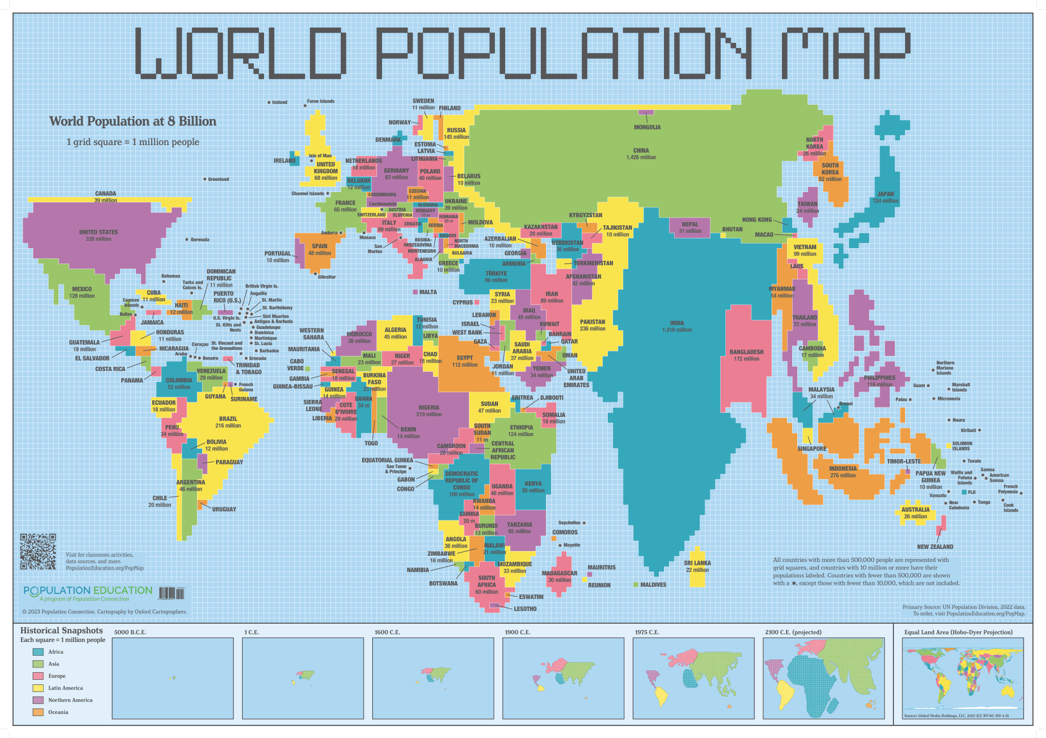
At its core, a cartogram is a testament to the idea that maps can be more than just navigation aids; they can be dynamic canvases for storytelling, transforming raw data into compelling visual narratives. This article will delve into the technical underpinnings, types, applications, and the software ecosystem that empowers the creation and interpretation of these unique geospatial visualizations.
The Core Concept: Distorting Geography for Data Insight
The fundamental principle behind a cartogram is to exchange conventional geographic accuracy for statistical accuracy. Instead of showing the world as it physically exists, a cartogram rearranges or resizes regions to proportionally represent a chosen variable. This radical departure from traditional cartography allows for immediate visual comparison of magnitudes across different areas, often revealing patterns that would be obscured on a standard map.
Beyond Traditional Maps: Area vs. Value
Traditional maps, such as choropleth maps, use color shading to represent data values within fixed geographical boundaries. While effective for showing distribution, they can be misleading. For instance, a large, sparsely populated state might dominate a choropleth map visually, even if its actual contribution to the variable (e.g., population, GDP) is minimal compared to a smaller, densely populated state.
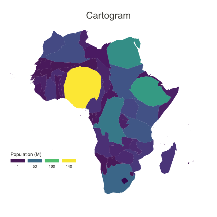
A cartogram directly addresses this issue. If a region has a higher value for the chosen variable (e.g., more population), its size on the cartogram will be proportionally larger. Conversely, regions with lower values will shrink. This transformation shifts the visual weight from physical size to the importance of the data itself, offering a more intuitive grasp of relative magnitudes. It’s a sophisticated exercise in data transformation, requiring precise algorithms and careful design to ensure the resulting visualization remains interpretable and insightful, rather than just confusing.
The Fundamental Principle: Area-Based Representation
The design of a cartogram relies on a computational process that scales or deforms geographic shapes based on statistical data. Imagine a map of the United States where each state’s area is proportional to its population. California and Texas would balloon in size, while Montana and Wyoming would shrink dramatically. This isn’t just about scaling; it’s about maintaining adjacency where possible (in contiguous cartograms) or at least relative position, while ensuring the visual impact accurately reflects the underlying numbers. The technological challenge lies in managing this distortion without rendering the map completely unrecognizable, thereby preserving some degree of geographic context for the viewer. This intricate balance is often achieved through iterative computational methods, making cartograms a prime example of applied computer science in data visualization.
Types of Cartograms: A Spectrum of Visualization Techniques
The field of cartography has evolved various methods to construct cartograms, each with its own advantages and inherent visual compromises. These methods are largely dictated by the algorithms used and the visual properties prioritized. Understanding these types is crucial for selecting the right tool for a given dataset and communication objective, all facilitated by different technological approaches.
Contiguous Cartograms
Contiguous cartograms strive to maintain the adjacency of geographic regions. This means that if two states share a border on a traditional map, they will ideally still share a distorted border on the cartogram. This type of cartogram is generally harder to create because it involves complex rubber-sheet distortions that stretch, shrink, and warp shapes while attempting to preserve connectivity. Algorithms for contiguous cartograms often employ iterative methods, like diffusion-based or force-directed approaches, which simulate physical forces to push and pull regions until their areas match the data values, all while minimizing shape distortion and maintaining adjacency. Software implementations for these are highly specialized and computationally intensive.
Non-Contiguous Cartograms
In contrast, non-contiguous cartograms are simpler to generate and interpret. Here, individual regions are scaled according to their data values, but their adjacencies are not preserved. Instead, each region becomes a separate, scaled shape, typically floating in its original relative position. While they lose some geographical context due to the gaps between regions, they are often easier to read for viewers unfamiliar with the base geography, as the individual shapes are typically less distorted. The technological process is straightforward: scale each polygon object based on the corresponding data value, then place it on a blank canvas. This simplicity makes them ideal for introductory visualizations or when the primary goal is to emphasize magnitude differences without the complexity of maintaining shared borders.
Dorling Cartograms
A popular subtype of non-contiguous cartograms is the Dorling cartogram, named after cartographer Daniel Dorling. In a Dorling cartogram, each geographic region is replaced by a standardized shape, typically a circle or square, scaled proportionally to the data variable. These circles are then packed together as tightly as possible, attempting to maintain their original relative positions without overlapping. Dorling cartograms are excellent for visualizing data where clear numerical comparison is key, such as election results or population counts, as the uniform shapes make size comparisons very direct. The computational challenge lies in the packing algorithm, which must efficiently arrange the circles to minimize overlap and maximize spatial representation, often relying on algorithms similar to those used in physics simulations for particle packing.
Rectangular Cartograms
Rectangular cartograms (also known as block or grid cartograms) represent regions as perfect rectangles or squares, scaled by their data value. These are particularly useful when the data structure naturally lends itself to a grid, such as visualizing electoral districts in a parliament or population distribution in a dense urban area. The advantage is their clean, uniform appearance, making it easy to compare areas and read labels. The complexity lies in arranging these rectangles to approximate geographic relationships while maintaining the correct area. This often involves tree-map-like algorithms or recursive partitioning techniques, which are common in software development for data layout and visualization.
The Technological Backbone: Creating Cartograms in the Digital Age
The creation of sophisticated cartograms is largely a product of advancements in computing power, geospatial software, and programming libraries. Without these technological tools, the intricate calculations and graphic manipulations required would be practically impossible.
Data Requirements and Pre-processing
Before any cartogram can be generated, precise and accurate data is essential. This includes:
- Geospatial Data: Typically in vector format (shapefiles, GeoJSON), defining the boundaries of the geographic regions (e.g., countries, states, counties).
- Statistical Data: Quantitative values linked to each geographic region (e.g., population, GDP, election votes, disease incidence).
- Data Linkage: The ability to accurately join the statistical data to its corresponding geographic feature. This often involves common identifiers (e.g., FIPS codes, ISO country codes) and robust data management within a GIS environment.
Pre-processing involves cleaning, validating, and structuring this data, often using scripting languages like Python or R, or dedicated ETL (Extract, Transform, Load) tools designed for data engineering workflows.
Software and Tools for Cartogram Generation
The evolution of Geographic Information Systems (GIS) and data visualization software has democratized cartogram creation:
- GIS Software: Platforms like Esri ArcGIS and QGIS offer varying levels of support for cartogram generation. While ArcGIS might require specialized extensions or scripting, QGIS often benefits from community-developed plugins that implement different cartogram algorithms. These tools provide the foundational capabilities for manipulating vector data.
- Programming Libraries: For developers and data scientists, libraries in languages like Python (e.g.,
geopandas,matplotlib,folium), R (e.g.,cartogram), and JavaScript (e.g.,D3.jsfor web-based interactive cartograms) provide granular control over the cartogram generation process. These libraries allow for custom algorithm implementation, dynamic adjustments, and integration into larger data pipelines. - Specialized Cartogram Tools: Some dedicated online tools or desktop applications focus specifically on cartograms, simplifying the process for users without deep GIS or programming expertise. These often use simplified interfaces to abstract away the underlying computational complexity.
Algorithmic Challenges and Innovations
The real magic of cartograms lies in their underlying algorithms. Creating a contiguous cartogram, for example, is a significant computational challenge. Early methods involved manual approximations, but modern approaches leverage:
- Diffusion-based algorithms: Treat the map as a membrane that expands or contracts based on data density, mimicking a physical diffusion process.
- Force-directed algorithms: Conceptualize regions as connected nodes in a graph, applying forces to adjust their sizes and positions while maintaining connections.
- Iterative Optimization: Many algorithms are iterative, meaning they refine the map through many small steps, gradually converging towards an optimal distortion that balances area accuracy with shape preservation and adjacency.
The continuous innovation in these algorithms aims to produce cartograms that are not only statistically accurate but also visually coherent and less prone to misinterpretation, leveraging advances in computational geometry and graph theory.
Applications and Impact in the Tech Landscape
Cartograms, as sophisticated data visualization tools, find their utility across various sectors, demonstrating how technological prowess can unlock deeper insights from spatial data.
Data Journalism and Communication
For data journalists, cartograms are invaluable for making complex social, economic, or political data immediately understandable and impactful. They can visually communicate the true weight of electoral votes, highlight disparities in wealth or population density, or show the spread of diseases in a way that standard maps cannot. Tools like D3.js enable interactive cartograms on news websites, allowing readers to explore the data dynamically, enhancing engagement and comprehension. This fusion of geospatial tech and storytelling is revolutionizing how news is consumed.
Urban Planning and Resource Management
In urban planning, cartograms help visualize population distribution, resource consumption (e.g., water, energy), or the accessibility of public services. By distorting city maps based on these variables, planners can identify areas of high demand or underserved populations, guiding infrastructure development, zoning decisions, and the allocation of resources more effectively. These applications leverage GIS platforms extensively, often integrating real-time sensor data and predictive analytics.
Business Intelligence and Market Analysis
Businesses use cartograms to understand market dynamics. A map distorted by sales volume might reveal unexpected geographic market strengths or weaknesses, regardless of a region’s physical size. This allows for targeted marketing campaigns, optimized sales territory definitions, and strategic business expansion based on actual customer bases or economic indicators. Integration with CRM systems and business intelligence dashboards makes these visualizations actionable for strategic decision-making.
Scientific Research and Policy Making
Researchers in fields like demography, epidemiology, and environmental science use cartograms to visualize trends that are obscured by geographical area. For example, a cartogram of disease prevalence might show the true burden on different populations, rather than just the geographic spread. Policy makers can then use these visualizations to develop evidence-based interventions and allocate funds more effectively, understanding the true scale of issues across diverse populations.
Challenges and the Future of Cartographic Visualization
Despite their power, cartograms present certain challenges, primarily related to interpretation and complexity. However, ongoing technological advancements are paving the way for more intuitive and dynamic cartographic visualizations.
Interpretation Challenges and Potential Misleading Visualizations
The inherent distortion of a cartogram, while its strength, can also be its weakness. For viewers unfamiliar with the base geography, a heavily distorted cartogram can be difficult to read and potentially misleading. It requires a certain level of geographic literacy to correctly infer the original context. Moreover, poorly designed cartograms can exaggerate or diminish features in ways that misrepresent the data, emphasizing the need for clear labeling, accompanying legends, and contextual information. The choice of algorithm and variable is critical to avoid unintentional bias in the visualization.
Advancements in Interactive and Dynamic Cartograms
The future of cartograms is deeply intertwined with interactive web technologies. Modern web mapping libraries and data visualization frameworks (like Mapbox GL JS, Leaflet, D3.js) allow for the creation of interactive cartograms where users can zoom, pan, and even switch between different data variables or cartogram types on the fly. This interactivity helps mitigate interpretation challenges by allowing users to explore the data and revert to traditional maps for reference. Dynamic cartograms can also integrate real-time data, updating distortions as new information becomes available, making them invaluable for tracking evolving phenomena.
Integration with AI and Machine Learning
Emerging trends point towards the integration of artificial intelligence and machine learning into cartogram generation. AI could potentially automate the selection of optimal cartogram algorithms based on data characteristics, suggest the most effective visual encodings, or even learn from user feedback to generate more intuitive distortions. Machine learning could also enhance data pre-processing, identifying spatial patterns or anomalies that inform the cartogram’s design. This could lead to a new generation of smart cartograms that are easier to create, more robust, and highly adaptive to diverse data landscapes, further solidifying their role as essential tech tools for geospatial analysis.

Conclusion
A cartogram map is far more than a simple geographical representation; it is a sophisticated data visualization tool that leverages advanced computational techniques to reveal hidden patterns and communicate quantitative insights with unparalleled clarity. By deliberately distorting geographical areas to reflect statistical values, cartograms challenge traditional perceptions of space, offering a powerful lens through which to understand complex social, economic, and environmental phenomena.
As technology continues to advance, from more robust GIS software and powerful programming libraries to interactive web platforms and the promise of AI-driven design, the creation and interpretation of cartograms will become even more accessible and insightful. For anyone seeking to move beyond conventional maps to truly visualize the impact and distribution of data, understanding and utilizing cartograms is a critical skill in the modern tech landscape. They are a testament to how innovative data visualization, powered by technology, can transform raw numbers into compelling and actionable narratives.
aViewFromTheCave is a participant in the Amazon Services LLC Associates Program, an affiliate advertising program designed to provide a means for sites to earn advertising fees by advertising and linking to Amazon.com. Amazon, the Amazon logo, AmazonSupply, and the AmazonSupply logo are trademarks of Amazon.com, Inc. or its affiliates. As an Amazon Associate we earn affiliate commissions from qualifying purchases.