
In the dynamic world of branding and marketing, every element on a page, screen, or advertisement serves a specific purpose: to communicate, persuade, and connect. Among these tools, the “callout” stands out as a deceptively simple yet incredibly powerful device. Far from a mere aesthetic flourish, a callout is a strategic design and content element meticulously crafted to draw immediate attention to crucial information, a unique selling proposition, a compelling statistic, or a direct call to action. It acts as a visual and textual beacon, cutting through the surrounding noise to highlight what truly matters, thereby guiding the audience’s focus and enhancing the overall effectiveness of a brand’s message.

At its core, a callout is an interruption – a deliberate break in the visual or textual flow designed to make a particular piece of content pop. Whether it’s a vibrant box highlighting a limited-time offer, an arrow pointing to a key product feature, a speech bubble containing a customer testimonial, or an infographic pulling out a startling industry statistic, the objective remains consistent: to ensure that critical information is not just seen, but understood and remembered. In an era of information overload and dwindling attention spans, the ability to succinctly and impactively convey key messages is paramount for brand success. Understanding what constitutes an effective callout, and how to strategically deploy it, is therefore indispensable for any brand aiming to cut through the clutter and truly resonate with its target audience. This article will delve into the multifaceted nature of callouts, exploring their strategic role, design principles, diverse applications, and methods for measuring their impact within the broader context of brand communication.
The Strategic Role of Callouts in Brand Communication
Callouts are more than just visual cues; they are integral components of a robust brand communication strategy. Their primary function revolves around manipulating attention, clarifying messages, and reinforcing the core values and propositions that define a brand. By strategically employing callouts, brands can sculpt the user experience, ensuring that visitors extract the most valuable information without feeling overwhelmed or lost.
Capturing Attention and Guiding Focus
In today’s fast-paced digital landscape, consumers are bombarded with an unprecedented volume of information. Websites are dense, advertisements are ubiquitous, and attention spans are notoriously short. This environment makes it challenging for brands to ensure their most critical messages are not only seen but also processed. This is where callouts become invaluable. By employing contrasting colors, bold typography, distinctive shapes, or strategic white space, a callout visually separates itself from the surrounding content, immediately drawing the eye.
Once attention is captured, the callout then serves to guide the user’s focus. Imagine a landing page with extensive text describing a product’s features. Without callouts, a user might skim the page and miss the most compelling benefits. However, a well-placed callout highlighting a “5-star customer rating” or “Exclusive 30-day money-back guarantee” directs the user’s gaze precisely to the information the brand wants to prioritize. This intentional guidance ensures that key value propositions or calls to action are not overlooked, improving the chances of engagement and conversion. It’s about curating the user’s journey, making sure they don’t just consume content, but absorb the right content at the right time.
Enhancing Message Clarity and Recall
The human brain processes visual information much faster than text. Callouts leverage this principle by presenting information in easily digestible, visually appealing chunks. Instead of burying a crucial statistic within a paragraph, a callout extracts it, places it in a prominent position, and often pairs it with an icon or a short, impactful headline. This simplification significantly enhances message clarity. Complex ideas or extensive data can be distilled into concise, memorable statements or figures, making them far easier for the audience to grasp and retain.
For instance, a software company might have a detailed feature list, but a callout stating “Boost productivity by 40% in the first month” is far more impactful and memorable than a technical description of how that productivity boost is achieved. This bite-sized communication strategy combats cognitive overload, ensuring that the brand’s core benefits are not only understood in the moment but also stick in the consumer’s mind long after they’ve left the page. Enhanced recall is crucial for brand recognition and ultimately influences purchasing decisions, as consumers are more likely to remember brands that effectively communicate their value.
Reinforcing Brand Value and Unique Selling Propositions (USPs)
Beyond drawing attention to individual pieces of information, callouts play a critical role in consistently reinforcing a brand’s overall value proposition and its unique selling points. Brands invest heavily in defining what makes them distinct and valuable; callouts are the tools that articulate these distinctions directly to the consumer. Whether it’s a commitment to sustainability, exceptional customer service, cutting-edge innovation, or unbeatable affordability, callouts can serve as mini-billboards for these brand pillars.
Consider an e-commerce brand emphasizing its commitment to speed. A callout stating “Free Next-Day Delivery” directly reinforces this promise. For a luxury brand focused on craftsmanship, a callout like “Hand-stitched in Italy” communicates exclusivity and quality. By repeatedly and prominently featuring these USPs through callouts across various marketing touchpoints, brands build a consistent narrative that strengthens their identity and differentiates them from competitors. This continuous reinforcement helps to build trust, establish credibility, and solidify the brand’s position in the minds of its target audience, ensuring that its unique promise is always front and center.
Anatomy of an Effective Callout: Design and Content Principles
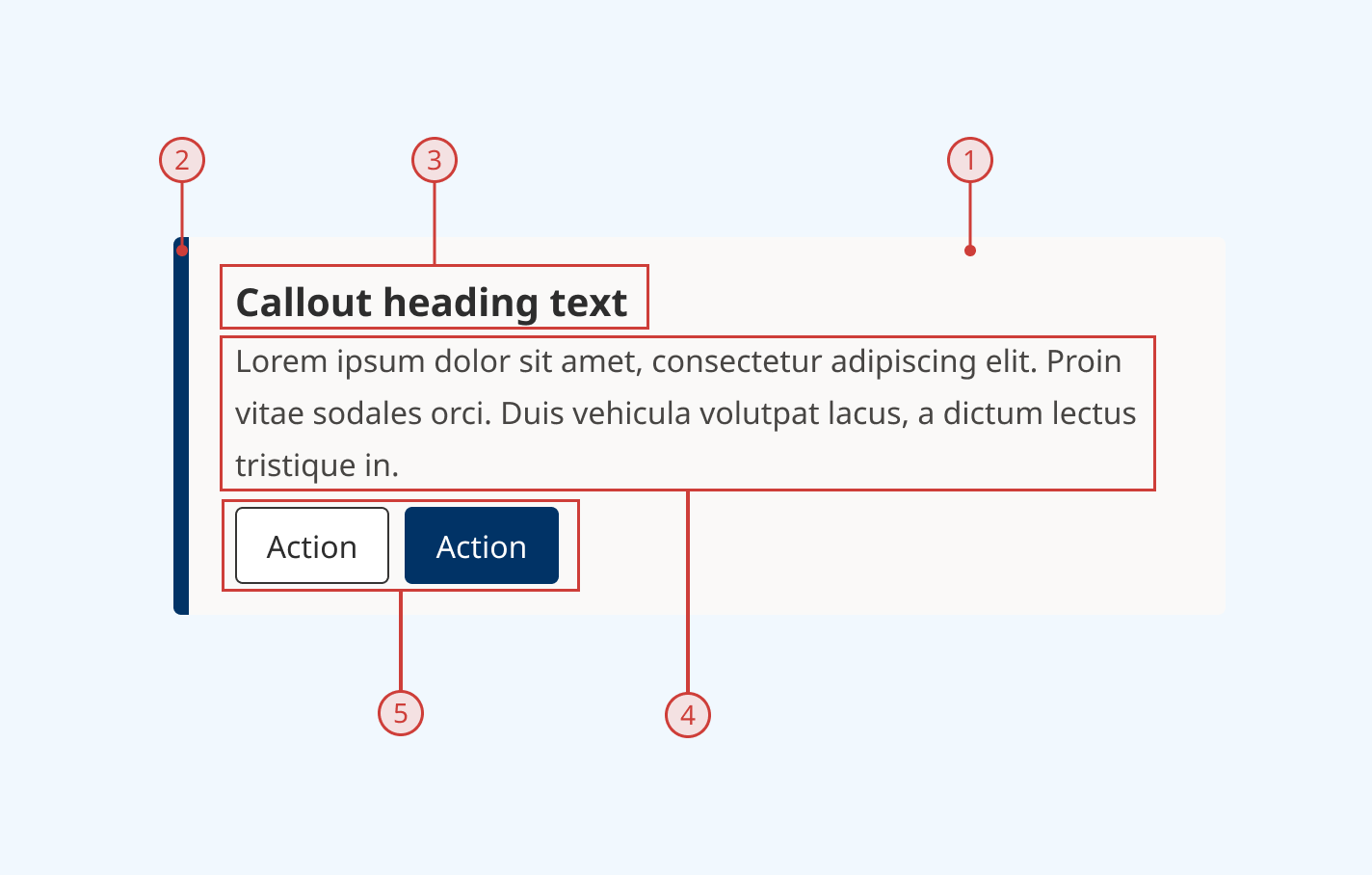
Creating an effective callout is an art and a science, requiring a thoughtful combination of visual design and compelling content. It’s not enough for a callout to simply exist; it must be strategically designed and precisely worded to achieve its communicative goals. A poorly designed or vaguely worded callout can easily be overlooked or, worse, detract from the overall brand message.
Visual Design Elements
The visual presentation of a callout is its first point of engagement. It must immediately stand out while remaining cohesive with the overall brand identity.
-
Typography: The font choice for a callout is critical. It should be legible, impactful, and ideally complementary to the brand’s primary typeface. Often, a bolder weight, a slightly larger size, or a contrasting font can be used to make the text pop. However, it’s essential to avoid overly decorative or complex fonts that hinder readability.
-
Color: Color is perhaps the most powerful visual tool for a callout. Strategic use of brand accent colors, or even a completely contrasting color (when appropriate), can instantly draw the eye. The chosen color should have sufficient contrast with the background to ensure accessibility and readability, while also evoking the desired emotion or urgency (e.g., red for urgency, green for positive affirmation).
-
Iconography and Imagery: Small, relevant icons can significantly enhance a callout’s impact, especially for visual learners. A checkmark for a benefit, a star for a rating, or an arrow for a direction can convey meaning quickly. Similarly, mini-images or subtle background patterns can add visual interest without overwhelming the core message.
-
Layout and Shape: The physical container of a callout also contributes to its effectiveness. A simple rectangular box, a circular badge, a speech bubble, or an arrow shape can all serve different purposes. The use of ample white space around the callout ensures it doesn’t feel cramped and allows its content to breathe and stand out clearly from surrounding elements.
Compelling Copywriting and Messaging
While design draws the eye, it’s the copy within the callout that seals the deal. The text must be concise, clear, and compelling.
-
Clarity and Conciseness: A callout is not the place for lengthy explanations. Its message should be stripped down to its absolute essence. Every word must count. The goal is to convey the core idea in the fewest possible words, making it instantly understandable.
-
Action-Oriented Language: If the callout is designed to prompt an action (e.g., “Shop Now,” “Learn More,” “Get Your Free Trial”), the language should be direct and action-oriented. Verbs are powerful in this context. Even if it’s not a direct CTA, messaging should imply value or benefit that encourages further engagement.
-
Benefit-Driven Focus: Consumers are inherently looking for solutions to their problems or ways to improve their lives. Callout copy should focus on the benefit to the user, not just the feature of the product or service. Instead of “Advanced AI algorithms,” consider “Save hours with intelligent automation.”
-
Urgency and Scarcity (when applicable): For promotions or limited offers, incorporating elements of urgency (“Limited Stock,” “Offer Ends Soon”) or scarcity (“Only 3 Left!”) can significantly boost conversion rates, provided these claims are genuine and ethical.
Placement and Proximity
Even the most beautifully designed and expertly worded callout will fail if it’s placed incorrectly.
-
Strategic Positioning: Callouts should be placed where they are most likely to be seen and where their message is most relevant. This often means above the fold on a webpage, near related content, or in an area of natural visual flow. Heatmaps and eye-tracking studies can provide valuable insights into optimal placement.
-
Proximity to Relevant Content: A callout highlighting a product’s key feature should be placed near that product’s image or description. A testimonial callout should be near the service it praises. Disconnecting the callout from its context weakens its power and can confuse the audience.
-
Avoiding Overlap and Clutter: While callouts are designed to stand out, they should not obscure other important content or overwhelm the user. Too many callouts on a single page can create visual clutter, dilute the impact of each, and ultimately frustrate the user. Balance is key; each callout should have its own space to shine.
Diverse Applications of Callouts Across Marketing Channels
The versatility of callouts makes them an indispensable tool across virtually every marketing channel, adapting their form and function to suit the specific medium and communication goals. From the digital realm to traditional print, callouts serve to amplify messages and drive desired user behaviors.
Website and Digital Marketing
In the digital landscape, callouts are omnipresent and critical for user experience and conversion.
-
Landing Pages: On landing pages, callouts are instrumental in highlighting unique selling propositions, key benefits, and especially the primary call to action. A prominent callout like “Start Your Free Trial Now” or “Download Our Ebook” directs users precisely where the brand wants them to go, minimizing friction in the conversion funnel.
-
Product Pages: For e-commerce, product pages leverage callouts to emphasize features, customer reviews (“4.8 out of 5 Stars!”), special offers (“Buy One Get One Free”), or guarantees (“100% Satisfaction Guarantee”). These elements build trust and provide quick answers to common purchasing concerns.
-
Blog Posts and Content Marketing: In longer-form content, callouts can break up text, summarize key takeaways, highlight important statistics, or insert relevant calls to action (“Read More on X Topic,” “Subscribe to Our Newsletter”). They improve readability and encourage further engagement with the brand’s ecosystem.
-
Website Banners and Pop-ups: Though sometimes intrusive, strategically designed banner callouts or polite pop-ups can announce promotions, new products, or newsletter sign-ups, effectively capturing attention at opportune moments.
Advertising and Print Media
Traditional advertising, despite its perceived decline, still thrives on impactful callouts to deliver concise messages.
-
Banners and Billboards: Due to limited viewing time, outdoor advertising relies heavily on callouts to convey a brand’s core message or a critical piece of information (e.g., “New Location Open!” with an arrow pointing to an address). Large, bold typography and contrasting colors are paramount.
-
Brochures and Magazines: In print media, callouts are used to highlight testimonials, key features, pricing, or contact information. They guide the reader through the material, ensuring that important details are not lost in dense text or complex layouts. Infographic-style callouts can present data in an engaging visual format.
-
Flyers and Posters: These promotional materials often feature a central callout announcing an event, a discount, or a product launch, with supporting details usually provided in a smaller font, allowing the primary message to be instantly understood from a distance.
Social Media and Content Marketing
Social media platforms, with their emphasis on visual content and rapid consumption, are ripe for effective callouts.
-
Social Media Graphics: Whether it’s an Instagram carousel, a Facebook ad, or a LinkedIn post, callouts are used to overlay text on images or videos to highlight statistics, quotes, questions, or calls to action (“Swipe Up to Shop,” “Link in Bio”). They make posts more engaging and actionable.
-
Infographics: Callouts are the lifeblood of infographics, where complex data is distilled into easily digestible visual chunks. Each data point or insight is essentially a callout, leveraging icons, bold numbers, and short descriptions to convey information quickly and effectively.
-
Video Content: In video, callouts can appear as animated text overlays, lower thirds, or annotations, pointing out key facts, speaker names, product features, or website URLs, keeping the audience informed without interrupting the visual flow.
Measuring the Impact and Optimizing Callout Performance
The strategic deployment of callouts isn’t a “set it and forget it” task. To ensure they are truly effective and contributing to brand objectives, their performance must be continuously monitored, measured, and optimized. This data-driven approach allows brands to refine their callout strategies, maximizing their impact and return on investment.
Key Performance Indicators (KPIs) for Callouts
Measuring the success of a callout often involves tracking specific metrics that align with its intended purpose.
-
Click-Through Rate (CTR): If a callout contains a link (e.g., a “Learn More” button or a promotional banner), CTR is a primary KPI. A higher CTR indicates that the callout is effectively capturing attention and motivating users to take the desired next step.
-
Conversion Rate: For callouts designed to drive a direct action (e.g., “Sign Up,” “Buy Now”), the conversion rate measures how many users who saw/interacted with the callout completed the target action. This is a crucial indicator of the callout’s persuasive power.
-
Engagement Metrics: For informational callouts (e.g., statistics, testimonials), engagement might be harder to quantify directly but can be inferred through metrics like time on page, scroll depth, or bounce rate. If callouts are helping users quickly grasp key information, it might lead to longer engagement or lower bounce rates on pages with relevant content.
-
A/B Test Results: The most direct way to measure callout impact is through A/B testing, which provides clear data on which variations perform best (see below).
-
Qualitative Feedback: User surveys, heatmaps, and session recordings can offer qualitative insights into how users interact with and perceive callouts, revealing areas for improvement that quantitative data might miss.
A/B Testing and Iterative Improvement
A/B testing is perhaps the most powerful tool for optimizing callout performance. It involves creating two or more versions of a callout (e.g., different copy, colors, placements, or designs) and presenting them to different segments of your audience.
-
Hypothesis Generation: Start by forming a hypothesis. For example: “Changing the callout color from blue to orange will increase its CTR by 15%.”
-
Controlled Experimentation: Run the test, ensuring all other variables remain constant to isolate the impact of the callout change.
-
Data Analysis: Analyze the data to determine which version performed better against your chosen KPIs.
-
Implementation and Iteration: Implement the winning version and then continue the process by testing new hypotheses. This iterative approach allows brands to continually refine their callout strategy, identifying what truly resonates with their audience and drives the best results. Test everything from the exact wording of a headline to the size of an icon or the precise placement on a page.
Avoiding Overuse and Clutter
While callouts are potent tools, their effectiveness is inversely proportional to their abundance. Overusing callouts can lead to “callout fatigue” and visual clutter, which dilutes the impact of each individual callout and can overwhelm or frustrate the user.
-
Strategic Scarcity: Treat callouts as precious resources. Each one should have a clear purpose and highlight truly vital information. Resist the urge to turn every piece of content into a callout.
-
Visual Hierarchy: Ensure there’s a clear visual hierarchy on the page. Callouts should stand out, but they shouldn’t compete aggressively with each other or the primary content for attention. There should be one primary message or action per section, with callouts supporting that central theme.
-
Maintain Brand Cohesion: While callouts should contrast, they must still align with the overall brand guidelines regarding color palette, typography, and imagery. A consistent brand aesthetic, even with prominent callouts, reinforces professionalism and trust.
Conclusion
A callout, in the context of branding and marketing, is much more than a simple visual highlight; it is a meticulously crafted strategic element designed to command attention, clarify crucial information, and reinforce a brand’s core message. In an increasingly noisy digital and physical landscape, the ability to distil complex ideas into digestible, impactful statements is a critical differentiator. By understanding the strategic role callouts play in guiding user focus, enhancing message clarity, and reinforcing brand values, marketers and designers can wield them with powerful precision.
From the careful selection of typography and color to the crafting of concise, benefit-driven copy and the strategic placement on a page, every aspect of a callout’s creation demands thoughtful consideration. Its diverse applications across websites, advertising, social media, and print underscore its universal utility in effectively communicating a brand’s story. Ultimately, by continually measuring their performance through KPIs and embracing an iterative process of A/B testing, brands can ensure their callouts are not just visible, but truly impactful, driving engagement, conversions, and a stronger, more memorable brand presence. In essence, a well-executed callout doesn’t just speak to the audience; it compels them to listen, understand, and act.
aViewFromTheCave is a participant in the Amazon Services LLC Associates Program, an affiliate advertising program designed to provide a means for sites to earn advertising fees by advertising and linking to Amazon.com. Amazon, the Amazon logo, AmazonSupply, and the AmazonSupply logo are trademarks of Amazon.com, Inc. or its affiliates. As an Amazon Associate we earn affiliate commissions from qualifying purchases.