
In the rapidly evolving landscape of front-end development, the complexity of user interfaces has grown exponentially. As websites transitioned from static documents to dynamic, component-based applications, developers faced a recurring nightmare: CSS maintenance. Cascading Style Sheets, by their very nature, are global. Without a rigorous organizational structure, styles frequently leak, naming collisions occur, and the “specificity war”—where developers use increasingly specific selectors to override previous styles—becomes an inevitable drain on productivity.
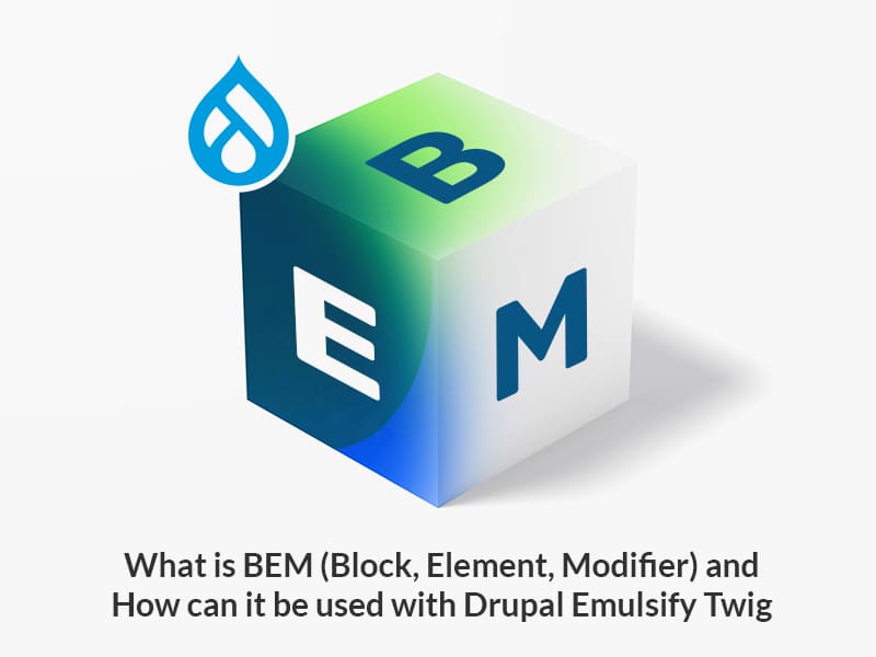
Enter BEM. Standing for Block, Element, Modifier, BEM is a highly popular naming convention and methodology designed to help developers create extendable and reusable interface components. Originally developed by the team at Yandex, BEM has since become a cornerstone of modern web architecture, providing a clear, strictly defined way to organize CSS that scales alongside the most complex digital products.
Understanding the Core Concepts: Block, Element, and Modifier
At its heart, BEM is a mental model that encourages developers to view a user interface as a collection of independent entities. By breaking down a UI into three distinct parts, the methodology provides a standardized language for both design and code.
The Block
A “Block” represents a standalone entity that is meaningful on its own. While a block can contain other blocks, it exists as a conceptually independent component of the interface. Think of a block as the “atoms” or “molecules” of your design. Common examples include a header, a navigation menu, a search bar, or a footer.
The primary rule of a block is that its name should describe its purpose (what it is) rather than its appearance (what it looks like). For instance, a class name like .error-message is a better block name than .red-box. In terms of CSS, blocks should not have margins or positions that affect their external environment; they should be “portable” so they can be dropped into any part of the page without breaking the layout.
The Element
An “Element” is a part of a block that has no standalone meaning and is semantically tied to its block. Elements are the internal constituent parts that make up the whole. If you have a menu block, the individual items within that menu (like menu item) are elements.
In BEM syntax, an element is denoted by two underscores (__) following the block name. For example: .menu__item or .header__logo. This naming convention immediately signals to any developer reading the code that the item is a child of the parent block, preventing confusion about where a specific style originates.
The Modifier
A “Modifier” is a flag used on a block or an element to change its appearance, state, or behavior. Modifiers are the key to reusability in BEM. Instead of creating a brand new block for a “success” button versus a “danger” button, you use a modifier to alter the base “button” block.
In BEM syntax, a modifier is denoted by two hyphens (--). For example: .button--large or .menu__item--active. This allows you to keep the base styles in the block or element class and only write the specific differences in the modifier class. This “multi-class” approach ensures that your CSS remains DRY (Don’t Repeat Yourself) and easy to toggle via JavaScript.
The Strategic Advantages of Using BEM in Modern Web Development
Adopting BEM is not merely about aesthetic preference in code; it is a strategic decision that impacts the entire lifecycle of a software project. As teams grow and codebases expand, the benefits of BEM become increasingly apparent.
Preventing Naming Collisions and Specificity Wars
One of the greatest challenges in large-scale CSS is the global namespace. In a traditional CSS environment, a class named .title might be used in the header, the sidebar, and the footer, leading to unintended style overrides. BEM solves this by ensuring that every class name is unique and context-aware. Because every element is prefixed with its block name (e.g., .card__title), the risk of two styles clashing is virtually eliminated.
Furthermore, BEM encourages a “flat” CSS structure. Because the class names themselves convey the hierarchy, there is no need to use nested selectors like .card div h2. This keeps the CSS specificity low. Low specificity is a superpower in web development; it makes it significantly easier to override styles when necessary without resorting to !important tags or overly complex selector chains that hurt browser rendering performance.
Enhancing Code Maintainability and Readability
For a developer stepping into a massive project for the first time, BEM acts as a self-documenting map. By looking at a snippet of HTML, a developer can instantly understand the relationship between different tags. If they see a class like .search-form__input--disabled, they know exactly which block it belongs to, what role it plays, and what state it is currently in.
This transparency reduces the cognitive load required to maintain the codebase. When a bug arises in the “footer,” the developer knows exactly which CSS file or section to look for and which classes are safe to edit without accidentally breaking the “header.”
Facilitating Scalability for Large Teams
In large organizations where multiple teams may be working on different features of the same application, BEM provides a shared vocabulary. It creates a standardized way of thinking about UI components. This consistency is vital for the success of Design Systems. When the design team and the engineering team both refer to a “Component” as a “Block,” the transition from Figma to code becomes seamless. BEM allows teams to build libraries of components that are truly modular, meaning they can be shared across different pages or even different projects with minimal friction.
Implementing BEM in Real-World Workflows
While the theory of BEM is straightforward, its implementation requires discipline and integration with modern development tools to reach its full potential.
Using BEM with SASS/SCSS
Pre-processors like SASS are a natural fit for BEM. Using the ampersand (&) operator, developers can write BEM code that is both organized and easy to read. For example:
.nav {
  display: flex;

  &__item {
    padding: 10px;

    &--active {
      color: blue;
    }
  }
}
This structure allows the developer to keep all the logic for a single block in one nested block of code, while the compiled CSS remains flat and performant. It balances the human need for hierarchical organization with the browser’s need for simple, low-specificity selectors.
BEM in Component-Based Frameworks
With the rise of frameworks like React, Vue, and Angular, some developers questioned whether BEM was still necessary. If styles are scoped to a component (using CSS Modules or Styled Components), why do we need a naming convention?
The answer lies in the clarity of the internal component structure. Even within a scoped React component, using BEM logic to name the internal elements helps distinguish between the component’s container, its constituent parts, and its various states. Furthermore, BEM provides a bridge for teams that are not yet using fully scoped CSS or those who prefer traditional CSS-in-JS patterns that still rely on class names for targeting.
Common Pitfalls and Best Practices for BEM Success
Despite its benefits, BEM can be misused, leading to overly long class names or “divitis.” Avoiding these common mistakes is essential for a clean implementation.
Avoiding “Grandchild” Selectors
A common error for BEM beginners is trying to mirror the entire DOM structure in the class name. For example: .card__content__button__text. This is not the BEM way. In BEM, elements are always children of the Block, regardless of how deeply they are nested in the HTML. The correct name would simply be .card__text. This keeps the class names manageable and ensures that the internal structure of a block can be changed (like moving a span inside a div) without having to rename all the CSS classes.
Balancing Clarity with Brevity
While BEM names can become long, they should remain descriptive. Developers should avoid abbreviations that are not universally understood. However, they should also avoid being overly verbose. Finding the “Goldilocks zone” of naming requires practice. The goal is that a developer who has never seen the project before should be able to guess what a class does just by reading its name.

BEM vs. Utility-First CSS: Where Does Methodology Sit Today?
In recent years, utility-first frameworks like Tailwind CSS have gained massive popularity, leading some to wonder if BEM is becoming obsolete. While utility-first CSS focuses on speed and avoiding the creation of new CSS rules, BEM focuses on the semantic integrity and modularity of components.
In many high-level enterprise environments, the two approaches are actually used in tandem. BEM is used to define the core structural components of the design system, while utility classes are used for “one-off” adjustments like specific spacing or alignment.
BEM remains the gold standard for developers who prioritize a clean separation of concerns and a clear, readable HTML structure. It forces a level of architectural thinking that utility classes sometimes bypass. By naming a block, a developer is forced to define what that component is, which leads to better-planned and more cohesive user interfaces.
As the tech industry continues to push toward more robust design systems and modular architecture, the principles of BEM—clarity, independence, and scalability—remain as relevant as ever. Whether you are a solo developer building a personal project or part of a global engineering team, BEM provides the framework necessary to turn a chaotic pile of styles into a professional, maintainable, and high-performance codebase.
aViewFromTheCave is a participant in the Amazon Services LLC Associates Program, an affiliate advertising program designed to provide a means for sites to earn advertising fees by advertising and linking to Amazon.com. Amazon, the Amazon logo, AmazonSupply, and the AmazonSupply logo are trademarks of Amazon.com, Inc. or its affiliates. As an Amazon Associate we earn affiliate commissions from qualifying purchases.