
The transition of the Galactic Republic into the Galactic Empire, catalyzed by the events of Episode 3, remains one of the most comprehensive and rapid organizational overhauls in fictional history. While historians often focus on the political and military shifts, the transformation of Coruscant provides a masterclass in aggressive brand strategy and corporate identity management. When Chancellor Palpatine declared the birth of the New Order, he didn’t just change the government; he initiated a total rebranding of the galaxy’s capital.
The “Coruscant Brand” transitioned from a symbol of pluralistic democracy and cultural heritage to a monument of monolithic authority. This metamorphosis was not accidental but was a calculated deployment of visual rhetoric, architectural semiotics, and strategic nomenclature designed to solidify the Empire’s market share of the galactic consciousness.
The Pivot from Republic Hub to Imperial Center: Renaming as a Strategic Tool
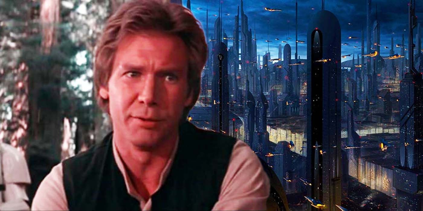
One of the most immediate shifts following the rise of the Empire was the renaming of the planet itself in official registries. While the name “Coruscant” remained in common parlance, the administrative and strategic brand name was changed to “Imperial Center.” This was a foundational move in brand architecture, designed to strip the planet of its historical weight and redefine it solely by its relationship to the new governing entity.
Breaking Continuity with the Past
In the world of brand strategy, names carry equity. The name “Coruscant” was associated with thousands of years of Republic history, Jedi influence, and a diverse, multi-cultural melting pot. By officially designating the planet as “Imperial Center,” the New Order effectively attempted to “white-label” the capital. The goal was to signal that the planet was no longer a destination for the galaxy’s various stakeholders to meet; it was now the proprietary headquarters of a single corporate entity.
This renaming served a dual purpose. First, it acted as a linguistic anchor, forcing every diplomatic envoy, merchant, and citizen to acknowledge the new ownership every time they addressed a manifest or filed a flight plan. Second, it decentralized the importance of the planet’s own history, placing the emphasis entirely on the “Imperial” prefix. This is a classic tactic used during corporate takeovers where the original identity of an acquired firm is subsumed into the parent brand to ensure total alignment.
The Psychology of Neutralizing Coruscant
The rebranding to “Imperial Center” also served to neutralize the “brand promise” of the Republic. The Republic’s brand was built on the idea of “The Galactic City”—a place where every voice mattered. The new brand, however, promised “Order.” By removing the unique geographic identifier and replacing it with a functional title, the Empire signaled a move toward homogenization. The messaging was clear: Coruscant was no longer a world of billions of individuals; it was the brain of a single, massive organism.
Visual Identity and Aesthetic Authoritarianism
Following Episode 3, the visual landscape of Coruscant underwent a radical transformation. The aesthetic of the High Republic and the late Republic era was characterized by an eclectic mix of art deco, sleek chrome, and diverse architectural styles that reflected the various species inhabiting the planet. The Empire replaced this with “Imperial Brutalism”—a design language intended to communicate power, stability, and the insignificance of the individual.
Brutalism as a Brand Language
The new Imperial architecture on Coruscant was defined by sharp angles, massive scale, and a lack of ornamentation. This shift mirrors how modern corporate brands use minimalist design to convey efficiency and technological superiority. However, the Empire took this to an extreme. The rounded edges and warm tones of the Senate District were increasingly overshadowed by the cold, grey slabs of Imperial administration buildings.
From a brand perspective, this was an exercise in “Aesthetic Authoritarianism.” The sharp, imposing silhouettes of the new structures were designed to be recognizable from orbit, creating a consistent visual brand identity that could be felt at every level of the planet’s atmosphere. The design language was not meant to be “beautiful” in the traditional sense; it was meant to be “undeniable.” It communicated that the brand was too large to be resisted and too efficient to be questioned.
Color Theory: The Shift from Warmth to Steel
The color palette of the planet changed significantly after the fall of the Republic. The Republic brand was associated with a wide spectrum of colors—deep blues, warm golds, and vibrant greens in the few remaining natural spaces. The post-Episode 3 Imperial brand narrowed this palette to “Imperial Grey,” black, and stark white, accented by the aggressive red of the Emperor’s Royal Guard and Imperial banners.
This color strategy is a textbook example of using visual cues to influence psychological perception. Grey communicates neutrality and logic, removing the “emotional” colors of democracy. The use of red was strategically reserved for high-value brand touchpoints associated directly with the Emperor’s personal brand, creating a sense of “prestige” through scarcity. By stripping the planet of its color, the Empire made the planet feel more like a factory and less like a home, reinforcing the brand value of “Order above All.”
Architectural Re-appropriation: The Imperial Palace
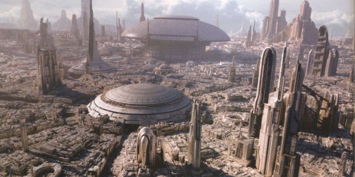
The most significant visual rebranding occurred at the Jedi Temple. Following the purge of the Jedi Order, the Temple was not demolished; instead, it was repurposed into the Imperial Palace. This is one of the most audacious examples of “brand hijacking” in history. By taking the most recognizable landmark of the previous era and turning it into the headquarters of the new regime, Palpatine successfully co-opted the Jedi’s visual equity while simultaneously perverting it.
Transforming the Jedi Temple Landmark
The Jedi Temple was a brand symbol of peace and spiritual guidance. Its five spires were iconic. By retrofitting the structure with Imperial technology, surveillance arrays, and the Emperor’s personal quarters, the brand message was clear: the power that once protected you is now the power that rules you.
This process of re-appropriation is often seen in the business world when a new company buys out a competitor and moves into their flagship office, often keeping the exterior structure but gutting the interior to reflect the new corporate culture. For the citizens of Coruscant, seeing the Jedi Temple draped in Imperial banners was the ultimate visual confirmation that the “Republic Brand” was dead.
Verticality and the Branding of Social Hierarchy
Post-Episode 3, the “Upper Levels” of Coruscant became more exclusive than ever, while the “Lower Levels” were effectively abandoned by the brand. The Empire’s brand strategy focused heavily on the elite—human-centric, high-net-worth individuals who could contribute to the war machine.
This created a vertical brand hierarchy. The top levels of the planet were the “Showroom,” polished and pristine to reflect the “Success” of the New Order. The lower levels, conversely, became the “Backstage,” where the brand’s promises of order and security were non-existent. This segmentation allowed the Empire to maintain a high-end brand image for the galaxy at large while ignoring the systemic rot beneath the surface.
Internal Communications and the Cult of the New Order
A brand is only as strong as its internal culture. To ensure the rebranding of Coruscant stuck, the Empire established the Commission for the Preservation of the New Order (COMPNOR). This acted as the Empire’s internal marketing and HR department, tasked with ensuring that every citizen—especially those on the capital—aligned with the new brand values.
COMPNOR: The Marketing Arm of the Empire
COMPNOR was responsible for the dissemination of “Imperial Truths.” This involved a total overhaul of the media landscape on Coruscant. State-sponsored news feeds replaced independent outlets, ensuring a singular brand voice. The messaging was relentless: the Republic was weak and chaotic; the Empire is strong and secure.
This is a masterclass in “integrated marketing communications” (IMC). By aligning all channels—from educational curriculum to public holofeeders—the Empire ensured that there was no “brand dissonance.” Every piece of information a citizen of Coruscant consumed reinforced the same narrative, making it nearly impossible for an alternative viewpoint to gain traction.
Standardization and the Erasure of Local Brand Identity
Coruscant was once a tapestry of different cultures and planetary identities. Post-Episode 3, the Empire pushed for “Standardization.” This meant the mandatory use of Galactic Basic, the imposition of Imperial credits as the only valid currency, and the phasing out of non-human cultural festivals.
In branding terms, this is known as “Brand Globalism”—the idea that a brand should look and feel the same regardless of where you are. By making Coruscant a “Standardized” world, the Empire made it easier to manage and control. They turned the planet into a franchise, where every district followed the same corporate guidelines, effectively killing the local “soul” of the planet in favor of a scalable, predictable Imperial experience.
The Long-term Impact of the Imperial Rebrand
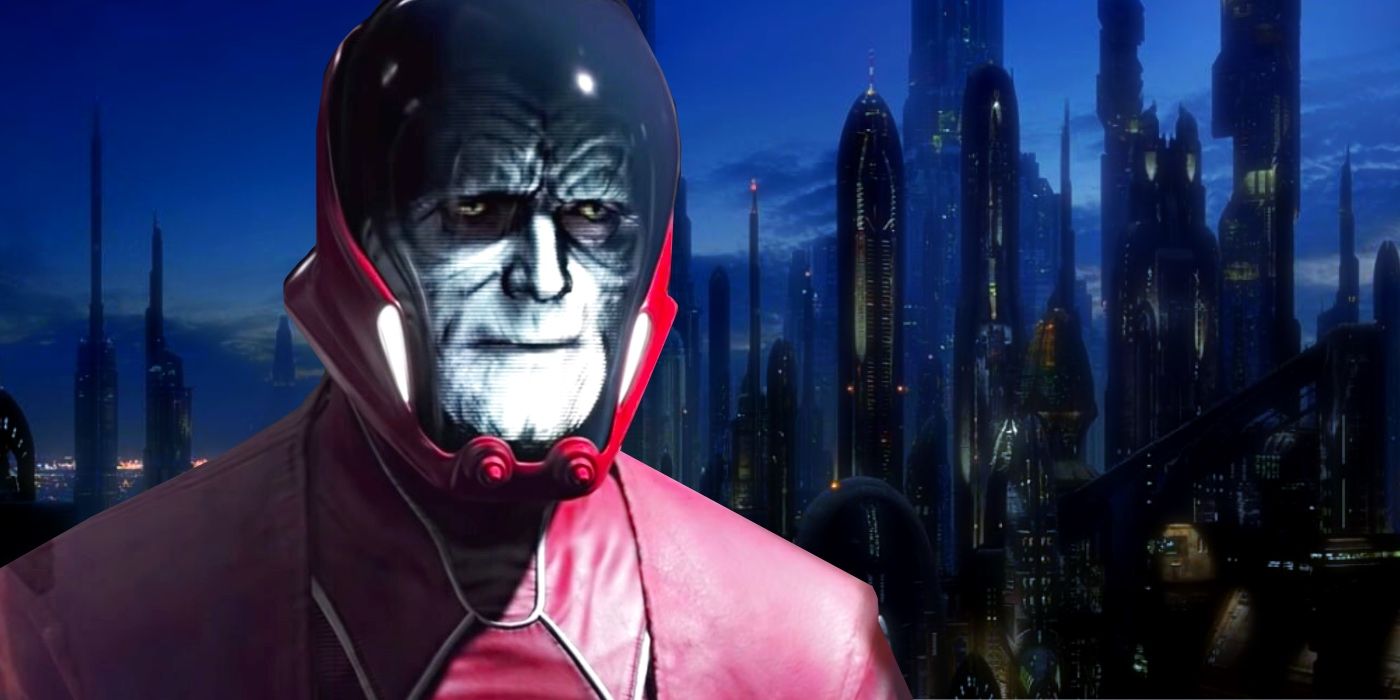
By the time the events of the original trilogy took place, the rebranding of Coruscant was so complete that the planet was almost unrecognizable from its Republic days. The transition from a vibrant, multi-polar world to a stark, centralized hub of authority was a triumph of brand management, albeit a dark one.
The “Imperial Center” brand was built on the pillars of strength, uniformity, and the suppression of the individual. While this strategy was effective at maintaining control for decades, it lacked the “Brand Loyalty” that comes from genuine engagement. The brand was respected and feared, but it was not loved. When the Empire eventually fell, the “Imperial Center” name was immediately discarded, and the planet reverted to “Coruscant,” proving that while a brand can be imposed through force and visual dominance, a name rooted in history and identity is far harder to erase permanently.
In the end, what happened to Coruscant after Episode 3 serves as a cautionary tale for brand managers: you can change the name, the colors, and the architecture, but the core identity of a legacy brand will always wait beneath the surface, ready to resurface when the pressure of the new regime finally cracks.
aViewFromTheCave is a participant in the Amazon Services LLC Associates Program, an affiliate advertising program designed to provide a means for sites to earn advertising fees by advertising and linking to Amazon.com. Amazon, the Amazon logo, AmazonSupply, and the AmazonSupply logo are trademarks of Amazon.com, Inc. or its affiliates. As an Amazon Associate we earn affiliate commissions from qualifying purchases.