In the realm of design and corporate identity, the concept of “unity” is often the invisible thread that separates a professional brand from a disorganized amateur effort. While the term originates in fine art—describing the sense of “oneness” or wholeness in a masterpiece—its application in the modern brand landscape is a matter of strategic survival. For a brand, unity is not merely an aesthetic choice; it is a psychological tool used to foster trust, ensure recognition, and communicate a singular, cohesive message across a fragmented digital marketplace.
Understanding what unity means in art, and by extension in brand strategy, requires a deep dive into how visual elements work together to create a singular experience. When every component of a brand’s visual output—from the logo and typography to the color palette and photographic style—feels like it belongs to the same family, the brand achieves a level of “Gestalt.” This psychological phenomenon suggests that the human brain perceives a whole image as more significant than the sum of its individual parts.
The Fundamental Principle: Defining Unity within the Brand Context
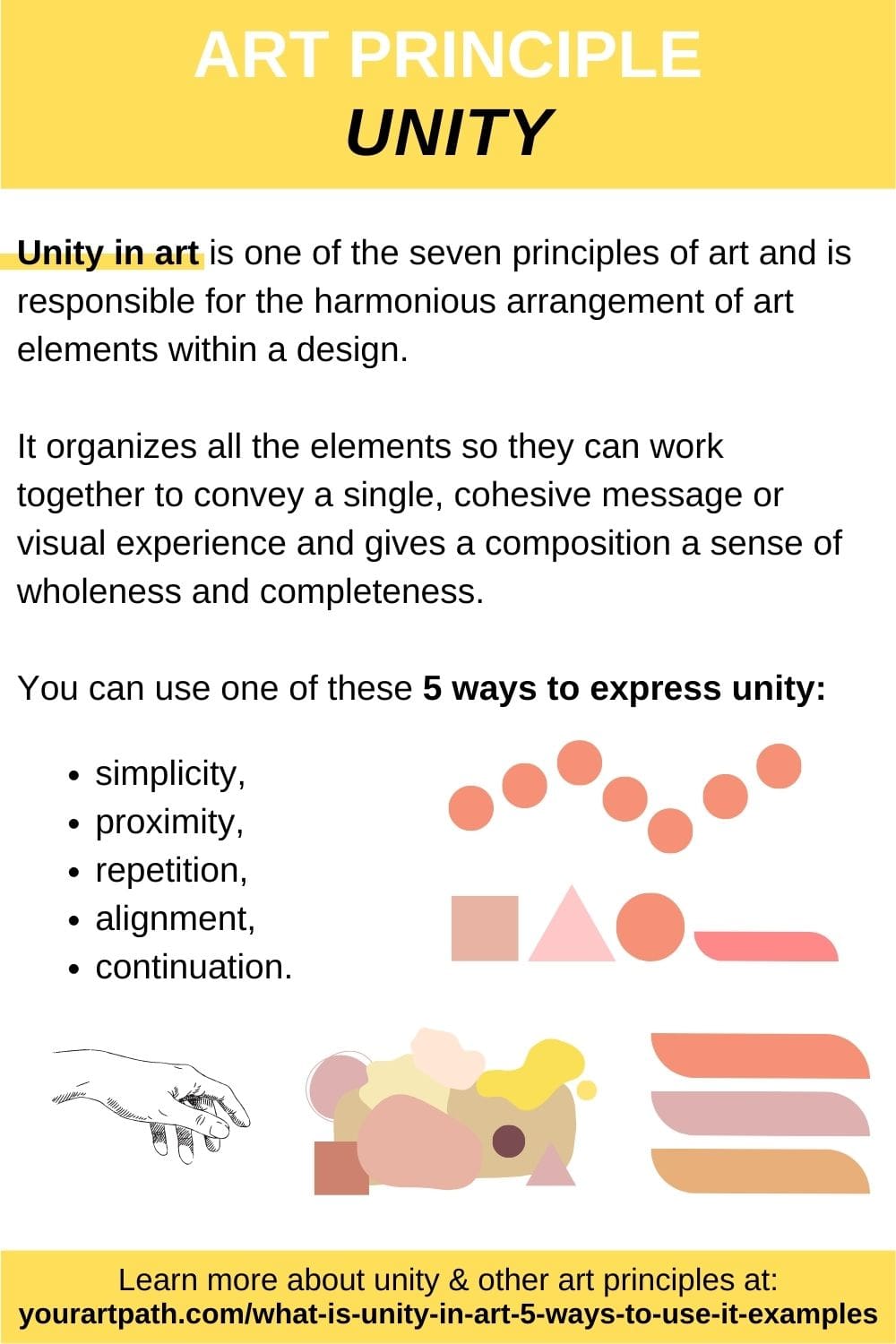
At its core, unity in the artistic sense refers to the arrangement of elements such that they create a balanced, harmonious whole. In branding, this translates to visual consistency. Without unity, a brand’s marketing materials can appear chaotic, leading to consumer confusion and a dilution of the brand’s perceived value.
The Intersection of Fine Art and Corporate Identity
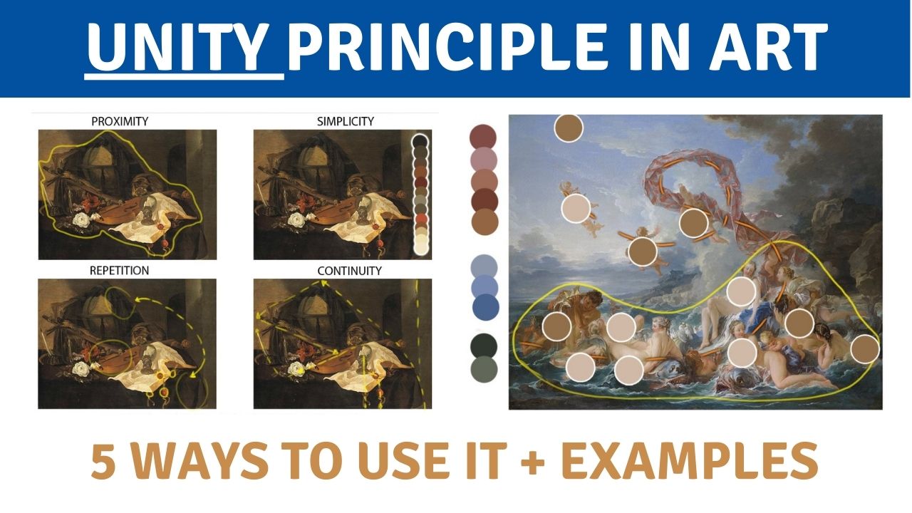
In traditional art, unity is achieved when the artist uses techniques such as proximity, repetition, and continuation to lead the viewer’s eye through the work. In corporate identity, these same principles are applied to ensure that a consumer recognizes a brand instantly, whether they are looking at a billboard, a mobile app, or a product package. The goal is to create a “visual shorthand.” When a brand achieves artistic unity, it no longer needs to rely solely on its logo to be identified; the “vibe” or aesthetic language of the brand becomes its signature.
Proximity and Alignment: The Building Blocks of Oneness
Proximity is one of the simplest yet most effective ways to achieve unity. In art, placing objects close together suggests a relationship. In brand design, the strategic use of white space and the proximity of text to imagery create a structured hierarchy. Alignment ensures that every element has a visual connection to something else on the page or screen. This creates a sense of order and intentionality. When a brand’s design elements are aligned and grouped logically, it signals to the audience that the company is organized, reliable, and professional.
Creating a Unified Brand Language through Repetition and Rhythm
If unity is the goal, repetition is the vehicle. In art, repeating a shape, color, or texture creates a sense of rhythm that keeps the viewer engaged. In brand strategy, repetition is what builds brand equity over time. By consistently using the same visual cues, a brand carves out a permanent space in the consumer’s memory.
The Role of Color Palettes in Establishing Visual Continuity
Color is perhaps the most immediate way to achieve unity. An artistic color palette isn’t just about picking “nice” colors; it’s about choosing a range of hues that work together to evoke a specific emotional response. In branding, a unified color strategy acts as a psychological anchor. When a consumer sees a specific shade of blue or a particular combination of neon accents, their brain immediately categorizes it under a specific brand umbrella. Deviating from this palette breaks the unity and, consequently, breaks the consumer’s “flow” of recognition.
Typographic Systems: Balancing Variety and Uniformity
Typography is often referred to as the “voice” of a brand’s visual art. To maintain unity, a brand must employ a typographic system that limits the number of fonts used while allowing for enough variety to indicate hierarchy (such as headlines versus body copy). Using too many disparate typefaces creates visual “noise” that disrupts unity. Conversely, a well-chosen font family used consistently across all platforms creates a rhythmic, cohesive experience that feels intentional and high-end.
The Psychological Impact of Unity on Consumer Perception
The reason unity is so vital in brand art is rooted in human psychology. We are biologically wired to seek patterns and order. When a brand presents a unified front, it aligns with the brain’s desire for simplicity, which in turn facilitates a smoother path to purchase.
Building Trust through Aesthetic Reliability
Trust is built on predictability. If a brand’s website looks like a high-tech minimalist gallery but its social media feed looks like a cluttered discount flyer, the “unity” is broken. This inconsistency creates a subconscious “red flag” for the consumer, suggesting a lack of focus or professionalism. However, when the artistic principles of unity are applied consistently, the consumer perceives the brand as reliable. This aesthetic reliability acts as a proxy for the quality of the product or service itself.
Reducing Cognitive Load: How Unity Improves User Experience
In the digital age, consumers are bombarded with information. Unity in design helps reduce “cognitive load”—the amount of mental effort required to process information. By using a unified set of icons, buttons, and layouts, a brand makes it easier for the user to navigate their ecosystem. When the “art” of the interface is unified, the user doesn’t have to relearn how to interact with the brand every time they switch devices. This seamlessness is a direct result of applying artistic harmony to functional design.
Case Studies: Brands that Mastered Artistic Unity
To truly understand the value of unity, one must look at the giants of industry who have treated their brand identity as a singular, evolving work of art. These companies prove that unity is not about being repetitive to the point of boredom, but about creating a flexible framework that always feels “on-brand.”
Apple: Minimalist Unity as a Luxury Signal
Apple is the gold standard for unity in art and brand. From the industrial design of the iPhone to the layout of their retail stores and the negative space in their advertisements, there is a profound sense of oneness. This unity communicates a specific set of values: simplicity, sophistication, and premium quality. Apple’s “art” is so unified that you could remove their logo from any of their products, and the majority of the global population would still identify the brand based on its visual language alone.
Coca-Cola: The Timeless Unity of Shape and Hue
Coca-Cola has maintained a unified brand identity for over a century. The specific “Coke Red” and the unique Spencerian script of the logo are part of a unified artistic strategy that has barely changed. Even when they launch modern campaigns, they use “continuation”—a principle of unity where the eye follows a line or curve. The iconic contour bottle shape is repeated in silhouettes and graphic patterns, ensuring that the brand’s “art” remains unified across different cultures, languages, and eras.
Implementation Strategies for Modern Brand Designers
Achieving unity is a deliberate process that requires both creative vision and rigorous discipline. For brand strategists and designers, the goal is to create a system that allows for growth without sacrificing the core visual identity.
Developing a Living Brand Style Guide
The most effective tool for maintaining unity is a comprehensive Brand Style Guide. This document acts as the “rulebook” for the brand’s art. It should define not just the logos and colors, but the application of those elements. How much padding should be around the logo? What is the specific “mood” of the photography? By codifying these artistic choices, a brand ensures that different teams—whether in-house or at an external agency—can produce work that contributes to the overall unity of the brand.

Ensuring Unity Across Multi-Channel Digital Touchpoints
In today’s multi-channel world, a brand exists in many places at once: Instagram, TikTok, email inboxes, physical storefronts, and web browsers. Unity must be maintained across all these touchpoints to prevent “brand fragmentation.” This often involves creating a “modular” design system where elements can be rearranged to fit different aspect ratios and platforms while retaining the same core artistic DNA. Whether a consumer is looking at a 15-second vertical video or a horizontal desktop banner, the use of color, motion, and typography should remain unified, reinforcing the brand identity at every possible interaction.
In conclusion, unity in art is the bridge between a collection of disparate images and a powerful, recognizable brand identity. By mastering the principles of harmony, repetition, and psychological alignment, businesses can transform their visual presence into a strategic asset. Unity doesn’t just make a brand look better; it makes it work better, creating a lasting impression that resonates with consumers on a visceral, intuitive level.
aViewFromTheCave is a participant in the Amazon Services LLC Associates Program, an affiliate advertising program designed to provide a means for sites to earn advertising fees by advertising and linking to Amazon.com. Amazon, the Amazon logo, AmazonSupply, and the AmazonSupply logo are trademarks of Amazon.com, Inc. or its affiliates. As an Amazon Associate we earn affiliate commissions from qualifying purchases.