
In the early days of mobile communication, texting was a strictly asynchronous medium. You sent a Short Message Service (SMS) packet, it traveled through the cellular signaling channel, and eventually, it landed on the recipient’s device. There was no feedback loop, no “read receipt,” and certainly no indication of what the other person was doing in real-time. Today, the landscape of digital communication has been transformed by the “three dots”—a simple UI element that has become one of the most significant psychological and technical features of modern software.
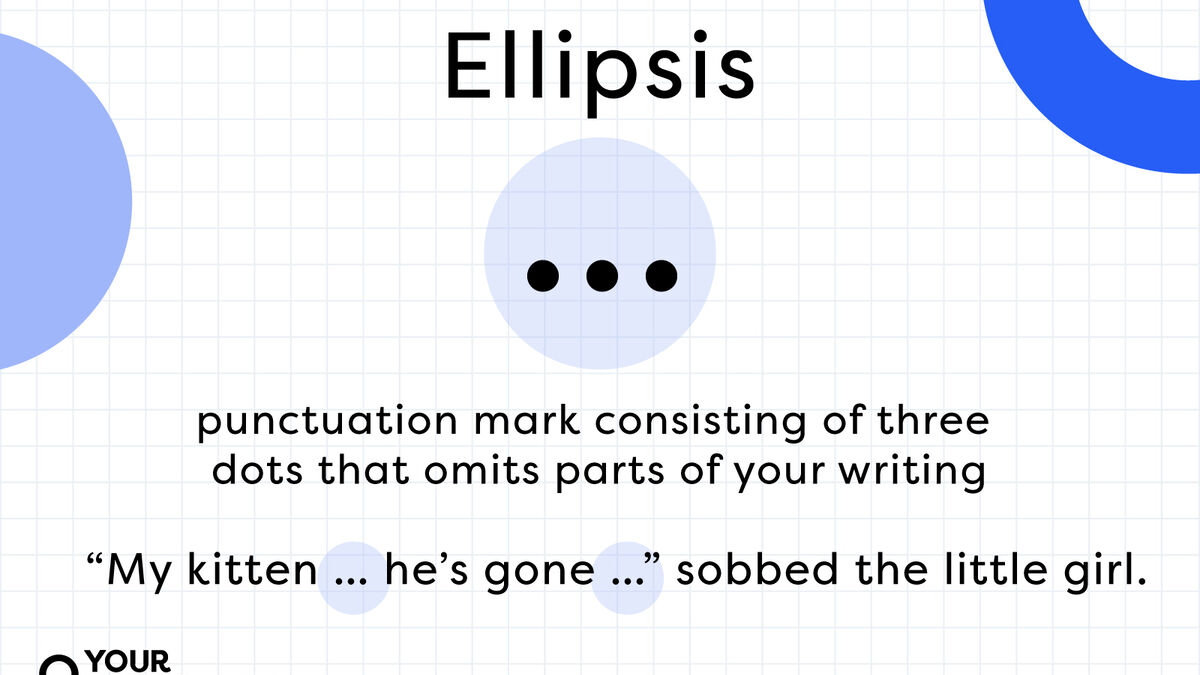
Whether appearing as an animated bubble in an iMessage thread or as a static “meatball menu” in an app’s interface, the ellipsis represents more than just punctuation. In the context of technology and user experience (UX) design, these three dots serve as a bridge between human intent and machine execution.
The Typing Indicator: The Pulse of Synchronous Communication
The most common encounter with “three dots” in texting is the typing indicator. This feature, technically known as a “presence indicator,” is designed to simulate the flow of a face-to-face conversation by providing real-time feedback. When you see those dots dancing on your screen, the software is communicating a specific state of data transmission.
The Technical Mechanism of “Is-Typing” Events
From a software engineering perspective, the typing indicator is powered by a persistent connection between the client device and the server, typically utilizing WebSockets or similar real-time communication protocols. Unlike a standard SMS, which is sent and forgotten by the network, modern Instant Messaging (IM) apps maintain an active “state.”
When a user taps a key in the text field, the app sends a small data packet—an “is-typing” event—to the server. The server then pushes this notification to the recipient’s device, triggering the animation of the three dots. To prevent the dots from flickering every time a user pauses for a millisecond, developers implement “debounce” or “throttle” logic. The indicator usually persists for a few seconds after the last keystroke before timing out, ensuring a smooth visual experience.
The Shift from Asynchronous to Synchronous UX
The introduction of the typing indicator by platforms like AOL Instant Messenger (AIM) and later refined by Apple’s iMessage changed the fundamental nature of texting. It transformed the medium from a digital version of a letter into a live event. This shift has profound implications for user engagement. By showing that a response is “in progress,” app developers reduce the “uncertainty gap,” encouraging users to stay within the app longer, thereby increasing session duration—a key metric for any software platform.
The “More” Menu: The Ellipsis as a Navigational Anchor
Beyond the chat bubble, the three dots serve a critical role in modern User Interface (UI) design. In this context, they are often referred to as the “Meatball Menu” (horizontal dots) or the “Kebab Menu” (vertical dots). As mobile screens remain constrained by physical real estate, the ellipsis has become the universal symbol for “more.”
Minimalism and Functional Grouping
In high-end software design, the goal is to reduce cognitive load. If every possible action—Delete, Mute, Archive, Export, Report—were visible on the main screen, the interface would be cluttered and unusable. The three dots act as a decluttering tool. By hiding secondary or tertiary functions behind an ellipsis, designers maintain a clean aesthetic while keeping powerful tools accessible.
This design choice relies on a concept called “progressive disclosure.” This strategy keeps the interface simple for novice users while providing advanced functionality for power users. When you tap the three dots in a texting app like WhatsApp or Telegram, you are essentially opening a drawer of extended capabilities that aren’t necessary for the core task of reading and writing.
Cross-Platform Standardization
The reason the three dots are so effective in tech is their standardization. Whether you are using an iOS app, an Android interface, or a web-based SaaS platform like Slack, the horizontal ellipsis is a recognized “affordance.” An affordance is a design feature that tells the user how to interact with it. Just as a door handle suggests “pull,” the three dots suggest “click for more options.” This cross-platform consistency is vital for digital security and accessibility, ensuring users can find privacy settings or blocking tools regardless of the hardware they use.
Protocol Shifts: How RCS and iMessage Redefined the Ellipsis

To understand why the “three dots” appear in some texts and not others, we must look at the underlying technology: the transition from legacy SMS/MMS to modern protocols like RCS (Rich Communication Services) and proprietary systems like iMessage.
The Limitations of SMS/MMS
Standard SMS is a technology built on the signaling paths of cellular networks. It was never designed for data-rich interactions. This is why, when you text someone via traditional SMS (the “green bubble” experience on iPhones), you do not see typing indicators. The network protocol simply does not support the constant back-and-forth signaling required to update a user’s status in real-time.
The Rise of RCS and Data-Driven Messaging
RCS is the modern successor to SMS, designed to bring the features of apps like WhatsApp to the native texting experience on Android and, more recently, across ecosystem borders. RCS operates over data (LTE/5G or Wi-Fi) rather than voice signaling channels. Because it functions more like an internet application, it supports “Rich” features, including high-resolution media, read receipts, and the ubiquitous typing indicator.
When the three dots appear in a native texting app today, it is a visual confirmation that the conversation has been “upgraded” from a basic carrier message to a data-rich session. This has significant implications for digital security, as these data-driven sessions often support better encryption standards than the antiquated SMS protocol.
The Psychology and Privacy of Presence Indicators
While the three dots are a triumph of real-time engineering, they also represent a point of tension in digital privacy and mental health. The “typing…” status is a form of passive surveillance that many users find intrusive.
Managing Digital Anxiety Through Software Settings
In response to user feedback regarding “digital anxiety”—the stress caused by knowing someone is watching you compose a message—many tech companies have introduced “Quiet Modes” or the ability to toggle presence indicators off. This represents a maturing of the software industry, recognizing that “always-on” connectivity can be a liability rather than a feature.
From a privacy standpoint, the typing indicator reveals metadata about user behavior. It tells the recipient when you are active and how long you are spending on a reply. For users concerned with digital footprints, the ability to disable these indicators is a critical security feature. This allows for “stealth” communication, where the user regains control over their digital presence.
AI and the Future of Texting Indicators
As we move into the era of AI-integrated messaging, the three dots are evolving again. We are beginning to see “AI writing” indicators. Platforms are experimenting with different visual cues to show when a message is being generated by a Large Language Model (LLM) rather than a human. In the near future, the three dots might not just mean “a person is typing,” but “a machine is processing.”
This evolution will require a new set of UI standards. Just as we learned that three dots mean a human is active, we will need new icons—perhaps sparkling icons or shifting gradients—to indicate machine-assisted communication. The goal remains the same: providing the user with transparency about what is happening on the other side of the glass.

Summary of the Ellipsis in the Tech Ecosystem
The “three dots” in texting are far more than a stylistic choice. They are a multi-functional tool that serves three distinct areas of the tech world:
- System State: As a typing indicator, they provide real-time feedback on data transmission and user activity, powered by WebSockets and RCS protocols.
- UI/UX Navigation: As a “meatball menu,” they enable minimalist, mobile-first design by housing secondary features through progressive disclosure.
- Communication Protocol: They serve as a visual marker for the “richness” of a connection, signaling to the user whether they are using a legacy system or a modern, data-encrypted platform.
As our devices become more sophisticated and our communication more integrated with artificial intelligence, the ellipsis will continue to be the primary symbol for the “hidden” work of software. It tells us that the machine is waiting, the data is moving, and the conversation—though digital—is still very much alive. Understanding these three dots is essential for navigating the modern digital landscape with both technical fluency and a clear sense of privacy.
aViewFromTheCave is a participant in the Amazon Services LLC Associates Program, an affiliate advertising program designed to provide a means for sites to earn advertising fees by advertising and linking to Amazon.com. Amazon, the Amazon logo, AmazonSupply, and the AmazonSupply logo are trademarks of Amazon.com, Inc. or its affiliates. As an Amazon Associate we earn affiliate commissions from qualifying purchases.