
In the vast and intricate landscape of branding, every element plays a crucial role in shaping perception, communicating identity, and forging connections with consumers. Among these elements, color stands out as a primal and potent force. It’s a silent communicator, capable of triggering deep-seated emotions, sparking subconscious associations, and ultimately, influencing purchasing decisions. While many colors carry distinct meanings, the vibrant and energetic hue of orange often sparks curiosity. “What does the orange mean?” is a question that delves into the strategic intentionality behind its use in brand identity and marketing. It’s not merely a splash of color; it’s a calculated choice, laden with psychological weight and designed to achieve specific brand objectives.

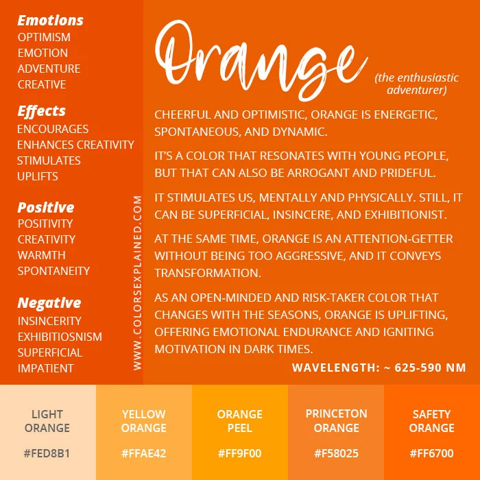
Orange is a color that sits at the intersection of red’s energy and yellow’s joy, creating a unique and compelling spectrum of associations. It is often linked to warmth, enthusiasm, creativity, and adventure. For brands, understanding these inherent qualities and knowing how to harness them is paramount. This exploration will delve into the multifaceted meanings and strategic applications of orange within the realm of branding, examining how it’s deployed to build recognition, convey specific brand personalities, and drive desired consumer responses.
The Psychology of Orange: More Than Just a Bright Color
The psychological impact of color is a well-established field, and orange holds a particularly fascinating position. Its ability to evoke a range of emotions and associations makes it a powerful tool in a brand’s arsenal. When a brand chooses to incorporate orange, it’s not a random decision; it’s a strategic deployment of psychological triggers.
Enthusiasm and Energy: Igniting Excitement
One of the most prominent associations with orange is its inherent energy and enthusiasm. It’s a color that commands attention and conveys a sense of dynamism. Brands looking to project vibrancy, optimism, and a go-getter attitude often turn to orange. Think of companies that champion innovation, adventure, or fun – orange often finds its way into their visual identity. This energy can translate into a feeling of excitement around a product or service, making it appear more appealing and engaging to the target audience. It suggests that interacting with the brand will be an invigorating experience.
Creativity and Innovation: Sparking New Ideas
Orange is also strongly linked to creativity and innovation. Its boldness and unconventional nature can inspire new ideas and encourage out-of-the-box thinking. Brands that position themselves as forward-thinking, artistic, or problem-solvers often leverage orange. It can signal a willingness to experiment, to challenge the status quo, and to offer unique solutions. This association can be particularly effective for brands in industries like design, technology, or entertainment, where creativity is a core value proposition.
Warmth and Approachability: Building Connections
Despite its vibrancy, orange also possesses a comforting warmth. It’s a color that can feel inviting and accessible, fostering a sense of approachability. This makes it an excellent choice for brands that want to build strong, positive relationships with their customers. Unlike some more aggressive colors, orange can strike a balance between being noticeable and being welcoming. This can encourage consumers to engage with the brand, feeling less intimidated and more inclined to explore what is being offered.
Strategic Applications of Orange in Brand Identity
The psychological underpinnings of orange translate directly into its strategic application in brand identity. From logos and packaging to marketing campaigns, orange is used to convey specific messages and achieve distinct branding goals.
Logo Design: The First Impression of Vibrancy
A brand’s logo is often the first and most enduring visual representation of its identity. When orange is incorporated into a logo, it immediately imbues the brand with a sense of energy and distinctiveness. Companies that want to stand out from competitors, project a youthful and dynamic image, or emphasize their innovative spirit often use orange in their logos. Consider brands like Nickelodeon, which uses orange to signify fun and entertainment for children, or Amazon’s smile logo, where the orange arrow points from ‘A’ to ‘Z’, suggesting comprehensive service and a friendly delivery experience. The specific shade of orange also matters; a bright, fiery orange will evoke a different feeling than a softer, more muted apricot tone.
Packaging: Capturing Attention on the Shelf
In the competitive retail environment, packaging is a critical touchpoint for attracting consumer attention. Orange, with its inherent visibility, is highly effective in making products stand out on crowded shelves. Its warmth can also create a sense of desire and appetite, making it particularly popular for food and beverage brands. Think of Fanta’s iconic orange branding, which directly communicates the flavor and promises a refreshing, energetic experience. Similarly, some snack brands use orange to convey a sense of fun and indulgence. The strategic use of orange on packaging can significantly influence impulse purchases and brand recall.
Marketing Campaigns: Driving Engagement and Action
Beyond static visual elements, orange is frequently employed in marketing campaigns to stimulate engagement and encourage action. Its energetic nature can be used to create a sense of urgency or excitement around promotions, new product launches, or special offers. For example, a bright orange call-to-action button on a website is more likely to grab a user’s attention and prompt them to click. Brands that aim to inspire a sense of adventure or exploration, such as outdoor gear companies, might use orange extensively in their advertising to evoke the thrill of the outdoors. The color can also be used to highlight specific features or benefits, drawing the consumer’s eye to what the brand wants them to notice.
Case Studies: Brands That Mastered the Orange Hue
Examining how successful brands have utilized orange provides invaluable insights into its strategic power. These case studies illustrate how the color has been integrated to define brand personality, build recognition, and connect with target audiences on an emotional level.
Harley-Davidson: Symbolizing Freedom and Rebellion
While not exclusively an orange brand, Harley-Davidson has famously incorporated vibrant orange into its branding, particularly in its signature “Vivid Black” and orange color schemes. For Harley-Davidson, orange is not just a color; it’s an extension of the brand’s ethos of freedom, rebellion, and adventurous spirit. It evokes the raw energy of the open road and the bold individuality of its riders. The association with fire and passion further amplifies this message, making orange a powerful symbol of the Harley-Davidson lifestyle. This strategic use of color reinforces the emotional connection riders have with the brand, transforming it from a mere product into a powerful symbol of identity.
Orange (Telecommunications Company): Direct and Memorable
The telecommunications company “Orange” is perhaps one of the most direct and obvious examples of a brand built around a single color. The company’s name and its visual identity are intrinsically linked. This strategy leverages the inherent qualities of orange – its energy, friendliness, and distinctiveness – to create a memorable and recognizable brand. The consistent use of orange across all touchpoints, from their mobile phones and store designs to their advertising, has cemented its association with connectivity and innovation. The simplicity of the branding allows the color itself to become a shorthand for the company, making it instantly identifiable in a crowded market.
Fanta: The Embodiment of Fun and Refreshment
Fanta, particularly its signature orange soda, has masterfully linked its brand to the color orange. The connection is so strong that the color itself has become synonymous with the product. Fanta uses orange to convey a sense of playful exuberance, youthful energy, and delicious refreshment. Their advertising often features bright, vibrant imagery and active scenarios, all amplified by the dominant presence of orange. This deliberate choice reinforces the brand’s promise of a fun and flavorful experience, making Fanta a go-to choice for consumers seeking a sweet, uplifting beverage.
The Nuances of Orange: Shades and Context Matter
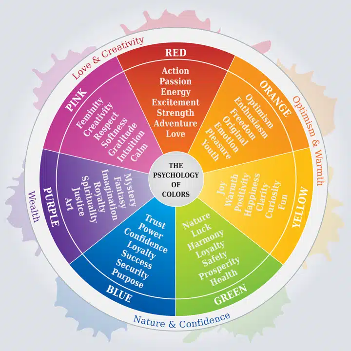
While we’ve explored the general psychological associations and strategic applications of orange, it’s crucial to acknowledge that the impact of the color can be nuanced, dependent on its specific shade and the context in which it is used. A bright, saturated orange will evoke a different feeling than a softer, more earthy terracotta.
Bright vs. Muted Oranges: Tailoring the Message
Bright, fiery oranges are excellent for conveying high energy, excitement, and a sense of urgency. They are attention-grabbing and can create a feeling of boldness and dynamism. Conversely, muted or earthy oranges, such as terracotta or burnt orange, evoke feelings of warmth, comfort, and sophistication. These shades can be used to create a more grounded, natural, or even rustic brand identity. The choice between a bright or muted orange allows brands to fine-tune the emotional response they wish to elicit from their audience, tailoring their message with subtle yet impactful variations.
Cultural and Contextual Interpretations: A Global Perspective
It’s also important to consider that color interpretations can vary across cultures. While orange is generally associated with warmth and enthusiasm in Western cultures, its meanings can differ elsewhere. In some Eastern cultures, orange can be associated with spirituality, prosperity, or mourning. Therefore, brands operating on a global scale must carefully consider these cultural nuances to ensure their branding resonates positively and avoids misinterpretation. The context of other colors used alongside orange also plays a significant role in shaping its perceived meaning. For instance, orange paired with black can convey a sense of Halloween or boldness, while orange paired with white might feel more cheerful and approachable.
Ultimately, “what does the orange mean” in branding is not a simple, singular answer. It’s a complex interplay of psychology, strategy, and execution. When wielded thoughtfully, orange is a powerful tool that can inject energy, foster creativity, build connections, and ensure a brand not only gets noticed but also deeply resonates with its audience. Its vibrant presence on the branding canvas is a testament to its enduring strategic value.
aViewFromTheCave is a participant in the Amazon Services LLC Associates Program, an affiliate advertising program designed to provide a means for sites to earn advertising fees by advertising and linking to Amazon.com. Amazon, the Amazon logo, AmazonSupply, and the AmazonSupply logo are trademarks of Amazon.com, Inc. or its affiliates. As an Amazon Associate we earn affiliate commissions from qualifying purchases.