
In the world of strategic competition, no figure is more central, more vulnerable, and more iconic than the King in chess. To ask “what does the King look like in chess” is to delve into a history of visual communication, standardization, and the psychological impact of design. From a branding perspective, the King is not merely a game piece; it is the ultimate corporate identity. It represents the “Brand Soul”—the singular element that must be protected at all costs, around which every other asset is deployed.

The visual evolution of the King provides a masterclass in brand strategy, demonstrating how a chaotic array of regional designs was eventually streamlined into a global gold standard. Today, we analyze the King’s appearance through the lens of brand identity, exploring how its physical form dictates its perceived value and authority.
The Evolution of the King: From Symbolism to Standardized Brand Identity
Before the mid-19th century, the “brand” of chess was fragmented. If you were to play a match in London, the pieces might look entirely different from those in Paris or St. Petersburg. The King’s appearance varied wildly, ranging from elaborate, fragile figurines to abstract geometric shapes. This lack of visual consistency was a significant hurdle for the “chess market,” making international play difficult and confusing.
The Pre-Staunton Era of Visual Chaos
In the early 1800s, popular designs like the Barleycorn, St. George, and Selenus sets dominated. The King in these sets was often overly ornate, adorned with multiple tiers of delicate carvings that made the piece top-heavy and prone to breaking. From a brand strategy perspective, these designs failed the “usability test.” They were beautiful but lacked the functional clarity required for a global audience. They represented a brand that was too focused on aesthetics and not enough on user experience (UX).
The Rise of the Staunton Standard
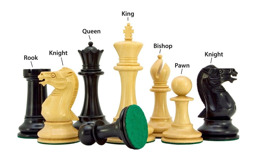
In 1849, a revolution occurred that would define the King’s look forever: the introduction of the Staunton chess set. Designed by Nathaniel Cook and endorsed by the world’s leading player, Howard Staunton, this design acted as a “rebranding” of the entire game. The King was redesigned with a wide base, a stately column, and a distinct finial. This move was a stroke of branding genius. It took a complex, fragmented product and gave it a recognizable, repeatable, and durable identity that anyone, anywhere, could identify instantly.
Why Visual Consistency Matters in Branding
The King’s transition to the Staunton design mirrors the importance of a “Brand Style Guide.” Just as a corporation requires a consistent logo and typography to ensure global recognition, the chess world needed a King that looked the same on every board. By standardizing the King’s appearance, the game became more professional, more marketable, and more accessible. This lesson remains vital for modern brands: consistency creates trust, and trust builds a lasting legacy.
Visual Elements of the King: Deconstructing the Anatomy of Authority
When we examine what the King looks like in a standard modern set, every curve and ornament serves a purpose in the “Visual Identity System.” The King is designed to be the tallest piece on the board, a clear indicator of its hierarchy. In branding, this is known as visual hierarchy—arranging elements to show their importance.
The Finial and the Cross: The Brand’s USP
The most defining feature of the King is its finial, which usually takes the form of a cross. In a branding context, this is the “Unique Selling Proposition” (USP) or the primary logo mark. It is the shorthand symbol that allows a player to distinguish the King from the Queen at a glance. Even in non-religious or stylized sets, the King retains a distinct crown or a specialized top. This “topping” serves as the brand’s signature, ensuring that even in a crowded field (or a crowded board), the leader is unmistakable.
Height and Proportion: Establishing Market Dominance
The King is almost always the tallest piece, typically standing between 3.75 and 4 inches in a tournament-sized set. This height is a deliberate design choice to signify “Market Leadership.” In corporate identity, size and scale are used to convey power. A flagship store or a prominent logo placement works on the same principle as the King’s height: it asserts dominance and provides a central point of focus for the consumer’s eye.
Materiality and Perception: The Luxury vs. Utility Brand
What the King is made of—be it plastic, boxwood, ebony, or marble—changes the “Brand Perception.” A plastic King speaks to accessibility, mass-market appeal, and utility (The “Value Brand”). An ebony King, weighted with lead and finished with a high-gloss polish, speaks to luxury, heritage, and exclusivity (The “Premium Brand”). The physical feel (the “haptics”) of the King is essential to the user’s connection with the game, much like the weight of an iPhone or the texture of a luxury car’s steering wheel informs the consumer’s perception of the brand’s quality.
The King as a Brand Archetype: Leadership and Protection
In branding theory, the “Archetype” is a way of giving a brand a human personality. The King in chess perfectly embodies the “Ruler” archetype. This archetype is defined by a desire for control, a sense of responsibility, and the creation of order out of chaos.
The Ruler Archetype in Corporate Strategy
Brands like Mercedes-Benz, Rolex, and Microsoft often lean into the Ruler archetype. Like the King in chess, these brands position themselves as the authoritative leaders in their respective fields. When we look at the King, we see a piece that does not move fast—it is limited to one square at a time—but its presence dictates the entire strategy of the “firm.” This mirrors high-level corporate leadership, where the CEO’s role is not to be the most active “tactician” on the ground, but to be the central figure whose safety and vision ensure the organization’s survival.
The Paradox of Power and Vulnerability
A fascinating aspect of the King’s visual brand is its inherent vulnerability. Despite being the most important piece, it is not the most powerful in terms of movement. This creates a compelling “Brand Narrative.” In marketing, showing a degree of vulnerability or a “human side” can make a powerful brand more relatable. The King must be protected by his “team” (the other pieces), which is a powerful metaphor for brand ecosystem management. No “King” brand survives without a strong support network of sub-brands, employees, and loyal customers.
Value and Symbolic Capital
In chess, the King has no numerical value because its loss ends the game; it is “priceless.” In brand strategy, this represents “Equity.” While you can put a price on a company’s inventory or its real estate, the Brand Equity—the reputation and the “King” of the business—is often the most valuable, yet intangible, asset. The visual “look” of the King must reflect this high stakes; if the King looks flimsy or cheap, the entire game feels less significant.
Applying Chess Branding to Corporate Identity
How can a modern business take the visual and strategic cues from the King to improve its own brand strategy? The King’s appearance teaches us about the “Centrality Principle” in design and marketing.
The Centrality Principle
In every marketing campaign, there should be a “King”—a central message or product that everything else supports. If your brand’s “King” is unclear, your customers will be confused. Whether it is a “Hero Product” or a “Core Value,” it must be as visually distinct as the King on a chessboard. It must be taller than the rest, capped with a unique identifier, and placed at the heart of your strategy.
Recognition in Complexity
Chess is a game of immense complexity, with trillions of possible positions. In this “noisy” environment, the King must be instantly recognizable. Modern brands operate in an even noisier environment—the digital marketplace. If your brand identity is too complex or lacks a “Standardized Finial” (a clear, recognizable logo or message), it will get lost in the shuffle. The lesson of the Staunton King is to simplify until only the most essential, authoritative elements remain.
The “Move” Strategy: Calculated Stability
The King’s limited movement (one square at a time) is a lesson in brand longevity. While “Pawn” brands might rush forward and “Knight” brands might jump erratically to follow trends, the “King” brand moves with calculated stability. Looking like a King means looking like you are here to stay. It’s about projecting a sense of permanent authority rather than fleeting trendiness.
Conclusion: The King as the Ultimate Visual Anchor
To understand what the King looks like in chess is to understand the power of visual semiotics. The King is a combination of historical tradition, functional design, and psychological authority. It stands tall, topped with a symbol of its status, anchored by a wide base of support.
For brand strategists, the King serves as a perpetual reminder that identity is not just about looking good—it is about being recognizable under pressure, maintaining a clear hierarchy, and representing the core value of the entire enterprise. Whether you are designing a new logo or architecting a global corporate strategy, ask yourself: “Does this have the presence of a King?” If the answer is yes, you have created a brand that is not just a participant in the market, but the very reason the game is played.
aViewFromTheCave is a participant in the Amazon Services LLC Associates Program, an affiliate advertising program designed to provide a means for sites to earn advertising fees by advertising and linking to Amazon.com. Amazon, the Amazon logo, AmazonSupply, and the AmazonSupply logo are trademarks of Amazon.com, Inc. or its affiliates. As an Amazon Associate we earn affiliate commissions from qualifying purchases.