
In the vast lexicon of human experience, few hues command as much visceral authority as red. It is the color of the blood that sustains us and the fire that transforms the landscape. Within the realm of spiritual symbolism, red serves as the primary bridge between the terrestrial and the celestial. Because it represents the foundational layers of existence, understanding its spiritual resonance is essential for anyone engaged in branding, design, or the cultivation of a cohesive visual identity. When we analyze red, we are not merely looking at a wavelength of light; we are exploring the archetypal language of power, survival, and manifestation.
The Foundation of Energy: Red and the Root Chakra
In spiritual anatomy, red is inextricably linked to the Muladhara, or the Root Chakra. Located at the base of the spine, this energy center is the anchor of our physical presence on earth. It governs our survival instincts, our sense of safety, and our connection to the material world.
Physical Grounding and Stability
From a branding perspective, the spiritual association of red with the Root Chakra translates into a perception of stability and reliability. When a brand utilizes deep, primary red, it signals to the consumer’s subconscious that the entity is established, secure, and firmly planted. This is why financial institutions and legacy brands often lean into crimson or brick-red tones. They are spiritually whispering to the client that they are a safe harbor in a chaotic market.
The Instinctual Drive
Beyond stability, red represents the raw, unfiltered life force. Spiritually, this is the color of “doing.” It is the impulse that drives an entrepreneur to launch a venture or an artist to put brush to canvas. When we speak of red in a brand identity, we are invoking the spirit of initiative. It is the color of the go-getter, the disruptor, and the pioneer. By aligning a brand with these spiritual frequencies, a company can tap into the consumer’s desire for action and momentum.
The Dual Nature of Red: Passion, Danger, and Transmutation
One of the most complex aspects of red’s spiritual significance is its inherent duality. It is simultaneously the color of life-giving love and life-ending destruction. In many esoteric traditions, red is seen as a force that requires containment. If fire is left unattended, it destroys; if harnessed, it provides warmth and light.
The Flame of Passion and Desire
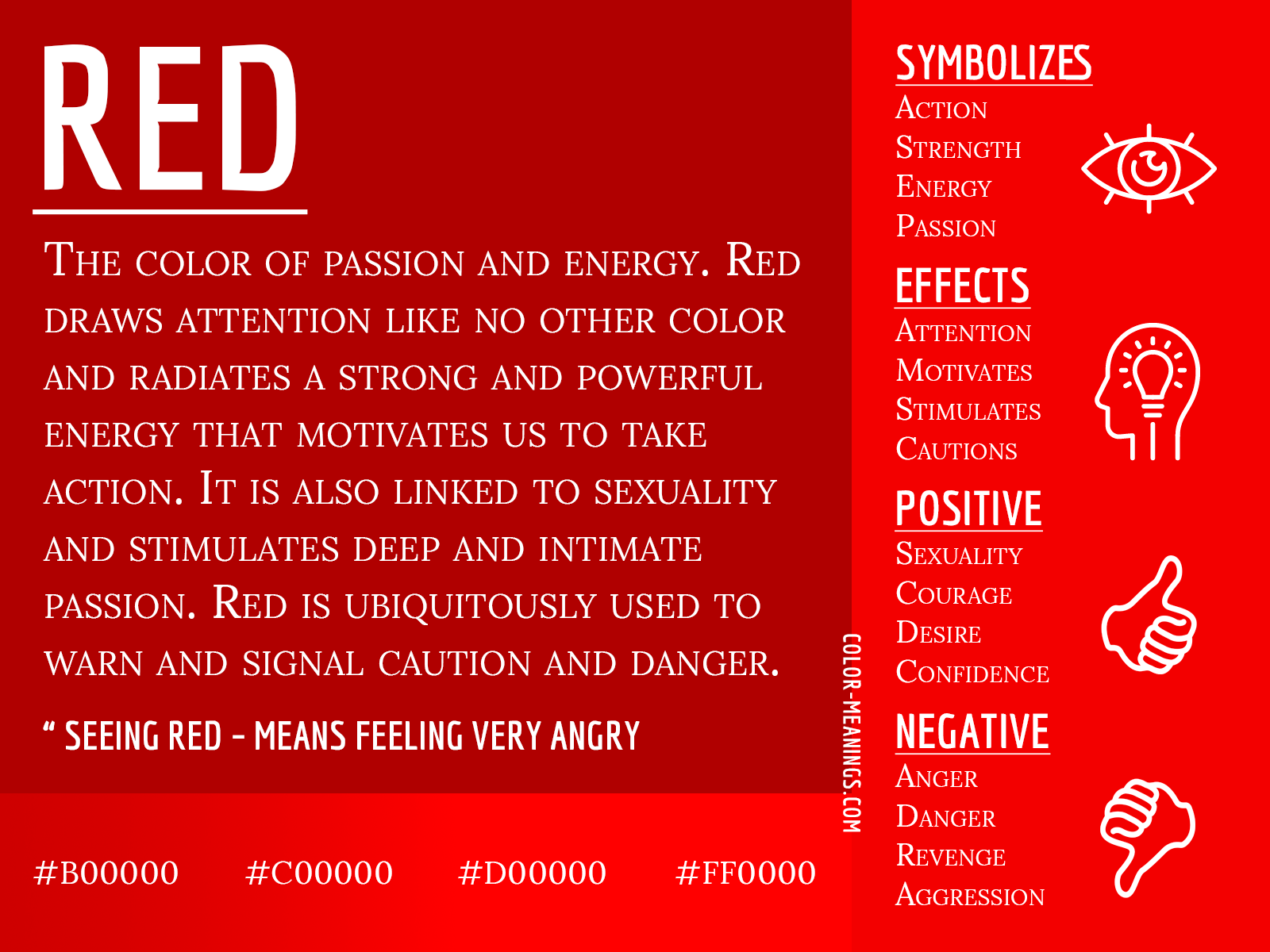
Spiritually, red is the highest vibration of physical desire. It is the color of the heart’s yearning, but specifically the yearning that manifests in the physical world. Marketing strategies that utilize red are often tapping into this “heart-fire.” It is an urgent color, one that demands immediate attention. When a brand uses red in its call-to-action buttons or promotional materials, it is intentionally trying to bypass the analytical mind and speak directly to the impulsive, passionate self.
The Element of Caution and Protection
Conversely, red serves as the universal sign for “stop.” Spiritually, this is an act of preservation. The same energy that drives a person to charge forward is the energy that warns them of danger. In design, red acts as a boundary-setter. It is a protective vibration. Brands that use red strategically can communicate a sense of “premium” exclusivity—a warning that to enter this space, one must possess a certain level of intent or prestige. Understanding this spiritual polarity allows for more sophisticated brand positioning; you are using the color to control the flow of energy between the brand and the audience.

Red as a Catalyst for Manifestation
In the study of spiritual alchemy, red is the color of manifestation—the point where thought becomes matter. If blue is the color of the abstract mind and the infinite sky, red is the color of the solid earth and the concrete result.
From Vision to Reality
For the modern professional, red represents the culmination of a project. It is the final stage of the creative cycle. When a strategy includes the use of red, it is an acknowledgment that the brand is moving from the phase of “theory” to the phase of “delivery.” This spiritual association explains why red is so pervasive in the world of high-performance business. It is a color that promises results. It tells the client that the abstract promises made during the pitch phase are about to be realized in physical form.
The Spirit of Leadership and Courage
Historically, red has been the color of royalty, the clergy, and the military—those who lead. The spiritual essence of red is courage; it is the willingness to be seen. In terms of personal branding, wearing or utilizing red acts as a psychological armor. It projects an aura of authority that is rooted in the spiritual belief that one has the right to take up space. By integrating red into your brand identity, you are not just choosing a color; you are adopting a mantle of leadership. You are asserting that your brand has the vitality to survive and the strength to lead others.
Harmonizing Red within a Visual Identity
While red is undeniably potent, its intensity requires a sophisticated approach to implementation. If red is the spiritual equivalent of a loud voice, using it in every aspect of a brand identity can lead to “noise.” To master the spiritual influence of red in a corporate or personal brand, one must learn the art of balanced presence.
The Psychology of Tint and Shade
Not all reds carry the same spiritual weight. A bright, neon red can feel aggressive, chaotic, and transient, potentially triggering a “fight or flight” response in a consumer. In contrast, deeper, more muted shades like burgundy, maroon, or oxblood carry a spiritual frequency of wisdom, experience, and enduring power. When crafting a brand identity, selecting the specific shade of red is a spiritual exercise in defining the “energy” you wish to project. Do you want the frenetic energy of a startup, or the grounded, authoritative wisdom of an institution?

Integrating Red for Maximum Impact
The most successful brands treat red as a focal point, not a backdrop. Because red is the color of the Root Chakra—the foundation—it works best when used to highlight the core elements of a brand. It is the exclamation point at the end of a sentence. It should be used to guide the user’s eye to the most important aspects of your message.
Spiritually, this is the act of directing intent. By placing red in strategic locations—a header, a logo mark, or a primary navigation element—you are essentially grounding the user’s attention. You are telling them, “This is where the substance is. This is where the truth of this brand resides.”
In conclusion, the color red is a profound spiritual tool for any brand strategist or design professional. It is the raw energy of existence, the stabilizing force of the earth, and the fire of human desire. By understanding its deeper, archetypal meanings, one can transcend superficial design choices and build a brand identity that resonates on a subconscious, spiritual level. When handled with intention, red does more than just catch the eye; it anchors the brand in the consciousness of the audience, creating a lasting impact that bridges the gap between vision and reality.
aViewFromTheCave is a participant in the Amazon Services LLC Associates Program, an affiliate advertising program designed to provide a means for sites to earn advertising fees by advertising and linking to Amazon.com. Amazon, the Amazon logo, AmazonSupply, and the AmazonSupply logo are trademarks of Amazon.com, Inc. or its affiliates. As an Amazon Associate we earn affiliate commissions from qualifying purchases.