
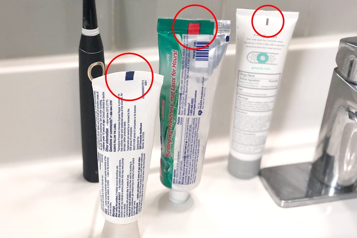
For decades, a pervasive urban legend has circulated through households and internet forums regarding the small, coloured squares found at the bottom of toothpaste tubes. These marks, often referred to as “colour codes,” have been the subject of elaborate theories suggesting that they indicate the chemical composition of the product. According to these myths, a green mark signifies an all-natural product, blue denotes natural ingredients mixed with medicine, red implies a mix of natural and chemical ingredients, and black indicates that the tube contains only harsh chemicals.
In the realm of brand strategy and packaging design, understanding why such myths gain traction—and why they are fundamentally incorrect—is essential. This exploration peels back the layers of industrial manufacturing and corporate identity to reveal the true purpose of these marks, proving that what consumers perceive as a “code” is actually a masterclass in automated supply chain logistics.

The Reality of Manufacturing: The “Eye Mark”
To understand why these colours appear, one must step away from the product’s chemical formula and into the high-speed environment of an assembly line. The marks at the bottom of toothpaste tubes are not “ingredients codes”; they are technically known as “eye marks” or “photo-eye marks.”
How Automated Packaging Works
Modern toothpaste tubes are produced in massive quantities, often at speeds that human eyes cannot track. During the manufacturing process, a long, flat sheet of laminated material is printed with the brand’s design. This material is then cut and rolled into the cylindrical shape of a tube.
Once the tube is formed, the bottom end must be sealed. This is where the eye mark becomes critical. As the open-ended tube passes through the filling machine, a sensor—usually an infrared light or a laser—scans the surface of the tube. When the sensor detects the specific contrast of the eye mark, it triggers the machine to perform an action: it cuts, folds, or seals the tube at the exact correct position.
Why Different Colours Exist
If these marks are purely functional for machines, why are there different colours? The answer lies in the limitations of industrial sensor technology. The “eye” of the packaging machine must be able to distinguish the mark from the background design of the tube. If a toothpaste tube features a bright red logo or a green mountain landscape, a green or red sensor mark might be invisible to the machine’s optical sensor.
Manufacturers choose the colour of the eye mark based on high-contrast requirements. If the packaging design is dark, the eye mark will likely be white or light-coloured. If the packaging is white or light, the eye mark will be a dark blue, green, or black. It is a decision driven by optical recognition software and production efficiency, not by the pharmacological makeup of the toothpaste itself.
Decoding the Brand Strategy Behind Packaging
The persistence of the “colour code” myth is a fascinating case study in consumer psychology and the limitations of corporate communication. Brands spend millions of dollars on packaging design to convey trust, efficacy, and safety, yet a small, obscure mark on the crimp of a tube has managed to bypass these branding efforts to become a “source of truth” for many consumers.
The Power of Visual Signifiers
Humans are naturally pattern-seeking creatures. In the absence of clear communication from brands about what these marks actually are, consumers filled the vacuum with their own logic. The myth gained momentum because it aligned with a growing consumer demand for “clean label” transparency. People want to know what they are putting into their bodies, and they are conditioned to look for cues—like “organic” labels or colour-coded warnings—to help them make quick, informed decisions.

When consumers see a black square, their brains immediately assign it negative connotations, reflecting a latent fear of hidden chemicals. This serves as a warning to brand strategists: when corporations fail to explain the technical aspects of their packaging, consumers will manufacture their own meanings, which can sometimes lead to unnecessary brand distrust.
Transparency as a Competitive Advantage
In the modern market, transparency is not just a moral imperative; it is a core component of brand equity. When a brand allows a false narrative about its products to persist, it loses control over the consumer narrative. Companies that address such myths head-on—through clear, accessible online content or FAQ sections—build deeper trust with their audience.
The “toothpaste myth” is a prime example of why brands must align their industrial design choices with their public-facing communication strategy. If a company uses a specific technology that could be misinterpreted, it is their responsibility to provide the context necessary to reassure the consumer. Ignoring these small design details can, ironically, lead to large-scale brand damage if the public begins to associate those marks with health risks.
Industrial Design Meets Consumer Perception
The disconnect between the factory floor and the bathroom counter highlights a gap in the broader field of industrial design. We live in an era of “experience design,” where every aspect of a product’s journey is intended to provide a seamless interaction. However, packaging manufacturing is often treated as a back-end logistics concern, divorced from the marketing and design teams who shape the consumer experience.
The Role of Quality Assurance
From a supply chain perspective, the eye mark is a quality assurance tool. If the sensor fails to register the mark, the machine might miss the seal, leading to leaking product or contaminated toothpaste. Thus, these marks are essential for product integrity.
From a designer’s perspective, these marks are an annoyance. They are an intrusive element on the canvas of a carefully designed tube. The tension between the engineers (who need the high-contrast mark for the machine) and the designers (who want a clean, aesthetic product) is a constant struggle in product development. Successful brands find a way to integrate these marks into the design itself—perhaps by making the eye mark part of the brand’s logo or a decorative border—to ensure they don’t look like cryptic, ominous codes.
Rebranding the Myth
Ultimately, the story of the toothpaste colour mark is a lesson in the importance of clear, unambiguous communication. Brands have an opportunity to turn a confusing technical necessity into a moment of education. Imagine a small note on the back of a tube that reads: “The small mark at the bottom is an ‘eye mark’ used to help our high-speed packaging machines ensure your toothpaste is sealed perfectly. It has no relation to the ingredients inside.”
By proactively addressing the source of the urban legend, companies can reclaim the narrative, demonstrating that they are not hiding chemicals, but rather utilizing precision engineering to maintain the quality of their product.
Final Insights on Consumer Literacy
The persistence of the colour-code theory serves as a reminder of the need for improved consumer literacy regarding manufacturing and industrial design. As shoppers become more sophisticated, they will continue to look for indicators of quality and safety. If brands do not educate their customers on what the packaging marks actually mean, they leave room for misinformation to flourish.
Moving forward, the best strategy for any brand is to embrace the “hidden” aspects of their manufacturing. Whether it is the eye mark on a tube or the recycling symbols on a plastic bottle, demystifying these elements helps to foster a relationship based on knowledge rather than fear. When consumers understand the “how” and the “why” behind the physical construction of their goods, they become more confident in the products they purchase.
In conclusion, the colour at the bottom of the toothpaste tube is a triumph of automated production and logistics. It is the silent language of the factory, ensuring that every tube is filled, sealed, and prepared with precision. While the myths surrounding these marks may be colorful and imaginative, the truth is far more pragmatic. The next time you pick up a tube of toothpaste, remember that the square on the bottom is not a warning of harmful ingredients, but a sign of the advanced technology required to bring that product from the factory floor to your toothbrush.
aViewFromTheCave is a participant in the Amazon Services LLC Associates Program, an affiliate advertising program designed to provide a means for sites to earn advertising fees by advertising and linking to Amazon.com. Amazon, the Amazon logo, AmazonSupply, and the AmazonSupply logo are trademarks of Amazon.com, Inc. or its affiliates. As an Amazon Associate we earn affiliate commissions from qualifying purchases.