
The allure of the mood ring, a seemingly simple piece of jewelry, has captivated people for decades. More than just a fashion accessory, it promised a window into our emotional landscape, with its thermochromic liquid crystal shifting through a spectrum of colors to reflect our inner state. Among the most frequently observed and perhaps most sought-after hues is green. But what does this particular shade truly signify when it appears on your mood ring, and what underlying technological and scientific principles contribute to this interpretation? Understanding the meaning of green in a mood ring delves into the fascinating intersection of human emotion, color psychology, and the clever application of material science.
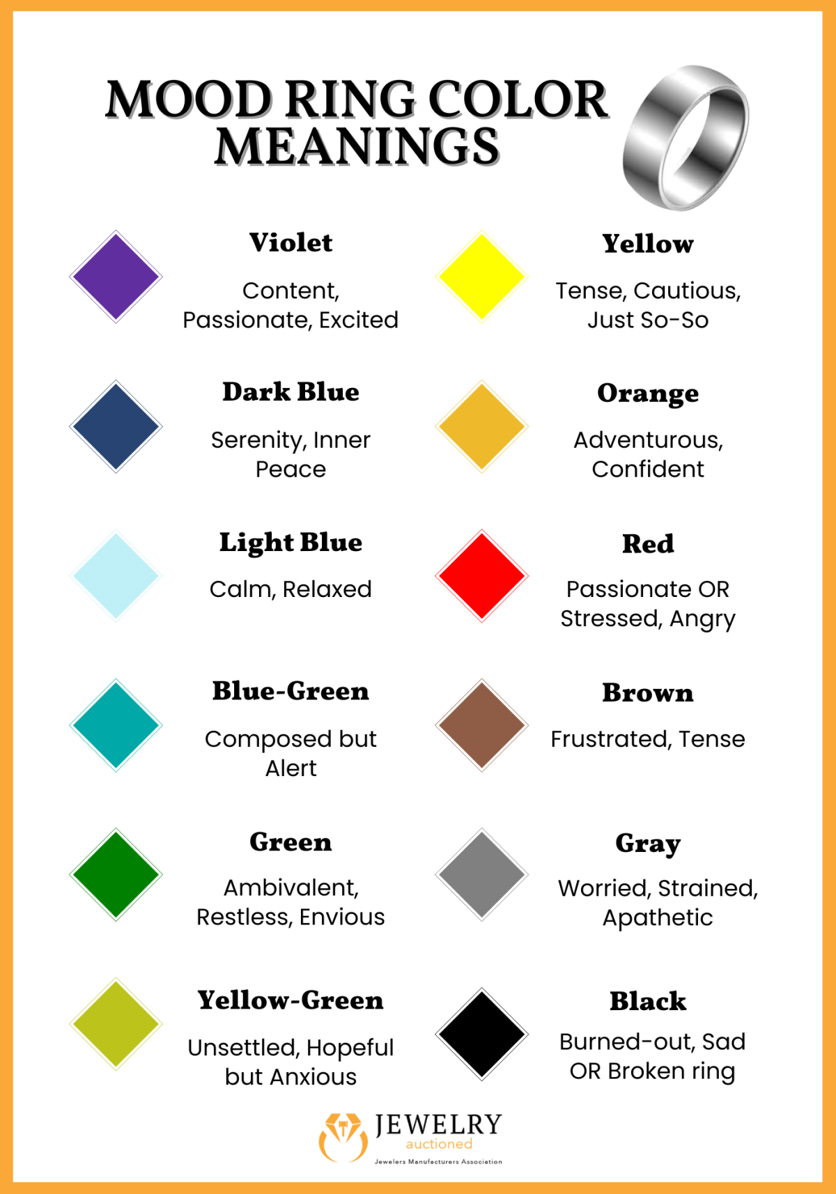
The interpretation of green in a mood ring is not arbitrary; it’s rooted in a system of color associations and physiological responses that have been explored and utilized across various fields, including technology and design. While the mood ring itself is a consumer gadget, its functionality relies on principles that resonate with broader technological concepts of sensing, interpretation, and display.
The Science Behind the Hue: Thermochromic Crystals and Body Temperature
At the heart of every mood ring lies a clever application of thermochromic liquid crystals. These are not your everyday crystals; they are complex organic compounds that exhibit a remarkable property: their molecular structure, and consequently their color, changes in response to temperature variations.
How Liquid Crystals React to Heat
Liquid crystals exist in a state between that of a conventional liquid and a solid crystal. In their liquid crystal state, their molecules possess a degree of order, allowing them to align in specific ways. When these compounds are incorporated into the small, sealed chamber of a mood ring, their alignment is sensitive to minute changes in temperature.
As the temperature of the wearer’s finger fluctuates, it directly impacts the liquid crystals. This thermal energy causes the molecules within the crystal to shift their orientation and arrangement. This alteration in molecular structure affects how light is refracted and reflected, leading to the perception of different colors. Different chemical formulations of liquid crystals are used to create specific color ranges, ensuring a predictable response to temperature. For example, one formulation might transition from deep blue at cooler temperatures to black at warmer ones, while another might display a vibrant spectrum including green within a particular temperature band.
The Physiological Connection: Body Temperature as an Indicator
The crucial link between our emotional state and the color displayed by the mood ring is our body temperature. When we experience certain emotions, our autonomic nervous system triggers physiological responses that can influence our body temperature. For instance, feeling calm and relaxed typically leads to a slight decrease in body temperature, while stress, anxiety, or excitement can cause a rise.
The mood ring, by accurately detecting these subtle shifts in finger temperature, acts as a proxy for these physiological responses. It’s important to note that this is an indirect measurement. The ring isn’t directly “reading” your emotions; it’s responding to the physical manifestations of those emotions, primarily temperature changes. This makes the mood ring a fascinating, albeit rudimentary, example of a biosensor – a device that detects biological signals and converts them into measurable data. In this case, the “data” is displayed visually as color.
Decoding the Emerald: The Psychological Significance of Green
When the mood ring settles on a shade of green, it’s generally interpreted as a sign of balance, harmony, and a state of emotional equilibrium. This association is not unique to mood rings; it’s deeply embedded in color psychology and cultural symbolism.
Green as a Symbol of Calm and Serenity
Across many cultures, green is overwhelmingly associated with nature – lush forests, serene meadows, and the tranquil expanse of the sea. This connection to the natural world evokes feelings of peace, rejuvenation, and stability. In the context of emotional well-being, green signifies a state of contentment and a lack of overwhelming emotional turmoil. When your mood ring displays green, it suggests that your body temperature is likely within a comfortable, stable range, indicative of a calm and collected disposition.
This doesn’t necessarily mean you are experiencing profound joy or ecstatic happiness. Instead, it points towards a balanced emotional state where you are not unduly stressed, anxious, or agitated. It represents a state of emotional neutrality, a gentle hum of well-being rather than a dramatic crescendo or a distressing decrescendo. Think of it as the emotional equivalent of a pleasant, mild day – neither too hot nor too cold, just comfortably right.
Green and the Concept of “Normal” Temperature

From a purely physiological standpoint, green often corresponds to a body temperature that is considered “normal” or “average” for a relaxed individual. While “normal” body temperature can vary slightly, mood rings are calibrated to interpret a specific temperature range as green. This range typically falls within the cooler end of the spectrum for warm colors but not so cool as to enter the blues.
This correlation between a stable body temperature and the color green highlights the scientific underpinnings of the mood ring’s interpretations. The technology is essentially translating thermal data into a color that aligns with established psychological and physiological associations. It’s a simple yet effective feedback loop: a stable internal environment is reflected by a stable, balanced color.
Beyond the Basics: Nuances and Variations of Green
While a solid green often signifies peace, the mood ring’s spectrum isn’t always a singular hue. Variations and shades of green can offer even more nuanced insights into your emotional state, further demonstrating the subtle interplay between temperature and color.
Lighter Greens: Indicating Openness and Receptivity
Lighter, more vibrant shades of green can sometimes indicate a state of openness and receptivity. This might suggest that you are feeling more agreeable, willing to engage, and less guarded. In this state, your body temperature might be slightly warmer than what signifies a deep, stable green, but still within a comfortable and balanced range. It’s a subtle shift, akin to the first rays of sunshine breaking through the clouds – still calm, but with a touch of brightness and positivity.
This interpretation aligns with how we often perceive lighter colors as more optimistic and approachable. A lighter green could signify that you are feeling refreshed, optimistic, and ready to embrace new experiences or interactions. It’s a state of pleasant engagement, where your emotions are flowing smoothly and you are feeling receptive to the world around you.
Deeper Greens: Suggesting Contentment and Stability
Conversely, deeper, richer greens might point towards a profound sense of contentment and emotional stability. This is the heart of the green spectrum, representing a deep-seated calm and a feeling of being grounded. Your body temperature in this instance would likely be at the lower end of the “green” range, signifying a relaxed and settled state.
This deep green is the emotional equivalent of being firmly rooted, feeling secure, and at peace with oneself. It’s a state of quiet confidence, where anxieties have receded and a sense of inner harmony prevails. This color suggests a strong sense of self-assurance and a comfortable equilibrium that allows for sustained tranquility.
The Mood Ring in the Context of Technological Expression
While the mood ring might seem like a whimsical novelty, its underlying principles touch upon broader themes in technology, particularly in the realm of user interfaces, data visualization, and personal sensing devices. The mood ring is a rudimentary, analog form of a wearable technology that translates biological data into a visual cue.
Color as a User Interface Element
The fundamental concept of using color to convey information is a cornerstone of user interface (UI) design and data visualization across all technological platforms. From the red of an error message to the green of a successful operation, colors are used to provide instant, intuitive feedback. The mood ring employs this principle by mapping temperature ranges to specific colors, creating a visual language for our internal states.
In a digital context, we see this in the color-coding of traffic lights, the status indicators on electronic devices, and the visual cues in software applications. The mood ring, in its own analog way, is an early example of leveraging color to communicate complex information – in this case, subjective emotional states – in an easily digestible format. It demonstrates the power of color to convey meaning quickly and effectively, a principle that remains vital in modern technological design.

The Evolution of Personal Sensing and Wearable Tech
The mood ring can be seen as a precursor to the sophisticated wearable technology that is commonplace today. Devices like smartwatches and fitness trackers continuously monitor vital signs, including heart rate, activity levels, and even stress indicators. These devices collect raw biological data and present it to the user through digital displays and companion apps, offering detailed insights into their health and well-being.
While mood rings are far less precise, they share the fundamental goal of making personal physiological data accessible and understandable. They tap into our innate curiosity about our own bodies and minds, providing a simple, tangible connection to our internal state. The mood ring, with its color-changing capabilities, was an early, accessible foray into the concept of personal sensing, paving the way for the more complex and data-rich wearable technologies of the 21st century. The fascination with understanding what our bodies are telling us through visual cues, a fascination that the mood ring elegantly captured, continues to drive innovation in the wearable tech industry.
aViewFromTheCave is a participant in the Amazon Services LLC Associates Program, an affiliate advertising program designed to provide a means for sites to earn advertising fees by advertising and linking to Amazon.com. Amazon, the Amazon logo, AmazonSupply, and the AmazonSupply logo are trademarks of Amazon.com, Inc. or its affiliates. As an Amazon Associate we earn affiliate commissions from qualifying purchases.