The national flag of Colombia is far more than a mere collection of colors; it is a profound visual articulation of the nation’s identity, history, and aspirations. In the realm of national branding, a flag functions as the ultimate corporate identity – a primary visual asset that communicates core values, heritage, and strategic positioning to both its citizens and the global community. Understanding the Colombian flag means delving into its design strategy, the symbolic weight of its hues, and how these elements coalesce to form a powerful and enduring national brand.
The Emblematic Colors: A Nation’s Visual Identity
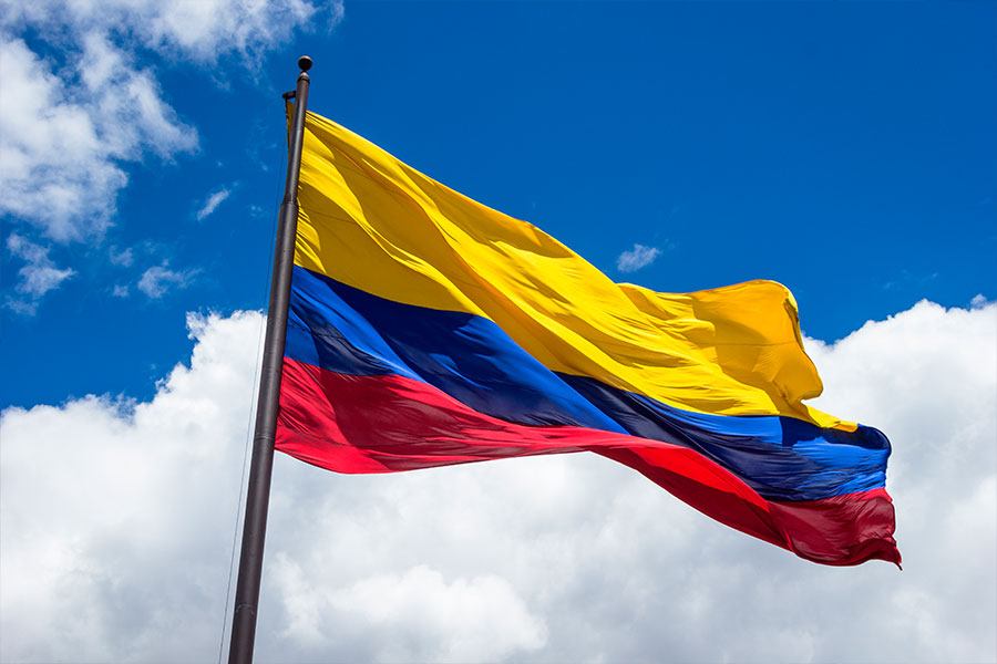
The vibrant horizontal stripes of yellow, blue, and red are not arbitrary choices but rather carefully selected components of Colombia’s national brand identity. Each color carries a distinct historical and cultural significance, contributing to a rich narrative that resonates deeply with the Colombian people.

Yellow: Sovereignty and Wealth
Dominating the upper half of the flag, the expansive yellow stripe is arguably the most prominent feature and carries the greatest symbolic weight. Historically, yellow represents the vast wealth and natural resources of Colombia. This includes not only the literal gold that once adorned pre-Columbian civilizations but also the fertile lands, abundant biodiversity, and valuable minerals that continue to define the nation’s economic potential. Strategically, this element positions Colombia as a land of opportunity and prosperity, a core message in its national branding. Beyond material wealth, yellow also signifies sovereignty, justice, and the radiant sun that illuminates the nation, symbolizing clarity, hope, and enlightenment for its citizens. It is a bold declaration of a nation rich in spirit and potential, aiming to project an image of self-sufficiency and brightness.
Blue: The Oceans, Rivers, and Skies
Nestled beneath the yellow, the blue stripe evokes Colombia’s profound geographical connection to water and sky. This color represents the two oceans (the Pacific and Atlantic/Caribbean Sea) that border Colombia, highlighting its strategic coastal position and maritime heritage. It also symbolizes the countless rivers that crisscross the country, vital for agriculture, transport, and life itself, much like the veins carrying lifeblood through a body. Furthermore, the blue stands for the skies above Colombia, suggesting purity, vastness, and the protective canopy under which the nation thrives. From a branding perspective, the blue connects Colombia to the global commons, emphasizing its natural beauty and its role as a steward of diverse ecosystems. It evokes a sense of peace, stability, and expansive horizons, reinforcing an image of a nation connected to the wider world and its environmental heritage.
Red: The Blood of Heroes
The final stripe, a vivid red at the bottom, carries the poignant and powerful symbolism of sacrifice and valor. Red represents the blood shed by the patriots who fought for Colombia’s independence from Spanish rule. It is a somber yet inspiring tribute to the heroes who gave their lives to secure the nation’s freedom and establish its sovereignty. This deeply emotional aspect of the flag’s design serves as a constant reminder of the profound cost of liberty and the collective resilience embedded within the national character. In terms of national branding, the red stripe communicates a history of struggle, courage, and unwavering determination. It fosters a sense of unity and shared sacrifice among Colombians, anchoring their identity in a heroic past and inspiring future generations to uphold the values for which their ancestors fought. This element is crucial for internal emotional branding, fostering patriotism and collective memory.
Beyond the Hues: The Design and Proportion
The impact of the Colombian flag’s visual identity extends beyond its chosen colors to its distinctive design architecture. The unique arrangement and proportion of its stripes contribute significantly to its recognizability and the implicit messages it conveys, establishing a unique visual signature within the global panorama of national symbols.
The Horizontal Tri-band Structure
Like many national flags, Colombia’s flag employs a horizontal tri-band design. This classic layout offers a sense of stability, balance, and continuity. However, unlike flags with equally sized bands, the Colombian design immediately sets itself apart through its specific proportions. This intentional deviation from the norm provides an instant visual cue that distinguishes it from other national banners. The horizontal orientation inherently suggests a landscape, a horizon, and a journey, subtly aligning with the narrative of a nation’s progression and its diverse geography. From a design perspective, this structure is clean, bold, and easily replicable, ensuring consistent brand recognition across various mediums and applications, from official documents to sporting events.
The 2:1:1 Ratio: A Unique Visual Signature
The most distinctive design feature of the Colombian flag is the proportion of its stripes. The yellow band occupies precisely half of the flag’s height, while the blue and red bands each take up a quarter. This 2:1:1 ratio is not accidental; it is a deliberate design choice that enhances the flag’s unique brand identity. This unequal distribution visually emphasizes the yellow, reinforcing its symbolic importance as the representation of national wealth, sovereignty, and the golden opportunities that define the Colombian narrative.
This particular ratio contributes to the flag’s strong visual identity, making it instantly recognizable even from a distance. In a world of often similar flag designs, this asymmetrical balance creates a memorable and distinctive brand mark. It suggests a hierarchy of values, where prosperity and self-determination are given pride of place, while the blue (representing geographical connections and skies) and red (symbolizing the sacrificial past) provide essential foundational support. This calculated proportion ensures that the flag not only carries deep meaning but also stands out visually, a critical aspect of effective brand differentiation.
Evolution and Enduring Symbolism: A Brand Story Through Time
The Colombian flag’s current design is the culmination of a rich historical process, tracing its lineage back to the foundational moments of South American independence. Understanding its evolution reveals a compelling brand story that has adapted and persisted, consistently reflecting the core aspirations of the nation.

Historical Roots: From Gran Colombia to Modern Identity
The design of the Colombian flag originates from the flag of Gran Colombia, a vast republic that included present-day Colombia, Venezuela, Ecuador, and Panama, conceived by the liberator Simón Bolívar. This shared heritage underscores a powerful regional brand identity, highlighting a common struggle for independence and shared ideals. Francisco de Miranda, a Venezuelan revolutionary, is credited with designing the original yellow, blue, and red horizontal tricolor. His vision was for a flag whose colors echoed his belief in the strategic importance of wealth (yellow), connection to the sea (blue), and the blood of patriots (red).
When Gran Colombia dissolved in 1831, the newly independent nations—Venezuela, Ecuador, and New Granada (which eventually became Colombia)—each adopted variations of this original flag, maintaining the essential color scheme and the symbolic narrative. This continuity speaks to the enduring power and resonance of the initial brand concept. Colombia formally adopted its current design and proportions in 1861, cementing its distinct national brand while honoring its revolutionary legacy. This historical trajectory demonstrates how a core brand identity can be adapted and refined over time to serve the specific needs and aspirations of individual entities while retaining a link to a shared heritage.
The Flag as a National Brand Asset
In the context of national branding, the flag serves as a primary visual asset. It is consistently deployed across all forms of official communication, from government buildings and diplomatic missions to passports and national sporting events. This omnipresence ensures high brand visibility and consistent recognition on the global stage. Its clear, bold colors and distinctive proportions make it easily reproducible and instantly identifiable, crucial for an effective visual brand.
Beyond official use, the flag is a powerful marketing tool for the nation, representing Colombia in international trade, tourism campaigns, and cultural exchanges. When seen abroad, it evokes a specific set of associations—ranging from its coffee and rich biodiversity to its vibrant culture and historical resilience. This consistent application builds strong brand equity, allowing the flag to become a shorthand for the entire Colombian experience and identity, both internally and externally.
Cultural Resonance and Emotional Branding
The Colombian flag is more than a legal symbol; it is a deeply emotional brand touchpoint for its citizens. It evokes powerful feelings of patriotism, national pride, and a shared sense of belonging. Children learn about its meaning from an early age, embedding its symbolism within the collective consciousness. During national holidays, sporting events, or moments of national triumph and tragedy, the flag is displayed prominently, acting as a unifying beacon.
This deep cultural resonance represents successful emotional branding. The colors and their meanings are intrinsically linked to the triumphs and struggles of the Colombian people, fostering a strong emotional connection. This connection translates into loyalty and a sense of collective identity, motivating citizens to contribute to the nation’s progress and defend its values. The flag thus functions as a powerful tool for internal cohesion, reminding Colombians of their shared heritage and collective future.
Strategic Communication: The Flag in National Storytelling
The Colombian flag is a dynamic instrument of strategic communication, deliberately crafted to convey specific messages and narratives to various audiences. Its design and symbolism are intentionally utilized to unify the population, project a desired image globally, and inspire collective action.
Unifying a Diverse Population
Colombia is a nation of immense geographical and cultural diversity, spanning Andean mountains, Caribbean coasts, Amazonian jungles, and Pacific lowlands. The flag plays a crucial role in knitting together this rich tapestry of regions and peoples under a single, overarching national identity. By embodying universally accepted national values—wealth, freedom, and sacrifice—the flag provides a common reference point that transcends regional differences.
In a country where local identities can be very strong, the national flag acts as a powerful unifier. When Colombians see their flag, it reminds them of their shared heritage, their collective aspirations, and the common narrative that binds them as one nation. This strategic use of symbolism helps to foster a sense of belonging and mutual respect among diverse communities, reinforcing the idea that despite their differences, they are all part of the larger Colombian family. This internal branding effort is vital for social cohesion and national stability.
Projecting an Image on the Global Stage
Internationally, the Colombian flag is a primary visual ambassador, communicating the nation’s identity and values to the world. When displayed at international summits, sporting events, or cultural festivals, it projects a concise and recognizable image of Colombia. The vibrant yellow suggests a nation rich in natural resources and economic potential; the blue signifies its strategic geographic position and natural beauty; and the red speaks to a history of resilience and a commitment to freedom.
This visual shorthand is critical for public diplomacy and nation branding efforts. It helps to shape perceptions, attract foreign investment, promote tourism, and foster international alliances. The flag becomes a mnemonic device, helping global audiences associate specific attributes with Colombia, steering perceptions towards an image of a vibrant, resourceful, and proud nation. This deliberate communication strategy ensures that Colombia’s presence on the world stage is both distinctive and meaningful.
Inspiring Patriotism and Collective Identity
Ultimately, the Colombian flag’s enduring power lies in its capacity to inspire patriotism and reinforce a strong collective identity. It serves as a constant visual cue for what it means to be Colombian. From celebrating national victories to commemorating historical milestones, the flag is central to public rituals and personal expressions of national pride. It’s seen in schools, government buildings, and homes, subtly reinforcing national values daily.
This inspiration extends beyond passive recognition; it actively encourages civic engagement and a sense of responsibility towards the nation. By continually invoking the sacrifices of the past and the promise of the future, the flag motivates citizens to contribute to the nation’s progress. It reinforces the understanding that individual actions contribute to the collective well-being and reputation of Colombia. In essence, the flag is a living brand narrative, continually told and retold through its colors, proportions, and the unwavering pride of its people.
aViewFromTheCave is a participant in the Amazon Services LLC Associates Program, an affiliate advertising program designed to provide a means for sites to earn advertising fees by advertising and linking to Amazon.com. Amazon, the Amazon logo, AmazonSupply, and the AmazonSupply logo are trademarks of Amazon.com, Inc. or its affiliates. As an Amazon Associate we earn affiliate commissions from qualifying purchases.