
In the world of visual communication, few symbols possess the enduring power and immediate recognition of a national flag. For Italy, the Tricolore—comprising three vertical stripes of green, white, and red—serves as more than a political banner; it is a masterclass in cohesive brand identity. To understand what the Italy flag colors mean is to delve into a strategic blend of historical narrative, geographical tribute, and psychological resonance that has propelled the “Made in Italy” brand to the pinnacle of global prestige.
For brand strategists and design professionals, the Italian flag represents a perfect alignment of values and aesthetics. It functions as a foundational visual asset that communicates heritage, quality, and passion without a single word of copy. By examining the symbolism and strategic application of these colors, we can uncover vital lessons in how visual identities are built, maintained, and leveraged for international influence.
The Core Palette: Decoding the Visual Pillars of the Italian Brand
Every successful brand identity is built upon a set of core values, often represented through a specific color palette. The Italian Tricolore is no different, with each hue serving as a visual shorthand for the nation’s foundational pillars. While the meanings have evolved over centuries, they consistently fall into two primary interpretations: the poetic-geographic and the religious-philosophical.
The Geographic Narrative: Land, Peaks, and Sacrifice
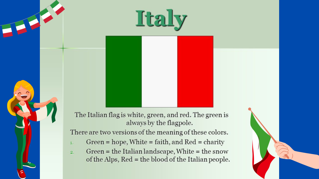
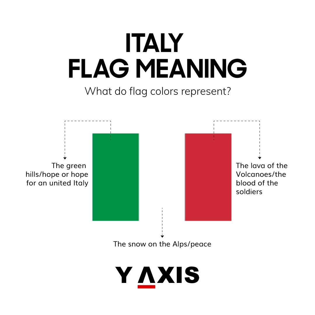
From a storytelling perspective, the colors provide a vivid map of the Italian landscape. The green represents the lush plains and the Mediterranean hills, symbolizing the nation’s natural wealth and fertility. The white signifies the snow-capped peaks of the Alps, the literal and figurative “crown” of the country that provides security and purity. The red represents the blood spilled during the wars of Italian independence and unification (the Risorgimento).
In branding terms, this is an exercise in “origin storytelling.” By grounding the brand in the physical reality of the land, the identity becomes tangible and authentic. It connects the consumer (or citizen) to the source of the product, creating a sense of place that is essential for premium positioning.
The Philosophical Narrative: Hope, Faith, and Charity
Beyond the physical landscape, the colors are often linked to the three theological virtues. Green represents Hope (Speranza), White represents Faith (Fede), and Red represents Charity (Carità).
Integrating these deep-seated cultural values into a visual mark ensures that the brand resonates on a psychological level. For a corporate entity, this is equivalent to establishing a “Mission and Values” statement that is reflected in every touchpoint of the visual identity. When a nation aligns its colors with universal virtues, it builds a brand that feels timeless and morally grounded, facilitating trust and long-term loyalty.
The Evolution of a Visual Identity: From Revolutionary Origins to Global Standard
The history of the Italian flag is a lesson in brand evolution. It was not a static creation but a design that adapted to the political and social shifts of the 18th and 19th centuries. The flag’s first official iteration appeared in 1797 for the Cispadane Republic, heavily influenced by the French Tricolore. However, the strategic decision to swap France’s blue for green was a pivotal branding move.
Differentiation through Design
In 1796, when Napoleon’s legions brought the tricolor concept to the Italian peninsula, the choice of green was intentional. It was the color of the Milanese civil guard and represented the “evergreen” hope for a unified Italy. In the context of brand strategy, this is known as “market differentiation.” By adopting a similar structure to a successful competitor (the French Republic) but changing a key visual element, Italy was able to signal its shared revolutionary values while maintaining a unique, localized identity.
Consistency and Standardization
As Italy moved toward unification in 1861 under the House of Savoy, the Tricolore became the definitive symbol of the new Kingdom. Over the decades, the flag underwent minor adjustments, including the removal of the royal coat of arms in 1946 when Italy became a Republic. This transition mirrors the “debranding” or “minimalist” trends seen in modern corporate identity, where legacy elements are stripped away to focus on the core essence of the brand.
Today, the Italian flag is strictly standardized. In 2003 and 2006, the Italian government defined the exact Pantone shades for the flag to ensure visual consistency across all physical and digital platforms:
- Fern Green (17-6153 TCX)
- Bright White (11-0601 TCX)
- Flame Scarlet (18-1662 TCX)
For designers, this highlights the importance of a Brand Style Guide. Without strict color specifications, a brand’s visual equity can be diluted by inconsistent reproduction.
Color Psychology and the “Made in Italy” Equity
The success of Italy as a global brand is inextricably linked to the psychological impact of its color palette. The combination of green, white, and red creates a high-contrast, high-energy visual that commands attention while remaining balanced.
The Power of Green: Vitality and Sustainability
Green is the color of growth, renewal, and equilibrium. In the modern marketplace, this aligns perfectly with the increasing consumer demand for sustainability and natural products. Brands that lean into the green of the Italian flag—such as high-end olive oil producers or organic textile manufacturers—are tapping into a subconscious association with freshness and environmental stewardship.
The Power of White: Precision and Clarity
White serves as the neutral anchor of the palette. It evokes cleanliness, sophistication, and transparency. In the Italian design context, white is the canvas upon which innovation is built. It is the color of marble, of minimalist architecture, and of high-fashion bridal wear. It suggests a brand that has nothing to hide and values the “less is more” philosophy.
The Power of Red: Passion and Performance
Red is arguably the most dominant color in the Italian identity. It triggers physical reactions: increased heart rate and heightened excitement. It represents the “passion” (passione) that is central to the Italian value proposition. Whether it is the speed of a Ferrari or the intensity of a volcanic Sicilian wine, the red in the flag signals a brand that is emotive, daring, and high-performing.
Strategic Implementation: How Global Brands Leverage the Flag’s Palette
Italy has achieved what few nations have: its flag has become a “quality mark.” The mere presence of the green, white, and red stripes on a product acts as a powerful endorsement, often allowing for a price premium. This is a phenomenon known as “Country of Origin Effect” (COE).
Case Study: The Automotive Industry
Ferrari, Maserati, and Alfa Romeo are not just car companies; they are ambassadors for the Italian brand. While Ferrari is famously associated with “Rosso Corsa,” their branding frequently incorporates the Tricolore to ground their cutting-edge technology in national heritage. By doing so, they remind the consumer that their engineering is fueled by Italian passion and history, making the product feel like a piece of art rather than a machine.
Case Study: Food and Beverage
The food industry provides the most ubiquitous examples of flag-based branding. From Barilla to San Pellegrino, the colors of the flag are used to authenticate the “Italian-ness” of the product. In a crowded global market, these visual cues act as a shortcut for the consumer, signaling high-quality ingredients and traditional craftsmanship. The “Made in Italy” mark is so valuable that the Italian government and trade associations actively protect it against “Italian Sounding” products—counterfeits that use the flag’s colors to mislead consumers about a product’s true origin.
Case Study: Fashion and Luxury
Gucci, Prada, and Dolce & Gabbana utilize the flag’s associations even when they don’t use the colors literally. The “brand” of Italy—conveyed through the flag’s history—is one of effortless elegance (sprezzatura). Luxury brands leverage the Tricolore to position themselves as the antithesis of mass-produced, “fast” goods. The flag communicates that the brand is part of a lineage of artisans and masters.

The Future of the Italian Brand Identity
As we move further into the digital age, the meaning of the Italian flag colors continues to expand. In an era of globalization, the Tricolore serves as a protective “halo” for emerging Italian tech startups and digital services. It provides a sense of reliability and aesthetic excellence that helps new ventures cut through the noise of the global digital economy.
The lesson for modern brand builders is clear: a visual identity is most powerful when it is rooted in a compelling narrative, standardized for consistency, and aligned with the psychological desires of the target audience. The Italian flag does not just represent a territory; it represents a lifestyle, a standard of quality, and a commitment to beauty.
By understanding what the Italy flag colors mean, we see a blueprint for how to build a brand that lasts for centuries. It is a design that balances history with modernity, and emotion with precision—a true hallmark of iconic branding. Through the strategic use of green, white, and red, Italy has successfully exported its culture to every corner of the globe, proving that a well-executed visual identity is the most potent tool in a nation’s—or a corporation’s—arsenal.
aViewFromTheCave is a participant in the Amazon Services LLC Associates Program, an affiliate advertising program designed to provide a means for sites to earn advertising fees by advertising and linking to Amazon.com. Amazon, the Amazon logo, AmazonSupply, and the AmazonSupply logo are trademarks of Amazon.com, Inc. or its affiliates. As an Amazon Associate we earn affiliate commissions from qualifying purchases.