In the world of marketing and corporate identity, a brand is often defined by its most visible touchpoints. For a state, those touchpoints aren’t just tourism commercials or official seals; they are the millions of mobile billboards traversing the highways every day. When we ask, “What does a Texas license plate look like?” we are not merely asking for a description of a piece of embossed aluminum. We are inquiring about the visual shorthand of the Texas brand—a design philosophy that balances heritage, legibility, and modern identity.

The Texas license plate has undergone a significant brand transformation over the last two decades, moving from illustrative complexity to a refined, minimalist aesthetic. This evolution reflects a broader trend in brand strategy: the move toward “The Classic,” where simplicity ensures longevity and instant recognition.
1. The Evolution of the Texas Brand Identity Through Aluminum
To understand what a Texas license plate looks like today, one must understand the branding journey the state has taken. Like any major corporation, the Texas Department of Motor Vehicles (TxDMV) has wrestled with the balance between artistic expression and brand utility.
From Illustrative Artistry to Iconic Minimalism
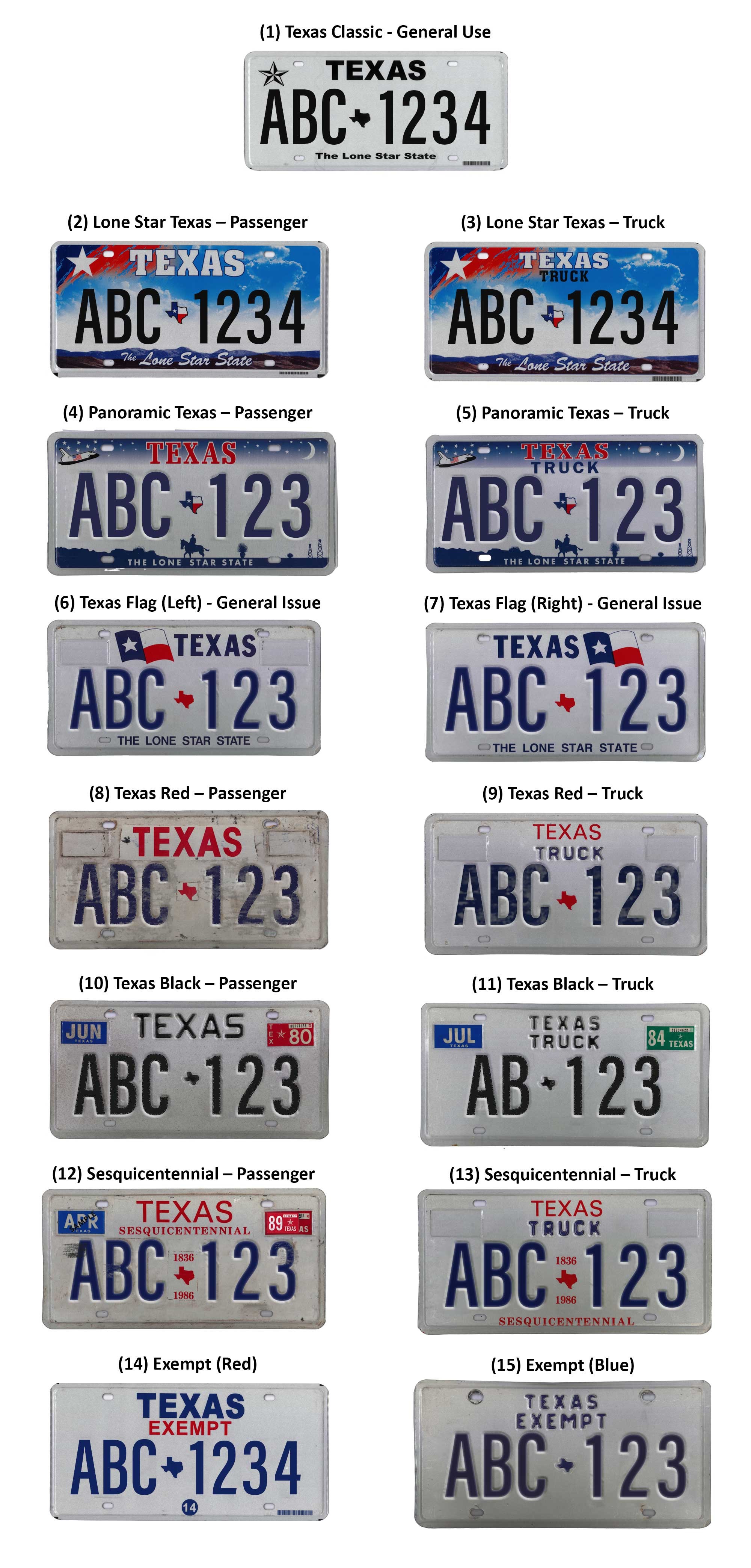
In the early 2000s, the Texas plate was a canvas for high-color illustration. The “Texas 2000” and the subsequent “Fine Art” series featured sprawling landscapes, space shuttles, and sunset gradients. While visually striking, these designs faced a “brand clarity” issue. From a distance, the intricate details became muddled, and the primary purpose of the plate—identification—was compromised by the “noise” of the background.
In 2012, the state underwent a massive rebranding of its standard plate, moving away from the “Big Sky” illustrative look toward what is now known as the “Texas Classic.” This shift mirrored the “flat design” movement seen in tech and corporate logo redesigns (such as those by Google or Airbnb), prioritizing clean lines and high contrast over three-dimensional realism.
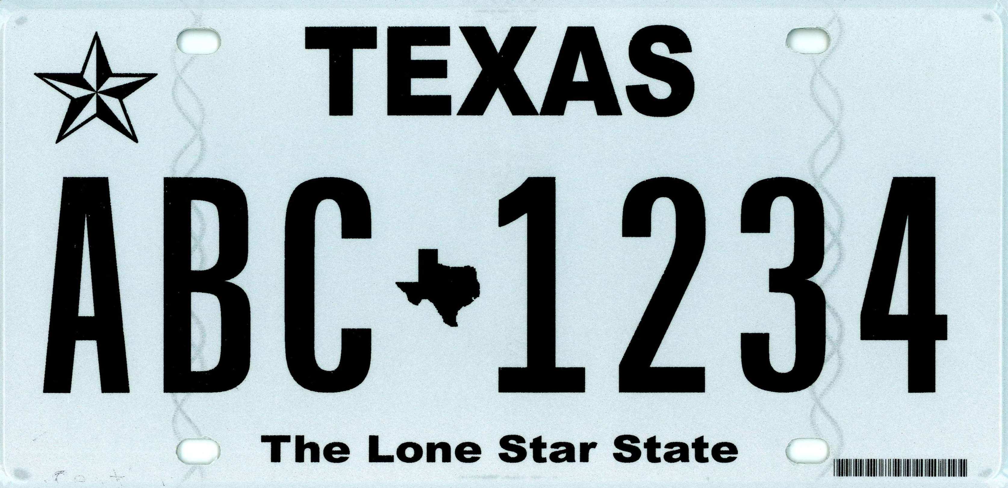
The “Texas Classic” as a Brand Standard
The current standard-issue plate is a masterclass in minimalist branding. It features a stark white background with bold black alphanumeric characters. This high-contrast palette isn’t just for law enforcement; it is a design choice that screams “Texas” through its no-nonsense, bold execution. The “Texas Classic” serves as the foundational brand identity for the state’s vehicles, providing a clean slate that represents the state’s modern, business-friendly image.
2. Decoding the Design Elements of the “Texas Classic”
When you look at a modern Texas license plate, you are looking at a carefully curated set of brand assets. Every symbol and font choice is intentional, designed to evoke a specific emotional response while maintaining functional excellence.
The Symbolism of the Lone Star and State Silhouette
At the center of the current “Texas Classic” plate, between the character sets, sits a small but powerful brand mark: the silhouette of the State of Texas with the iconic Lone Star embedded within it. This is the “logo” of the plate. In branding terms, this is a “lockup”—a combination of two recognizable symbols that reinforce geographic pride.
The silhouette of Texas is one of the most globally recognized geographic shapes. By placing it front and center, the plate leverages “geographic equity.” Even without reading the word “TEXAS” at the top, a viewer instantly recognizes the origin of the vehicle.
Typography and Legibility as Brand Values
The font used on Texas plates is a proprietary, sans-serif typeface designed for maximum legibility. In branding, typography communicates personality. The Texas plate font is thick, sturdy, and unapologetic. It reflects the “Texas Brand” personality: strong, dependable, and transparent.
The word “TEXAS” at the top of the plate is rendered in a clean, modern block font. Unlike older versions that used more decorative scripts, the current branding uses a typeface that suggests efficiency and modernization. This aligns with the state’s positioning as a hub for technology and corporate relocation.
3. Specialty Plates: Diversifying the State’s Visual Portfolio
While the “Texas Classic” is the standard, the Texas license plate ecosystem includes a vast array of specialty plates. From a brand strategy perspective, this represents “brand extensions.” Just as a fashion house might have a “Couture” line and a “Ready-to-Wear” line, Texas offers various plate designs that allow citizens to align their personal brand with specific causes or organizations.
Lifestyle Branding: From Conservation to Sports
Texas has pioneered the “affinity plate” market. What these plates look like depends entirely on the sub-brand they represent.
- The “Bluebonnet” Plate: This plate uses the state flower to appeal to a brand of “Texas Naturalism.” It uses softer colors and organic shapes.
- The “Starry Night” Plate: Featuring the McDonald Observatory, this plate targets the “Intellectual/Scientific” segment of the Texas brand.
- Professional Sports Plates: By allowing the Dallas Cowboys or Houston Astros logos on plates, the state leverages “co-branding.” This creates a symbiotic relationship where the state’s official document becomes a piece of fan merchandise.
Personal Branding and Customization
The rise of “MyPlates.com,” the state’s private vendor for specialty plates, has turned the license plate into a tool for personal branding. Drivers can choose from hundreds of colors and designs—ranging from “Carbon Fiber” looks for car enthusiasts to “Pink Ribbon” designs for advocates.
This customization does not dilute the Texas brand; rather, it strengthens it by making the brand “participatory.” When a driver chooses a specific plate design, they are curating their own visual identity under the umbrella of the Texas state brand. It proves that a government-issued item can be a high-end lifestyle product.
4. Why the Design Matters: The License Plate as a Mobile Billboard
In the field of Brand Strategy, “reach” and “frequency” are key metrics. The Texas license plate has an unmatched reach. With millions of vehicles registered, the design of the plate serves as a constant reinforcement of the Texas identity, both within the state and across the country.
Strengthening State Pride and Tourism
What a Texas license plate looks like matters for tourism. When a family from Austin drives to the Grand Canyon, their license plate is a rolling advertisement for their home state. The clean, professional look of the “Texas Classic” projects an image of a state that is organized, modern, and proud. It functions as a “brand ambassador.”
States that have messy, over-designed, or dated plates often struggle with a “visual clutter” problem that can subconsciously affect how outsiders perceive the state’s government and its “vibe.” Texas, by sticking to a high-contrast, iconic design, ensures its brand remains premium and recognizable in any environment.
Consistency Across Touchpoints
The design of the Texas license plate is increasingly consistent with other state touchpoints, such as the TxDMV website, state-issued IDs, and highway signage. This “brand consistency” is a hallmark of successful corporate identity programs. When the plate looks like the website, and the website looks like the driver’s license, it builds trust. It tells the user (the citizen) that the organization is unified and professional.
5. The Future of Texas Plate Design: Digital and Beyond
As we look forward, the question of “what a Texas license plate looks like” may shift from physical aluminum to digital displays. Several states are already experimenting with digital license plates—essentially e-ink screens that can change their display.
The Digital Frontier of State Branding
If Texas adopts digital plates, the brand strategy will shift from static design to dynamic interface design. Imagine a plate that can switch to a “Parked” mode displaying a different brand message, or a “Silver Alert” mode for public safety.
However, even in a digital future, the core branding elements identified in the “Texas Classic” will likely remain. The Lone Star, the state silhouette, and the bold typography are the “DNA” of the Texas brand. Whether they are embossed on metal or rendered in pixels, these elements ensure that the visual identity of Texas remains unmistakable.
Conclusion: More Than Just a Number
In conclusion, a Texas license plate looks like a strategic intersection of history and modern design. It is a 6×12-inch reflection of a state that understands the power of its own image. From the minimalist perfection of the “Texas Classic” to the diverse portfolio of specialty affinity plates, the Texas DMV has created a visual language that communicates strength, pride, and clarity.
For the brand strategist, the Texas license plate is a reminder that even the most utilitarian objects are opportunities for identity building. For the driver, it is a badge of belonging. For the observer, it is an iconic piece of American graphic design that says, without a doubt, “This is Texas.”
aViewFromTheCave is a participant in the Amazon Services LLC Associates Program, an affiliate advertising program designed to provide a means for sites to earn advertising fees by advertising and linking to Amazon.com. Amazon, the Amazon logo, AmazonSupply, and the AmazonSupply logo are trademarks of Amazon.com, Inc. or its affiliates. As an Amazon Associate we earn affiliate commissions from qualifying purchases.