In the crowded landscape of global commerce, symbols act as the shorthand of human communication. A single image can bypass logical reasoning and tap directly into the subconscious, triggering emotions, memories, and associations that would take pages of text to describe. Among the diverse lexicon of botanical symbols, few flowers carry as much weight, controversy, and versatility as the poppy. To understand what a poppy signifies in a professional context is to understand the power of semiotics in brand strategy.
For brand architects, marketers, and designers, the poppy is more than a wildflower; it is a potent tool for storytelling. Depending on its color, its context, and the brand’s industry, the poppy can signify anything from solemn remembrance and stoic resilience to avant-garde luxury and intoxicating beauty. This article explores the multifaceted significance of the poppy through the lens of brand strategy and corporate identity.

The Semiotics of the Poppy: Why Symbols Matter in Brand Strategy
Semiotics—the study of signs and symbols—is the backbone of effective branding. When a company chooses a symbol like the poppy, it is not merely selecting an aesthetic; it is inheriting thousands of years of cultural baggage. In brand strategy, this is known as “symbolic equity.”
From Ancient Myth to Modern Recognition
The poppy’s significance begins in antiquity. Associated with Morpheus, the Greek god of dreams, and Demeter, the goddess of agriculture, the flower originally signified sleep, peace, and the fertility of the earth. In branding, these ancestral meanings are often used by wellness and pharmaceutical companies to project an image of natural healing and restorative rest. When a brand adopts the poppy, it taps into this deep-seated human understanding of the plant as a provider of both solace and sustenance.
Evoking Emotional Responses through Botanical Imagery
In an era of hyper-digitalization, many brands are turning back to organic symbols to ground their corporate identity. The poppy, with its delicate, paper-thin petals and sturdy stem, represents a unique duality: vulnerability and strength. Brands that position themselves as “human-centric” or “authentically raw” use the poppy to signify that they are not just corporate entities, but organizations with a pulse. This emotional resonance is vital for building brand loyalty in a cynical market where consumers value purpose over product.
Case Studies: Brands that Harnessed the Power of the Poppy
To truly understand what the poppy signifies, one must look at how it has been deployed by major organizations to define their market position. The following case studies illustrate how the same symbol can be pivoted to serve vastly different brand missions.
The Royal British Legion: A Masterclass in Cause-Related Branding
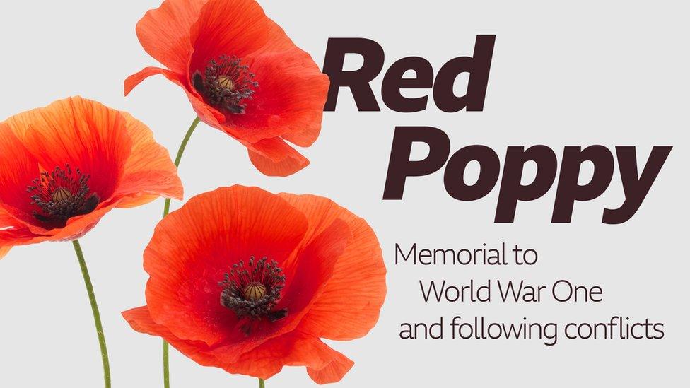
Perhaps the most iconic use of the poppy is by the Royal British Legion. In this context, the red poppy signifies remembrance, sacrifice, and national identity. As a brand mark, the “Remembrance Poppy” is one of the most successful examples of cause-related branding in history.
From a strategic perspective, the Legion has protected this symbol fiercely. It signifies a “contract of memory” between the public and the armed forces. By centralizing their brand identity around the poppy, they have created a visual trigger that, every November, generates millions in revenue for veteran services. Here, the poppy signifies a “Legacy Brand”—one built on history, honor, and a non-negotiable set of values.
Kenzo and the “Flower in the City”: Luxury and Whimsy
Contrast the solemnity of the British Legion with the luxury fashion house Kenzo. Their “Flower by Kenzo” fragrance features a tall, slender poppy stretching across the glass bottle. Because the poppy has no actual scent in nature, Kenzo used this as a creative opportunity to “invent” a smell for it.
In Kenzo’s brand universe, the poppy signifies urban poetry and unexpected beauty. It is the flower that grows between the cracks of the sidewalk. This positioning allows the brand to appeal to a demographic that values creativity, individuality, and the marriage of the organic with the industrial. For Kenzo, the poppy is a symbol of “Rebellious Elegance.”
Jo Malone and the Wild Poppy: Storytelling through Scent
Jo Malone London, a brand built on the pillars of British heritage and sophisticated simplicity, often utilizes the “Poppy and Barley” motif. In their brand narrative, the poppy signifies the wild, unmanicured beauty of the English countryside. It moves the brand away from “stuffy” luxury toward “accessible” luxury. By pairing the poppy with grains like barley, the brand communicates a sense of warmth, harvest, and wholesome refinement.
The Psychology of Color: How the Red Poppy Influences Consumer Perception
In branding, the “what” is often defined by the “how.” The color of the poppy is perhaps its most significant attribute in influencing consumer behavior and brand perception.
Urgency, Passion, and High-Energy Visuals
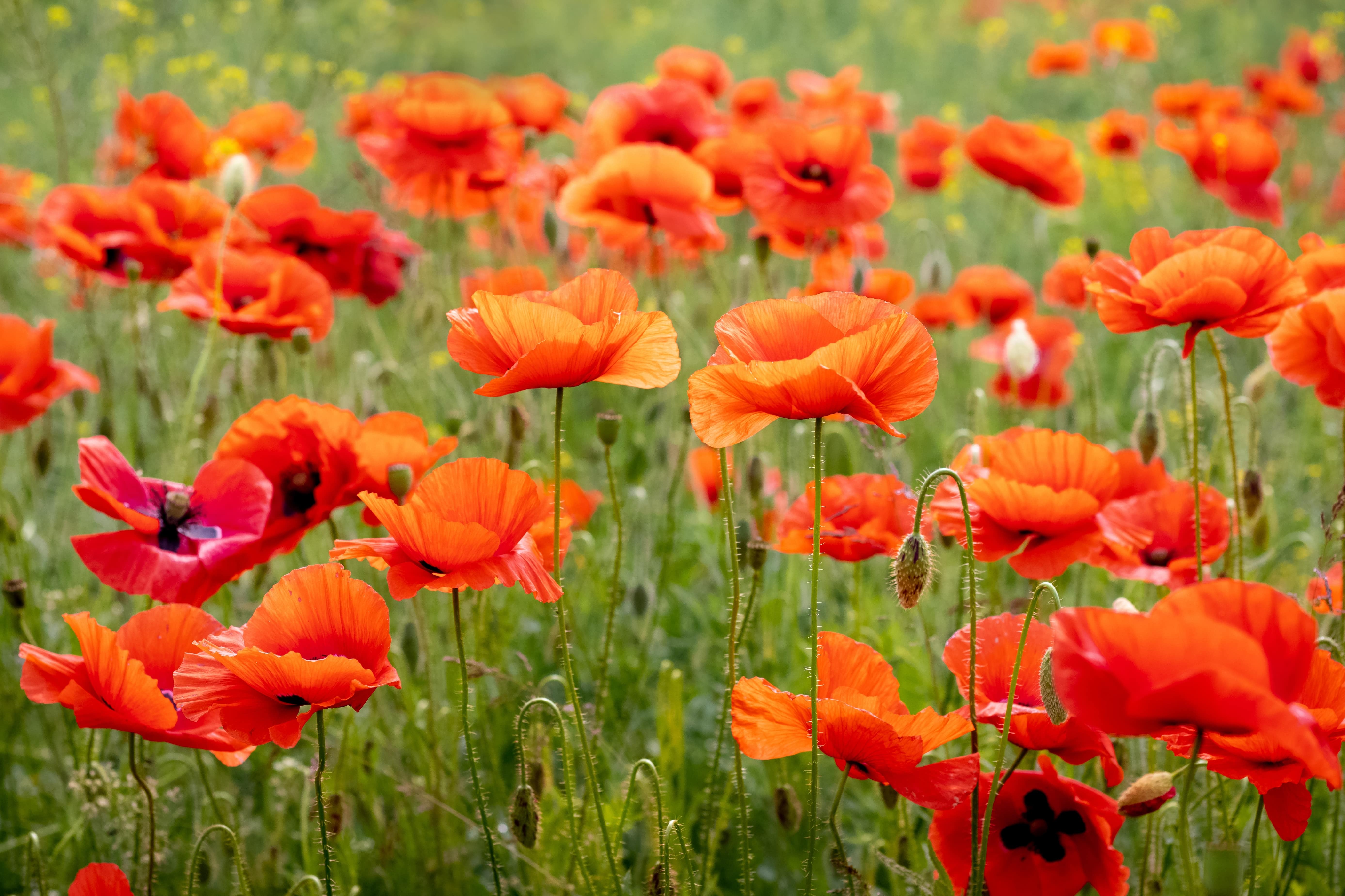
The classic red poppy is synonymous with high energy. In the psychology of color, red is the most stimulating hue, known to increase heart rates and create a sense of urgency. Brands that use the red poppy in their marketing—such as high-end floral boutiques or bold lifestyle magazines—signify passion and a “live for the moment” ethos. It is a color that demands attention in a saturated social media feed, making it a favorite for visual-first branding.
Contrasting the Black Center: Creating Visual Focus
The anatomical structure of the poppy—often a bright petal surrounding a dark, complex center—provides a natural focal point for graphic designers. In logo design, this contrast signifies depth and “the core.” It suggests that the brand has a central “truth” or “heart” that is protected by its outward appearance. This visual “bullseye” effect is used in corporate identity to lead the eye toward the center of a composition, signifying stability and focus.
Strategic Implementation: Incorporating Floral Symbols into Your Corporate Identity
If a brand is considering adopting the poppy or a similar botanical symbol, it must do so with a high degree of strategic intentionality. Symbols are not “set it and forget it” assets; they require careful stewardship.
Cultural Sensitivity and Navigating Symbolic Nuance
A brand must be aware that symbols do not mean the same thing everywhere. While the poppy signifies remembrance in the UK, Canada, and Australia, it may have different connotations in other regions. For example, in parts of East Asia, certain flowers (including some varieties of poppies) are associated with funerals and the afterlife.
Furthermore, the poppy is the source of opium. Brands in the wellness or food sectors must be careful to signify the “flower” rather than the “drug,” unless they are leaning into a provocative, “edgy” brand persona (as seen in some high-fashion or perfume marketing). A failure to account for these nuances can lead to a “brand disconnect,” where the audience misinterprets the company’s values.
Future-Proofing Brand Symbols in a Digital Landscape
In the digital age, a brand symbol must be scalable. The complex, ruffled edges of a real poppy can be difficult to render in a 16×16 pixel favicon. Successful modern brands simplify the poppy into geometric shapes—circles and curves—while retaining the “essence” of the flower.
When a brand simplifies its symbol, it signifies a move toward “Minimalist Sophistication.” It shows that the brand is forward-thinking and tech-savvy, capable of translating traditional natural beauty into the language of the modern web. This evolution from a literal illustration to a symbolic icon is a hallmark of a brand that is maturing and preparing for global scale.
Conclusion: The Poppy as a Beacon of Brand Identity
What does a poppy signify? In the realm of branding and professional identity, it signifies the power of association. It is a vessel into which a brand can pour its specific values—be they the solemnity of a non-profit, the whimsy of a fashion house, or the vitality of a lifestyle brand.
The poppy reminds us that even in a world of AI and data-driven marketing, humans still respond most powerfully to the organic and the symbolic. By understanding the historical, psychological, and visual significance of the poppy, brand strategists can craft identities that are not only seen but felt. Whether it represents the “lest we forget” of a nation or the “boldly blooming” of a startup, the poppy remains one of the most versatile and evocative symbols in the strategist’s toolkit. Choosing it is a statement of intent: a commitment to a narrative that is as deep, colorful, and resilient as the flower itself.
aViewFromTheCave is a participant in the Amazon Services LLC Associates Program, an affiliate advertising program designed to provide a means for sites to earn advertising fees by advertising and linking to Amazon.com. Amazon, the Amazon logo, AmazonSupply, and the AmazonSupply logo are trademarks of Amazon.com, Inc. or its affiliates. As an Amazon Associate we earn affiliate commissions from qualifying purchases.