
Political maps are more than just colored lines on a page or a digital display. They are sophisticated representations of human organization and power structures on Earth’s surface. In the contemporary world, understanding what a political map reveals is deeply intertwined with technological advancements. From the software used to create them to the platforms that distribute them, technology plays a crucial role in defining and accessing the information presented on these essential cartographic tools. This article will delve into the core elements displayed on a political map, emphasizing the technological underpinnings that enable their creation, accuracy, and accessibility in the digital age.
The Foundation of Cartographic Representation: Borders and Boundaries
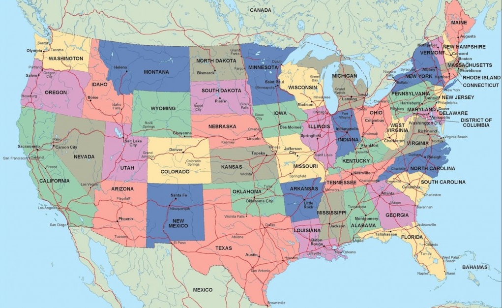
At its most fundamental level, a political map is a cartographic tool designed to illustrate the divisions and administrative territories that humans have established. These divisions are not natural phenomena but rather the result of historical events, treaties, conflicts, and agreements. Technology has revolutionized the way these borders are defined, measured, and represented.
Defining Sovereign States: The Pillars of Global Politics
The most prominent feature on any political map is the depiction of sovereign states, commonly referred to as countries. These are independent political entities with defined territories, permanent populations, a government, and the capacity to enter into relations with other states. The borders that delineate these states are painstakingly charted, often with the aid of advanced surveying technologies like GPS (Global Positioning System) and satellite imagery. High-resolution satellite data allows for incredibly precise mapping of international boundaries, even in remote or inaccessible terrains. Software applications can then process this data, translating it into the lines we see on maps, ensuring accuracy and consistency.
Internal Divisions: States, Provinces, and Territories
Beyond national borders, political maps also illustrate the internal administrative divisions within a country. These can take various forms, such as states, provinces, regions, or territories, each with its own level of autonomy and governance. The hierarchy of these divisions is crucial for understanding a nation’s political organization. For example, in the United States, states are the primary sub-national divisions, while in Canada, they are provinces and territories. The boundaries of these internal divisions are also meticulously mapped, often using similar technological methods as national borders, though typically with less international geopolitical scrutiny. This level of detail is essential for administrative purposes, resource management, and providing localized information to citizens.
Specialized Mapping Software and Data Integration
The creation and updating of these border delineations rely heavily on specialized Geographic Information System (GIS) software. GIS platforms allow cartographers and geographers to integrate various datasets, including cadastral information (land ownership), elevation data, and demographic statistics, with geographical features. This integration enables the creation of highly detailed and informative political maps. For instance, a GIS can overlay population density data onto a map of administrative divisions, revealing how political boundaries align with human settlement patterns. The continuous refinement of GIS technology, including cloud-based solutions and advanced analytical tools, ensures that political maps remain dynamic and can be updated in near real-time as geopolitical changes occur.
Key Political Features and Their Digital Rendering
While borders are paramount, political maps also convey a wealth of other information related to governance and human settlement, all of which are increasingly rendered and accessed through digital technologies.
Capital Cities and Major Urban Centers: Nodes of Power and Population
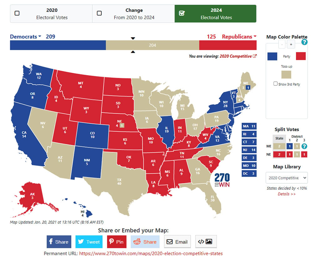
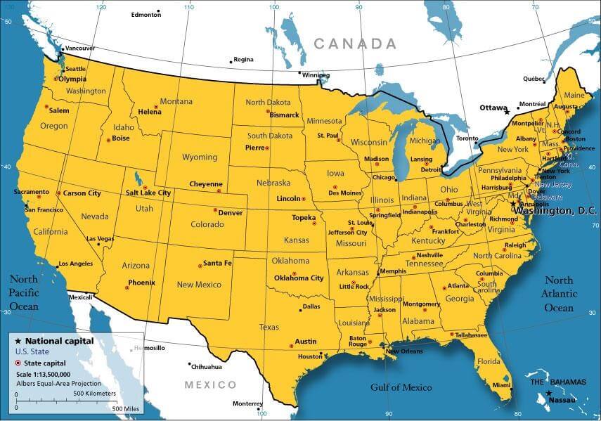
Political maps invariably highlight capital cities, which serve as the seats of government for their respective nations or sub-national entities. These are often marked with distinct symbols to indicate their importance. Additionally, major urban centers, typically defined by their population size and economic significance, are also depicted. The identification and labeling of these cities are crucial for understanding patterns of human concentration and the administrative heartlands of different regions. Digital mapping platforms utilize databases that link geographical coordinates with names and classifications of cities, allowing users to easily locate and learn about these key settlements. The interactive nature of online maps often provides further information about these cities, such as population figures, economic data, and cultural landmarks, all accessed through sophisticated data retrieval systems.
Significant Political Features: International Organizations and Dispute Areas
Beyond administrative divisions, political maps can also indicate areas of specific political significance. This might include the locations of major international organizations, such as the United Nations headquarters, or areas that are subject to political dispute or territorial claims. While these are often represented with specific notations or shading, their inclusion adds layers of geopolitical context. Digital platforms excel at presenting this kind of nuanced information. For instance, an interactive online political map might allow users to click on a disputed region to access detailed historical information, legal arguments, or current news related to the conflict, all dynamically pulled from vast online databases. This level of dynamic information delivery would be impossible without robust digital infrastructure and sophisticated data management techniques.
Road Networks and Transportation Infrastructure: Facilitating Governance and Connectivity
While not exclusively political, the depiction of major road networks, railways, and airports on political maps serves a crucial purpose in illustrating the connectivity and logistical capabilities that underpin governance. These infrastructure elements facilitate the movement of people, goods, and information, which are essential for a functioning state. Advanced mapping technologies, such as those used in navigation apps, provide incredibly detailed representations of these networks, often overlaying them with real-time traffic data and route planning algorithms. This integration of transportation data with political boundaries offers insights into how effectively a government can exert its influence and manage its territory. The development of smart city initiatives, for example, heavily relies on the precise digital mapping of urban infrastructure within defined political jurisdictions.
The Technological Evolution of Political Mapping
The way political maps are created, shared, and interacted with has been fundamentally transformed by technological innovation. What once required laborious manual drafting is now largely automated and accessible through digital means.
From Physical Artifacts to Digital Interfaces: The Rise of GIS and Digital Cartography
The transition from printed maps to digital formats represents a paradigm shift. Geographic Information Systems (GIS) are at the forefront of this revolution. GIS software allows for the creation, storage, analysis, and management of geographically referenced data. Cartographers use GIS to digitize existing maps, process satellite imagery, and integrate diverse datasets to produce highly accurate and dynamic political maps. Tools like ArcGIS, QGIS, and Google Earth Engine are indispensable in this field. These platforms enable the visualization of complex spatial relationships and the querying of information based on geographical criteria. The development of web-based mapping APIs (Application Programming Interfaces) has further democratized access to this information, allowing developers to embed interactive political maps into websites and applications, reaching a global audience instantaneously.
Data Visualization and Interactivity: Enhancing Understanding and Engagement
Digital political maps are no longer static. Through advanced data visualization techniques and interactive interfaces, users can explore and understand the information presented in more profound ways. Features like zooming, panning, layer toggling, and interactive pop-ups provide a rich user experience. For instance, a user can zoom in on a specific country and see its major cities, internal divisions, and perhaps even overlays of demographic data or election results. The ability to layer different datasets – such as population density, economic indicators, or even historical territorial changes – on top of a political map allows for sophisticated analysis and a deeper comprehension of geopolitical dynamics. This interactivity is powered by complex algorithms and high-speed data processing, making the exploration of political geography a dynamic and engaging endeavor.
Real-time Updates and Geopolitical Monitoring: The Edge of Technology
The geopolitical landscape is constantly shifting. Technology, particularly through satellite observation and rapid data dissemination, allows for more timely updates to political maps. While major border changes are infrequent, minor disputes, shifts in administrative control, or the emergence of new settlements can be reflected with increasing speed. This capability is crucial for international relations, defense, and disaster response. Online mapping services often integrate crowdsourced data and real-time reporting, allowing for a near-instantaneous update of certain geographical information. Furthermore, sophisticated analytical tools within GIS can be used to monitor changes in land use, population movements, or infrastructure development within defined political boundaries, providing valuable insights for governments and international organizations. The future of political mapping is likely to be even more integrated with real-time data streams, offering a constantly evolving picture of our world’s governance.
aViewFromTheCave is a participant in the Amazon Services LLC Associates Program, an affiliate advertising program designed to provide a means for sites to earn advertising fees by advertising and linking to Amazon.com. Amazon, the Amazon logo, AmazonSupply, and the AmazonSupply logo are trademarks of Amazon.com, Inc. or its affiliates. As an Amazon Associate we earn affiliate commissions from qualifying purchases.