
Snapchat, a platform renowned for its ephemeral messaging and playful interface, heavily relies on visual cues to communicate information quickly and intuitively. Among these, colors play a pivotal role, transforming seemingly simple icons into conveyors of meaning. Understanding what these colors signify isn’t just about deciphering app aesthetics; it’s about unlocking a deeper understanding of user interaction, platform functionality, and even a subtle form of digital communication that influences engagement and perception. For those navigating the ever-evolving tech landscape, mastering these visual languages can be a significant advantage, whether for personal brand building, understanding user behavior for marketing, or simply enhancing productivity within the app.

This article will explore the multifaceted meaning behind Snapchat’s colors, drawing connections to the core tenets of technology, brand perception, and even the subtle financial implications of user engagement. We’ll delve into how these colors impact the user experience, influence brand messaging, and ultimately contribute to the platform’s unique ecosystem.
Decoding the Palette: Core Snapchat Colors and Their Meanings
Snapchat’s visual identity is built on a foundation of vibrant, often primary colors. Each hue, while seemingly a stylistic choice, serves a functional purpose, guiding users through the app’s features and indicating the status of various interactions.
The Ubiquitous Yellow: Friendliness, Ephemerality, and Newness
The signature Snapchat yellow is arguably the most dominant color on the platform. Its cheerful and approachable nature aligns perfectly with Snapchat’s original ethos of casual, spontaneous communication. Beyond its friendly disposition, yellow also subtly signifies the ephemeral nature of content on Snapchat. Think of the fleeting sunlight – here one moment, gone the next. This color acts as a constant visual reminder that Snaps and Chats are designed for temporary viewing, fostering a sense of urgency and encouraging immediate engagement.
Furthermore, yellow is frequently associated with newness and discovery. When a new Snap is received, a new Story is available, or a new feature is introduced, the yellow indicator is often present. This visual cue primes the user for something fresh and exciting, driving exploration and interaction.
Yellow Indicators and Their Nuances
Within the realm of yellow, subtle variations and contexts imbue it with further meaning:
- Solid Yellow Circle (Unopened Snap): This is the most direct indicator of a new, unread Snap. The solid color signifies something waiting for your attention, prompting you to tap and view the content before it disappears. This is a crucial element of the “fear of missing out” (FOMO) that Snapchat cultivates.
- Faded Yellow Circle (Opened but Not Replied to): When a Snap has been opened but not yet replied to, the yellow may appear slightly faded. This subtle shift communicates a less urgent but still pending interaction, indicating that a response is expected or has been acknowledged.
- Yellow with a Blue Outline (New Chat Message): When you receive a new chat message, you’ll often see a yellow icon with a blue outline. This combination signals a text-based interaction, distinct from a visual Snap, and also denotes a new, unread message. The blue can be interpreted as a cooling or more measured tone compared to the energetic yellow.
- Yellow Notification Icons: Various notifications within the app, such as updates or friend requests, often incorporate yellow. This consistent use reinforces yellow’s association with activity and engagement.
The Assertive Red: Action, Activity, and Completion
Red on Snapchat typically signifies action, progress, or completion. It’s a more assertive color, demanding attention and indicating a more involved state of affairs compared to the passive yellow.
Red Indicators and Their Significance
- Red Circle with a White Arrow (Sent Snap): When you send a Snap, you’ll see a red circle with a white arrow. This signifies that your message is in transit or has been successfully delivered. The red here suggests an active process, a message on its way to its destination.
- Red Camera Icon (Recording a Video Snap): The iconic red button to record a video Snap is a universal symbol of recording in progress. The vibrant red emphasizes the active creation of content.
- Red Heart (Best Friends): A red heart next to a friend’s name signifies that you have been each other’s “Best Friends” for a consecutive period. This is a more intimate and cherished indicator, representing a strong connection and a history of frequent interaction. From a brand perspective, this signifies loyalty and deep engagement.
The Cool Blue: Communication and Connectivity
Blue on Snapchat often represents communication, connectivity, and the broader social graph. It’s a color that conveys a sense of calm and reliability, indicating established connections and ongoing conversations.
Blue Indicators and Their Roles
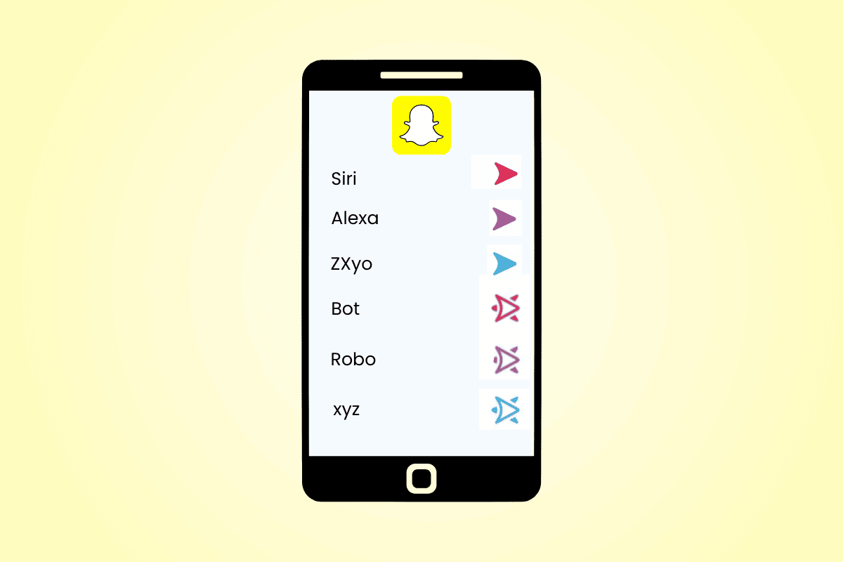
- Blue Arrow (Delivered but Not Viewed/Replied to): A blue arrow within a circle indicates that a Snap has been delivered to the recipient but has not yet been viewed or replied to. This is a more passive state than the red arrow, signifying that the ball is in the recipient’s court.
- Blue Chat Bubbles: Chat conversations are characterized by blue chat bubbles, visually distinguishing them from Snaps. This differentiation helps users quickly identify the mode of communication.
- Blue Outline on Icons: As mentioned earlier, a blue outline can accompany yellow, signifying specific types of interactions like new chat messages. This often suggests a more formal or text-based communication channel.
The Subtle White and Gray: Status and Information
White and gray on Snapchat, while less vibrant, are crucial for conveying status and providing essential information without overwhelming the user.
- White Icons and Borders: White is often used for icons, borders, and text, providing clear contrast and readability against colorful backgrounds. It signifies clarity, neutrality, and a focus on functionality.
- Grayed-Out Elements: Grayed-out elements typically indicate disabled features, inactive accounts, or content that is no longer available. This serves as a clear visual cue that an action cannot be performed or that information is no longer current.

Beyond the Basics: Colors as Brand and Behavioral Indicators
The meanings of Snapchat’s colors extend beyond simple functional indicators. They play a significant role in shaping the platform’s brand identity and influencing user behavior, subtly tapping into principles of marketing and psychology.
Colors and Brand Perception: The Snapchat Identity
Snapchat’s consistent use of bright, cheerful colors like yellow establishes a strong, recognizable brand identity. This palette evokes feelings of fun, playfulness, and youthfulness, aligning with its target demographic.
- The Power of Consistency: By consistently applying these colors to specific functions, Snapchat reinforces user expectations. Users learn to associate yellow with new content, red with sending and recording, and blue with messaging. This predictability builds familiarity and reduces cognitive load, making the app easier and more enjoyable to use.
- Emotional Resonance: The vibrant colors are designed to evoke positive emotions, making the user experience more engaging and memorable. This emotional connection is vital for user retention and platform loyalty.
Colors and User Behavior: Driving Engagement and Interaction
The color coding on Snapchat is a masterclass in subtle behavioral nudges.
- Urgency and Immediate Gratification: The presence of yellow for unopened Snaps creates a sense of urgency, encouraging users to open and view content promptly. This taps into the desire for immediate gratification, a key driver of engagement on social media platforms.
- Social Status and Relationships: The red heart, signifying Best Friends, transforms a functional feature into a status symbol. This gamified element encourages users to maintain high levels of interaction to earn and keep these coveted badges, fostering deeper social connections within the app.
- Information Hierarchy: The distinct colors for Snaps (yellow/red/blue) and Chats (blue) help users quickly prioritize and differentiate between types of incoming messages, allowing for more efficient management of communication.
The Tech, Brand, and Money Intersection: Why Colors Matter
Understanding Snapchat’s color system isn’t just an app-specific exercise; it offers valuable insights into the interconnectedness of technology, brand strategy, and even the economic drivers behind digital platforms.
Tech and User Experience: Streamlining Interaction
From a technology perspective, the color system is a brilliant piece of user interface (UI) and user experience (UX) design.
- Intuitive Navigation: By assigning specific colors to different actions and statuses, Snapchat makes its interface incredibly intuitive. Users can grasp the meaning of icons and notifications at a glance, without needing to read extensive labels. This is crucial for a platform that prioritizes speed and spontaneity.
- Accessibility: While not explicitly designed for accessibility in all cases, the clear color distinctions can aid users with certain visual preferences, helping them differentiate between various elements on the screen.
- Evolution of Features: As Snapchat introduces new features, its established color language provides a framework for integrating them seamlessly. New functionalities are often accompanied by familiar color cues, making them easier for existing users to adopt.
Brand and Marketing: Building Loyalty and Monetization
The colors of Snapchat are integral to its brand. They contribute to its unique identity, making it instantly recognizable and appealing to its core audience.
- Brand Recall: The vibrant yellow, in particular, is a powerful brand recall tool. It’s synonymous with Snapchat and evokes the specific emotions and experiences associated with the app.
- Engagement as a Metric: For marketers and brands, understanding these color cues is vital. They represent opportunities for engagement. For instance, seeing a red arrow (sent Snap) encourages a user to anticipate a response, and the subsequent notification of a red heart (Best Friends) signifies a strong existing relationship that a brand might leverage.
- Monetization Strategies: The platform’s ability to drive consistent user engagement through its intuitive design and color-coded nudges directly impacts its monetization potential. More engaged users mean more opportunities for advertising, in-app purchases, and data insights. The colors, by driving engagement, indirectly contribute to the platform’s financial success.
Money and User Value: The Economics of Engagement
While not a direct currency, the colors and the interactions they represent have economic implications.
- Attention Economy: Snapchat operates within the attention economy, where user attention is a valuable commodity. The colors are designed to capture and hold this attention, making users spend more time on the app. This increased time translates into more ad impressions and potential revenue.
- Social Capital and Perceived Value: Features like the red heart create a form of social capital within the app. Users invest time and effort to attain and maintain these statuses, adding perceived value to their engagement. This perceived value can influence how users interact with brands and content on the platform.
- Data and Insights: Every interaction indicated by a color provides valuable data for Snapchat and its advertisers. Knowing when a Snap is sent, received, viewed, or replied to offers insights into user behavior, preferences, and social networks, which can be used for targeted advertising and feature development.
Conclusion: A Colorful World of Communication
The colors on Snapchat are far more than just aesthetic choices. They are a sophisticated language, a testament to how visual design can profoundly impact user experience, brand perception, and even the underlying economic model of a digital platform. From the cheerful yellow of newness to the assertive red of action and the cool blue of connection, each hue plays a crucial role in guiding users through the app’s dynamic landscape.
For anyone interested in the intricacies of modern technology, understanding these visual cues provides a window into effective UI/UX design, powerful branding strategies, and the subtle yet significant ways that digital platforms engage their users. By deciphering Snapchat’s colorful lexicon, we gain a deeper appreciation for the nuanced communication that shapes our digital lives and the invisible threads that connect technology, brand, and the very economy of attention.
aViewFromTheCave is a participant in the Amazon Services LLC Associates Program, an affiliate advertising program designed to provide a means for sites to earn advertising fees by advertising and linking to Amazon.com. Amazon, the Amazon logo, AmazonSupply, and the AmazonSupply logo are trademarks of Amazon.com, Inc. or its affiliates. As an Amazon Associate we earn affiliate commissions from qualifying purchases.