In the world of branding, color is never just an aesthetic choice; it is a psychological trigger, a silent communicator, and a foundational element of corporate identity. When we ask the fundamental question—”what colours make green?”—the answer extends far beyond the elementary school classroom. For brand strategists, designers, and marketing executives, the “mix” that creates green is a complex blend of yellow’s optimism and blue’s stability.
Understanding how to construct, deploy, and leverage the color green is essential for any brand looking to signal growth, reliability, or environmental consciousness. This article explores the technical, psychological, and strategic layers of green in the context of brand identity, examining how this versatile secondary color is engineered to influence consumer perception.
The Foundations of Visual Identity: The Color Theory of Green
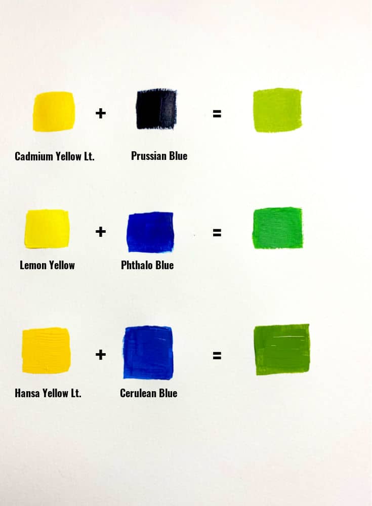
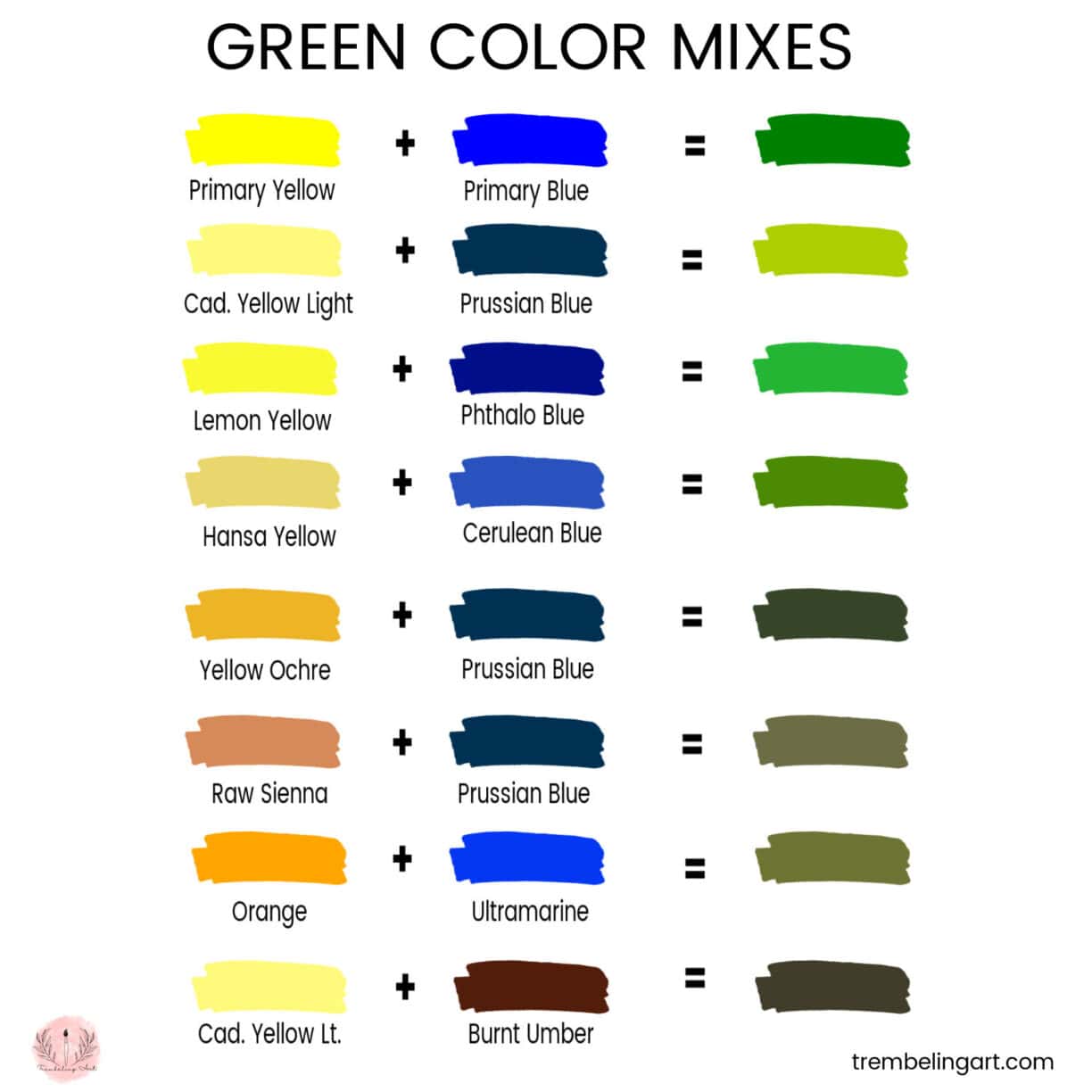
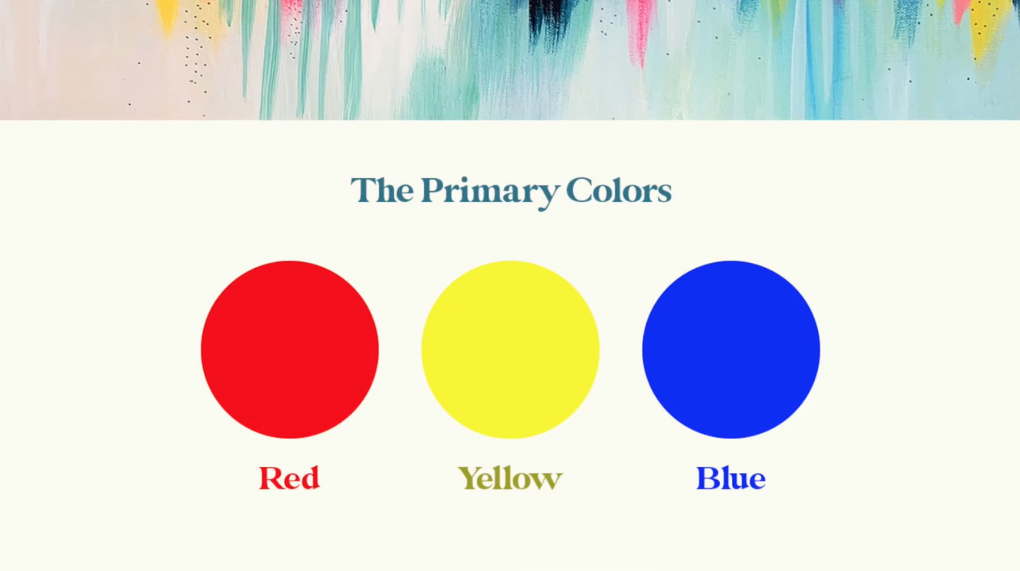
To understand green’s role in branding, we must first look at its construction. In traditional color theory (the RYB model used in painting and early design), green is a secondary color created by mixing two primaries: yellow and blue. However, in the modern landscape of brand strategy, the “mix” is as much about digital science as it is about visual art.
The Mix: Yellow and Blue as the Pillars of Balance
The synthesis of yellow and blue to create green is a metaphor for the balance that many brands strive to achieve. Yellow represents clarity, sunshine, and warmth, while blue represents trust, wisdom, and professional calm. When a brand identifies as “green,” it is often attempting to capture the middle ground between these two extremes. It seeks to be approachable yet authoritative, energetic yet grounded.
From a design perspective, the ratio of the mix determines the brand’s “voice.” A lime green, leaning heavily toward yellow, communicates innovation, youth, and high energy. Conversely, a forest green, saturated with blue, speaks to tradition, luxury, and conservative stability. Strategic branding requires a precise understanding of these nuances to ensure the visual identity aligns with the brand’s core values.
Digital vs. Print: Understanding RGB and CMYK in Brand Consistency
A significant challenge in brand management is maintaining color consistency across different mediums. This is where the technical definition of “what colours make green” changes.
In the digital world (RGB—Red, Green, Blue), green is a primary color. It is emitted directly by screens. In the world of print (CMYK—Cyan, Magenta, Yellow, Black), green is created by layering Cyan and Yellow inks. A brand strategist must ensure that the vibrant green seen on a high-definition smartphone screen translates accurately to a matte business card or a glossy billboard. This requires rigorous brand guidelines that define specific Pantone Matching System (PMS) codes, ensuring that the “green” of the brand remains a constant, recognizable asset regardless of the touchpoint.
The Psychology of Green: Why Brands Choose This Spectrum
In brand strategy, color is the shortest path to a consumer’s emotions. Green is unique because it is the most prevalent color in the natural world, leading the human brain to associate it with safety, fertility, and survival. For a brand, these primal associations can be converted into market authority.
Growth and Vitality: The Health and Wellness Sector
For brands in the health, organic food, and wellness industries, green is the default language. It signals that a product is “living” or “natural.” When we see green on a juice bottle or a skincare package, our brains automatically bypass the “processed” alarm and move toward a “fresh” perception.
Strategic branding leverages this by using varying shades of green to differentiate within the market. A bright, leafy green might suggest raw energy and vitality, whereas a softer, sage green might suggest calming holistic healing. By choosing the right “mix” of green, a brand can position itself as an industry leader in the “clean label” movement, appealing to the growing demographic of health-conscious consumers.
Wealth and Stability: The Financial Implications of Deep Greens
While light greens speak to nature, darker greens speak to “old money” and institutional stability. In many cultures, particularly in the United States, green is synonymous with currency. Therefore, brands in the financial services, insurance, and luxury sectors often utilize deep hunter or British racing greens.
These shades suggest a history of success and a future of security. When a brand like Rolex or TD Bank uses green, they are not talking about the environment; they are talking about the “evergreen” nature of their value. They are using the color to project a sense of permanence in a volatile market, reassuring clients that their investments and legacies are in safe, steady hands.
Strategic Implementation: Crafting a Green Brand Language
Choosing green as a primary brand color is only the first step. The true mastery of brand strategy lies in how that green is implemented alongside other visual elements to create a cohesive corporate identity.
Complementary Schemes: Using Accent Colours to Enhance Green
No brand color exists in a vacuum. The effectiveness of green is often defined by what sits next to it. In high-end brand design, the use of “analogous” or “complementary” color schemes determines the brand’s sophistication.
- The Naturalist Palette: Pairing green with browns and creams suggests an earthy, artisanal quality. This is common in craft industries and sustainable fashion.
- The Modernist Palette: Pairing a vibrant green with stark blacks, whites, or grays creates a tech-forward, “neon-noir” aesthetic. This helps the brand stand out in a crowded digital marketplace by looking sleek and cutting-edge.
- The High-Contrast Palette: Using red (green’s complementary color on the color wheel) is a bold move that demands immediate attention, though it must be handled carefully to avoid looking like a holiday-themed promotion.
Accessibility and Inclusivity in Colour Design
A crucial aspect of modern brand strategy is inclusivity. When developing a green-based identity, designers must account for color vision deficiency (CVD), commonly known as color blindness. Since red-green color blindness is the most common form, a brand that relies solely on green to communicate vital information risks alienating a portion of its audience.
Strategic brand guidelines now include “accessibility audits.” This ensures that the specific “mix” of green used has enough contrast against its background and is supported by icons or text labels. A brand that prioritizes accessibility in its color strategy demonstrates a commitment to user experience and social responsibility, which in turn strengthens personal branding and corporate reputation.
Case Studies: Brands That Defined Their Niche Through Green
To see the power of green in action, we can look at global leaders who have turned a simple color mix into a multi-billion dollar brand asset.
Starbucks and the “Third Place” Identity
Starbucks is perhaps the most famous example of “brand green.” Their transition from a brown logo (associated with coffee beans) to a green one was a strategic masterstroke. It shifted the brand’s identity from being just a coffee seller to being a “third place”—a relaxing, sustainable, and inviting environment between work and home. The specific shade of Starbucks Green (PMS 3425 C) is now so recognizable that the color alone can trigger the craving for a latte, even without the siren logo present.
Shopify and the Modern Professional Green
In the world of e-commerce and software, Shopify has claimed a specific, vibrant shade of green. For them, green represents the “go” signal—the act of starting a business. It symbolizes the growth of the entrepreneur. By using a bright, digital-first green, Shopify differentiates itself from the traditional, “blue” corporate world of old-school finance. It signals that they are a tool for the modern, agile merchant, blending the trust of a financial platform with the energy of a startup.
The Future of Green Branding: Sustainability and Ethical Marketing
As we look toward the future, the question of “what colours make green” takes on a socio-political dimension. Green is no longer just a design choice; it is a claim of ethical standing.
“Greenwashing” vs. Authentic Visual Commitment
With the rise of Environmental, Social, and Governance (ESG) standards, many brands are rushing to “go green” in their visual identity. However, brand strategists warn against “greenwashing”—the practice of using green aesthetics to mask environmentally harmful practices.
In a world of radical transparency, consumers are quick to spot a brand that uses a forest-green logo while contributing to deforestation. Authenticity is the new currency of brand strategy. For a brand to successfully use green in the modern era, the visual identity must be backed by tangible corporate actions. The color should be an honest reflection of the brand’s “DNA,” not a deceptive coat of paint.
Adapting Green for Global Markets
Finally, a global brand must understand that green has different meanings in different cultures. In some Middle Eastern cultures, green is a sacred color associated with paradise. In certain East Asian cultures, it can symbolize infidelity or a lack of experience.
A sophisticated brand strategy involves “localizing” the green. This might mean adjusting the saturation or the “mix” of the color to better suit regional perceptions. By understanding the global nuances of what makes green, a brand can ensure its message of growth and vitality resonates across borders, building a truly universal corporate identity.
In conclusion, the journey from mixing yellow and blue to launching a global brand identity is a testament to the power of visual communication. Green is more than a color; it is a strategic tool that, when mixed with precision and used with integrity, can define a brand’s legacy for generations.
aViewFromTheCave is a participant in the Amazon Services LLC Associates Program, an affiliate advertising program designed to provide a means for sites to earn advertising fees by advertising and linking to Amazon.com. Amazon, the Amazon logo, AmazonSupply, and the AmazonSupply logo are trademarks of Amazon.com, Inc. or its affiliates. As an Amazon Associate we earn affiliate commissions from qualifying purchases.